I want your feedback to make the book better for you and other readers. If you find typos, errors, or places where the text may be improved, please let me know. The best ways to provide feedback are by GitHub or hypothes.is annotations.
You can leave a comment at the bottom of the page/chapter, or open an issue or submit a pull request on GitHub: https://github.com/isaactpetersen/Fantasy-Football-Analytics-Textbook
Alternatively, you can leave an annotation using hypothes.is.
To add an annotation, select some text and then click the
symbol on the pop-up menu.
To see the annotations of others, click the
symbol in the upper right-hand corner of the page.
5 Data Visualization
This chapter provides an overview of principles of data visualization and how to implement them using R.
5.1 Getting Started
5.1.1 Load Packages
5.1.2 Load Data
We created the player_stats_weekly.RData and player_stats_seasonal.RData objects in Section 4.4.3.
5.2 Overview
Graphics serve an important way of efficiently communicating findings to diverse audiences. Effective graphics can help people with less technical knowledge better understand your findings. As noted by Tanney (2021), it is important to communicate your work clearly to stakeholders (e.g., coaches, companies, or prospective clients); if you cannot explain your work clearly, you cannot expect a stakeholder to “buy in” to what you are selling.
5.2.1 Principles of Graphic Design
When designing graphics, it is important to understand general principles of graphic design. Adobe Express (2020) describes important principles about graphic design at the following link: https://www.adobe.com/express/learn/blog/8-basic-design-principles-to-help-you-create-better-graphics (archived at https://perma.cc/29P9-NNSK). The important principles include:
- Focus on alignment.
- Use hierarchy to help focus your design.
- Leverage contrast to accentuate important design elements.
- Use repetition to your advantage.
- Consider proximity when organizing your graphic elements.
- Make sure your designs have balance.
- Optimize color to support your design.
- Leave negative space.
5.2.2 Principles of Data Visualization
Data visualization involves graphic design in a particular domain—the visualization of data (numeric-derived information). Schwabish (2021) describes five principles in data visualization:
- Show the data.
- Reduce the clutter.
- Integrate the graphics and text.
- Avoid the spaghetti chart.
- Start with gray.
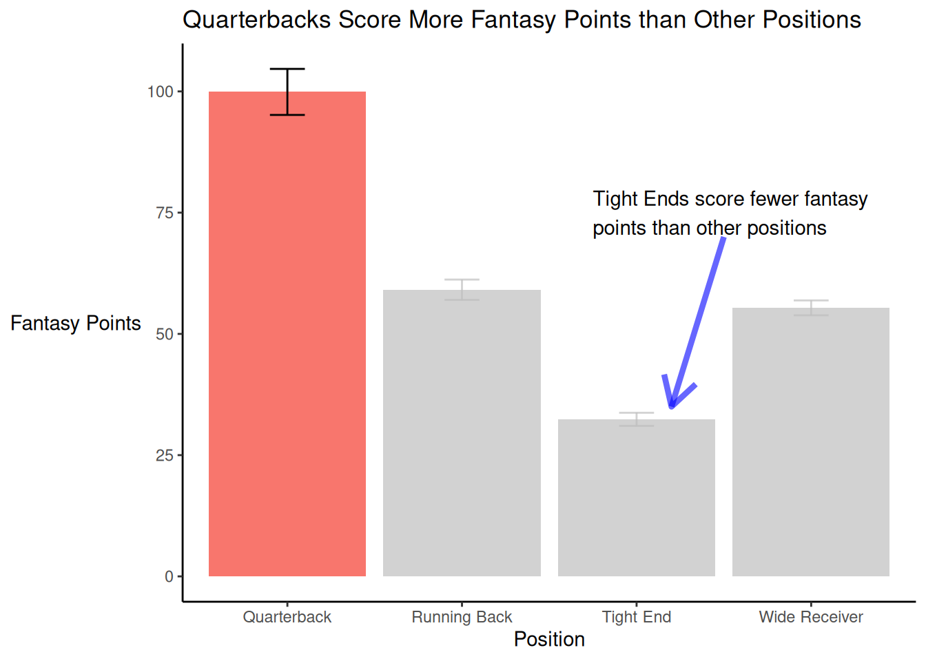
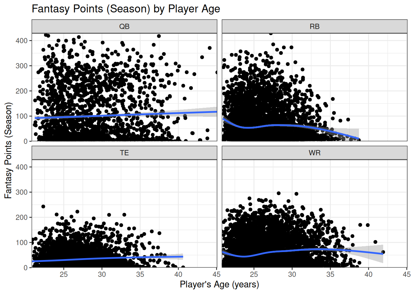
“Showing the data” involves showing the data that matter the most. “Reducing the clutter” involves removing non-data things that obscure the data—for example, extraneous gridlines, tick marks, data markers (e.g., symbols to distinguish between series), and complex shadings (e.g., textured or filled gradients). “Integrating the graphics and text” involves using headline titles, clear and useful labels (instead of legends), and helpful annotations. Headline or newspaper-like titles are titles that are succinct with active phasing and that indicate the take-away message (e.g., “Quarterbacks Threw Fewer Touchdowns in 2024 than in Previous Years”). In terms of labels, Schwabish (2021) advocates to label the data directly instead of using a legend. In terms of helpful annotations, you can provide additional text that helps explain the data (e.g., peaks or valleys, outliers, or other variations that deserve explanation), including how to interpret the chart. “Avoiding the spaghetti chart” means avoiding packed charts with too much information that makes them difficult to interpret. Spaghetti charts are lines with many lines that, make the plot look like a bunch of spaghetti. However, Schwabish (2021) also advocates against using charts of other types that are complicated and difficult to interpret due to too much information, such as complicated maps or bar plots with too many colors, icons, or bars. If there are too many lines or series, Schwabish (2021) advocates breaking it up into multiple charts (i.e., facets, trellis charts, or small multiples). An example of faceted charts is depicted in Figure 5.48. “Starting with gray” refers to the idea of using gray as the default color for most lines/points/bars, so that you can use a color to highlight the lines/points/bars of interest. In addition, as noted by Schwabish (2021), it is important to treat data as objectively as possible and not to present figures in a biased way as to mislead.
In his classic book, Tufte (2001) states that effective data visualizations should follow principles of graphical excellence and integrity. He notes that “Graphical excellence is that which gives to the viewer the greatest number of ideas in the shortest time with the least ink in the smallest space.” (p. 51). That is, data visualizations should seek to maximize the data-to-ink ratio (within reason), and should spend less space on “fluff” (i.e., non-data things that can be erased without losing meaning, such as grid lines, redundancies, etc.). This is consistent with Schwabish’s (2021) principles of showing the data and reducing the clutter. Tufte (2001) describes six principles of graphical integrity:
- The representation of numbers, as physically measured on the surface of the graphic itself, should be directly proportional to the numerical quantities represented.
- Clear, detailed, and thorough labeling should be used to defeat graphic distortion and ambiguity. Write out explanations of the data on the graphic itself. Label important events in the data.
- Show data variation, not design variation.
- In time-series displays of money, deflated and standardized units of monetary measurement are nearly always better than nominal units.
- The number of information-carrying (variable) dimensions depicted should not exceed the number of dimensions in the data.
- Graphics must not quote data out of context.
— Tufte (2001, p. 77)
Tufte (2001) also provides recommendations for friendly, accessible graphics, including:
- spell words out (rather than using abbreviations)
- have words run from left to write (including the y-axis title)
- include little messages to help explain the data
- place labels on the graphic so no legend is needed
- avoid elaborately encoded shadings, cross-hatching, and colors
- avoid “chartjunk”—i.e., unnecessary or distracting elements (e.g., excessive decoration, overly complex graphics, graphical effects, and irrelevant information such as moiré vibration, heavy grids, and self-promoting graphs) that do not improve viewers’ understanding of the data
- if colors are used, use colors that are distinguishable by color-deficient and color-blind viewers (red–green is a common form of color-blindness)
- use type (i.e., of the text) that is clear, precise, and modest
- use text that is upper-and-lower case, not all capitals
An example figure that applies these principles of data visualization is in Figure 5.1.
Code
confidenceLevel <- .95 # for 95% confidence interval

player_stats_seasonal_offense_summary <- player_stats_seasonal %>%
  filter(position_group %in% c("QB","RB","WR","TE")) %>%
  group_by(position_group) %>%
  summarise(
    n = sum(!is.na(fantasyPoints)),
    mean = mean(fantasyPoints, na.rm = TRUE),
    sd = sd(fantasyPoints, na.rm = TRUE)
  ) %>%
  mutate(se = sd/sqrt(n)) %>%
  mutate(
    ci_lower = mean - qt(p = 1 - (1 - confidenceLevel) / 2, df = n - 1) * se,
    ci_upper = mean + qt(p = 1 - (1 - confidenceLevel) / 2, df = n - 1) * se,
    positionLabel = case_match(
      position_group,
      "QB" ~ "Quarterback",
      "RB" ~ "Running Back",
      "WR" ~ "Wide Receiver",
      "TE" ~ "Tight End"
      )
  )

ggplot2::ggplot(
  data = player_stats_seasonal_offense_summary %>%
    filter(position_group %in% c("QB","RB","WR","TE")),
  mapping = aes(
    x = positionLabel,
    y = mean,
    fill = positionLabel
    )
) +
  geom_bar(
    stat = "identity") +
  geom_errorbar(
    aes(
      ymin = ci_lower,
      ymax = ci_upper),
    width = 0.2,
    color = "black"
  ) +
  gghighlight::gghighlight(
    positionLabel == "Quarterback",
    label_key = positionLabel) +
  labs(
    x = "Position",
    y = "Fantasy Points",
    title = "Quarterbacks Score More Fantasy Points than Other Positions"
  ) +
  annotate(
    "segment",
    x = 3.5,
    xend = 3.2,
    y = 70,
    yend = 35,
    color = "blue",
    linewidth = 1.5,
    alpha = 0.6,
    arrow = arrow()) +
  annotate(
    "text",
    x = 2.75,
    y = 75,
    label = "Tight Ends score fewer fantasy\npoints than other positions",
    hjust = 0) + # left-justify
  theme_classic() +
  theme(legend.position = "none") +
  theme(axis.title.y = element_text(angle = 0, vjust = 0.5)) # horizontal y-axis title
5.2.3 Creating Data Visualizations in R
The Data Visualization Catalogue, from Data to Viz, and Data Viz Project provide examples of various types of plots depending on one’s goal: https://datavizcatalogue.com/search.html, https://www.data-to-viz.com, and https://datavizproject.com. The R Graph Gallery provides examples of various types of plots and how to create them in R: https://r-graph-gallery.com. Books on data visualization in R include ggplot2: Elegant Graphics for Data Analysis (Wickham, 2024) and R Graphics Cookbook: Practical Recipes for Visualizing Data (Chang, 2018). In this chapter, we will examine how to create statistical graphics to visualize data. We will create the plots using the ggplot2 package (Wickham et al., 2024; Wickham, 2024). When creating plots in ggplot2 with multiple points or lines (e.g., multiple players or levels of a predictor variable), it is easiest to do so with the data in long form (as opposed to wide form).
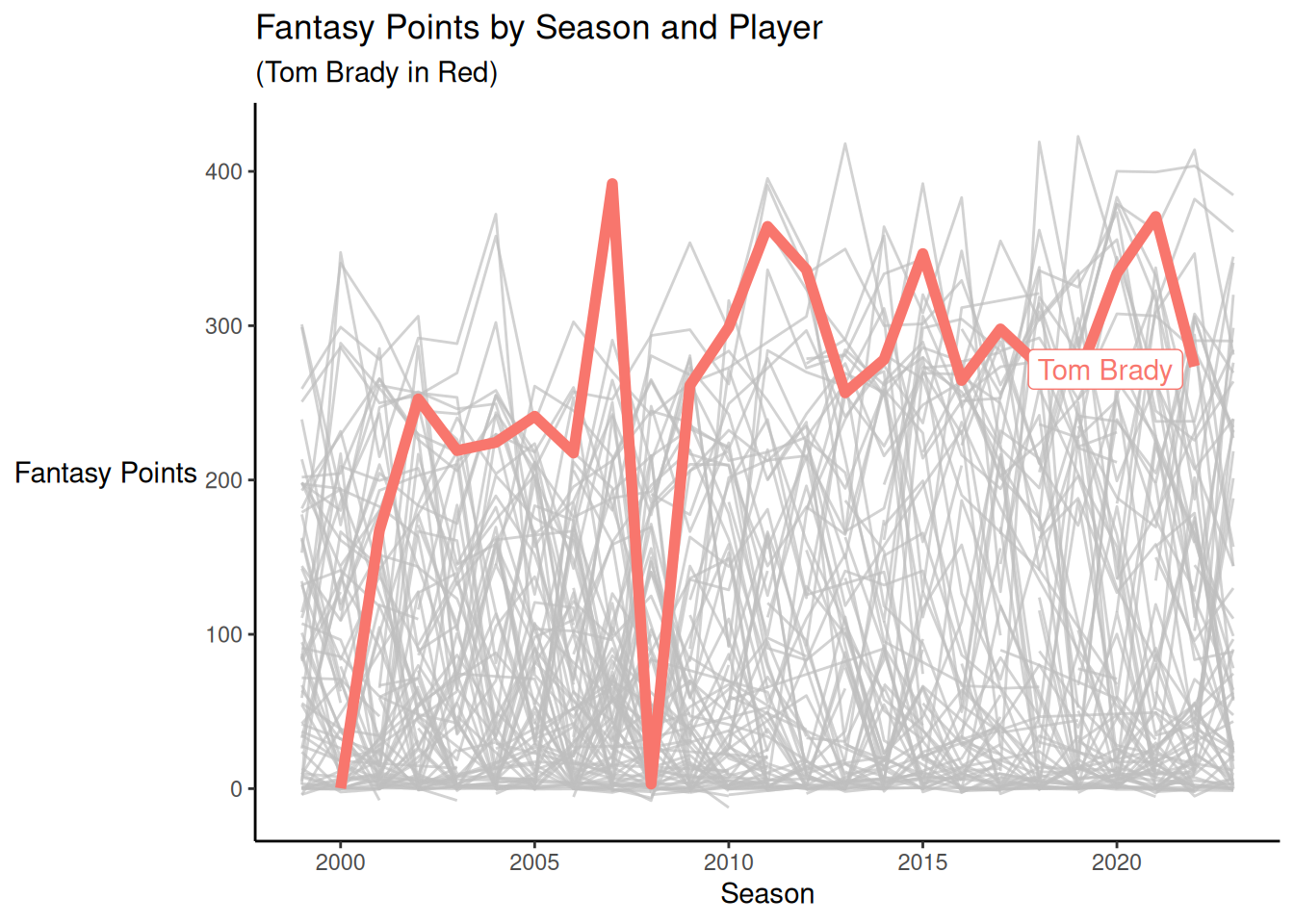
A key principle of graphic design and data visualization is the importance of contrast. Each visual component (e.g., line) that is important to see should be easy to distinguish. For instance, you can highlight lines or points of interest to draw people’s attention to the target of interest (Schwabish, 2021). For examples of highlighting in figures, see Figures 5.44 (Section 5.6.1) and 14.6.
It is also important to use color schemes with distinguishable colors. Good color schemes for sequential, diverging, and qualitative (i.e., categorical) data are provided by ColorBrewer (https://colorbrewer2.org) and are available using the ggplot2::scale_color_brewer() and ggplot2::scale_fill_brewer() functions of the ggplot2 package (Wickham et al., 2024), as demonstrated in Figure 5.47 (Section 5.7.2). ColorBrewer allows users to select colorblind safe, print friendly, and photocopy safe palettes. Good colorblind-friendly color schemes for binned (_b), continuous (_c), and discrete (i.e., categorical; _d) scales are available from the viridis palette using the ggplot2::scale_color_viridis_X() and ggplot2::scale_fill_viridis_X() functions of the ggplot2 package (Wickham et al., 2024) (where X is b, c, or d, depending on whether you want a binned, continuous, discrete scale). There are a variety of resources for color schemes that are accessible to color-blind viewers:
- https://www.datylon.com/blog/data-visualization-for-colorblind-readers [Kilin (2022); archived at https://perma.cc/7VTA-Y8YS]
- the
viridispackage (Garnier, 2024; Garnier et al., 2024) - Okabe-Ito color palette [Okabe & Ito (2008); archived at https://perma.cc/VD2E-XZZU]
- Nuñez et al. (2018)
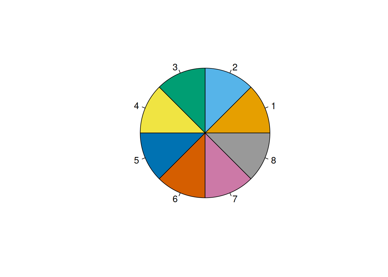
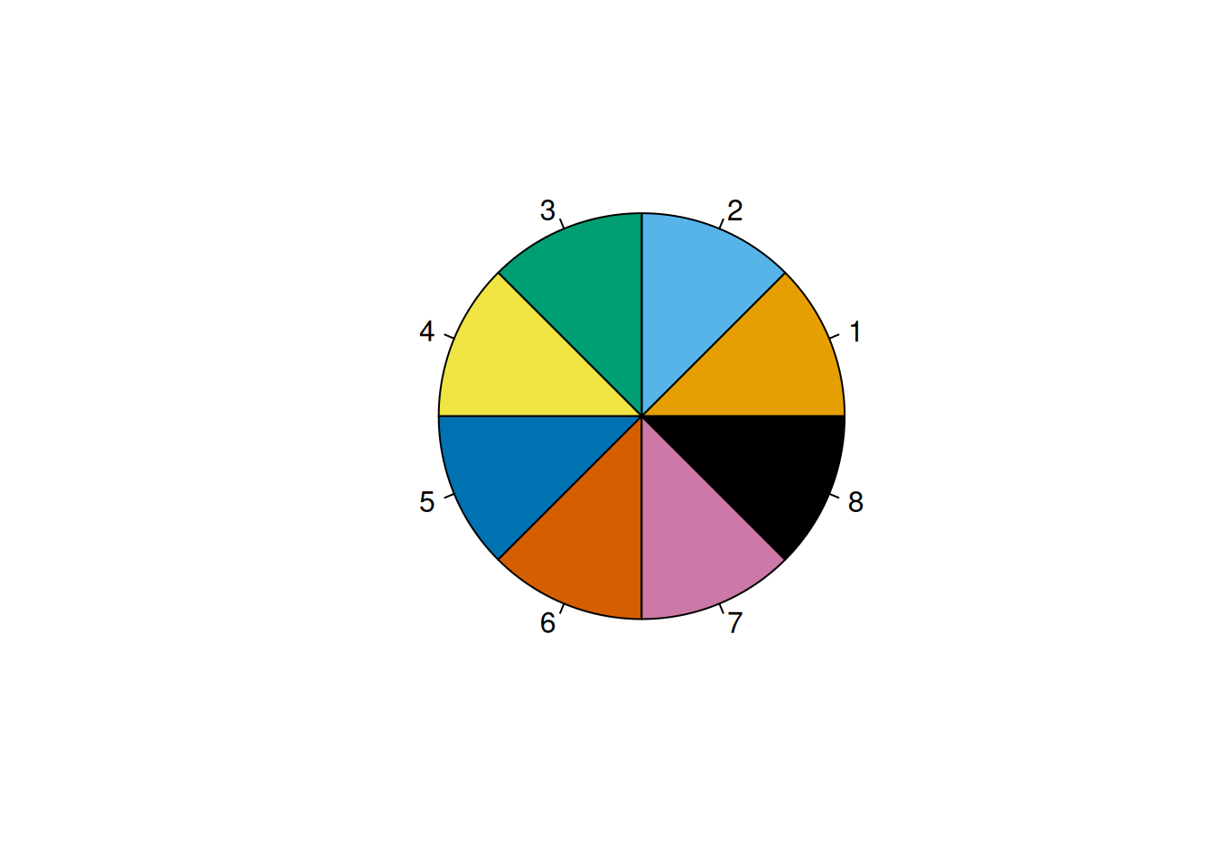
The Okabe-Ito color palette (Okabe & Ito, 2008) can be specified with the following colors:
The Okabe-Ito color palette (Okabe & Ito, 2008) is depicted in Figures 5.2 and 5.3. You can see a pie chart of colors using the graphics::pie() function:
5.3 ggplot2 Syntax
5.3.1 General Syntax
The ggplot2 package (Wickham et al., 2024) is based on the grammar of graphics (Wickham, 2024), which is the principle that you can build any graph from three components: 1) the data, 2) the coordinate system (and aesthetic attributes), and 3) the geometric objects (“geoms”)—visual marks that represent data points (e.g., points, lines, and bars). The general syntax for plots created using the ggplot2 package (Wickham et al., 2024) is:
Code
ggplot2::ggplot(
  data = INSERT, # 1) data
  mapping = aes(
    x = variableName1, # name of variable on x-axis
    y = variableName2) # name of variable on y-axis
) +
  coord_cartesian( # 2) coordinate system
    xlim = c(NA, NA), # set limits (min and max) of x-axis
    ylim = c(NA, NA)) + # set limits (min and max) of y-axis
  INSERT_GEOM_FUNCTIONS # 3) geom(s)
The ggplot2::coord_cartesian() function can be used to specify the axis limits; however, this function is not required and the plot will apply sensible limits by default. In addition, there are optional settings you can specify or modify, such as axis titles, axis labels, faceting, and the theme.
Here is a template including these potential modifications:
Code
ggplot2::ggplot(
  data = INSERT, # 1) data
  mapping = aes(
    x = variableName1, # name of variable on x-axis
    y = variableName2) # name of variable on y-axis
) +
  coord_cartesian( # 2) coordinate system
    xlim = c(NA, NA), # set limits (min and max) of x-axis
    ylim = c(NA, NA)) + # set limits (min and max) of y-axis
  INSERT_GEOM_FUNCTIONS + # 3) geom(s)
  scale_x_continuous(
    breaks = INSERT # specify x-axis labels
  ) +
  scale_y_continuous(
    breaks = INSERT # specify y-axis labels
  ) +
  labs( # add plot labels
    x = "INSERT", # x-axis title
    y = "INSERT", # y-axis title
    title = "INSERT", # plot title
    subtitle = "INSERT", # plot subtitle
    caption = "Add a caption below plot", # plot caption
    alt = "Add alt text to the plot" # plot alt-text
  ) +
  INSERT_THEME_NAME + # apply theme
  facet_wrap(vars(INSERT_VARIABLES_TO_FACET)) # facet by one or more variables
You can layer multiple geoms in the same plot, layer by layer. You can have a different data set and aesthetics associated with each geom, by specifying the data and mapping arguments for the function of that particular geom. For an example of a plot that uses different data sets for different geoms, see Figure 11.32 (Section 11.15.1).
5.3.2 Geometric Objects
Here is a list of common geometric objects (“geoms”) available in ggplot2 (there are many others):
-
histogram:
ggplot2::geom_histogram() -
density plot:
ggplot2::geom_density() -
box-and-whisker plot:
ggplot2::geom_boxplot() -
violin plot:
ggplot2::geom_violin() -
bar plot:
ggplot2::geom_bar() -
scatterplot:
ggplot2::geom_point() -
rug plot:
ggplot2::geom_rug() -
line chart:
ggplot2::geom_line() - statistical summary (e.g., best-fit line):
ggplot2::geom_smooth()
5.3.3 Color
In ggplot2, you can specify the color of a geom using one of two parameters: 1) fill and 2) color. The fill parameter specifies the color inside the geom. The color parameter specifies the outline/border color of the geom.
The colors to use in the fill and color parameters can be specified by name (as in Figure 5.4), hexadecimal (HEX) codes (as in Figure 5.5), values in red-green-blue (RGB) space (as in Figure 5.6), or palettes (e.g., ColorBrewer or viridis; as in Figures 5.9 and 5.10).
Code
You can see a full list of color names available using the grDevices::colors() function:
[1] "white" "aliceblue" "antiquewhite"
[4] "antiquewhite1" "antiquewhite2" "antiquewhite3"
[7] "antiquewhite4" "aquamarine" "aquamarine1"
[10] "aquamarine2" "aquamarine3" "aquamarine4"
[13] "azure" "azure1" "azure2"
[16] "azure3" "azure4" "beige"
[19] "bisque" "bisque1" "bisque2"
[22] "bisque3" "bisque4" "black"
[25] "blanchedalmond" "blue" "blue1"
[28] "blue2" "blue3" "blue4"
[31] "blueviolet" "brown" "brown1"
[34] "brown2" "brown3" "brown4"
[37] "burlywood" "burlywood1" "burlywood2"
[40] "burlywood3" "burlywood4" "cadetblue"
[43] "cadetblue1" "cadetblue2" "cadetblue3"
[46] "cadetblue4" "chartreuse" "chartreuse1"
[49] "chartreuse2" "chartreuse3" "chartreuse4"
[52] "chocolate" "chocolate1" "chocolate2"
[55] "chocolate3" "chocolate4" "coral"
[58] "coral1" "coral2" "coral3"
[61] "coral4" "cornflowerblue" "cornsilk"
[64] "cornsilk1" "cornsilk2" "cornsilk3"
[67] "cornsilk4" "cyan" "cyan1"
[70] "cyan2" "cyan3" "cyan4"
[73] "darkblue" "darkcyan" "darkgoldenrod"
[76] "darkgoldenrod1" "darkgoldenrod2" "darkgoldenrod3"
[79] "darkgoldenrod4" "darkgray" "darkgreen"
[82] "darkgrey" "darkkhaki" "darkmagenta"
[85] "darkolivegreen" "darkolivegreen1" "darkolivegreen2"
[88] "darkolivegreen3" "darkolivegreen4" "darkorange"
[91] "darkorange1" "darkorange2" "darkorange3"
[94] "darkorange4" "darkorchid" "darkorchid1"
[97] "darkorchid2" "darkorchid3" "darkorchid4"
[100] "darkred" "darksalmon" "darkseagreen"
[103] "darkseagreen1" "darkseagreen2" "darkseagreen3"
[106] "darkseagreen4" "darkslateblue" "darkslategray"
[109] "darkslategray1" "darkslategray2" "darkslategray3"
[112] "darkslategray4" "darkslategrey" "darkturquoise"
[115] "darkviolet" "deeppink" "deeppink1"
[118] "deeppink2" "deeppink3" "deeppink4"
[121] "deepskyblue" "deepskyblue1" "deepskyblue2"
[124] "deepskyblue3" "deepskyblue4" "dimgray"
[127] "dimgrey" "dodgerblue" "dodgerblue1"
[130] "dodgerblue2" "dodgerblue3" "dodgerblue4"
[133] "firebrick" "firebrick1" "firebrick2"
[136] "firebrick3" "firebrick4" "floralwhite"
[139] "forestgreen" "gainsboro" "ghostwhite"
[142] "gold" "gold1" "gold2"
[145] "gold3" "gold4" "goldenrod"
[148] "goldenrod1" "goldenrod2" "goldenrod3"
[151] "goldenrod4" "gray" "gray0"
[154] "gray1" "gray2" "gray3"
[157] "gray4" "gray5" "gray6"
[160] "gray7" "gray8" "gray9"
[163] "gray10" "gray11" "gray12"
[166] "gray13" "gray14" "gray15"
[169] "gray16" "gray17" "gray18"
[172] "gray19" "gray20" "gray21"
[175] "gray22" "gray23" "gray24"
[178] "gray25" "gray26" "gray27"
[181] "gray28" "gray29" "gray30"
[184] "gray31" "gray32" "gray33"
[187] "gray34" "gray35" "gray36"
[190] "gray37" "gray38" "gray39"
[193] "gray40" "gray41" "gray42"
[196] "gray43" "gray44" "gray45"
[199] "gray46" "gray47" "gray48"
[202] "gray49" "gray50" "gray51"
[205] "gray52" "gray53" "gray54"
[208] "gray55" "gray56" "gray57"
[211] "gray58" "gray59" "gray60"
[214] "gray61" "gray62" "gray63"
[217] "gray64" "gray65" "gray66"
[220] "gray67" "gray68" "gray69"
[223] "gray70" "gray71" "gray72"
[226] "gray73" "gray74" "gray75"
[229] "gray76" "gray77" "gray78"
[232] "gray79" "gray80" "gray81"
[235] "gray82" "gray83" "gray84"
[238] "gray85" "gray86" "gray87"
[241] "gray88" "gray89" "gray90"
[244] "gray91" "gray92" "gray93"
[247] "gray94" "gray95" "gray96"
[250] "gray97" "gray98" "gray99"
[253] "gray100" "green" "green1"
[256] "green2" "green3" "green4"
[259] "greenyellow" "grey" "grey0"
[262] "grey1" "grey2" "grey3"
[265] "grey4" "grey5" "grey6"
[268] "grey7" "grey8" "grey9"
[271] "grey10" "grey11" "grey12"
[274] "grey13" "grey14" "grey15"
[277] "grey16" "grey17" "grey18"
[280] "grey19" "grey20" "grey21"
[283] "grey22" "grey23" "grey24"
[286] "grey25" "grey26" "grey27"
[289] "grey28" "grey29" "grey30"
[292] "grey31" "grey32" "grey33"
[295] "grey34" "grey35" "grey36"
[298] "grey37" "grey38" "grey39"
[301] "grey40" "grey41" "grey42"
[304] "grey43" "grey44" "grey45"
[307] "grey46" "grey47" "grey48"
[310] "grey49" "grey50" "grey51"
[313] "grey52" "grey53" "grey54"
[316] "grey55" "grey56" "grey57"
[319] "grey58" "grey59" "grey60"
[322] "grey61" "grey62" "grey63"
[325] "grey64" "grey65" "grey66"
[328] "grey67" "grey68" "grey69"
[331] "grey70" "grey71" "grey72"
[334] "grey73" "grey74" "grey75"
[337] "grey76" "grey77" "grey78"
[340] "grey79" "grey80" "grey81"
[343] "grey82" "grey83" "grey84"
[346] "grey85" "grey86" "grey87"
[349] "grey88" "grey89" "grey90"
[352] "grey91" "grey92" "grey93"
[355] "grey94" "grey95" "grey96"
[358] "grey97" "grey98" "grey99"
[361] "grey100" "honeydew" "honeydew1"
[364] "honeydew2" "honeydew3" "honeydew4"
[367] "hotpink" "hotpink1" "hotpink2"
[370] "hotpink3" "hotpink4" "indianred"
[373] "indianred1" "indianred2" "indianred3"
[376] "indianred4" "ivory" "ivory1"
[379] "ivory2" "ivory3" "ivory4"
[382] "khaki" "khaki1" "khaki2"
[385] "khaki3" "khaki4" "lavender"
[388] "lavenderblush" "lavenderblush1" "lavenderblush2"
[391] "lavenderblush3" "lavenderblush4" "lawngreen"
[394] "lemonchiffon" "lemonchiffon1" "lemonchiffon2"
[397] "lemonchiffon3" "lemonchiffon4" "lightblue"
[400] "lightblue1" "lightblue2" "lightblue3"
[403] "lightblue4" "lightcoral" "lightcyan"
[406] "lightcyan1" "lightcyan2" "lightcyan3"
[409] "lightcyan4" "lightgoldenrod" "lightgoldenrod1"
[412] "lightgoldenrod2" "lightgoldenrod3" "lightgoldenrod4"
[415] "lightgoldenrodyellow" "lightgray" "lightgreen"
[418] "lightgrey" "lightpink" "lightpink1"
[421] "lightpink2" "lightpink3" "lightpink4"
[424] "lightsalmon" "lightsalmon1" "lightsalmon2"
[427] "lightsalmon3" "lightsalmon4" "lightseagreen"
[430] "lightskyblue" "lightskyblue1" "lightskyblue2"
[433] "lightskyblue3" "lightskyblue4" "lightslateblue"
[436] "lightslategray" "lightslategrey" "lightsteelblue"
[439] "lightsteelblue1" "lightsteelblue2" "lightsteelblue3"
[442] "lightsteelblue4" "lightyellow" "lightyellow1"
[445] "lightyellow2" "lightyellow3" "lightyellow4"
[448] "limegreen" "linen" "magenta"
[451] "magenta1" "magenta2" "magenta3"
[454] "magenta4" "maroon" "maroon1"
[457] "maroon2" "maroon3" "maroon4"
[460] "mediumaquamarine" "mediumblue" "mediumorchid"
[463] "mediumorchid1" "mediumorchid2" "mediumorchid3"
[466] "mediumorchid4" "mediumpurple" "mediumpurple1"
[469] "mediumpurple2" "mediumpurple3" "mediumpurple4"
[472] "mediumseagreen" "mediumslateblue" "mediumspringgreen"
[475] "mediumturquoise" "mediumvioletred" "midnightblue"
[478] "mintcream" "mistyrose" "mistyrose1"
[481] "mistyrose2" "mistyrose3" "mistyrose4"
[484] "moccasin" "navajowhite" "navajowhite1"
[487] "navajowhite2" "navajowhite3" "navajowhite4"
[490] "navy" "navyblue" "oldlace"
[493] "olivedrab" "olivedrab1" "olivedrab2"
[496] "olivedrab3" "olivedrab4" "orange"
[499] "orange1" "orange2" "orange3"
[502] "orange4" "orangered" "orangered1"
[505] "orangered2" "orangered3" "orangered4"
[508] "orchid" "orchid1" "orchid2"
[511] "orchid3" "orchid4" "palegoldenrod"
[514] "palegreen" "palegreen1" "palegreen2"
[517] "palegreen3" "palegreen4" "paleturquoise"
[520] "paleturquoise1" "paleturquoise2" "paleturquoise3"
[523] "paleturquoise4" "palevioletred" "palevioletred1"
[526] "palevioletred2" "palevioletred3" "palevioletred4"
[529] "papayawhip" "peachpuff" "peachpuff1"
[532] "peachpuff2" "peachpuff3" "peachpuff4"
[535] "peru" "pink" "pink1"
[538] "pink2" "pink3" "pink4"
[541] "plum" "plum1" "plum2"
[544] "plum3" "plum4" "powderblue"
[547] "purple" "purple1" "purple2"
[550] "purple3" "purple4" "red"
[553] "red1" "red2" "red3"
[556] "red4" "rosybrown" "rosybrown1"
[559] "rosybrown2" "rosybrown3" "rosybrown4"
[562] "royalblue" "royalblue1" "royalblue2"
[565] "royalblue3" "royalblue4" "saddlebrown"
[568] "salmon" "salmon1" "salmon2"
[571] "salmon3" "salmon4" "sandybrown"
[574] "seagreen" "seagreen1" "seagreen2"
[577] "seagreen3" "seagreen4" "seashell"
[580] "seashell1" "seashell2" "seashell3"
[583] "seashell4" "sienna" "sienna1"
[586] "sienna2" "sienna3" "sienna4"
[589] "skyblue" "skyblue1" "skyblue2"
[592] "skyblue3" "skyblue4" "slateblue"
[595] "slateblue1" "slateblue2" "slateblue3"
[598] "slateblue4" "slategray" "slategray1"
[601] "slategray2" "slategray3" "slategray4"
[604] "slategrey" "snow" "snow1"
[607] "snow2" "snow3" "snow4"
[610] "springgreen" "springgreen1" "springgreen2"
[613] "springgreen3" "springgreen4" "steelblue"
[616] "steelblue1" "steelblue2" "steelblue3"
[619] "steelblue4" "tan" "tan1"
[622] "tan2" "tan3" "tan4"
[625] "thistle" "thistle1" "thistle2"
[628] "thistle3" "thistle4" "tomato"
[631] "tomato1" "tomato2" "tomato3"
[634] "tomato4" "turquoise" "turquoise1"
[637] "turquoise2" "turquoise3" "turquoise4"
[640] "violet" "violetred" "violetred1"
[643] "violetred2" "violetred3" "violetred4"
[646] "wheat" "wheat1" "wheat2"
[649] "wheat3" "wheat4" "whitesmoke"
[652] "yellow" "yellow1" "yellow2"
[655] "yellow3" "yellow4" "yellowgreen" However, you can use any color by specifying its HEX code, as in Figure 5.5.
Code
You can use any color by specifying its values in red-green-blue (RGB) color space using the grDevices::rgb() function, as in Figure 5.6.
Code
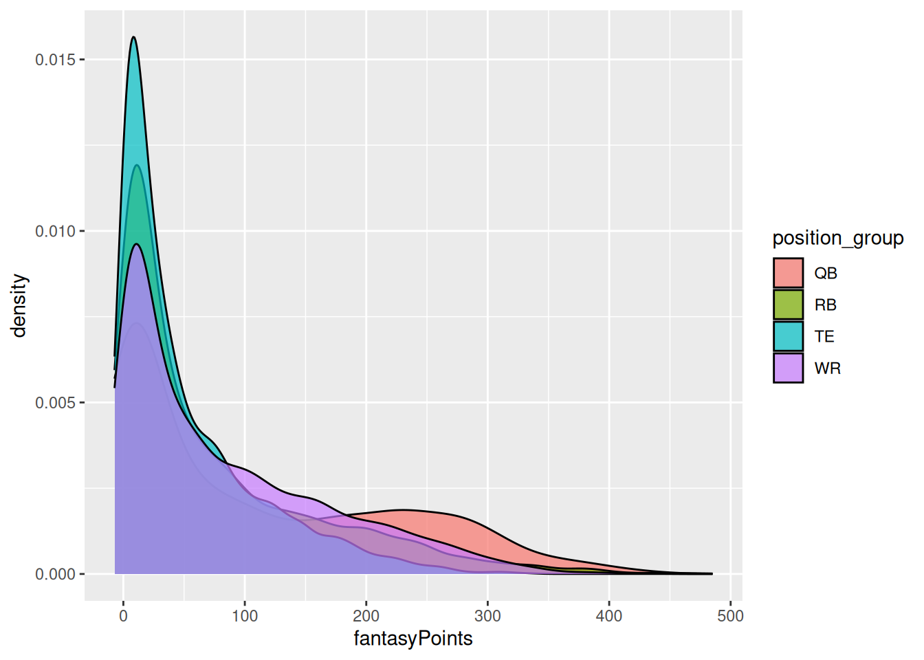
We can allow the colors to differ by group by specifying the fill parameter in the mapping aesthetics, as in Figure 5.7.
Code
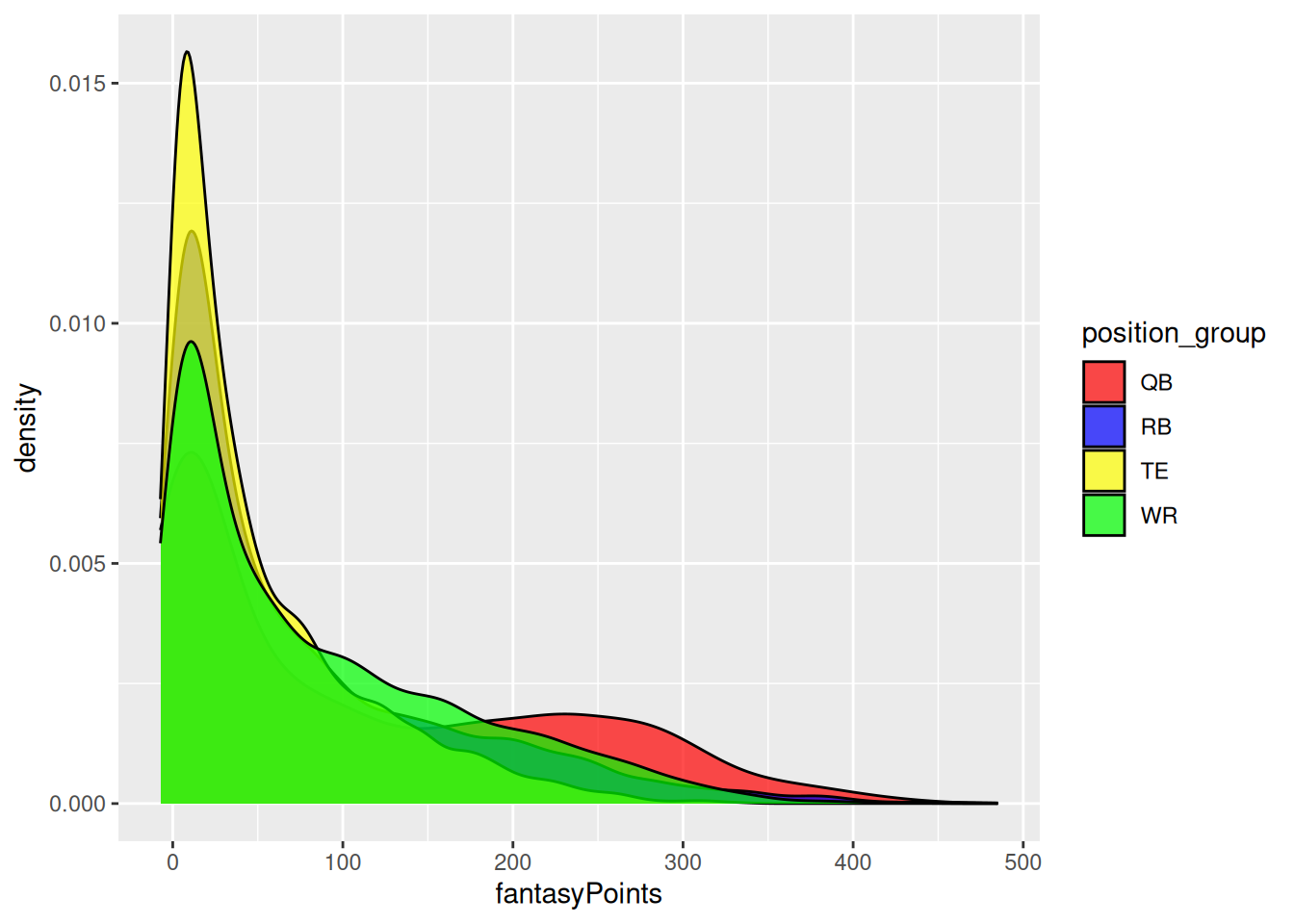
We can specify multiple colors manually using the ggplot2::scale_fill_manual() function, as in Figure 5.8.
Code
ggplot2::ggplot(
  data = player_stats_seasonal %>%
    filter(position_group %in% c("QB","RB","WR","TE")),
  mapping = aes(
    x = fantasyPoints,
    fill = position_group)
) +
  geom_density(
    color = "black",
    alpha = 0.7
) +
scale_fill_manual(
values = c(
"QB" = "red", # or could use hex, rgb, etc.
"RB" = "blue", # or could use hex, rgb, etc.
"WR" = "green", # or could use hex, rgb, etc.
"TE" = "yellow") # or could use hex, rgb, etc.
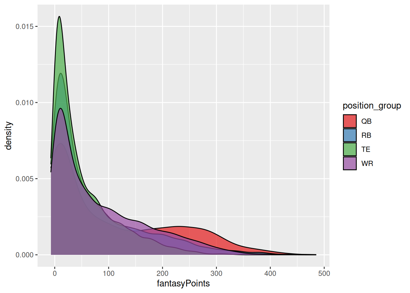
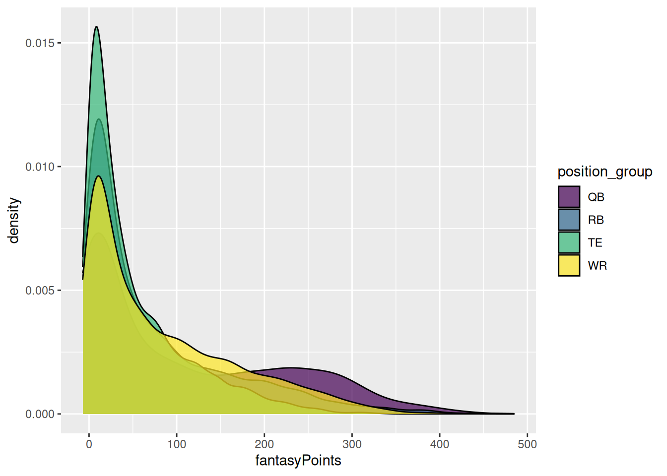
)We can also specify the colors using a palette, such as by the ColorBrewer palette using the ggplot2::scale_fill_brewer() function (as in Figure 5.9) or the viridis palette using the ggplot2::scale_fill_viridis_d() function (as in Figure 5.10).
Code
ggplot2::ggplot(
  data = player_stats_seasonal %>%
    filter(position_group %in% c("QB","RB","WR","TE")),
  mapping = aes(
    x = fantasyPoints,
    fill = position_group)
) +
  geom_density(
    color = "black",
    alpha = 0.7
  ) +
scale_fill_brewer(palette = "Set1") # see ?scale_fill_brewer for list of available palettesCode
ggplot2::ggplot(
  data = player_stats_seasonal %>%
    filter(position_group %in% c("QB","RB","WR","TE")),
  mapping = aes(
    x = fantasyPoints,
    fill = position_group)
) +
  geom_density(
    color = "black",
    alpha = 0.7
  ) +
scale_fill_viridis_d(option = "viridis") # see ?scale_fill_viridis_d for list of available palettes5.3.4 Line Type
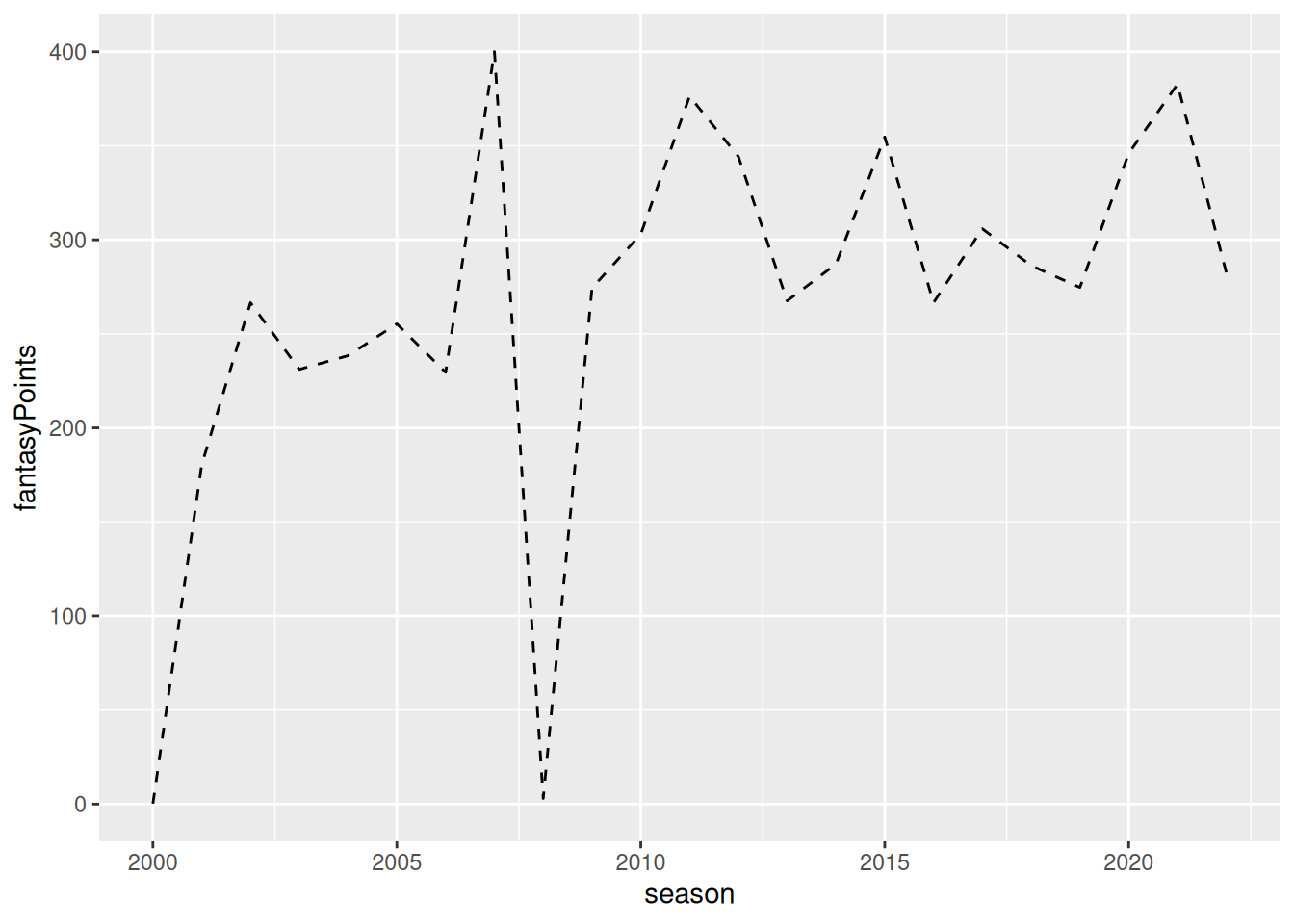
Common line types include “solid” lines, “dashed” lines, and “dotted” lines. A full list of line types available is provided here: https://ggplot2.tidyverse.org/articles/ggplot2-specs.html (archived at https://perma.cc/N9ED-6LUS). To specify the line type, you can use the linetype parameter, as in Figure 5.11.
Code
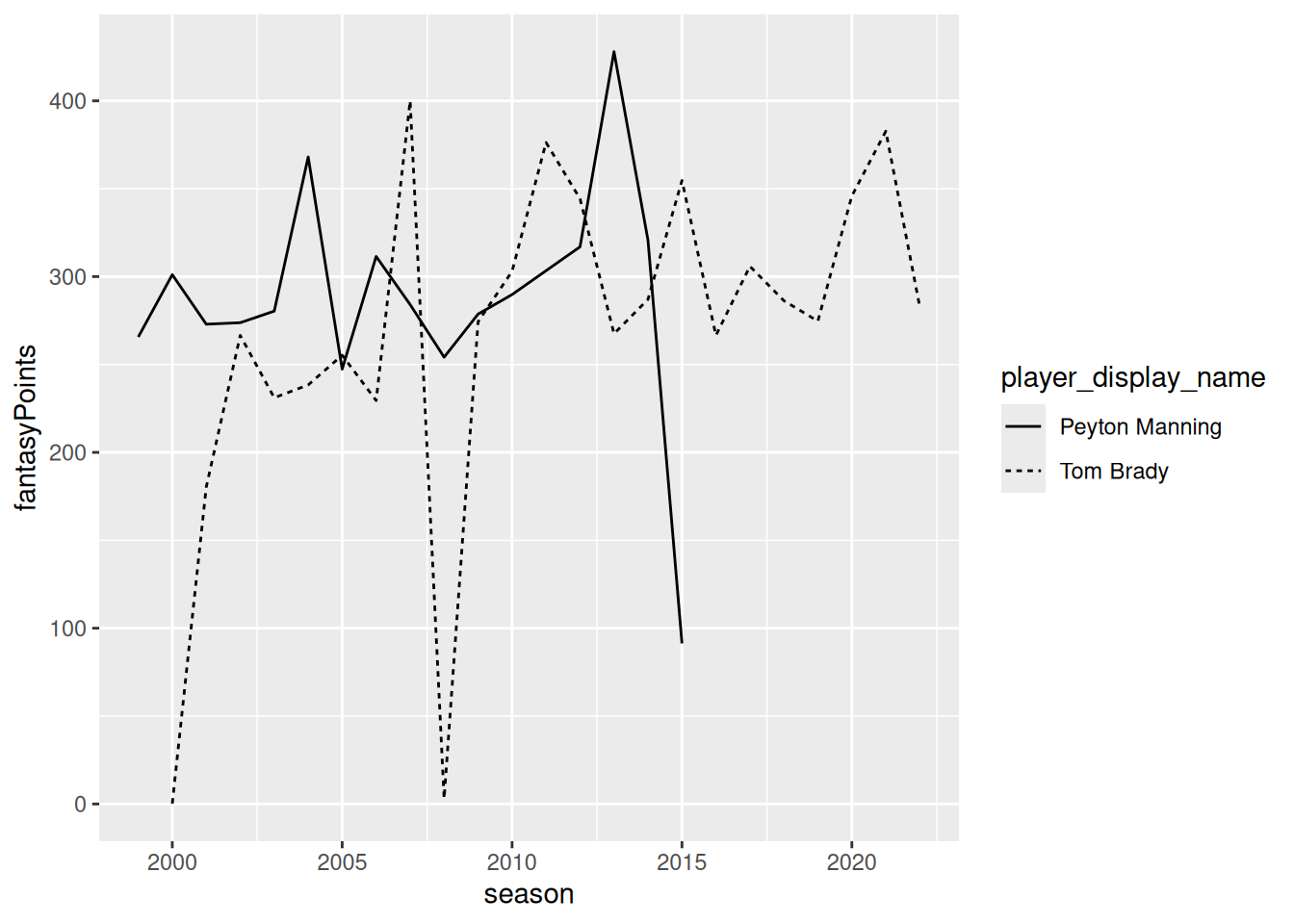
We can allow the line type to differ by group by specifying the linetype parameter in the mapping aesthetics, as in Figure 5.12.
Code
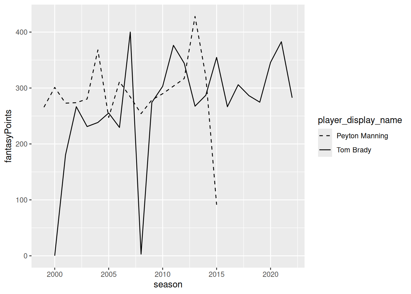
We can specify the line types manually using the ggplot2::scale_linetype_manual() function as in Figure 5.13.
Code
ggplot2::ggplot(
  data = player_stats_seasonal %>%
    filter(player_display_name %in% c("Tom Brady","Peyton Manning")),
  mapping = aes(
    x = season,
    y = fantasyPoints,
    group = player_display_name,
    linetype = player_display_name)
) +
  geom_line() +
  scale_linetype_manual(
    values = c(
      "Tom Brady" = "solid",
      "Peyton Manning" = "dashed")
)5.3.5 Line Width
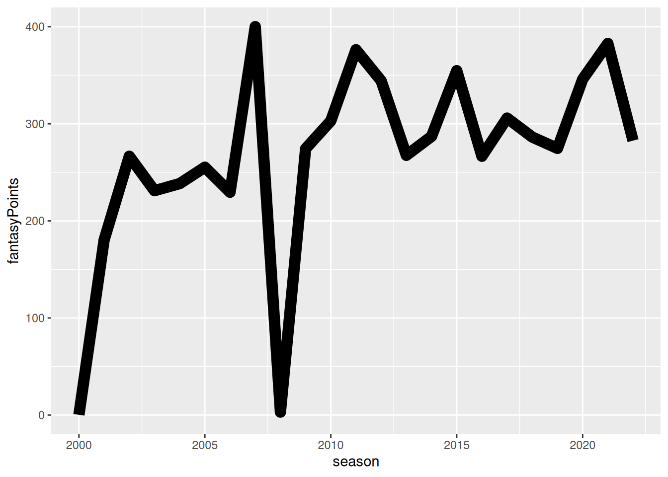
To specify the line width, you can use the linewidth parameter, as in Figure 5.14.
5.3.6 Point Shape
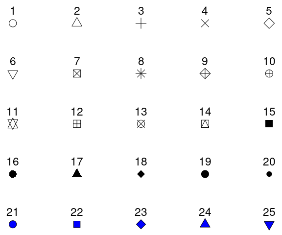
Common point shapes include circles, triangles, squares, etc. A full list of point shapes available is provided here: https://ggplot2.tidyverse.org/articles/ggplot2-specs.html (archived at https://perma.cc/N9ED-6LUS) and is in Figure 5.15.
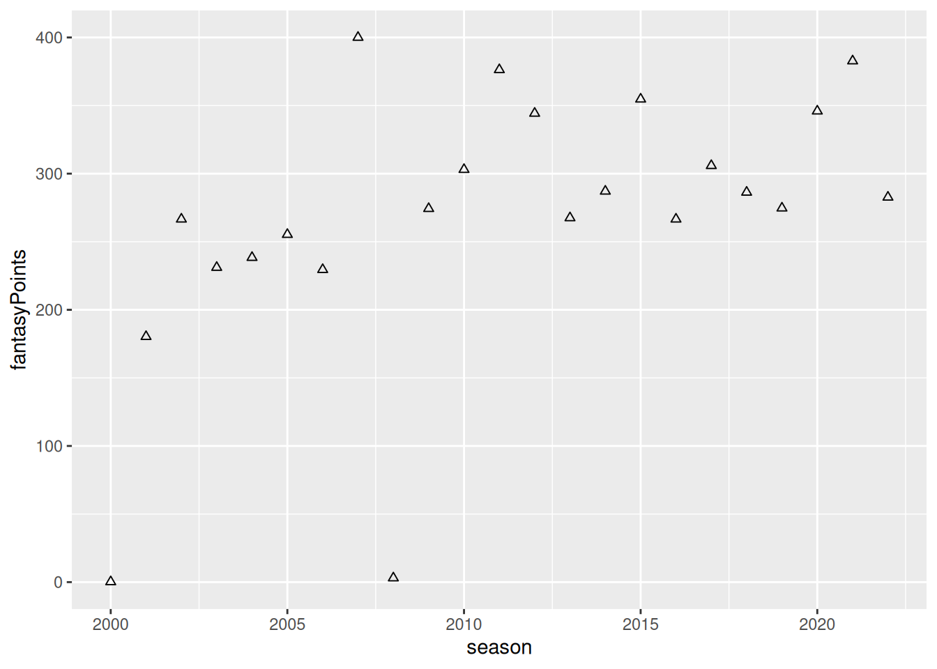
To specify the point shape, you can use the shape parameter, as in Figure 5.16.
Code
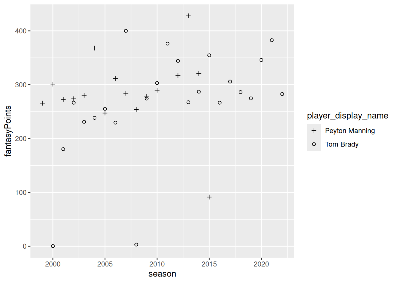
We can allow the point shape to differ by group by specifying the shape parameter in the mapping aesthetics, as in Figure 5.17.
Code
We can specify the point shape manually using the ggplot2::scale_shape_manual() function as in Figure 5.18.
Code
5.3.7 Size of Points and Text
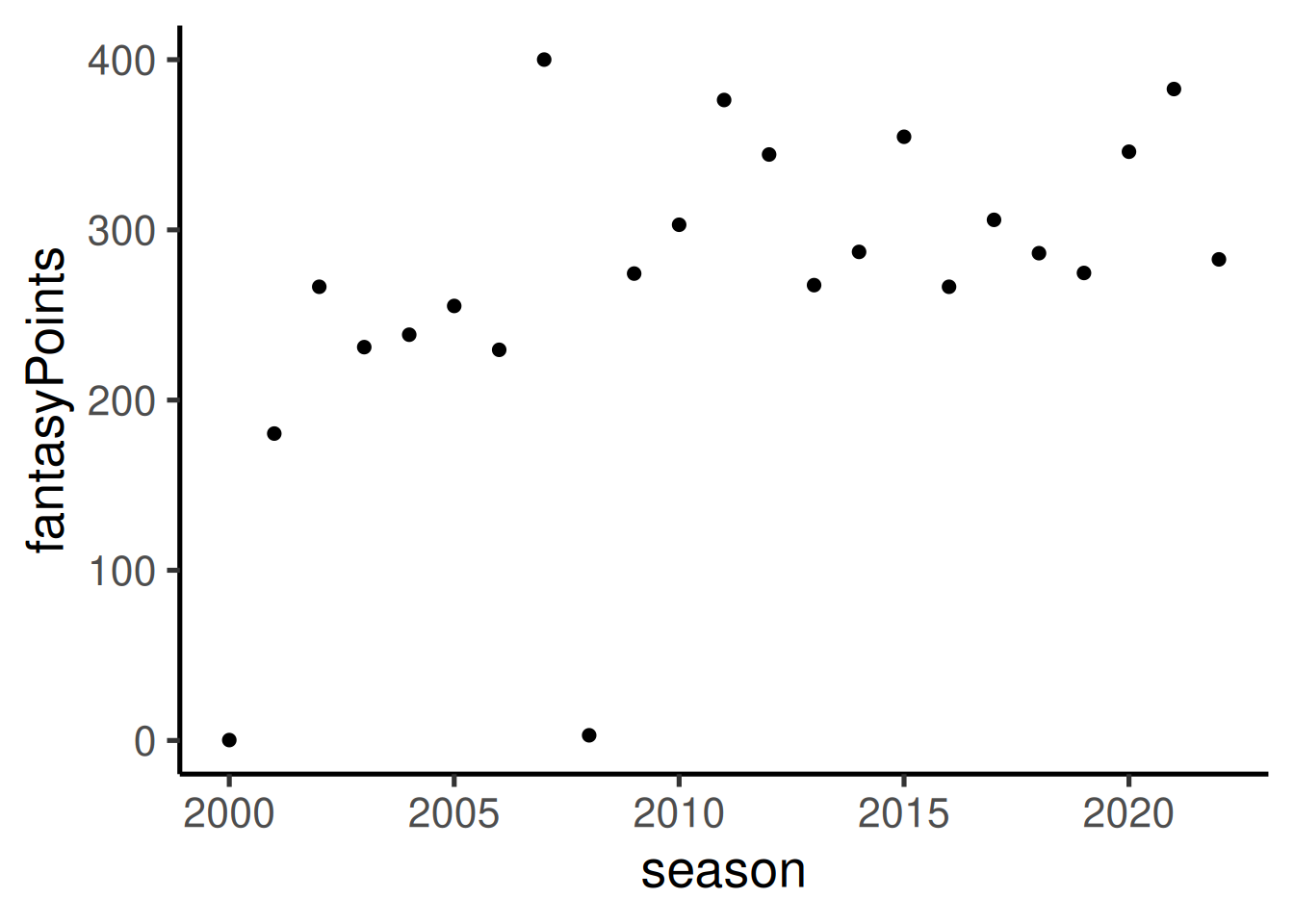
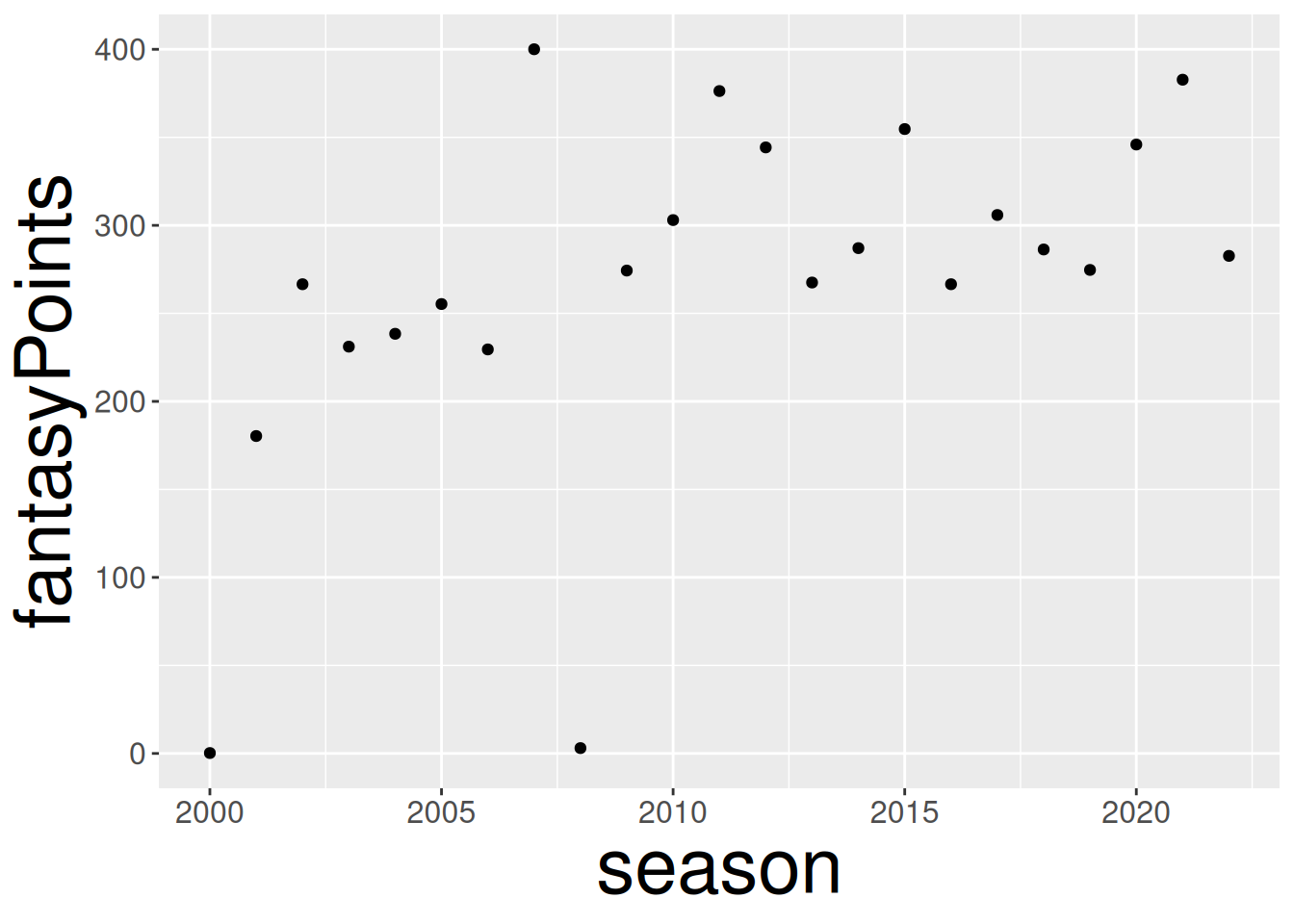
To specify the size of points and text, you can use the size and base_size parameters, respectively, as in Figure 5.19.
Code
You can also specify the font size separately for particular elements, as in Figure 5.20.
Code
ggplot2::ggplot(
  data = player_stats_seasonal %>%
    filter(player_display_name %in% c("Tom Brady")),
  mapping = aes(
    x = season,
    y = fantasyPoints,
    group = player_display_name)
) +
  geom_point() +
  theme(
    axis.title.x = element_text(size = 30), # font size for x-axis title
    axis.title.y = element_text(size = 30), # font size for y-axis title
    axis.text.x  = element_text(size = 12), # font size for x-axis labels
    axis.text.y  = element_text(size = 12)  # font size for y-axis labels
)5.4 Univariate Distribution
Scherer (2021) describes various ways of visualizing univariate distributions; see here (archived at https://perma.cc/EEJ8-LND2).
5.4.1 Histogram
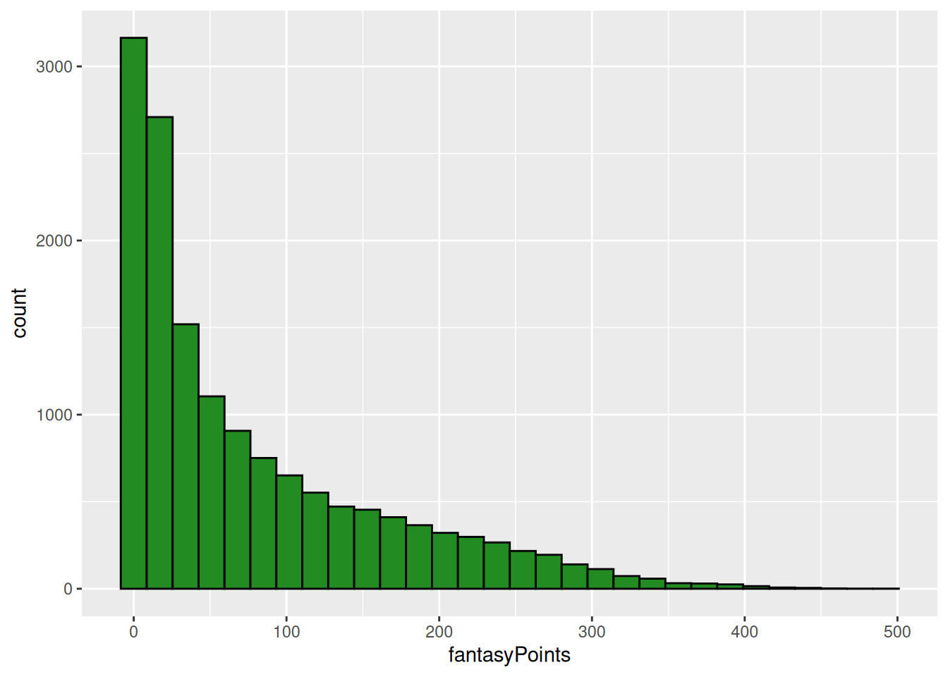
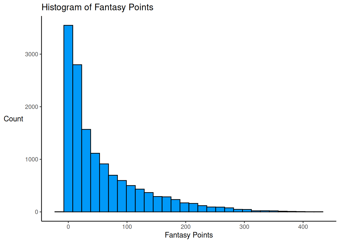
A histogram of fantasy points is depicted in Figure 5.21.
Code
ggplot2::ggplot(
  data = player_stats_seasonal %>%
    filter(position_group %in% c("QB","RB","WR","TE")),
  mapping = aes(
    x = fantasyPoints)
) +
  geom_histogram(
    color = "#000000",
    fill = "#0099F8"
  ) +
  labs(
    x = "Fantasy Points",
    y = "Count",
    title = "Histogram of Fantasy Points"
  ) +
  theme_classic() +
theme(axis.title.y = element_text(angle = 0, vjust = 0.5)) # horizontal y-axis title5.4.2 Density Plot
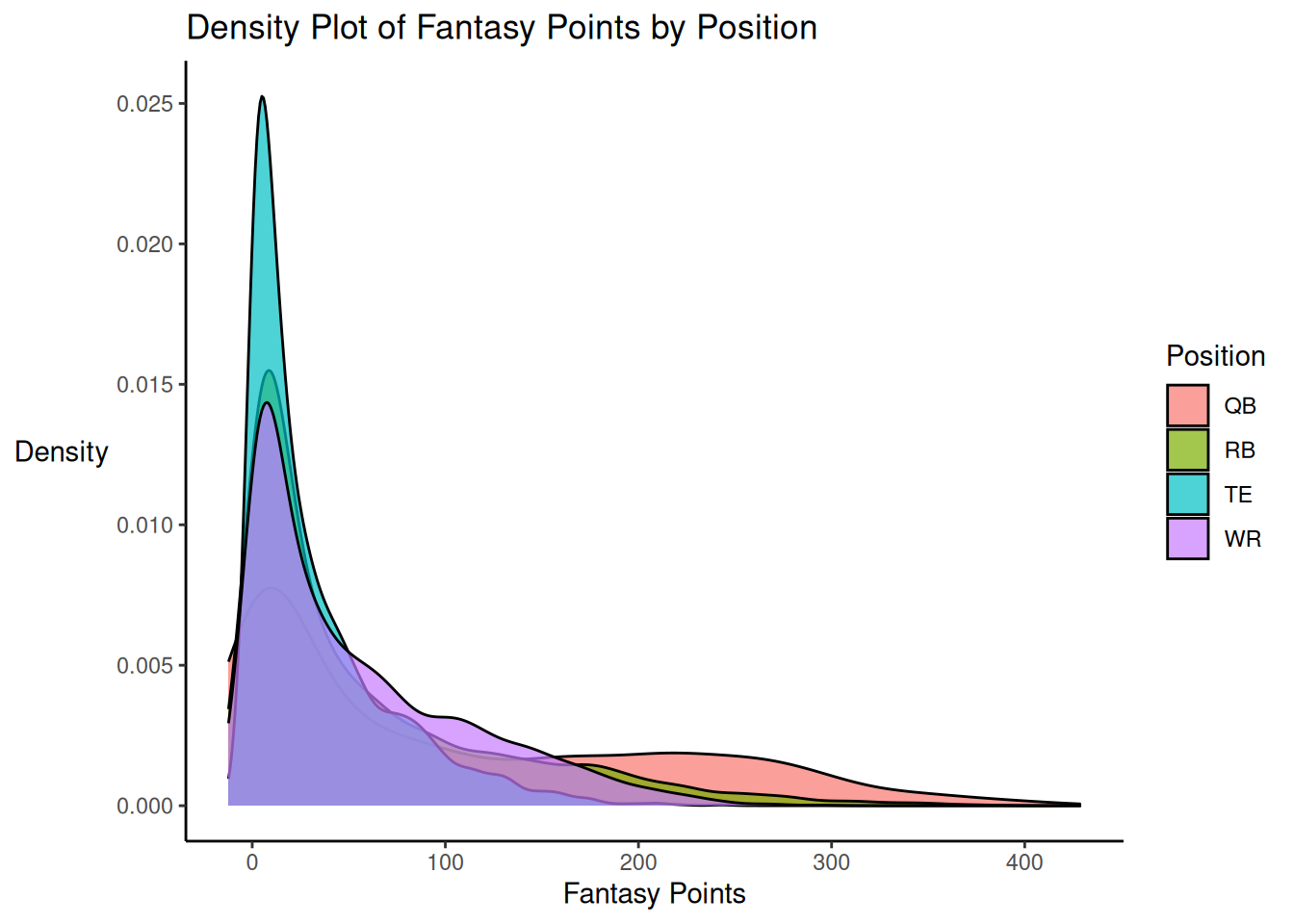
A histogram of fantasy points is depicted in Figure 5.22.
Code
ggplot2::ggplot(
  data = player_stats_seasonal %>%
    filter(position_group %in% c("QB","RB","WR","TE")),
  mapping = aes(
    x = fantasyPoints,
    fill = position_group)
) +
  geom_density(alpha = 0.7) + # add transparency
  labs(
    x = "Fantasy Points",
    y = "Density",
    fill = "Position",
    title = "Density Plot of Fantasy Points by Position"
  ) +
  theme_classic() +
theme(axis.title.y = element_text(angle = 0, vjust = 0.5)) # horizontal y-axis title5.4.3 Density Plot with Histogram and Rug Plot
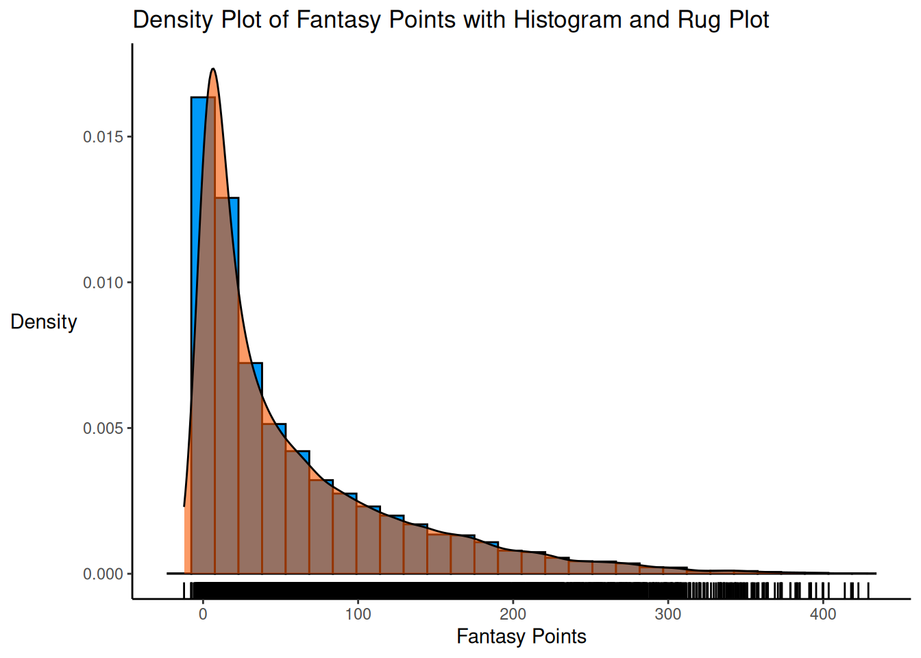
A density plot of fantasy points with a histogram and rug plot is depicted in Figure 5.23.
Code
ggplot2::ggplot(
  data = player_stats_seasonal %>%
    filter(position_group %in% c("QB","RB","WR","TE")),
  mapping = aes(
    x = fantasyPoints)
) +
  geom_histogram(
    aes(y = after_stat(density)),
    color = "#000000",
    fill = "#0099F8"
  ) +
  geom_density(
    color = "#000000",
    fill = "#F85700",
    alpha = 0.6 # add transparency
  ) +
  geom_rug() +
  labs(
    x = "Fantasy Points",
    y = "Density",
    title = "Density Plot of Fantasy Points with Histogram and Rug Plot"
  ) +
  theme_classic() +
theme(axis.title.y = element_text(angle = 0, vjust = 0.5)) # horizontal y-axis title5.4.4 Histogram with Overlaid Density and Rug Plot
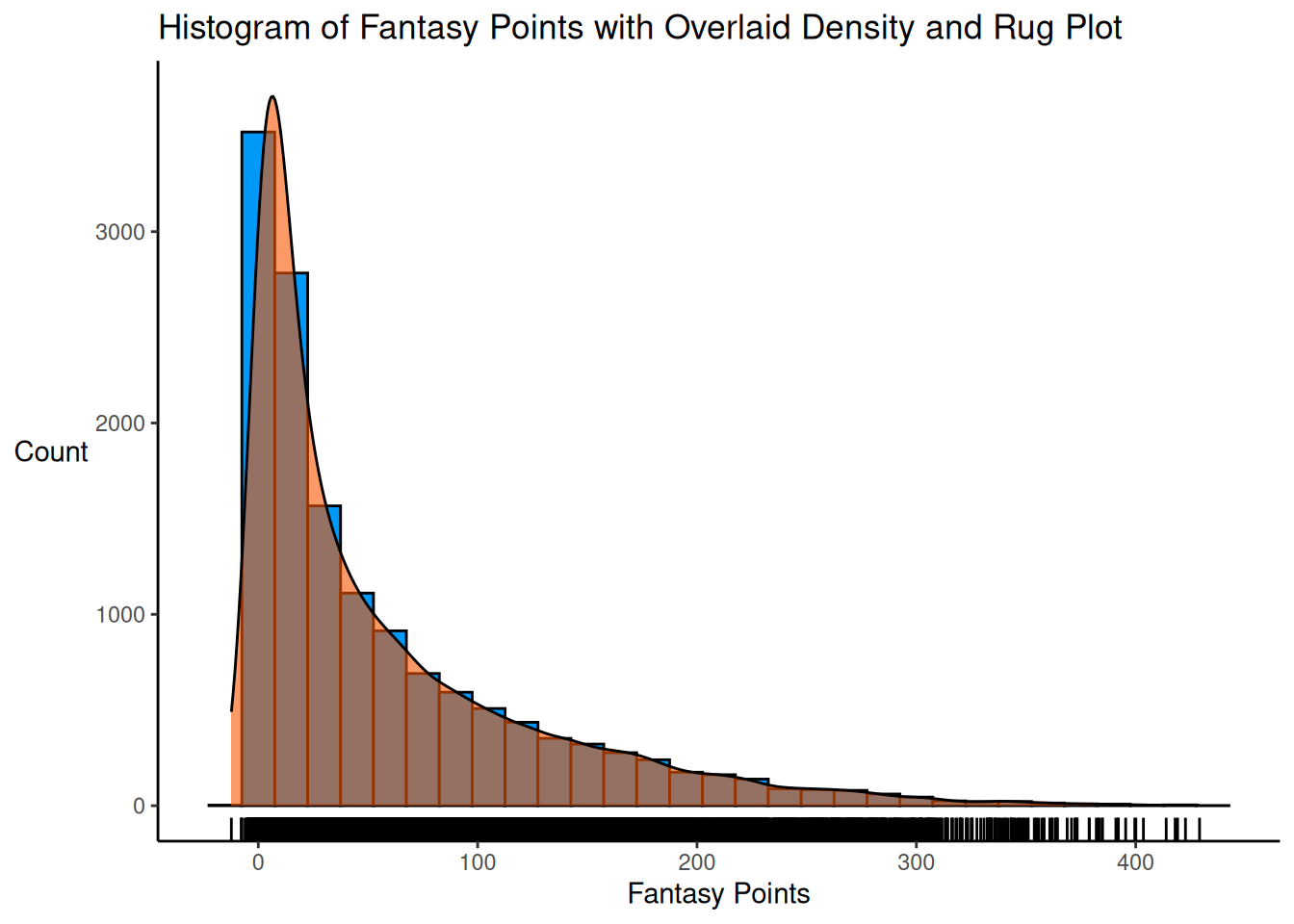
A histogram of fantasy points with an overlaid density and rug plot is depicted in Figure 5.24.
Code
binWidth <- 15

ggplot2::ggplot(
  data = player_stats_seasonal %>%
    filter(position_group %in% c("QB","RB","WR","TE")),
  mapping = aes(
    x = fantasyPoints)
) +
  geom_histogram(
    color = "#000000",
    fill = "#0099F8",
    binwidth = binWidth
  ) +
  geom_density(
    aes(y = after_stat(count) * binWidth),
    color = "#000000",
    fill = "#F85700",
    alpha = 0.6 # add transparency
  ) +
  geom_rug() +
  labs(
    x = "Fantasy Points",
    y = "Count",
    title = "Histogram of Fantasy Points with Overlaid Density and Rug Plot"
  ) +
  theme_classic() +
theme(axis.title.y = element_text(angle = 0, vjust = 0.5)) # horizontal y-axis title5.4.5 Box-and-Whisker Plot
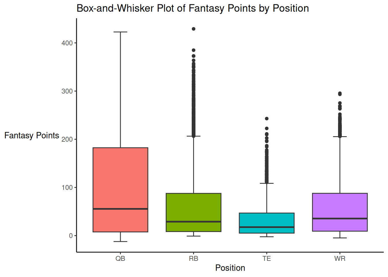
In a box-and-whisker plot, the box is created using the 1st and 3rd quartiles (i.e., the 25th and 75th percentiles, respectively). The length of the box is equal to the interquartile range, which is calculated as: \(\text{IQR} = Q_3 - Q_1\), where \(Q_3\) and \(Q_1\) are the third and first quartiles, respectively. The line in the middle of the box is located at the median (i.e., the 2nd quartile or 50th percentile). The whiskers commonly extend \(1.5 \times \text{IQR}\) units from the box. That is, the upper whisker is commonly located at \(1.5 \times \text{IQR}\) units above the third quartile. The lower whisker is commonly located at \(1.5 \times \text{IQR}\) units below the first quartile. The points represent extreme values (i.e., outliers) that are outside the whiskers.
A box-and-whisker plot of fantasy points is depicted in Figure 5.25.
Code
ggplot2::ggplot(
  data = player_stats_seasonal %>%
    filter(position_group %in% c("QB","RB","WR","TE")),
  mapping = aes(
    x = position_group,
    y = fantasyPoints,
    fill = position_group)
) +
  geom_boxplot(staplewidth = 0.25) +
  labs(
    x = "Position",
    y = "Fantasy Points",
    title = "Box-and-Whisker Plot of Fantasy Points by Position"
  ) +
  theme_classic() +
  theme(
    legend.position = "none",
axis.title.y = element_text(angle = 0, vjust = 0.5)) # horizontal y-axis title5.4.6 Violin Plot
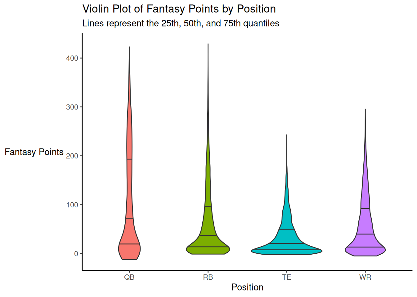
A violin plot of fantasy points is depicted in Figure 5.26.
Code
ggplot2::ggplot(
  data = player_stats_seasonal %>%
    filter(position_group %in% c("QB","RB","WR","TE")),
  mapping = aes(
    x = position_group,
    y = fantasyPoints,
    fill = position_group)
) +
  geom_violin(
    quantiles = c(0.25, 0.5, 0.75),
    quantile.linetype = "solid"
  ) +
  labs(
    x = "Position",
    y = "Fantasy Points",
    title = "Violin Plot of Fantasy Points by Position",
    subtitle = "Lines represent the 25th, 50th, and 75th quantiles"
  ) +
  theme_classic() +
  theme(
    legend.position = "none",
axis.title.y = element_text(angle = 0, vjust = 0.5)) # horizontal y-axis title5.4.7 Ridgeline Plot
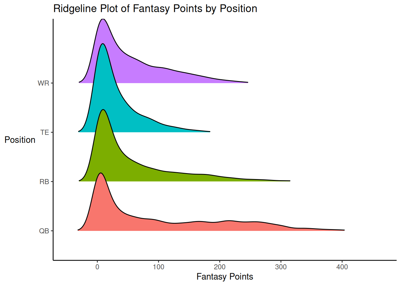
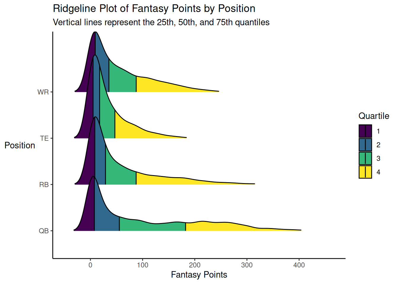
A ridgeline plot of fantasy points is depicted in Figure 5.27 using the ggridges package (Wilke, 2024).
Code
ggplot2::ggplot(
  data = player_stats_seasonal %>%
    filter(position_group %in% c("QB","RB","WR","TE")),
  mapping = aes(
    x = fantasyPoints,
    y = position_group,
    group = position_group,
    fill = position_group)
) +
  ggridges::geom_density_ridges(
    rel_min_height = 0.0085, # remove trailing tails
  ) +
  labs(
    x = "Fantasy Points",
    y = "Position",
    title = "Ridgeline Plot of Fantasy Points by Position"
  ) +
  theme_classic() +
  theme(
    legend.position = "none",
axis.title.y = element_text(angle = 0, vjust = 0.5)) # horizontal y-axis titleWe can add lines at the quartiles, as depicted in Figure 5.28.
Code
ggplot2::ggplot(
  data = player_stats_seasonal %>%
    filter(position_group %in% c("QB","RB","WR","TE")),
  mapping = aes(
    x = fantasyPoints,
    y = position_group,
    group = position_group,
    fill = factor(after_stat(quantile)))
) +
  ggridges::stat_density_ridges(
    rel_min_height = 0.0085, # remove trailing tails
    geom = "density_ridges_gradient",
    calc_ecdf = TRUE,
    quantiles = 4,
    quantile_lines = TRUE
  ) +
   scale_fill_viridis_d() + # use viridis color scheme
  labs(
    x = "Fantasy Points",
    y = "Position",
    title = "Ridgeline Plot of Fantasy Points by Position",
    subtitle = "Vertical lines represent the 25th, 50th, and 75th quantiles",
    fill = "Quartile"
  ) +
  theme_classic() +
theme(axis.title.y = element_text(angle = 0, vjust = 0.5)) # horizontal y-axis title5.5 Scatterplot
As a tutorial, we walk through some of the (many) modifications that can be made to create an advanced, customized plot in ggplot2.
First, we prepare the data:
5.5.1 Base Layer
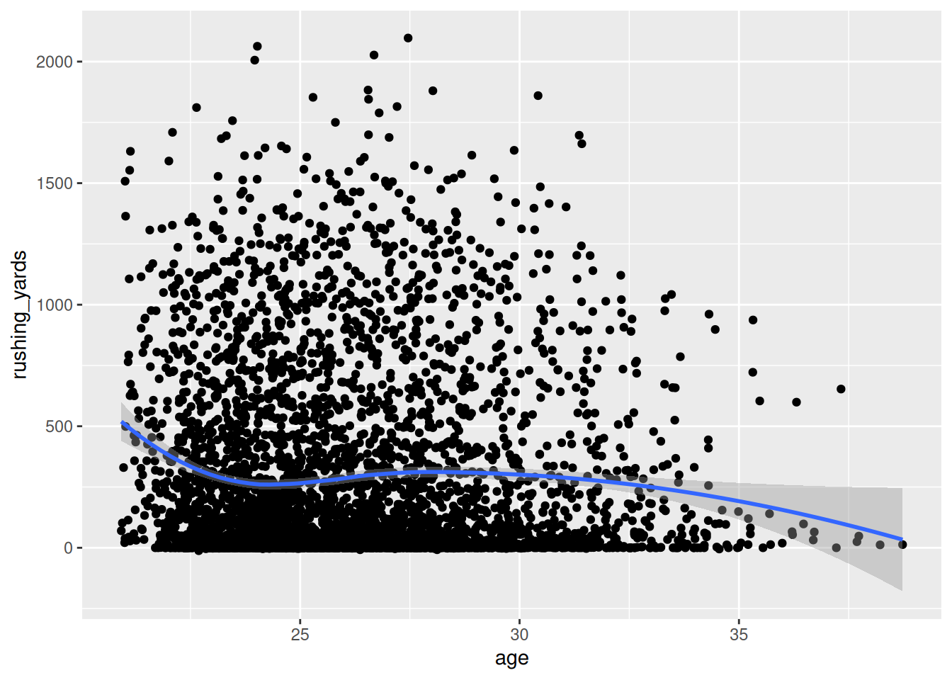
Second, we create the base layer of the plot using the ggplot2::ggplot() function of the ggplot2 package (Wickham et al., 2024), as in Figure 5.29. We specify the data object and the variables in the data object that are associated with the x- and y-axes:
5.5.2 Add Points
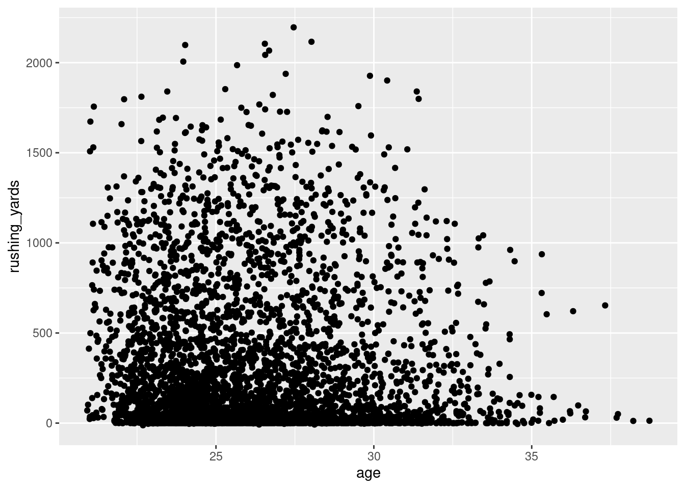
Third, we create a scatterplot using the ggplot2::geom_point() function from the ggplot2 package (Wickham et al., 2024), as in Figure 5.30:
5.5.3 Best-Fit Line
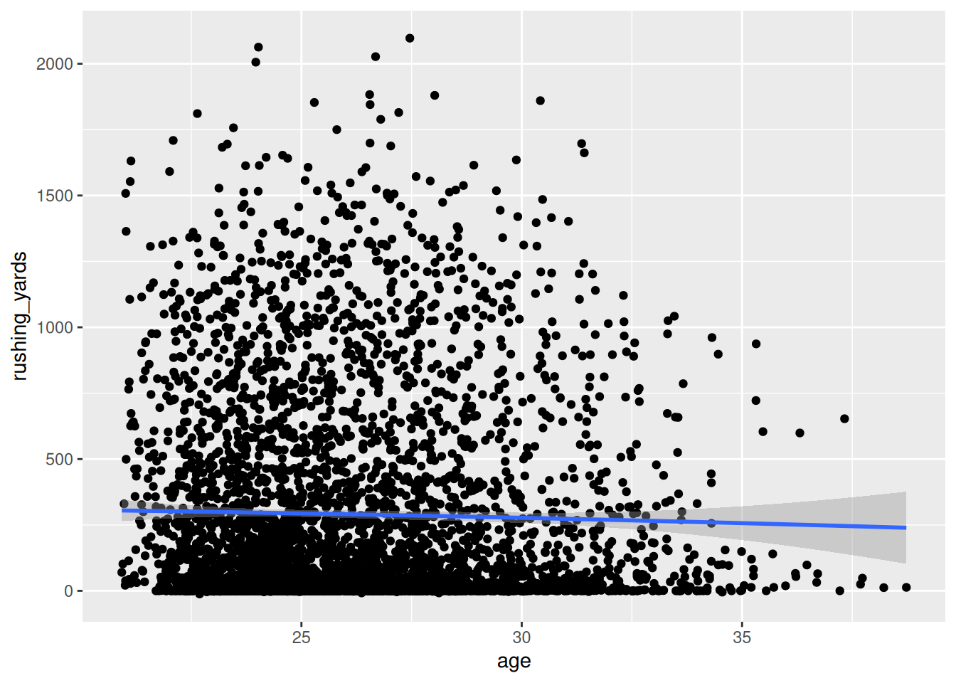
Fourth, we add a linear best-fit line using the geom_smooth(), as in Figure 5.31:
Code
We could also estimate a quadratic polynomial best-fit line, as in Figure 5.32:
Code
Or, we could estimate a smooth best-fit line using locally estimated scatterplot smoothing (LOESS) to allow for any form of nonlinearity, as in Figure 5.33:
Code
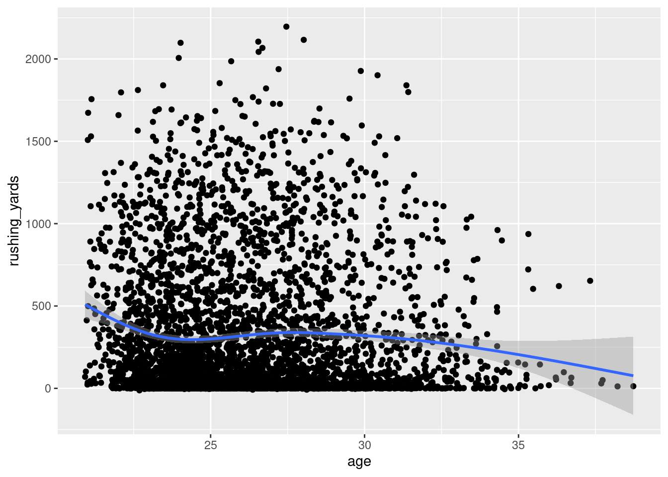
By default, the best-fit line is based on a generalized additive model, which allows for nonlinearity, as in Figure 5.34:
5.5.4 Modify Axes
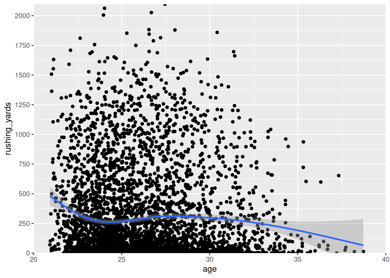
Then, we can change the axes, as in Figure 5.35:
Code
ggplot2::ggplot(
  data = rb_seasonal,
  aes(
    x = age,
    y = rushing_yards)) +
  geom_point() +
  geom_smooth() +
  coord_cartesian(
    xlim = c(20,40), # set limits of x-axis
    ylim = c(0,NA), # set limits of y-axis
    expand = FALSE) + # don't add space between axes and data
  scale_x_continuous(
    breaks = seq(from = 20, to = 40, by = 5) # specify x-axis labels
  ) +
  scale_y_continuous(
    breaks = seq(from = 0, to = 2500, by = 250) # specify y-axis labels
)5.5.5 Plot Labels
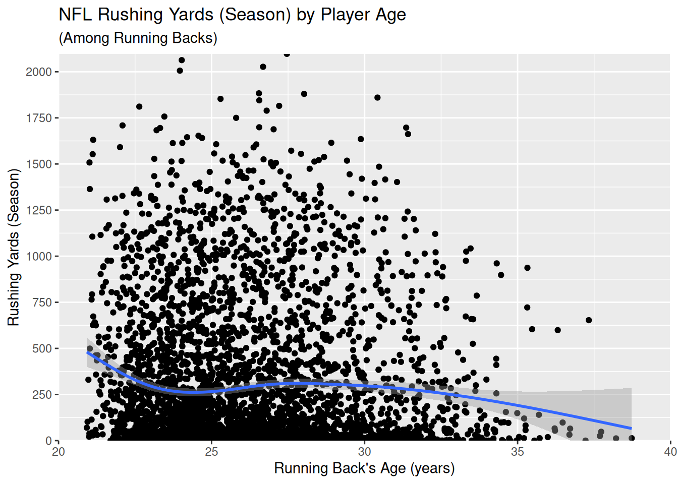
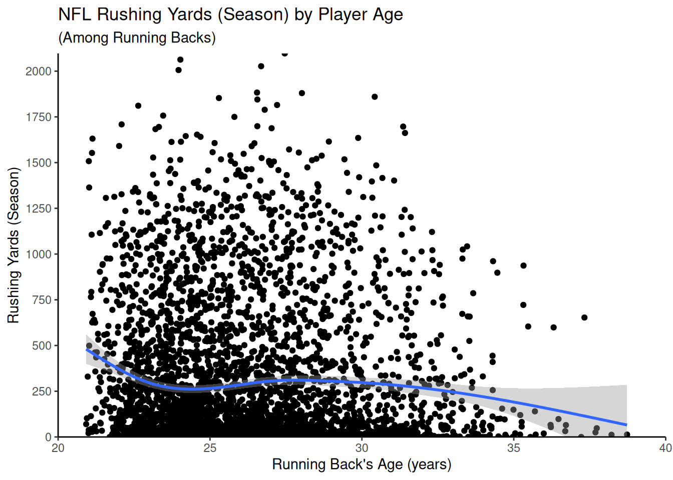
Then, we can add plot labels, as in Figure 5.36:
Code
ggplot2::ggplot(
  data = rb_seasonal,
  aes(
    x = age,
    y = rushing_yards)) +
  geom_point() +
  geom_smooth() +
  coord_cartesian(
    xlim = c(20,40),
    ylim = c(0,NA),
    expand = FALSE) +
  scale_x_continuous(
    breaks = seq(from = 20, to = 40, by = 5)
  ) +
  scale_y_continuous(
    breaks = seq(from = 0, to = 2500, by = 250)
  ) +
  labs( # add plot labels
    x = "Running Back's Age (years)", # x-axis title
    y = "Rushing Yards (Season)", # y-axis title
    title = "NFL Rushing Yards (Season) by Player Age", # plot title
    subtitle = "(Among Running Backs)" # plot subtitle
)5.5.6 Theme
Then, we can use a theme such as the classic theme (theme_classic()) to make it more visually presentable, as in Figure 5.37:
Code
ggplot2::ggplot(
  data = rb_seasonal,
  aes(
    x = age,
    y = rushing_yards)) +
  geom_point() +
  geom_smooth() +
  coord_cartesian(
    xlim = c(20,40),
    ylim = c(0,NA),
    expand = FALSE) +
  scale_x_continuous(
    breaks = seq(from = 20, to = 40, by = 5)
  ) +
  scale_y_continuous(
    breaks = seq(from = 0, to = 2500, by = 250)
  ) +
  labs(
    x = "Running Back's Age (years)",
    y = "Rushing Yards (Season)",
    title = "NFL Rushing Yards (Season) by Player Age",
    subtitle = "(Among Running Backs)"
  ) +
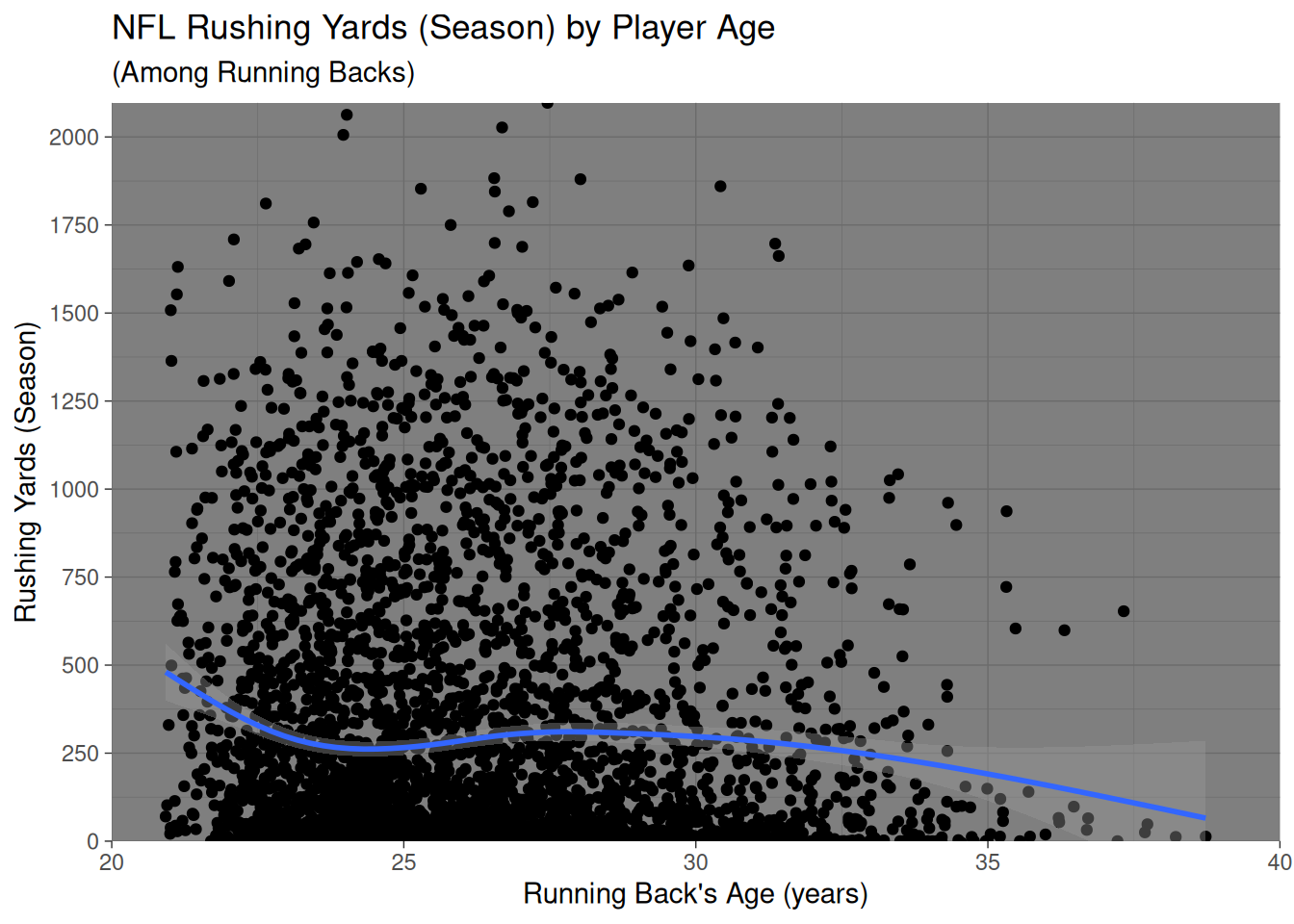
theme_classic() # use the classic themeOr, we could use a different theme, such as the dark theme (theme_dark()) in Figure 5.38. For a list of themes available in ggplot2, see here: https://ggplot2-book.org/themes#sec-themes (Wickham, 2024).
Code
ggplot2::ggplot(
  data = rb_seasonal,
  aes(
    x = age,
    y = rushing_yards)) +
  geom_point() +
  geom_smooth() +
  coord_cartesian(
    xlim = c(20,40),
    ylim = c(0,NA),
    expand = FALSE) +
  scale_x_continuous(
    breaks = seq(from = 20, to = 40, by = 5)
  ) +
  scale_y_continuous(
    breaks = seq(from = 0, to = 2500, by = 250)
  ) +
  labs(
    x = "Running Back's Age (years)",
    y = "Rushing Yards (Season)",
    title = "NFL Rushing Yards (Season) by Player Age",
    subtitle = "(Among Running Backs)"
  ) +
theme_dark() # use the dark theme5.5.7 Interactive
After creating our plot, we can make the plot interactive using the plotly::ggplotly() function from the plotly package (Sievert, 2020; Sievert et al., 2024), as in Figure 5.39.
Code
plot_ypcByPlayerAge <- ggplot2::ggplot(
  data = rb_seasonal,
  aes(
    x = age,
    y = rushing_yards)) +
  geom_point(
    aes(
      text = player_display_name, # add player name for mouse over tooltip
      label = season)) + # add season for mouse over tooltip
  geom_smooth() +
  coord_cartesian(
    xlim = c(20,40),
    ylim = c(0,NA),
    expand = FALSE) +
  scale_x_continuous(
    breaks = seq(from = 20, to = 40, by = 5)
  ) +
  scale_y_continuous(
    breaks = seq(from = 0, to = 2500, by = 250)
  ) +
  labs(
    x = "Running Back's Age (years)",
    y = "Rushing Yards (Season)",
    title = "NFL Rushing Yards (Season) by Player Age",
    subtitle = "(Among Running Backs)"
  ) +
  theme_classic()

plotly::ggplotly(plot_ypcByPlayerAge)5.5.8 Scatterplot with Rug Plot
We can also add a rug plot, as in Figure 5.40.
Code
ggplot2::ggplot(
  data = rb_seasonal,
  aes(
    x = age,
    y = rushing_yards)) +
  geom_point() +
  geom_smooth() +
  geom_rug(
    color = "#800000",
    alpha = 0.2) +
  coord_cartesian(
    xlim = c(20,40),
    ylim = c(0,NA)) +
  scale_x_continuous(
    breaks = seq(from = 20, to = 40, by = 5)
  ) +
  scale_y_continuous(
    breaks = seq(from = 0, to = 2500, by = 250)
  ) +
  labs(
    x = "Running Back's Age (years)",
    y = "Rushing Yards (Season)",
    title = "NFL Rushing Yards (Season) by Player Age",
    subtitle = "(Among Running Backs)"
  ) +
theme_classic()5.5.9 Marginal Density/Histogram
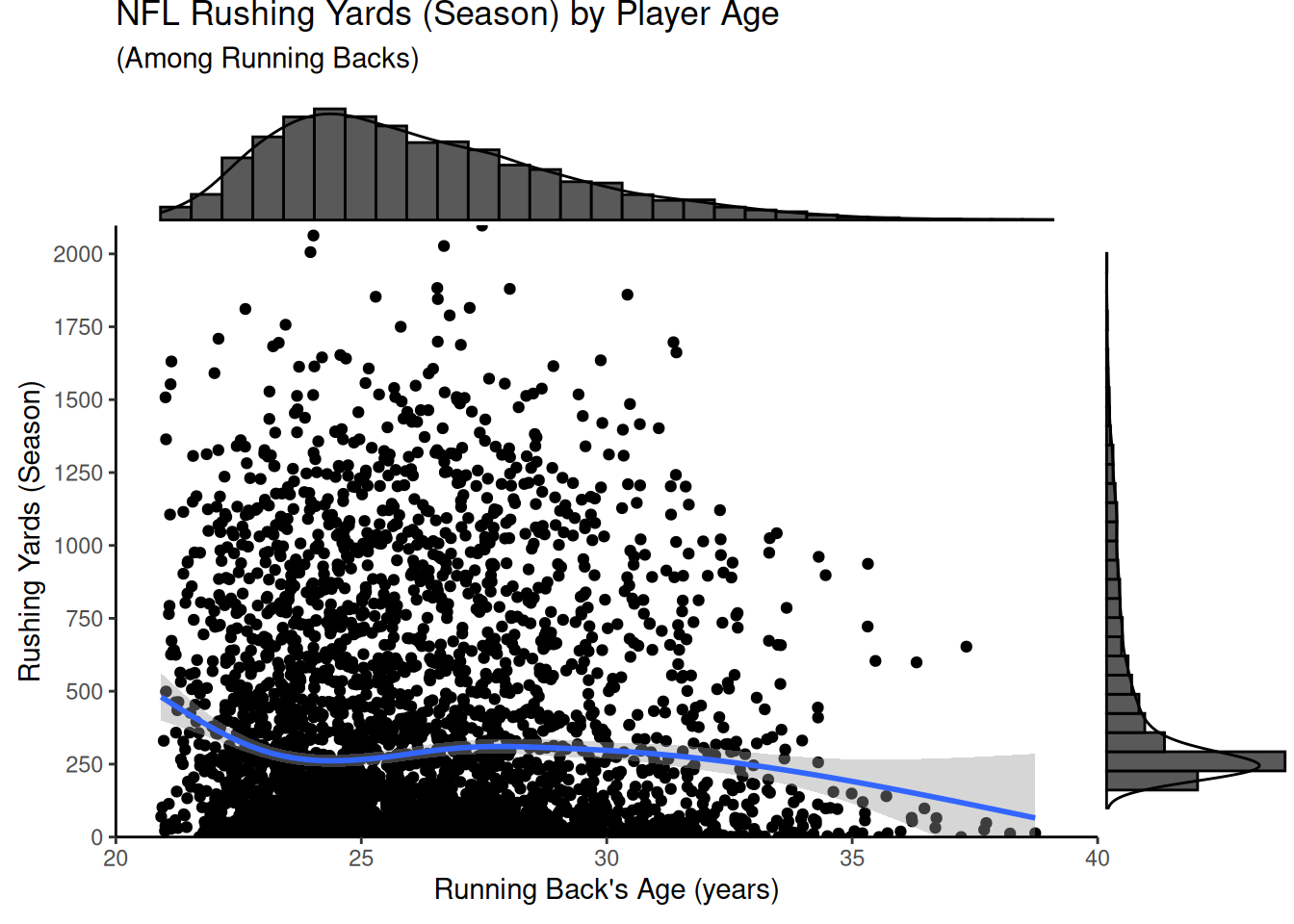
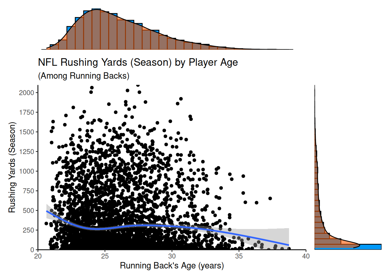
We can also add a marginal density/histogram, as in Figure 5.41 using the ggExtra package (Attali & Baker, 2023):
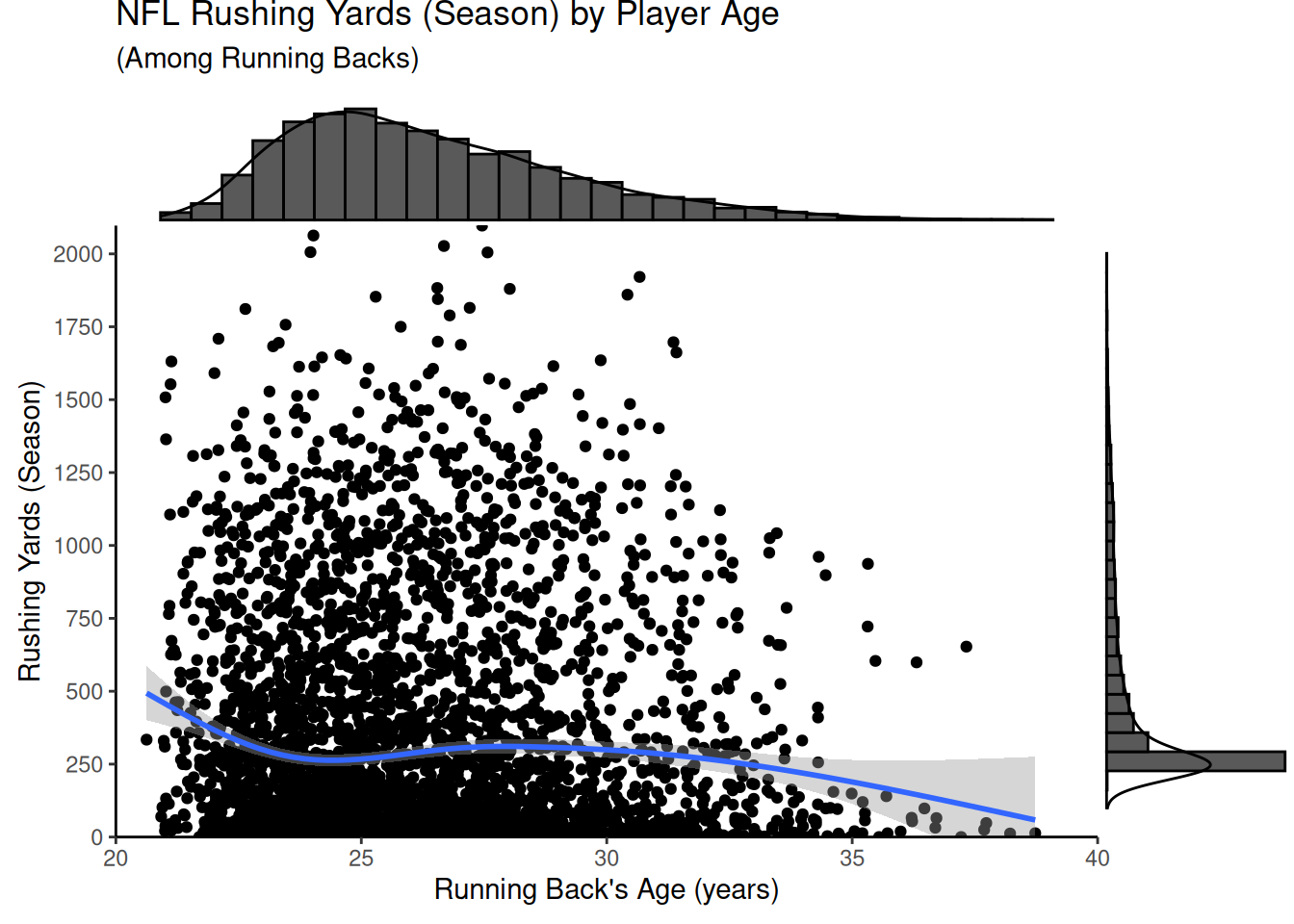
Or we can create the plots manually, as in Figure 5.42 using the patchwork package (Pedersen, 2024):
Code
dens1 <- ggplot2::ggplot(
  data = rb_seasonal,
  aes(
    x = age)) +
  coord_cartesian(
    xlim = c(20,40),
    expand = FALSE) +
  geom_histogram(
    aes(y = after_stat(density)),
    color = "#000000",
    fill = "#0099F8"
  ) +
  geom_density(
    color = "#000000",
    fill = "#F85700",
    alpha = 0.6 # add transparency
  ) +
  theme_void()

dens2 <- ggplot2::ggplot(
  data = rb_seasonal,
  aes(
    x = rushing_yards)) +
  geom_histogram(
    aes(y = after_stat(density)),
    color = "#000000",
    fill = "#0099F8"
  ) +
  geom_density(
    color = "#000000",
    fill = "#F85700",
    alpha = 0.6 # add transparency
  ) +
  theme_void() +
  coord_flip(
    ylim = c(0, NA),
    expand = FALSE)

dens1 + patchwork::plot_spacer() + plot_ypcByPlayerAge + dens2 +
  patchwork::plot_layout(
    ncol = 2,
    nrow = 2,
    widths = c(4, 1),
    heights = c(1, 4)
)5.6 Line Chart
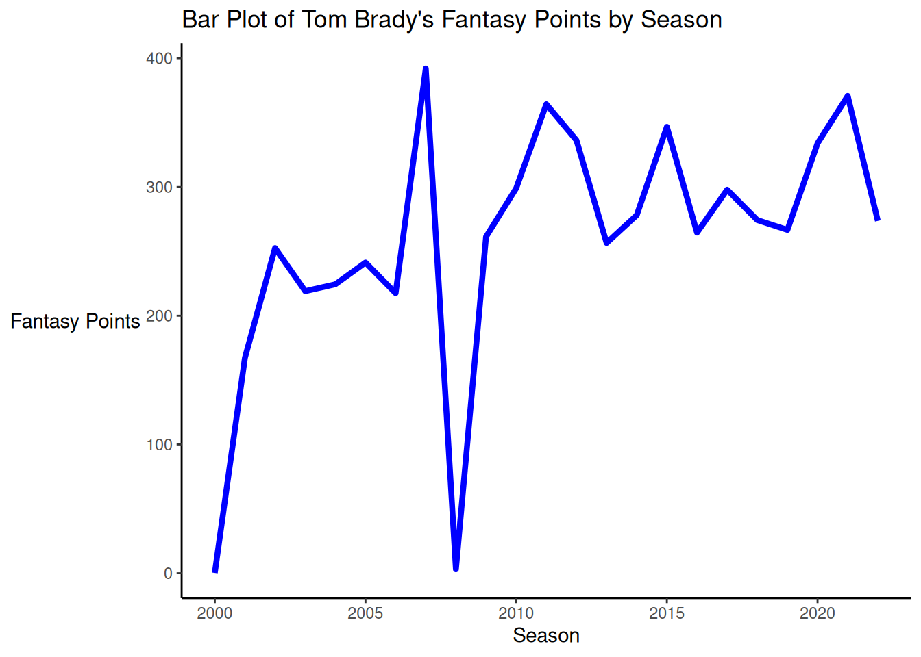
A bar plot of Tom Brady’s fantasy points by season is depicted in Figure 5.43.
Code
ggplot2::ggplot(
  data = player_stats_seasonal %>%
    filter(player_display_name == "Tom Brady"),
  mapping = aes(
    x = season,
    y = fantasyPoints
    )
) +
  geom_line(
    linewidth = 1.5,
    color = "blue"
  ) +
  labs(
    x = "Season",
    y = "Fantasy Points",
    title = "Bar Plot of Tom Brady's Fantasy Points by Season"
  ) +
  theme_classic() +
theme(axis.title.y = element_text(angle = 0, vjust = 0.5)) # horizontal y-axis title5.6.1 With Highlighting
We use the gghighlight package (Yutani, 2023) to highlight particular elements:
Code
ggplot2::ggplot(
  data = player_stats_seasonal %>%
    filter(position_group %in% c("QB")),
  mapping = aes(
    x = season,
    y = fantasyPoints,
    group = player_id,
    color = player_display_name)
) +
  geom_line(linewidth = 2) +
  gghighlight::gghighlight(
    player_display_name == "Tom Brady",
    label_key = player_display_name,
    unhighlighted_params = list(linewidth = 0.5)) +
  labs(
    x = "Season",
    y = "Fantasy Points",
    title = "Fantasy Points by Season and Player",
    subtitle = "(Tom Brady in Red)"
  ) +
  theme_classic() +
theme(axis.title.y = element_text(angle = 0, vjust = 0.5)) # horizontal y-axis title5.7 Bar Plot
To create a bar plot, we first compute summary statistics:
Code
confidenceLevel <- .95 # for 95% confidence interval

player_stats_seasonal_offense_summary <- player_stats_seasonal %>%
    filter(position_group %in% c("QB","RB","WR","TE")) %>%
  group_by(position_group) %>%
  summarise(
    n = sum(!is.na(fantasyPoints)),
    mean = mean(fantasyPoints, na.rm = TRUE),
    sd = sd(fantasyPoints, na.rm = TRUE)
  ) %>%
  mutate(se = sd/sqrt(n)) %>%
  mutate(
    ci_lower = mean - qt(p = 1 - (1 - confidenceLevel) / 2, df = n - 1) * se,
    ci_upper = mean + qt(p = 1 - (1 - confidenceLevel) / 2, df = n - 1) * se
  )
The summary statistics are in Table 5.1.
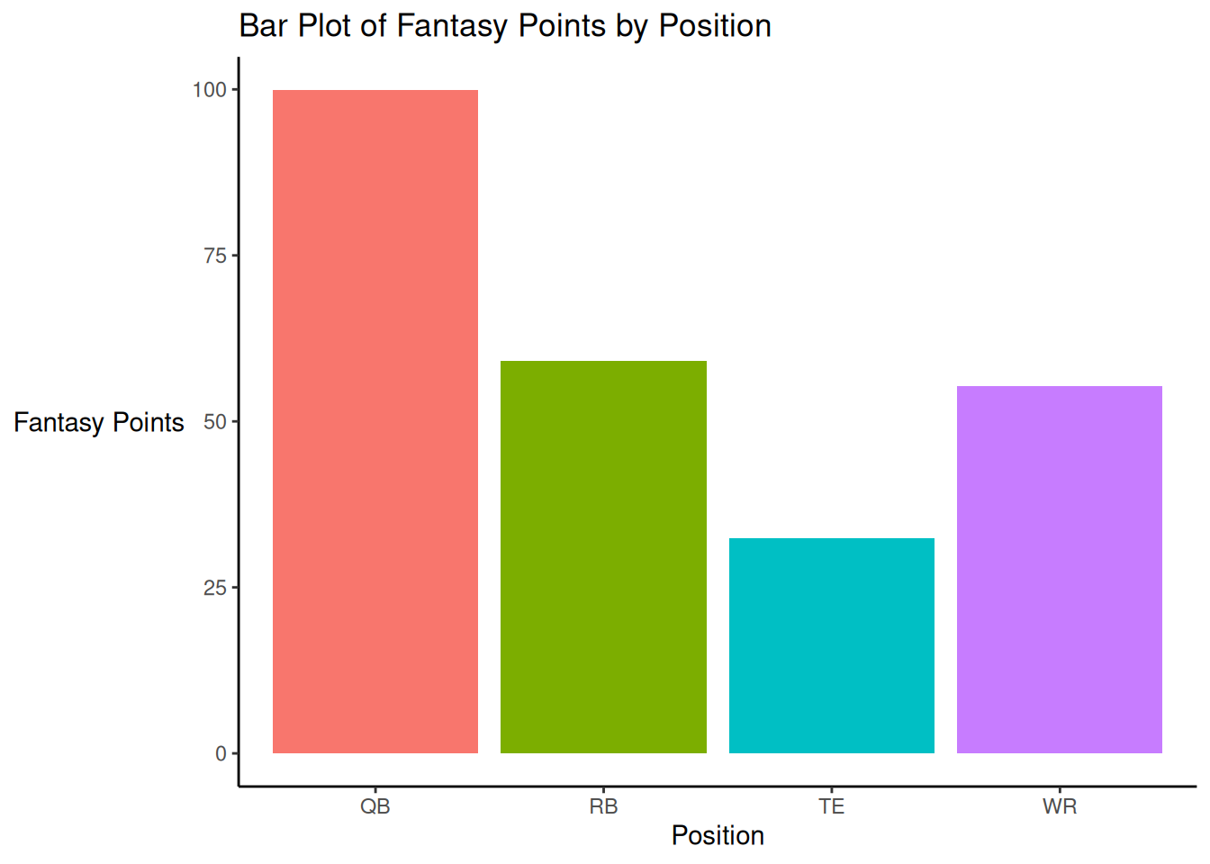
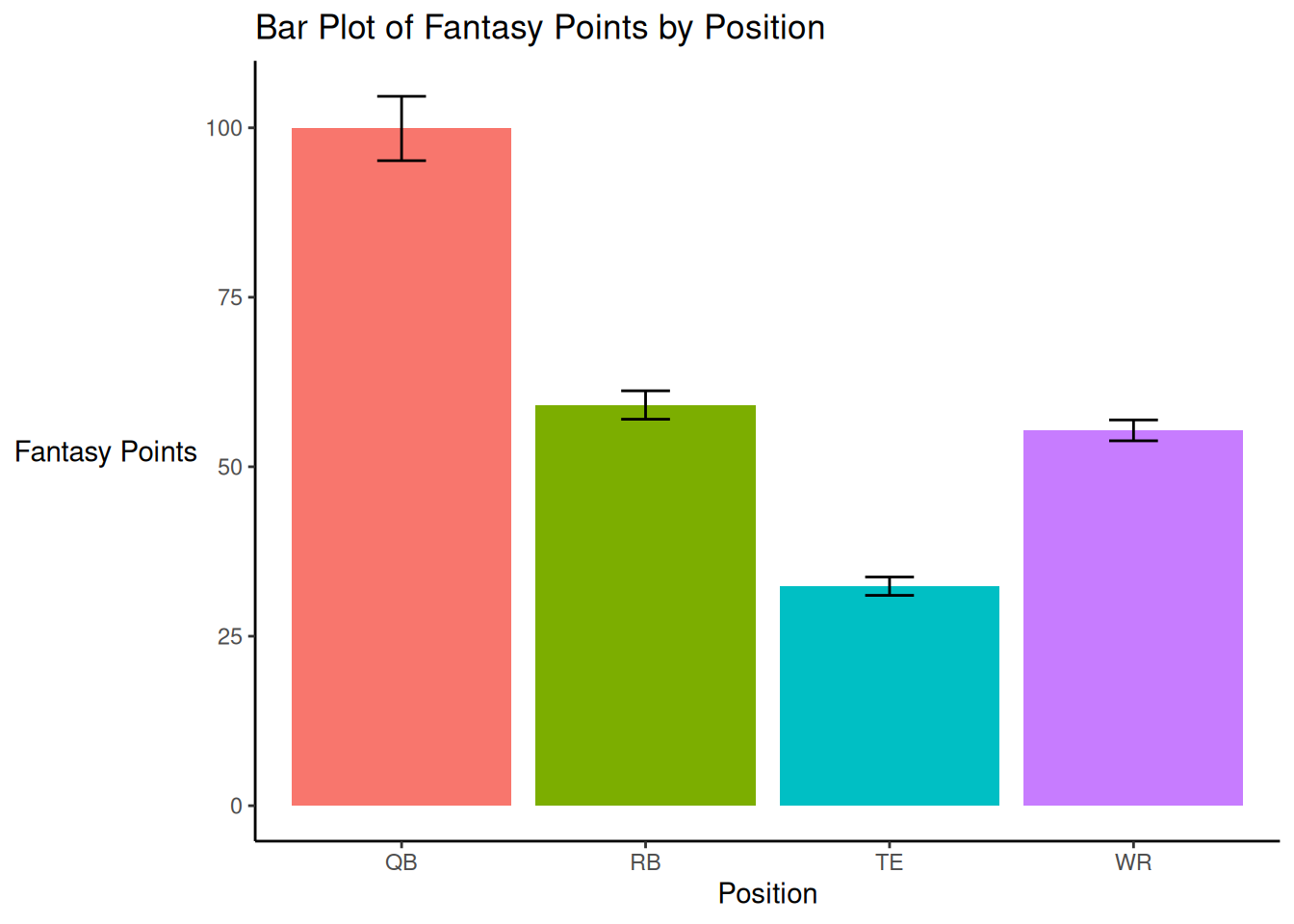
A bar plot of fantasy points by position is depicted in Figure 5.45.
Code
ggplot2::ggplot(
  data = player_stats_seasonal_offense_summary,
  mapping = aes(
    x = position_group,
    y = mean,
    fill = position_group
    )
) +
  geom_bar(
    stat = "identity") +
  labs(
    x = "Position",
    y = "Fantasy Points",
    title = "Bar Plot of Fantasy Points by Position"
  ) +
  theme_classic() +
  theme(legend.position = "none") +
theme(axis.title.y = element_text(angle = 0, vjust = 0.5)) # horizontal y-axis title5.7.1 With Error Bars
Based on the summary statistics in Table 5.1, we create a bar plot with bars representing the 95% confidence interval in Figure 5.46.
Code
ggplot2::ggplot(
  data = player_stats_seasonal_offense_summary %>%
    filter(position_group %in% c("QB","RB","WR","TE")),
  mapping = aes(
    x = position_group,
    y = mean,
    fill = position_group
    )
) +
  geom_bar(
    stat = "identity") +
  geom_errorbar(
    aes(
      ymin = ci_lower,
      ymax = ci_upper),
    width = 0.2,
    color = "black"
  ) +
  labs(
    x = "Position",
    y = "Fantasy Points",
    title = "Bar Plot of Fantasy Points by Position"
  ) +
  theme_classic() +
  theme(legend.position = "none") +
theme(axis.title.y = element_text(angle = 0, vjust = 0.5)) # horizontal y-axis title5.7.2 Modified Color Scheme
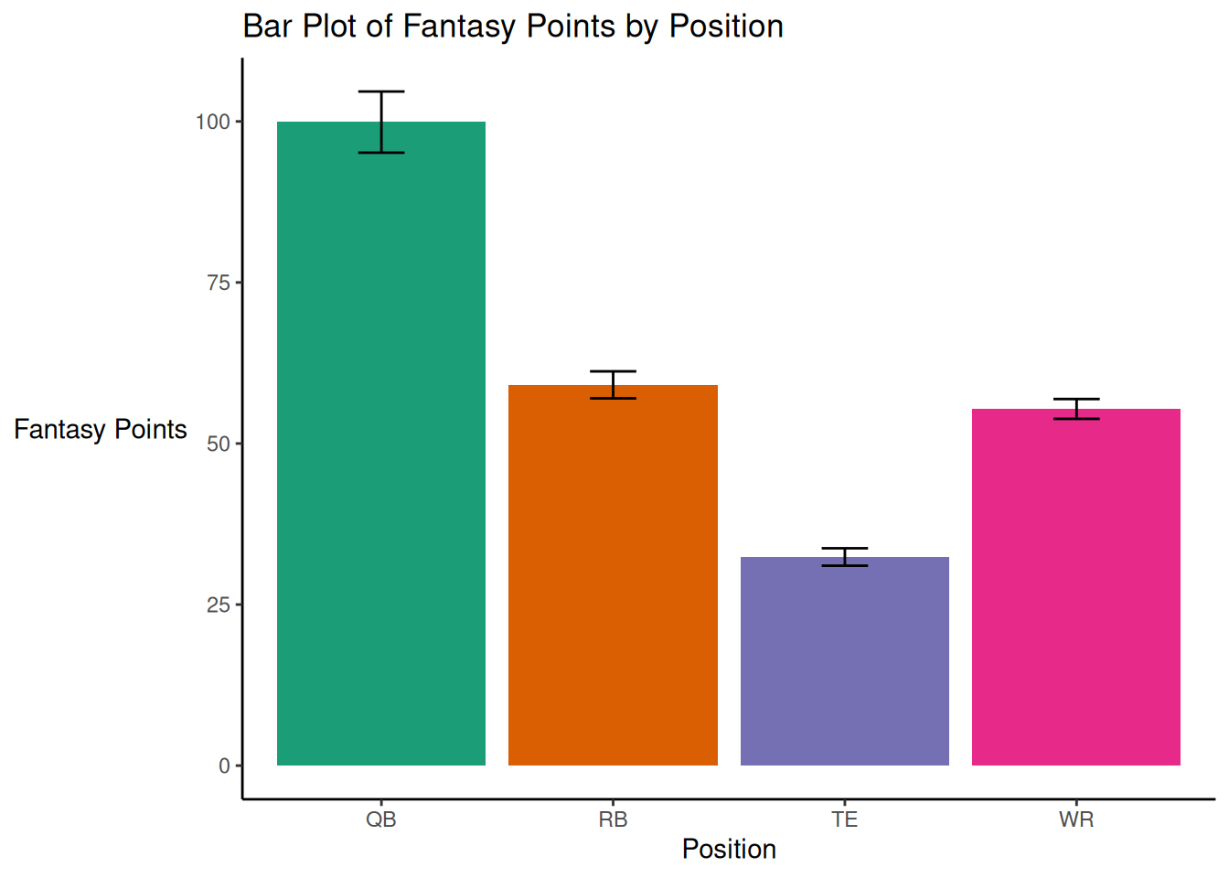
We can also modify the color scheme, as in Figure 5.47
Code
ggplot2::ggplot(
  data = player_stats_seasonal_offense_summary %>%
    filter(position_group %in% c("QB","RB","WR","TE")),
  mapping = aes(
    x = position_group,
    y = mean,
    fill = position_group
    )
) +
  geom_bar(
    stat = "identity") +
  scale_fill_brewer(palette = "Dark2") +
  geom_errorbar(
    aes(
      ymin = ci_lower,
      ymax = ci_upper),
    width = 0.2,
    color = "black"
  ) +
  labs(
    x = "Position",
    y = "Fantasy Points",
    title = "Bar Plot of Fantasy Points by Position"
  ) +
  theme_classic() +
  theme(legend.position = "none") +
theme(axis.title.y = element_text(angle = 0, vjust = 0.5)) # horizontal y-axis title5.8 Faceting
Code
ggplot2::ggplot(
  data = player_stats_seasonal %>%
    filter(position_group %in% c("QB","RB","WR","TE")),
  aes(
    x = age,
    y = fantasyPoints)) +
  geom_point() +
  geom_smooth() +
  coord_cartesian(
    ylim = c(0,NA), # set limits of y-axis
    expand = FALSE) + # don't add space between axes and data
  labs(
    x = "Player's Age (years)",
    y = "Fantasy Points (Season)",
    title = "Fantasy Points (Season) by Player Age"
  ) +
  theme_bw() +
facet_wrap(vars(position_group)) # facet by position_group5.9 Examples
5.9.1 Players
5.9.1.1 Running Back Performance By Player Age
Code
# Prepare Data
rushing_attempts <- nfl_pbp %>%
  dplyr::filter(season_type == "REG") %>%
  dplyr::filter(
    rush == 1,
    rush_attempt == 1,
    qb_scramble == 0,
    qb_dropback == 0,
    !is.na(rushing_yards))

rb_yardsPerCarry <- rushing_attempts %>%
  dplyr::group_by(rusher_id, season) %>%
  dplyr::summarise(
    ypc = mean(rushing_yards, na.rm = TRUE),
    rush_attempts = n(),
    .groups = "drop") %>%
  dplyr::ungroup() %>%
  dplyr::left_join(
    player_stats_seasonal,
    by = c("rusher_id" = "player_id", "season")
  ) %>%
  dplyr::filter(
    position_group == "RB",
    rush_attempts >= 50)
5.9.1.1.1 Rushing Yards Per Carry
Rushing yards per carry over the course of the season is depicted as a function of the Running Back’s age in Figure 5.49.
Code
plot_ypcByPlayerAge2 <- ggplot2::ggplot(
  data = rb_yardsPerCarry,
  aes(
    x = age,
    y = ypc)) +
  geom_point(
    aes(
      text = player_display_name,
      label = season)) +
  geom_smooth() +
  labs(
    x = "Running Back's Age (years)",
    y = "Rushing Yards Per Carry (Season)",
    title = "NFL Rushing Yards Per Carry (Season) by Player Age",
    subtitle = "(minimum 50 rushing attempts)"
  ) +
  theme_classic()

ggplotly(plot_ypcByPlayerAge2)5.9.1.1.2 Rushing EPA Per Season
Rushing expected points added (EPA) over the course of the season is depicted as a function of the Running Back’s age in Figure 5.50.
Code
plot_rushEPAbyPlayerAge <- ggplot2::ggplot(
  data = rb_seasonal,
  aes(
    x = age,
    y = rushing_epa)) +
  geom_point(
    aes(
      text = player_display_name,
      label = season)) +
  geom_smooth() +
  labs(
    x = "Running Back's Age (years)",
    y = "Rushing EPA (Season)",
    title = "NFL Rushing Expected Points Added (Season) by Player Age"
  ) +
  theme_classic()

ggplotly(plot_rushEPAbyPlayerAge)5.9.2 Teams
5.9.2.1 Defensive and Offensive EPA per Play
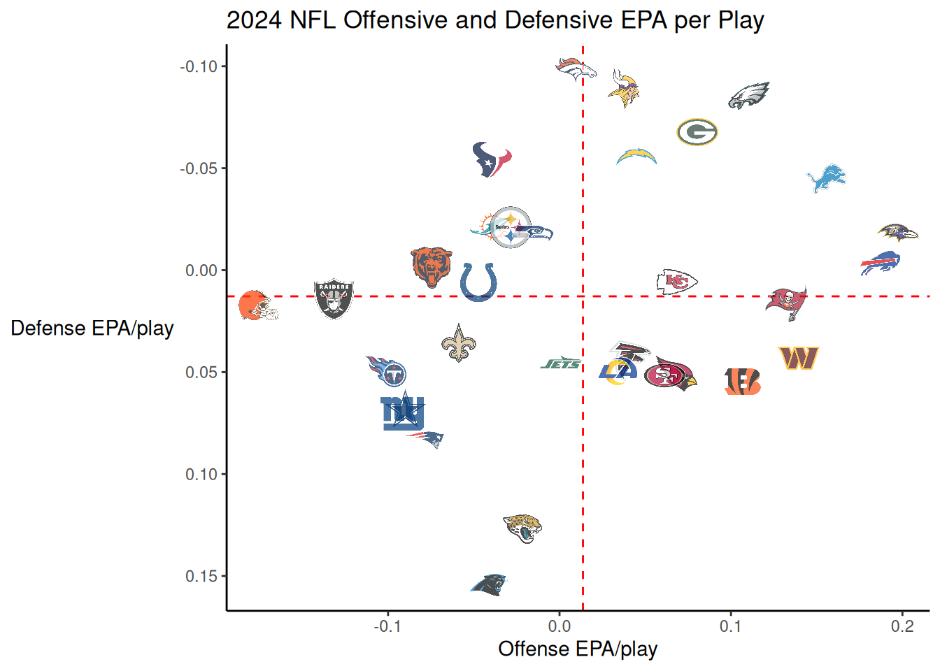
Expected points added (EPA) per play by the team with possession.
Code
pbp_regularSeason <- nfl_pbp %>%
  dplyr::filter(
    season == 2025,
    season_type == "REG") %>%
  dplyr::filter(!is.na(posteam) & (rush == 1 | pass == 1))

epa_offense <- pbp_regularSeason %>%
  dplyr::group_by(team = posteam) %>%
  dplyr::summarise(off_epa = mean(epa, na.rm = TRUE))

epa_defense <- pbp_regularSeason %>%
  dplyr::group_by(team = defteam) %>%
  dplyr::summarise(def_epa = mean(epa, na.rm = TRUE))

epa_combined <- epa_offense %>%
  dplyr::inner_join(
    epa_defense,
    by = "team")
Defensive EPA per play during the 2025 NFL season is depicted as a function of offensive EPA per play in Figure 5.51 using the nflplotR package (Carl, 2024).
Code
ggplot2::ggplot(
  data = epa_combined,
  aes(
    x = off_epa,
    y = def_epa)) +
  nflplotR::geom_mean_lines(
    aes(
      x0 = off_epa,
      y0 = def_epa)) +
  nflplotR::geom_nfl_logos(
    aes(
      team_abbr = team),
      width = 0.065,
      alpha = 0.7) +
  labs(
    x = "Offense EPA/play",
    y = "Defense EPA/play",
    title = "2025 NFL Offensive and Defensive EPA per Play"
  ) +
  theme_classic() +
  theme(axis.title.y = element_text(angle = 0, vjust = 0.5)) + # horizontal y-axis title
scale_y_reverse()5.10 Conclusion
This chapter provided an overview of principles of data visualization and how to implement them using R. Key principles of data visualization include: ensuring adequate contrast, highlighting key elements of interest (and using gray for other elements), reducing clutter, and adding helpful titles and annotations. We provided examples of data visualizations, including histograms, density plots, rug plots, box-and-whisker plots, violin plots, ridgeline plots, scatterplots, line charts, and bar plots.
5.11 Session Info
R version 4.6.0 (2026-04-24)
Platform: x86_64-pc-linux-gnu
Running under: Ubuntu 24.04.4 LTS

Matrix products: default
BLAS:   /usr/lib/x86_64-linux-gnu/openblas-pthread/libblas.so.3
LAPACK: /usr/lib/x86_64-linux-gnu/openblas-pthread/libopenblasp-r0.3.26.so;  LAPACK version 3.12.0

locale:
 [1] LC_CTYPE=C.UTF-8       LC_NUMERIC=C           LC_TIME=C.UTF-8
 [4] LC_COLLATE=C.UTF-8     LC_MONETARY=C.UTF-8    LC_MESSAGES=C.UTF-8
 [7] LC_PAPER=C.UTF-8       LC_NAME=C              LC_ADDRESS=C
[10] LC_TELEPHONE=C         LC_MEASUREMENT=C.UTF-8 LC_IDENTIFICATION=C

time zone: UTC
tzcode source: system (glibc)

attached base packages:
[1] stats     graphics  grDevices utils     datasets  methods   base

other attached packages:
 [1] lubridate_1.9.5   forcats_1.0.1     stringr_1.6.0     dplyr_1.2.1
 [5] purrr_1.2.2       readr_2.2.0       tidyr_1.3.2       tibble_3.3.1
 [9] tidyverse_2.0.0   patchwork_1.3.2   ggExtra_0.11.0    ggridges_0.5.7
[13] gghighlight_0.5.0 plotly_4.12.0     ggplot2_4.0.3     nflplotR_1.6.0

loaded via a namespace (and not attached):
 [1] gtable_0.3.6        xfun_0.57           htmlwidgets_1.6.4
 [4] ggrepel_0.9.8       lattice_0.22-9      tzdb_0.5.0
 [7] vctrs_0.7.3         tools_4.6.0         crosstalk_1.2.2
[10] generics_0.1.4      pkgconfig_2.0.3     Matrix_1.7-5
[13] data.table_1.18.2.1 RColorBrewer_1.1-3  S7_0.2.2
[16] lifecycle_1.0.5     compiler_4.6.0      farver_2.1.2
[19] httpuv_1.6.17       htmltools_0.5.9     yaml_2.3.12
[22] lazyeval_0.2.3      later_1.4.8         pillar_1.11.1
[25] cachem_1.1.0        magick_2.9.1        nlme_3.1-169
[28] mime_0.13           tidyselect_1.2.1    digest_0.6.39
[31] stringi_1.8.7       labeling_0.4.3      splines_4.6.0
[34] fastmap_1.2.0       grid_4.6.0          cli_3.6.6
[37] magrittr_2.0.5      withr_3.0.2         nflreadr_1.5.1
[40] scales_1.4.0        promises_1.5.0      ggpath_1.1.1
[43] timechange_0.4.0    rmarkdown_2.31      httr_1.4.8
[46] otel_0.2.0          hms_1.1.4           memoise_2.0.1
[49] shiny_1.13.0        evaluate_1.0.5      knitr_1.51
[52] miniUI_0.1.2        viridisLite_0.4.3   mgcv_1.9-4
[55] rlang_1.2.0         Rcpp_1.1.1-1.1      xtable_1.8-8
[58] glue_1.8.1 jsonlite_2.0.0 R6_2.6.1 