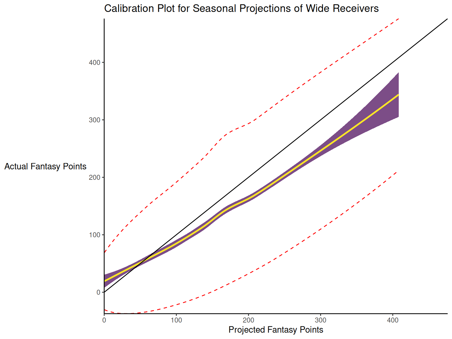
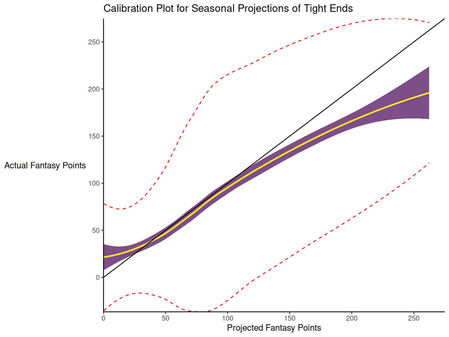
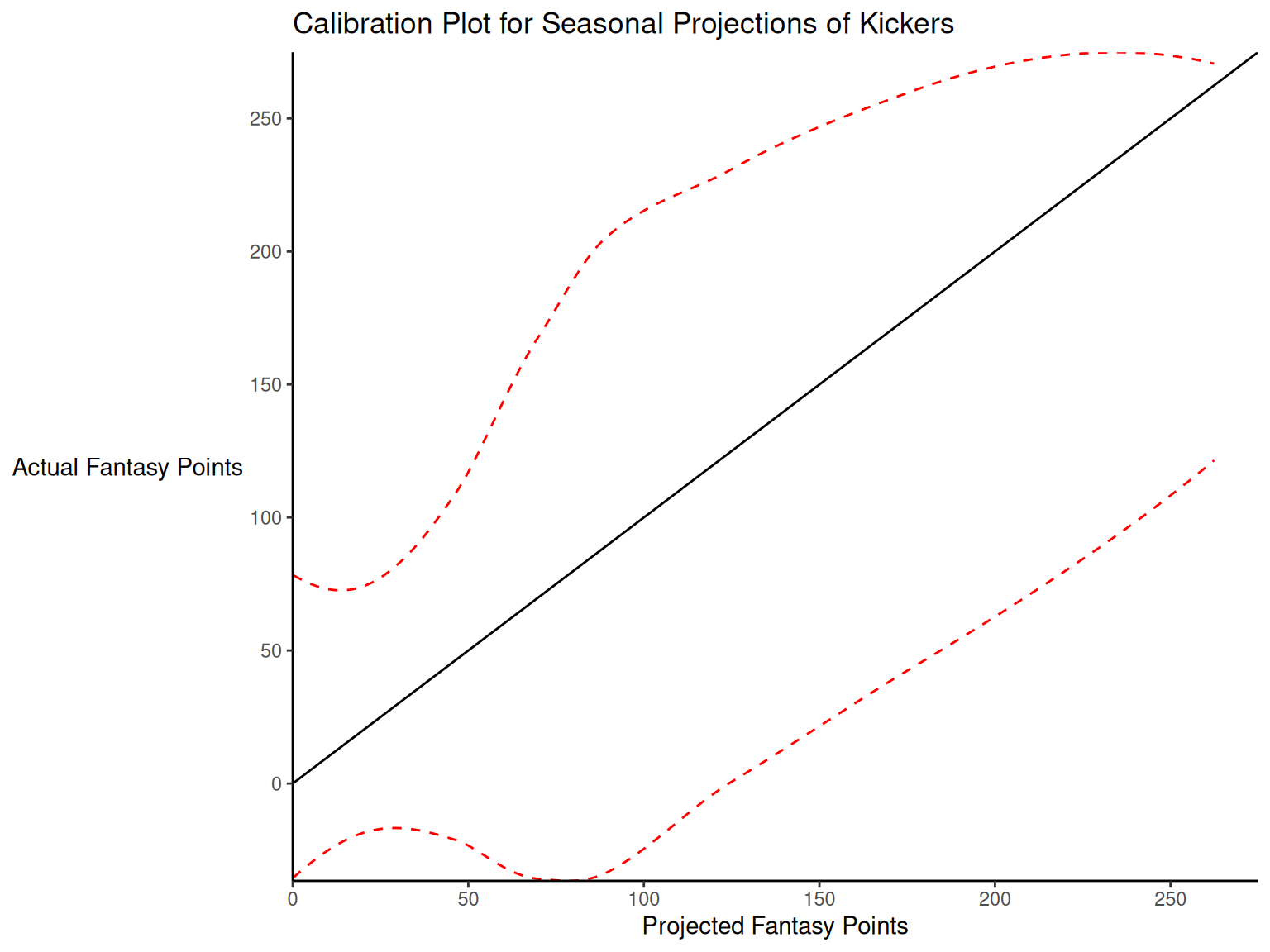
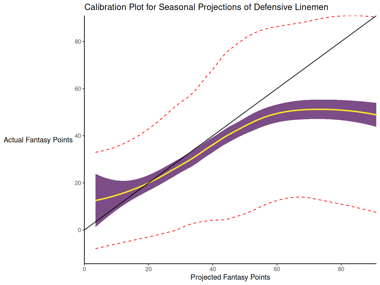
I want your feedback to make the book better for you and other readers. If you find typos, errors, or places where the text may be improved, please let me know. The best ways to provide feedback are by GitHub or hypothes.is annotations.
You can leave a comment at the bottom of the page/chapter, or open an issue or submit a pull request on GitHub: https://github.com/isaactpetersen/Fantasy-Football-Analytics-Textbook
Alternatively, you can leave an annotation using hypothes.is.
To add an annotation, select some text and then click the
symbol on the pop-up menu.
To see the annotations of others, click the
symbol in the upper right-hand corner of the page.
17 Evaluation of Prediction/Forecasting Accuracy
“Nothing ruins fantasy more than reality.” – Renee Miller, Ph.D. (Yahoo! Sports, 2024)
This chapter provides an overview of ways to evaluate the accuracy of predictions. In addition, we evaluate the accuracy of fantasy football projections.
17.1 Getting Started
17.1.1 Load Packages
17.1.2 Load Data
We created the player_stats_weekly.RData and player_stats_seasonal.RData objects in Section 4.4.3. The players_projections_weekly and players_projections_seasonal objects were derived from projected points objects that were created in Section 4.3.27.
17.1.3 Specify Options
17.1.4 Prepare Data
17.1.4.1 Seasonal Projections
To evaluate the accuracy of projections, we must first merge projections with actual performance. Below, we merge seasonal projections with actual performance.
Code
player_stats_seasonal_subset <- player_stats_seasonal %>%
  filter(!is.na(player_id))

nfl_playerIDs_subset <- nfl_playerIDs %>%
  filter(!is.na(gsis_id)) %>%
  distinct(gsis_id, .keep_all = TRUE) %>% # keep only rows that do not have duplicate values of gsis_id
  select(-all_of(c("team", "position", "height", "weight", "age")))

players_projectedPoints_seasonal_combined$season <- as.integer(players_projectedPoints_seasonal_combined$season)
players_projections_seasonal_average_merged$season <- as.integer(players_projections_seasonal_average_merged$season)

player_stats_seasonal_subset_IDs <- left_join(
  player_stats_seasonal_subset,
  nfl_playerIDs_subset,
  by = c("player_id" = "gsis_id")
) %>%
  filter(!is.na(mfl_id))

projectionsWithActuals_seasonal <- full_join(
  player_stats_seasonal_subset_IDs,
  players_projectedPoints_seasonal_combined,
  by = c("mfl_id" = "id", "season"),
  suffix = c("", "_proj"),
)

crowdAveragedProjectionsWithActuals_seasonal <- full_join(
  player_stats_seasonal_subset_IDs,
  players_projections_seasonal_average_merged %>% filter(avg_type == "average"),
  by = c("mfl_id" = "id", "season"),
  suffix = c("", "_proj"),
)

projectionsWithActuals_seasonal <- projectionsWithActuals_seasonal %>%
  unite(
    "player_id_season",
    player_id,
    season,
    remove = FALSE
  )

crowdAveragedProjectionsWithActuals_seasonal <- crowdAveragedProjectionsWithActuals_seasonal %>%
  unite(
    "player_id_season",
    player_id,
    season,
    remove = FALSE
  )
Players in the projectionsWithActuals_seasonal object are (supposed to be) uniquely identified by player_id-season-data_src:
Code
Players in the crowdAveragedProjectionsWithActuals_seasonal object are (supposed to be) uniquely identified by player_id-season-avg_type:
Code
We save the data object for use in other chapters:
Code
playersWithHighProjectedOrActualPoints <- projectionsWithActuals_seasonal %>%
  filter(raw_points > 100 | fantasyPoints > 100) %>%
  select(player_id_season) %>%
  pull()

projectionsWithActuals_seasonal_qb <- projectionsWithActuals_seasonal %>%
  filter(position_group == "QB")

projectionsWithActuals_seasonal_rb <- projectionsWithActuals_seasonal %>%
  filter(position_group == "RB")

projectionsWithActuals_seasonal_wr <- projectionsWithActuals_seasonal %>%
  filter(position_group == "WR")

projectionsWithActuals_seasonal_te <- projectionsWithActuals_seasonal %>%
  filter(position_group == "TE")

projectionsWithActuals_seasonal_k <- projectionsWithActuals_seasonal %>%
  filter(position == "K")

projectionsWithActuals_seasonal_dl <- projectionsWithActuals_seasonal %>%
  filter(position_group == "DL")

projectionsWithActuals_seasonal_lb <- projectionsWithActuals_seasonal %>%
  filter(position_group == "LB")

projectionsWithActuals_seasonal_db <- projectionsWithActuals_seasonal %>%
  filter(position_group == "DB")

crowdAveragedProjectionsWithActuals_seasonal_qb <- crowdAveragedProjectionsWithActuals_seasonal %>%
  filter(position_group == "QB")

crowdAveragedProjectionsWithActuals_seasonal_rb <- crowdAveragedProjectionsWithActuals_seasonal %>%
  filter(position_group == "RB")

crowdAveragedProjectionsWithActuals_seasonal_wr <- crowdAveragedProjectionsWithActuals_seasonal %>%
  filter(position_group == "WR")

crowdAveragedProjectionsWithActuals_seasonal_te <- crowdAveragedProjectionsWithActuals_seasonal %>%
  filter(position_group == "TE")

crowdAveragedProjectionsWithActuals_seasonal_k <- crowdAveragedProjectionsWithActuals_seasonal %>%
  filter(position == "K")

crowdAveragedProjectionsWithActuals_seasonal_dl <- crowdAveragedProjectionsWithActuals_seasonal %>%
  filter(position_group == "DL")

crowdAveragedProjectionsWithActuals_seasonal_lb <- crowdAveragedProjectionsWithActuals_seasonal %>%
  filter(position_group == "LB")

crowdAveragedProjectionsWithActuals_seasonal_db <- crowdAveragedProjectionsWithActuals_seasonal %>%
  filter(position_group == "DB")
17.1.4.2 Weekly Projections
Below, we merge weekly projections with actual performance.
Code
player_stats_weekly_subset <- player_stats_weekly %>%
  filter(!is.na(player_id))

nfl_playerIDs_subset <- nfl_playerIDs %>%
  filter(!is.na(gsis_id)) %>%
  distinct(gsis_id, .keep_all = TRUE) %>% # keep only rows that do not have duplicate values of gsis_id
  select(-all_of(c("team", "position", "height", "weight", "age")))

players_projectedPoints_weekly_combined$season <- as.integer(players_projectedPoints_weekly_combined$season)
players_projections_weekly_average_merged$season <- as.integer(players_projections_weekly_average_merged$season)

player_stats_weekly_subset_IDs <- left_join(
  player_stats_weekly_subset,
  nfl_playerIDs_subset,
  by = c("player_id" = "gsis_id")
) %>%
  filter(!is.na(mfl_id))

projectionsWithActuals_weekly <- full_join(
  player_stats_weekly_subset_IDs,
  players_projectedPoints_weekly_combined,
  by = c("mfl_id" = "id", "season", "week"),
  suffix = c("", "_proj"),
)

crowdAveragedProjectionsWithActuals_weekly <- full_join(
  player_stats_weekly_subset_IDs,
  players_projections_weekly_average_merged,
  by = c("mfl_id" = "id", "season", "week"),
  suffix = c("", "_proj"),
)

projectionsWithActuals_weekly <- projectionsWithActuals_weekly %>%
  unite(
    "player_id_season_week",
    player_id,
    season,
    week,
    remove = FALSE
  )

crowdAveragedProjectionsWithActuals_weekly <- crowdAveragedProjectionsWithActuals_weekly %>%
  unite(
    "player_id_season_week",
    player_id,
    season,
    week,
    remove = FALSE
  )
Players in the projectionsWithActuals_weekly object are (supposed to be) uniquely identified by player_id-season-week-data_src:
Code
Players in the crowdAveragedProjectionsWithActuals_weekly object are (supposed to be) uniquely identified by player_id-season-week-avg_type:
Code
We save the data object for use in other chapters:
Code
playersWithHighProjectedOrActualPoints_weekly <- projectionsWithActuals_weekly %>%
  filter(raw_points > 6 | fantasyPoints > 6) %>%
  select(player_id_season_week) %>%
  pull()

projectionsWithActuals_weekly_qb <- projectionsWithActuals_weekly %>%
  filter(position_group == "QB")

projectionsWithActuals_weekly_rb <- projectionsWithActuals_weekly %>%
  filter(position_group == "RB")

projectionsWithActuals_weekly_wr <- projectionsWithActuals_weekly %>%
  filter(position_group == "WR")

projectionsWithActuals_weekly_te <- projectionsWithActuals_weekly %>%
  filter(position_group == "TE")

projectionsWithActuals_weekly_k <- projectionsWithActuals_weekly %>%
  filter(position == "K")

projectionsWithActuals_weekly_dl <- projectionsWithActuals_weekly %>%
  filter(position_group == "DL")

projectionsWithActuals_weekly_lb <- projectionsWithActuals_weekly %>%
  filter(position_group == "LB")

projectionsWithActuals_weekly_db <- projectionsWithActuals_weekly %>%
  filter(position_group == "DB")

crowdAveragedProjectionsWithActuals_weekly_qb <- crowdAveragedProjectionsWithActuals_weekly %>%
  filter(position_group == "QB")

crowdAveragedProjectionsWithActuals_weekly_rb <- crowdAveragedProjectionsWithActuals_weekly %>%
  filter(position_group == "RB")

crowdAveragedProjectionsWithActuals_weekly_wr <- crowdAveragedProjectionsWithActuals_weekly %>%
  filter(position_group == "WR")

crowdAveragedProjectionsWithActuals_weekly_te <- crowdAveragedProjectionsWithActuals_weekly %>%
  filter(position_group == "TE")

crowdAveragedProjectionsWithActuals_weekly_k <- crowdAveragedProjectionsWithActuals_weekly %>%
  filter(position == "K")

crowdAveragedProjectionsWithActuals_weekly_dl <- crowdAveragedProjectionsWithActuals_weekly %>%
  filter(position_group == "DL")

crowdAveragedProjectionsWithActuals_weekly_lb <- crowdAveragedProjectionsWithActuals_weekly %>%
  filter(position_group == "LB")

crowdAveragedProjectionsWithActuals_weekly_db <- crowdAveragedProjectionsWithActuals_weekly %>%
  filter(position_group == "DB")
17.2 Overview
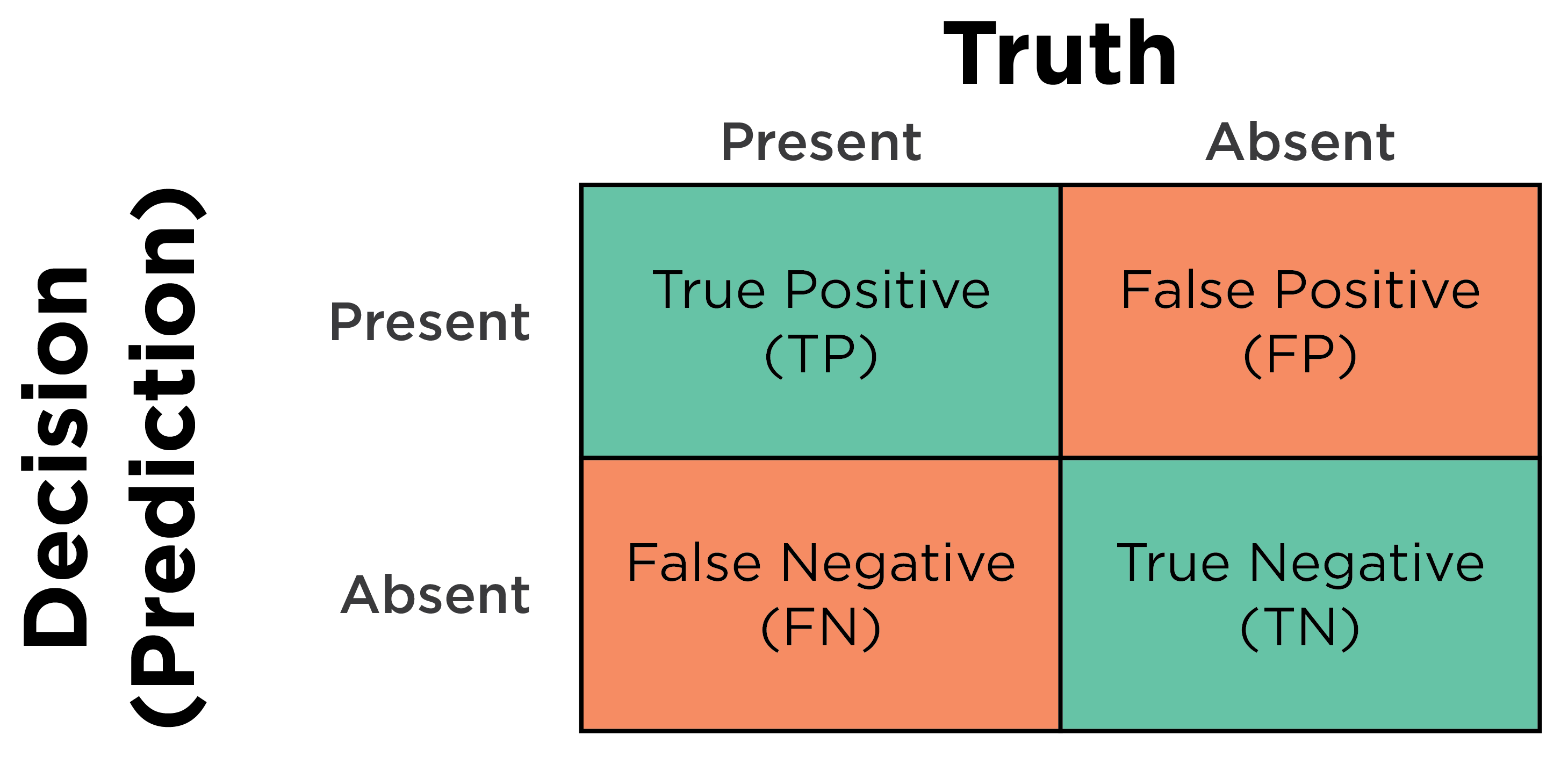
Predictions can come in different types. Some predictions involve categorical data, whereas other predictions involve continuous data. When dealing with a dichotomous (nominal data that are binary) predictor and outcome variable (or continuous data that have been dichotomized using a cutoff), we can evaluate predictions using a 2x2 table known as a confusion matrix (see Figure 17.2), or with logistic regression models. When dealing with a continuous outcome variable (e.g., ordinal, interval, or ratio data), we can evaluate predictions using multiple regression or similar variants such as structural equation modeling and mixed models.
In fantasy football, we most commonly predict continuous outcome variables (e.g., fantasy points, rushing yards). Nevertheless, it is also important to understand principles in the prediction of categorical outcomes variables.
In any domain, it is important to evaluate the accuracy of predictions, so we can know how (in)accurate we are, and we can strive to continually improve our predictions. Fantasy performance—and human behavior more general—is incredibly challenging to predict. Indeed, many things in the world, in particular long-term trends, are unpredictable (Kahneman, 2011). In fantasy football, there is considerable luck/chance/randomness. There are relatively few (i.e. 17) games, and there is a sizeable injury risk for each player in a given game. These and other factors combine to render fantasy football predictions not highly accurate. Domains with high uncertainty and unpredictability are considered “low-validity environments” (Kahneman, 2011, p. 223). But, first, let’s learn about the various ways we can evaluate the accuracy of predictions.
17.3 Types of Accuracy
There are two primary dimensions of accuracy: (1) discrimination and (2) calibration. Discrimination and calibration are distinct forms of accuracy. Just because predictions are high in one form of accuracy does not mean that they will be high in the other form of accuracy. As described by Lindhiem et al. (2020), predictions can follow any of the following configurations (and anywhere in between):
- high discrimination, high calibration
- high discrimination, low calibration
- low discrimination, high calibration
- low discrimination, low calibration
Some general indexes of accuracy combine discrimination and calibration, as described in Section 17.3.3.
In addition, accuracy indices can be threshold-dependent or -independent and can be scale-dependent or -independent. Threshold-dependent accuracy indices differ based on the cutoff (i.e., threshold), whereas threshold-independent accuracy indices do not. Thus, raising or lowering the cutoff will change threshold-dependent accuracy indices. Scale-dependent accuracy indices depend on the metric/scale of the data, whereas scale-independent accuracy indices do not. Thus, scale-dependent accuracy indices cannot be directly compared when using measures of differing scales, whereas scale-independent accuracy indices can be compared across data of differing scales.
17.3.1 Discrimination
When dealing with a categorical outcome, discrimination is the ability to separate events from non-events. When dealing with a continuous outcome, discrimination is the strength of the association between the predictor and the outcome. Aspects of discrimination at a particular cutoff (e.g., sensitivity, specificity, area under the ROC curve) are described in Section 17.6.
17.3.2 Calibration
When dealing with a categorical outcome, calibration is the degree to which a probabilistic estimate of an event reflects the true underlying probability of the event. When dealing with a continuous outcome, calibration is the degree to which the predicted values are close in value to the outcome values. The importance of examining calibration (in addition to discrimination) is described by Lindhiem et al. (2020).
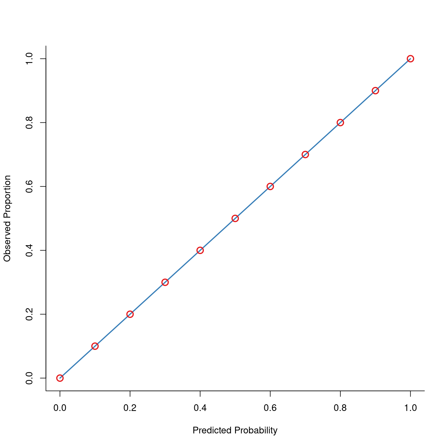
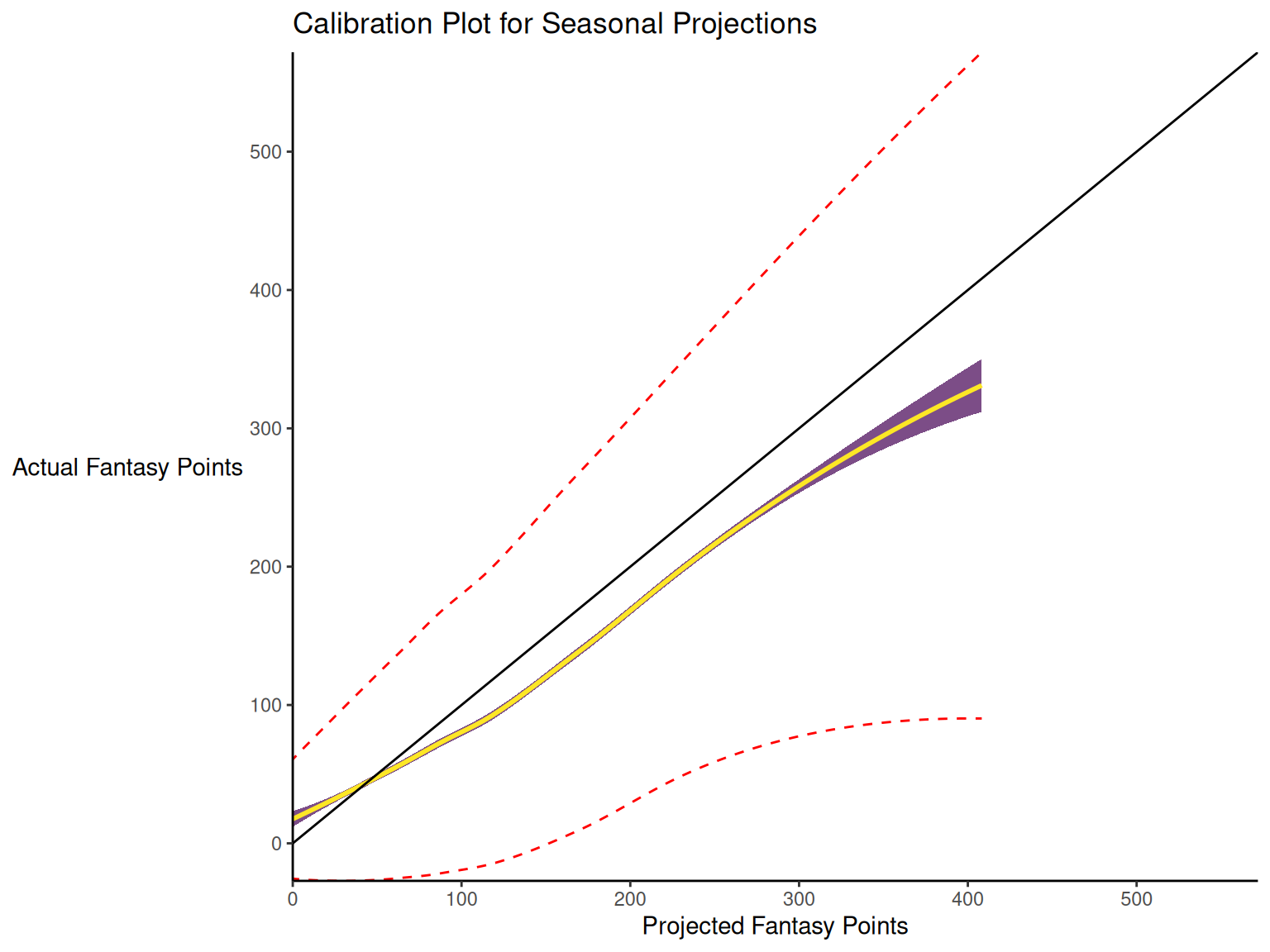
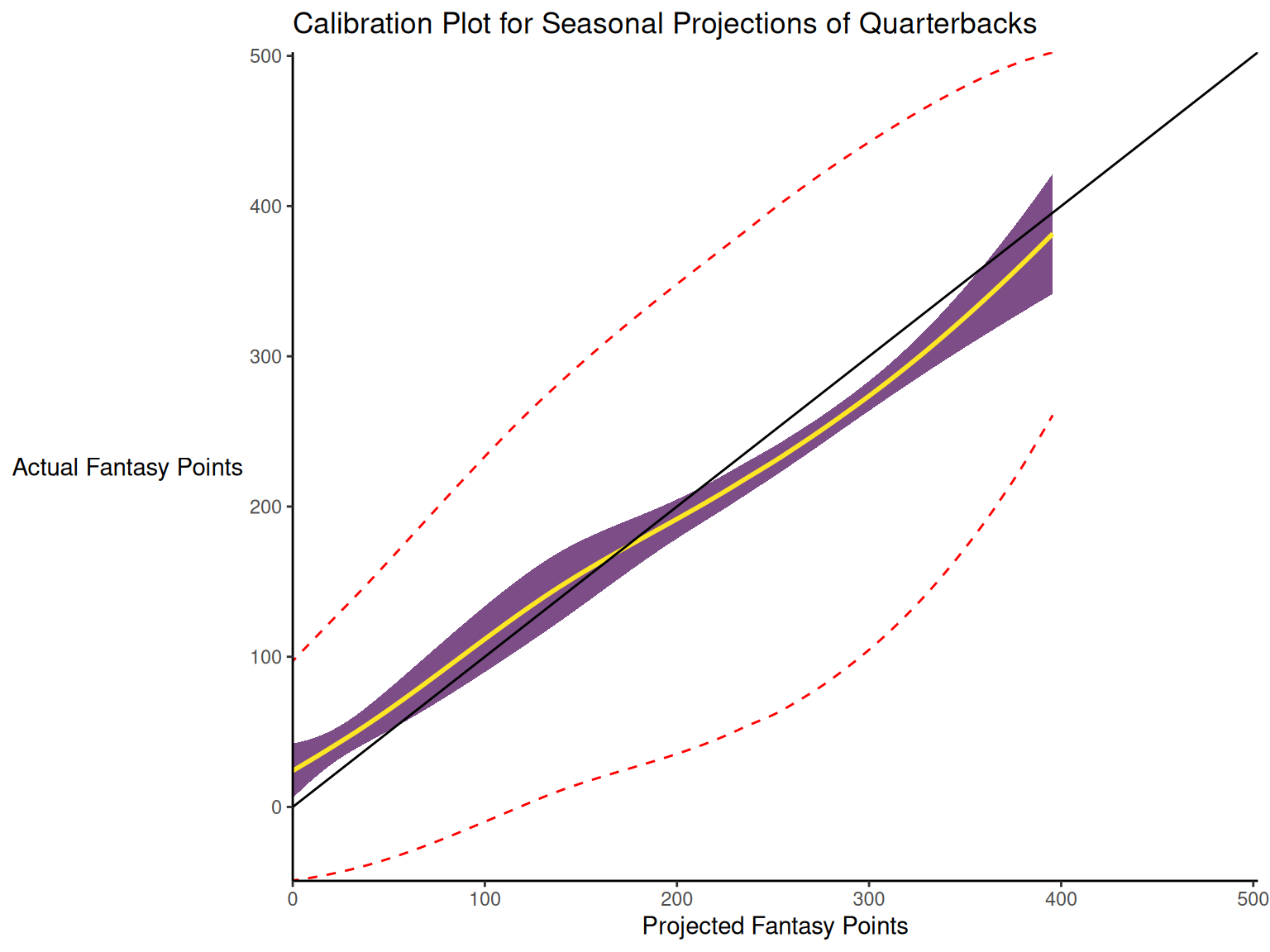
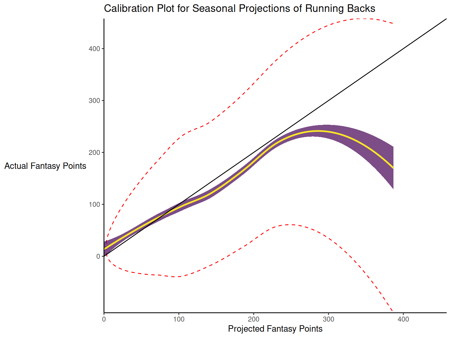
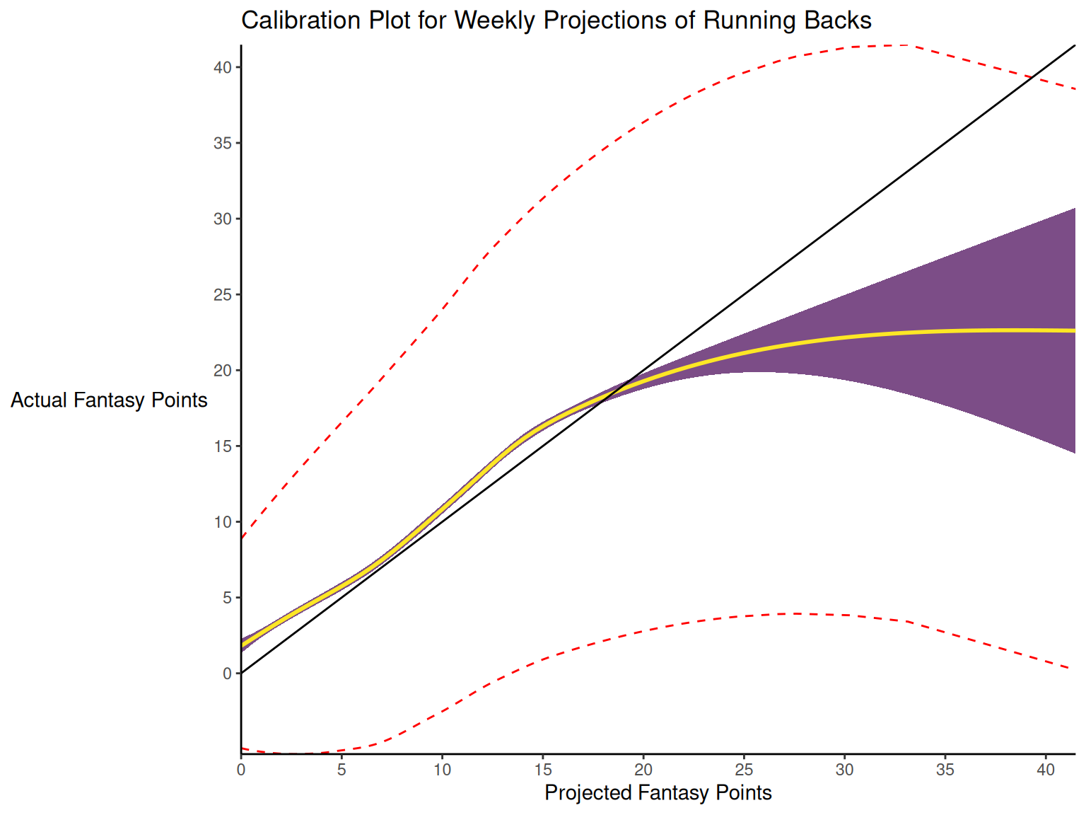
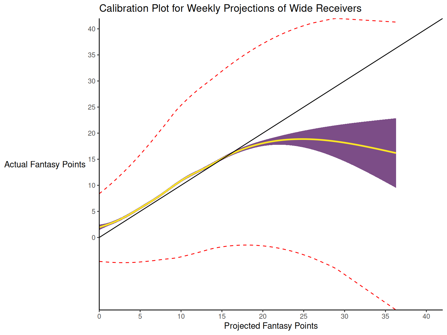
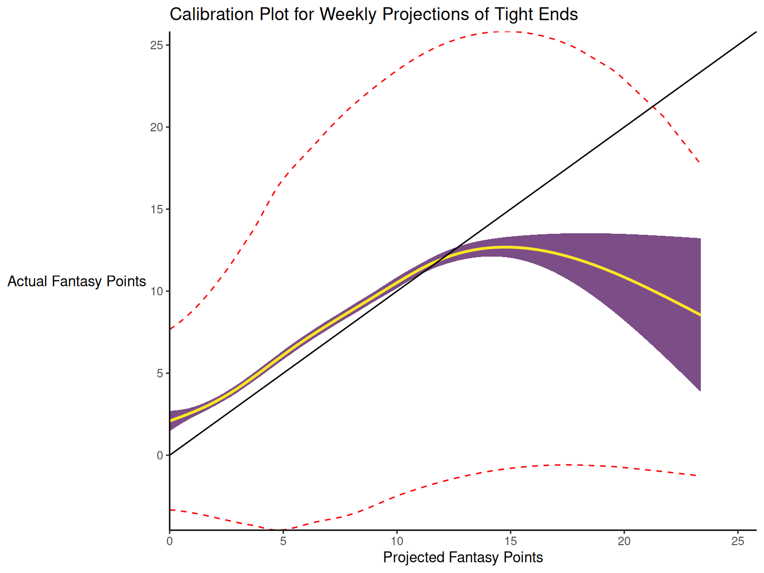
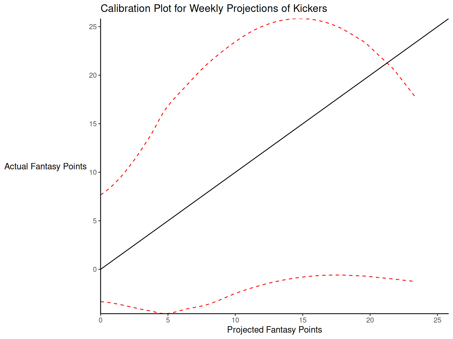
Calibration is relevant to all kinds of predictions, including weather forecasts. For instance, on the days that the meteorologist says there is a 60% chance of rain, it should rain about 60% of the time. Calibration is also important for fantasy football predictions. When projections state that a group of players is each expected to score 200 points, their projections would be miscalibrated if those players scored only 150 points on average.
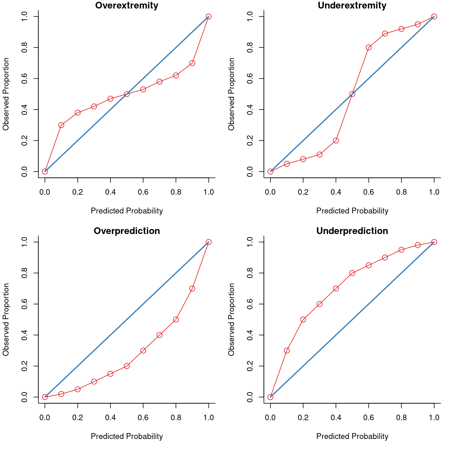
There are four general patterns of miscalibration: overextremity, underextremity, overprediction, and underprediction (see Figure 17.15). Overextremity exists when the predicted probabilities are too close to the extremes (zero or one). Underextremity exists when the predicted probabilities are too far away from the extremes. Overprediction exists when the predicted probabilities are consistently greater than the observed probabilities. Underprediction exists when the predicted probabilities are consistently less than the observed probabilities. For a more thorough description of these types of miscalibration, see Lindhiem et al. (2020).
Indices for evaluating calibration are described in Section 17.7.3.
17.3.3 General Accuracy
General accuracy indices combine estimates of discrimination and calibration.
17.4 Prediction of Categorical Outcomes
To evaluate the accuracy of our predictions for categorical outcome variables (e.g., binary, dichotomous, or nominal data), we can use either threshold-dependent or threshold-independent accuracy indices.
17.5 Prediction of Continuous Outcomes
To evaluate the accuracy of our predictions for continuous outcome variables (e.g., ordinal, interval, or ratio data), the outcome variable does not have cutoffs, so we would use threshold-independent accuracy indices.
17.6 Threshold-Dependent Accuracy Indices
17.6.1 Decision Outcomes
To consider how we can evaluate the accuracy of predictions for a categorical outcome, consider an example adapted from Meehl & Rosen (1955). The military conducts a test of its prospective members to screen out applicants who would likely fail basic training. To evaluate the accuracy of our predictions using the test, we can examine a confusion matrix. A confusion matrix is a matrix that presents the predicted outcome on one dimension and the actual outcome (truth) on the other dimension. If the predictions and outcomes are dichotomous, the confusion matrix is a 2x2 matrix with two rows and two columns that represent four possible predicted-actual combinations (decision outcomes), as in Figure 17.2: true positives (TP), true negatives (TN), false positives (FP), and false negatives (FN).
When discussing the four decision outcomes, “true” means an accurate judgment, whereas “false” means an inaccurate judgment. “Positive” means that the judgment was that the person has the characteristic of interest, whereas “negative” means that the judgment was that the person does not have the characteristic of interest. A true positive is a correct judgment (or prediction) where the judgment was that the person has (or will have) the characteristic of interest, and, in truth, they actually have (or will have) the characteristic. A true negative is a correct judgment (or prediction) where the judgment was that the person does not have (or will not have) the characteristic of interest, and, in truth, they actually do not have (or will not have) the characteristic. A false positive is an incorrect judgment (or prediction) where the judgment was that the person has (or will have) the characteristic of interest, and, in truth, they actually do not have (or will not have) the characteristic. A false negative is an incorrect judgment (or prediction) where the judgment was that the person does not have (or will not have) the characteristic of interest, and, in truth, they actually do have (or will have) the characteristic.
An example of a confusion matrix is in Figure 17.3.
With the information in the confusion matrix, we can calculate the marginal sums and the proportion of people in each cell (in parentheses), as depicted in Figure 17.4.
That is, we can sum across the rows and columns to identify how many people actually showed poor adjustment (\(n = 100\)) versus good adjustment (\(n = 1,900\)), and how many people were selected to reject (\(n = 508\)) versus retain (\(n = 1,492\)). If we sum the column of predicted marginal sums (\(508 + 1,492\)) or the row of actual marginal sums (\(100 + 1,900\)), we get the total number of people (\(N = 2,000\)).
Based on the marginal sums, we can compute the marginal probabilities, as depicted in Figure 17.5.
The marginal probability of the person having the characteristic of interest (i.e., showing poor adjustment) is called the base rate (BR). That is, the base rate is the proportion of people who have the characteristic. It is calculated by dividing the number of people with poor adjustment (\(n = 100\)) by the total number of people (\(N = 2,000\)): \(BR = \frac{FN + TP}{N}\). Here, the base rate reflects the prevalence of poor adjustment. In this case, the base rate is .05, so there is a 5% chance that an applicant will be poorly adjusted. The marginal probability of good adjustment is equal to 1 minus the base rate of poor adjustment.
The marginal probability of predicting that a person has the characteristic (i.e., rejecting a person) is called the selection ratio (SR). The selection ratio is the proportion of people who will be selected (in this case, rejected rather than retained); i.e., the proportion of people who are identified as having the characteristic. The selection ratio is calculated by dividing the number of people selected to reject (\(n = 508\)) by the total number of people (\(N = 2,000\)): \(SR = \frac{TP + FP}{N}\). In this case, the selection ratio is .25, so 25% of people are rejected. The marginal probability of not selecting someone to reject (i.e., the marginal probability of retaining) is equal to 1 minus the selection ratio.
The selection ratio might be something that the test dictates according to its cutoff score. Or, the selection ratio might be imposed by external factors that place limits on how many people you can assign a positive test value. For instance, when deciding whether to treat a client, the selection ratio may depend on how many therapists are available and how many cases can be treated.
17.6.2 Percent Accuracy
Based on the confusion matrix, we can calculate the prediction accuracy based on the percent accuracy of the predictions. The percent accuracy is the number of correct predictions divided by the total number of predictions, and multiplied by 100. In the context of a confusion matrix, this is calculated as: \(100\% \times \frac{\text{TP} + \text{TN}}{N}\). In this case, our percent accuracy was 78%—that is, 78% of our predictions were accurate, and 22% of our predictions were inaccurate.
17.6.3 Percent Accuracy by Chance
78% sounds pretty accurate. And it is much higher than 50%, so we are doing a pretty good job, right? Well, it is important to compare our accuracy to what accuracy we would expect to get by chance alone, if predictions were made by a random process rather than using a test’s scores. Our selection ratio was 25.4%. How accurate would we be if we randomly selected 25.4% of people to reject? To determine what accuracy we could get by chance alone given the selection ratio and the base rate, we can calculate the chance probability of true positives and the chance probability of true negatives. The probability of a given cell in the confusion matrix is a joint probability—the probability of two events occurring simultaneously. To calculate a joint probability, we multiply the probability of each event.
So, to get the chance expectancies of true positives, we would multiply the respective marginal probabilities, as in Equation 17.1:
\[ \begin{aligned} P(TP) &= P(\text{Poor adjustment}) \times P(\text{Reject})\\ &= BR \times SR \\ &= .05 \times .254 \\ &= .0127 \end{aligned} \tag{17.1}\]
To get the chance expectancies of true negatives, we would multiply the respective marginal probabilities, as in Equation 17.2:
\[ \begin{aligned} P(TN) &= P(\text{Good adjustment}) \times P(\text{Retain})\\ &= (1 - BR) \times (1 - SR) \\ &= .95 \times .746 \\ &= .7087 \end{aligned} \tag{17.2}\]
To get the percent accuracy by chance, we sum the chance expectancies for the correct predictions (TP and TN): \(.0127 + .7087 = .7214\). Thus, the percent accuracy you can get by chance alone is 72%. This is because most of our predictions are to retain people, and the base rate of poor adjustment is quite low (.05). Our measure with 78% accuracy provides only a 6% increment in correct predictions. Thus, you cannot judge how good your judgment or prediction is until you know how you would do by random chance.
The chance expectancies for each cell of the confusion matrix are in Figure 17.6.
17.6.4 Predicting from the Base Rate
Now, let us consider how well you would do if you were to predict from the base rate. Predicting from the base rate is also called “betting from the base rate”, and it involves setting the selection ratio by taking advantage of the base rate so that you go with the most likely outcome in every prediction. Because the base rate is quite low (.05), we could predict from the base rate by selecting no one to reject (i.e., setting the selection ratio at zero). Our percent accuracy by chance if we predict from the base rate would be calculated by multiplying the marginal probabilities, as we did above, but with a new selection ratio, as in Equation 17.3:
\[ \begin{aligned} P(TP) &= P(\text{Poor adjustment}) \times P(\text{Reject})\\ &= BR \times SR \\ &= .05 \times 0 \\ &= 0 \\ \\ P(TN) &= P(\text{Good adjustment}) \times P(\text{Retain})\\ &= (1 - BR) \times (1 - SR) \\ &= .95 \times 1 \\ &= .95 \end{aligned} \tag{17.3}\]
We sum the chance expectancies for the correct predictions (TP and TN): \(0 + .95 = .95\). Thus, our percent accuracy by predicting from the base rate is 95%. This is damning to our measure because it is a much higher accuracy than the accuracy of our measure. That is, we can be much more accurate than our measure simply by predicting from the base rate and selecting no one to reject.
Going with the most likely outcome in every prediction (predicting from the base rate) can be highly accurate (in terms of percent accuracy) as noted by Meehl & Rosen (1955), especially when the base rate is very low or very high. This should serve as an important reminder that we need to compare the accuracy of our measures to the accuracy by (1) random chance and (2) predicting from the base rate. There are several important implications of the impact of base rates on prediction accuracy. One implication is that using the same test in different settings with different base rates will markedly change the accuracy of the test. Oftentimes, using a test will actually decrease the predictive accuracy when the base rate deviates greatly from .50. But percent accuracy is not everything. Percent accuracy treats different kinds of errors as if they are equally important. However, the value we place on different kinds of errors may be different, as described next.
17.6.5 Different Kinds of Errors Have Different Costs
Some errors have a high cost, and some errors have a low cost. Among the four decision outcomes, there are two types of errors: false positives and false negatives. The extent to which false positives and false negatives are costly depends on the prediction problem. So, even though you can often be most accurate by going with the base rate, it may be advantageous to use a screening instrument despite lower overall accuracy because of the huge difference in costs of false positives versus false negatives in some cases.
Consider the example of a screening instrument for HIV. False positives would be cases where we said that someone is at high risk of HIV when they are not, whereas false negatives are cases where we said that someone is not at high risk when they actually are. The costs of false positives include a shortage of blood, some follow-up testing, and potentially some anxiety, but that is about it. The costs of false negatives may be people getting HIV. In this case, the costs of false negatives greatly outweigh the costs of false positives, so we use a screening instrument to try to identify the cases at high risk for HIV because of the important consequences of failing to do so, even though using the screening instrument will lower our overall accuracy level.
Another example is when the Central Intelligence Agency (CIA) used a screen for protective typists during wartime to try to detect spies. False positives would be cases where the CIA believes that a person is a spy when they are not, and the CIA does not hire them. False negatives would be cases where the CIA believes that a person is not a spy when they actually are, and the CIA hires them. In this case, a false positive would be fine, but a false negative would be really bad.
How you weigh the costs of different errors depends considerably on the domain and context. Possible costs of false positives to society include: unnecessary and costly treatment with side effects and sending an innocent person to jail (despite our presumption of innocence in the United States criminal justice system that a person is innocent until proven guilty). Possible costs of false negatives to society include: setting a guilty person free, failing to detect a bomb or tumor, and preventing someone from getting treatment who needs it.
The differential costs of different errors also depend on how much flexibility you have in the selection ratio in being able to set a stringent versus loose selection ratio. Consider if there is a high cost of getting rid of people during the selection process. For example, if you must hire 100 people and only 100 people apply for the position, you cannot lose people, so you need to hire even high-risk people. However, if you do not need to hire many people, then you can hire more conservatively.
Any time the selection ratio differs from the base rate, you will make errors. For example, if you reject 25% of applicants, and the base rate of poor adjustment is 5%, then you are making errors of over-rejecting (false positives). By contrast, if you reject 1% of applicants and the base rate of poor adjustment is 5%, then you are making errors of under-rejecting or over-accepting (false negatives).
17.6.6 Difficulty Predicting Low Base Rate Events
A low base rate makes it harder to make predictions, and tends to lead to less accurate predictions. For instance, it is very challenging to predict low base rate behaviors, including suicide (Kessler et al., 2020). For this reason, it is likely much more challenging to predict touchdowns—which happen relatively less often—than it is to predict passing/rushing/receiving yards—which are more frequent and continuously distributed.
Here is the accuracy of the prediction of passing touchdowns versus passing yards among Quarterbacks:
Code
Code
The accuracy for predicting passing yards (\(R^2 = .27\)) is higher than the accuracy for predicting passing touchdowns (\(R^2 = .09\)).
Here is the accuracy of the prediction of rushing touchdowns versus rushing yards among Running Backs:
Code
Code
The accuracy for predicting rushing yards (\(R^2 = .41\)) is higher than the accuracy for predicting rushing touchdowns (\(R^2 = .10\)).
Here is the accuracy of the prediction of receiving touchdowns versus receiving yards among Wide Receivers:
Code
Code
The accuracy for predicting receiving yards (\(R^2 = .31\)) is higher than the accuracy for predicting rushing touchdowns (\(R^2 = .01\)) among Wide Receivers.
Here is the accuracy of the prediction of receiving touchdowns versus receiving yards among Tight Ends:
Code
Code
The accuracy for predicting receiving yards (\(R^2 = .28\)) is higher than the accuracy for predicting rushing touchdowns (\(R^2 = .00\)) among Tight Ends.
In sum, the proportion of variance explained by the prediction (i.e., \(R^2\)) is much higher for passing/rushing/receiving yards than it is for touchdowns. This is consistent with the notion that prediction accuracy tends to be lower for lower base rate events (like touchdowns) compared to higher base rate events.
17.6.7 Sensitivity, Specificity, PPV, and NPV
As described earlier, percent accuracy is not the only important aspect of accuracy. Percent accuracy can be misleading because it is highly influenced by base rates. You can have a high percent accuracy by predicting from the base rate and saying that no one has the condition (if the base rate is low) or that everyone has the condition (if the base rate is high). Thus, it is also important to consider other aspects of accuracy, including sensitivity (SN), specificity (SP), positive predictive value (PPV), and negative predictive value (NPV). We want our predictions to be sensitive to be able to detect the characteristic but also to be specific so that we classify only people actually with the characteristic as having the characteristic.
Let us return to the confusion matrix in Figure 17.5. If we know the frequency of each of the four predicted-actual combinations of the confusion matrix (TP, TN, FP, FN), we can calculate sensitivity, specificity, PPV, and NPV.
Sensitivity is the proportion of those with the characteristic (\(\text{TP} + \text{FN}\)) that we identified with our measure (\(\text{TP}\)): \(\frac{\text{TP}}{\text{TP} + \text{FN}} = \frac{86}{86 + 14} = .86\). Specificity is the proportion of those who do not have the characteristic (\(\text{TN} + \text{FP}\)) that we correctly classify as not having the characteristic (\(\text{TN}\)): \(\frac{\text{TN}}{\text{TN} + \text{FP}} = \frac{1,478}{1,478 + 422} = .78\). PPV is the proportion of those who we classify as having the characteristic (\(\text{TP} + \text{FP}\)) who actually have the characteristic (\(\text{TP}\)): \(\frac{\text{TP}}{\text{TP} + \text{FP}} = \frac{86}{86 + 422} = .17\). NPV is the proportion of those we classify as not having the characteristic (\(\text{TN} + \text{FN}\)) who actually do not have the characteristic (\(\text{TN}\)): \(\frac{\text{TN}}{\text{TN} + \text{FN}} = \frac{1,478}{1,478 + 14} = .99\).
Sensitivity, specificity, PPV, and NPV are proportions, and their values therefore range from 0 to 1, where higher values reflect greater accuracy. With sensitivity, specificity, PPV, and NPV, we have a good snapshot of how accurate the measure is at a given cutoff. In our case, our measure is good at finding whom to reject (high sensitivity), but it is rejecting too many people who do not need to be rejected (lower PPV due to many FPs). Most people whom we classify as having the characteristic do not actually have the characteristic. However, the fact that we are over-rejecting could be okay depending on our goals, for instance, if we do not care about over-dropping (i.e., the PPV being low).
17.6.7.1 Some Accuracy Estimates Depend on the Cutoff
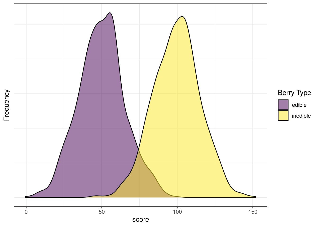
Sensitivity, specificity, PPV, and NPV differ based on the cutoff (i.e., threshold) for classification. Consider the following example. Aliens visit Earth, and they develop a test to determine whether a berry is edible or inedible.
Figure 17.7 depicts the distributions of scores by berry type. Note how there are clearly two distinct distributions. However, the distributions overlap to some degree. Thus, any cutoff will have at least some inaccurate classifications. The extent of overlap of the distributions reflects the amount of measurement error of the measure with respect to the characteristic of interest.
Code
#No Cutoff
sampleSize <- 1000

edibleScores <- rnorm(sampleSize, 50, 15)
inedibleScores <- rnorm(sampleSize, 100, 15)

edibleData <- data.frame(
  score = c(
    edibleScores,
    inedibleScores),
  type = c(
    rep("edible", sampleSize),
    rep("inedible", sampleSize)))

cutoff <- 75

hist_edible <- density(
  edibleScores,
  from = 0,
  to = 150) %$% # exposition pipe magrittr::`%$%`
  data.frame(
    x = x,
    y = y) %>%
  mutate(area = x >= cutoff)

hist_edible$type[hist_edible$area == TRUE] <- "edible_FP"
hist_edible$type[hist_edible$area == FALSE] <- "edible_TN"

hist_inedible <- density(
  inedibleScores,
  from = 0,
  to = 150) %$% # exposition pipe magrittr::`%$%`
  data.frame(
    x = x,
    y = y) %>%
  mutate(area = x < cutoff)

hist_inedible$type[hist_inedible$area == TRUE] <- "inedible_FN"
hist_inedible$type[hist_inedible$area == FALSE] <- "inedible_TP"

density_data <- bind_rows(
  hist_edible,
  hist_inedible)

density_data$type <- factor(
  density_data$type,
  levels = c(
    "edible_TN",
    "inedible_TP",
    "edible_FP",
    "inedible_FN"))

ggplot(
  data = edibleData,
  aes(
    x = score,
    ymin = 0,
    fill = type)) +
  geom_density(alpha = .5) +
  scale_fill_manual(
    name = "Berry Type",
    values = c(
      viridis::viridis(2)[1],
      viridis::viridis(2)[2])) +
  scale_y_continuous(name = "Frequency") +
  theme_bw() +
  theme(
    axis.text.y = element_blank(),
    axis.ticks.y = element_blank())
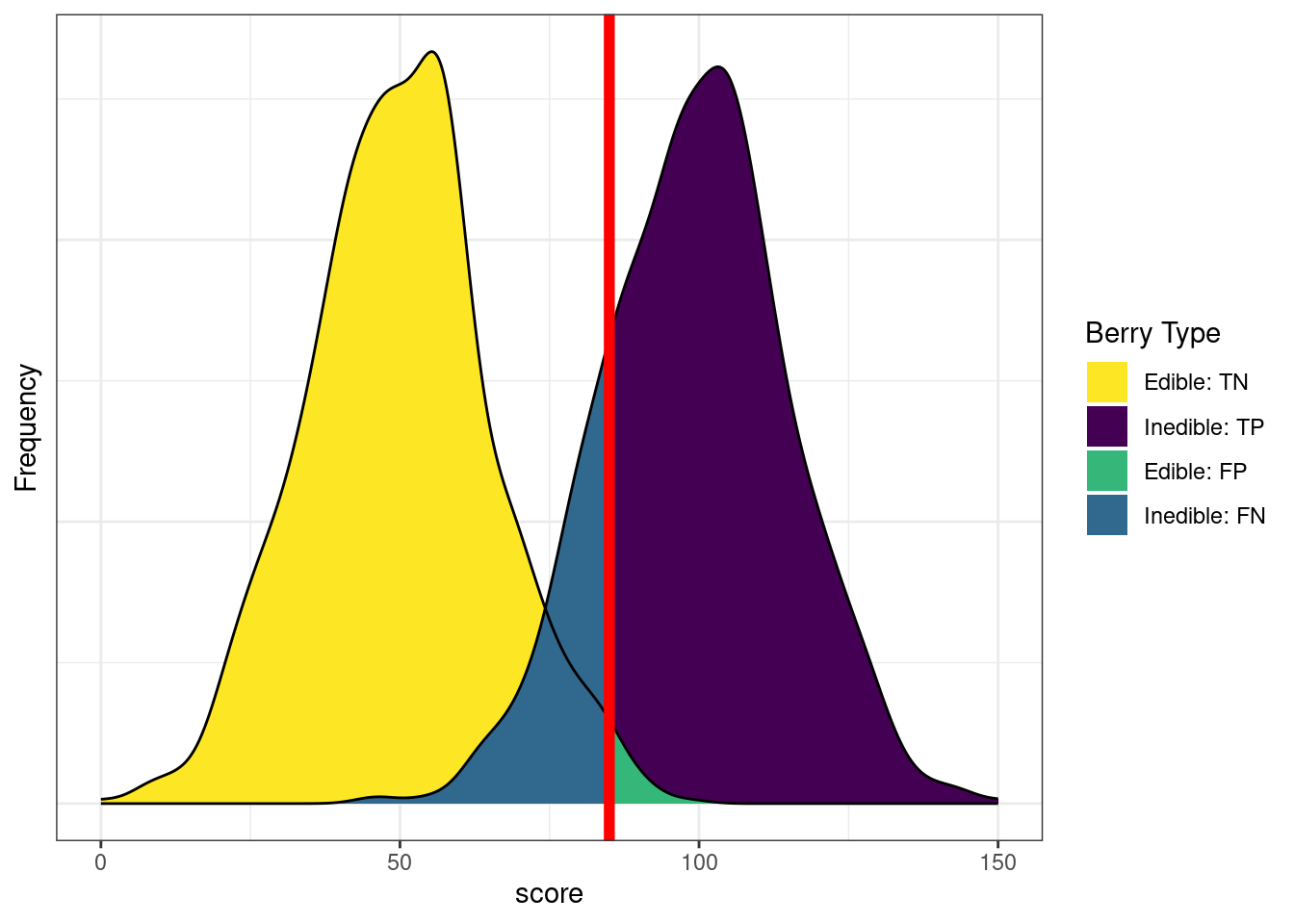
Figure 17.8 depicts the distributions of scores by berry type with a cutoff. The red line indicates the cutoff—the level above which berries are classified by the test as inedible. There are errors on each side of the cutoff. Below the cutoff, there are some false negatives (blue): inedible berries that are inaccurately classified as edible. Above the cutoff, there are some false positives (green): edible berries that are inaccurately classified as inedible. Costs of false negatives could include sickness or death from eating the inedible berries. Costs of false positives could include taking longer to find food, finding insufficient food, and starvation.
Code
#Standard Cutoff
ggplot(
  data = density_data,
  aes(
    x = x,
    ymin = 0,
    ymax = y,
    fill = type)) +
  geom_ribbon(alpha = 1) +
  scale_fill_manual(
    name = "Berry Type",
    values = c(
      viridis::viridis(4)[4],
      viridis::viridis(4)[1],
      viridis::viridis(4)[3],
      viridis::viridis(4)[2]),
    breaks = c("edible_TN","inedible_TP","edible_FP","inedible_FN"),
    labels = c("Edible: TN","Inedible: TP","Edible: FP","Inedible: FN")) +
  geom_line(aes(y = y)) +
  geom_vline(
    xintercept = cutoff,
    color = "red",
    linewidth = 2) +
  scale_x_continuous(name = "score") +
  scale_y_continuous(name = "Frequency") +
  theme_bw() +
  theme(
    axis.text.y = element_blank(),
axis.ticks.y = element_blank())Based on our assessment goals, we might use a different selection ratio by changing the cutoff. Figure 17.9 depicts the distributions of scores by berry type when we raise the cutoff. There are now more false negatives (blue) and fewer false positives (green). If we raise the cutoff (to be more conservative), the number of false negatives increases and the number of false positives decreases. Consequently, as the cutoff increases, sensitivity and NPV decrease (because we have more false negatives), whereas specificity and PPV increase (because we have fewer false positives). A higher cutoff could be optimal if the costs of false positives are considered greater than the costs of false negatives. For instance, if the aliens cannot risk eating the inedible berries because the berries are fatal, and there are sufficient edible berries that can be found to feed the alien colony.
Code
#Raise the cutoff
cutoff <- 85

hist_edible <- density(
  edibleScores,
  from = 0,
  to = 150) %$% # exposition pipe magrittr::`%$%`
  data.frame(
    x = x,
    y = y) %>%
  mutate(area = x >= cutoff)

hist_edible$type[hist_edible$area == TRUE] <- "edible_FP"
hist_edible$type[hist_edible$area == FALSE] <- "edible_TN"

hist_inedible <- density(
  inedibleScores,
  from = 0,
  to = 150) %$% # exposition pipe magrittr::`%$%`
  data.frame(
    x = x,
    y = y) %>%
  mutate(area = x < cutoff)

hist_inedible$type[hist_inedible$area == TRUE] <- "inedible_FN"
hist_inedible$type[hist_inedible$area == FALSE] <- "inedible_TP"

density_data <- bind_rows(
  hist_edible,
  hist_inedible)

density_data$type <- factor(
  density_data$type,
  levels = c(
    "edible_TN",
    "inedible_TP",
    "edible_FP",
    "inedible_FN"))

ggplot(
  data = density_data,
  aes(
    x = x,
    ymin = 0,
    ymax = y,
    fill = type)) +
  geom_ribbon(alpha = 1) +
  scale_fill_manual(
    name = "Berry Type",
    values = c(
      viridis::viridis(4)[4],
      viridis::viridis(4)[1],
      viridis::viridis(4)[3],
      viridis::viridis(4)[2]),
    breaks = c("edible_TN","inedible_TP","edible_FP","inedible_FN"),
    labels = c("Edible: TN","Inedible: TP","Edible: FP","Inedible: FN")) +
  geom_line(aes(y = y)) +
  geom_vline(
    xintercept = cutoff,
    color = "red",
    linewidth = 2) +
  scale_x_continuous(name = "score") +
  scale_y_continuous(name = "Frequency") +
  theme_bw() +
  theme(
    axis.text.y = element_blank(),
    axis.ticks.y = element_blank())
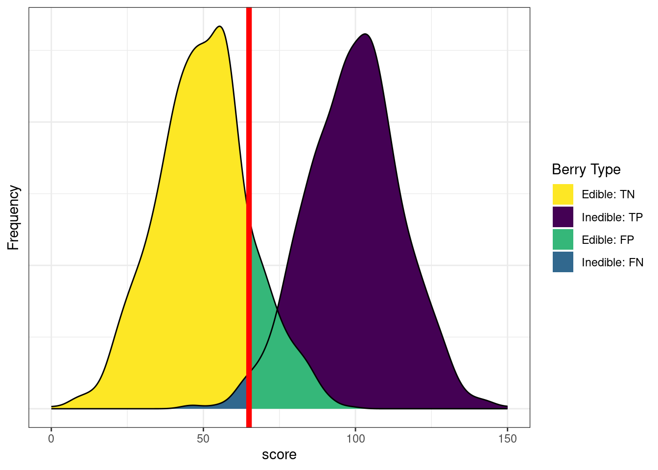
Figure 17.10 depicts the distributions of scores by berry type when we lower the cutoff. There are now fewer false negatives (blue) and more false positives (green). If we lower the cutoff (to be more liberal), the number of false negatives decreases and the number of false positives increases. Consequently, as the cutoff decreases, sensitivity and NPV increase (because we have fewer false negatives), whereas specificity and PPV decrease (because we have more false positives). A lower cutoff could be optimal if the costs of false negatives are considered greater than the costs of false positives. For instance, if the aliens cannot risk missing edible berries because they are in short supply relative to the size of the alien colony, and eating the inedible berries would, at worst, lead to minor, temporary discomfort.
Code
#Lower the cutoff
cutoff <- 65

hist_edible <- density(
  edibleScores,
  from = 0,
  to = 150) %$% # exposition pipe magrittr::`%$%`
  data.frame(
    x = x,
    y = y) %>%
  mutate(area = x >= cutoff)

hist_edible$type[hist_edible$area == TRUE] <- "edible_FP"
hist_edible$type[hist_edible$area == FALSE] <- "edible_TN"

hist_inedible <- density(
  inedibleScores,
  from = 0,
  to = 150) %$% # exposition pipe magrittr::`%$%`
  data.frame(
    x = x,
    y = y) %>%
  mutate(area = x < cutoff)

hist_inedible$type[hist_inedible$area == TRUE] <- "inedible_FN"
hist_inedible$type[hist_inedible$area == FALSE] <- "inedible_TP"

density_data <- bind_rows(
  hist_edible,
  hist_inedible)

density_data$type <- factor(
  density_data$type,
  levels = c(
    "edible_TN",
    "inedible_TP",
    "edible_FP",
    "inedible_FN"))

ggplot(
  data = density_data,
  aes(
    x = x,
    ymin = 0,
    ymax = y,
    fill = type)) +
  geom_ribbon(alpha = 1) +
  scale_fill_manual(
    name = "Berry Type",
    values = c(
      viridis::viridis(4)[4],
      viridis::viridis(4)[1],
      viridis::viridis(4)[3],
      viridis::viridis(4)[2]),
    breaks = c("edible_TN","inedible_TP","edible_FP","inedible_FN"),
    labels = c("Edible: TN","Inedible: TP","Edible: FP","Inedible: FN")) +
  geom_line(aes(y = y)) +
  geom_vline(
    xintercept = cutoff,
    color = "red",
    linewidth = 2) +
  scale_x_continuous(name = "score") +
  scale_y_continuous(name = "Frequency") +
  theme_bw() +
  theme(
    axis.text.y = element_blank(),
axis.ticks.y = element_blank())In sum, sensitivity and specificity differ based on the cutoff for classification. If we raise the cutoff, sensitivity and PPV increase (due to fewer false positives), whereas sensitivity and NPV decrease (due to more false negatives). If we lower the cutoff, sensitivity and NPV increase (due to fewer false negatives), whereas specificity and PPV decrease (due to more false positives). Thus, the optimal cutoff depends on how costly each type of error is: false negatives and false positives. If false negatives are more costly than false positives, we would set a low cutoff. If false positives are more costly than false negatives, we would set a high cutoff.
17.6.8 Set a Cutoff/Threshold
For evaluating sensitivity, specificity, positive predictive value, negative predictive value, and the receiver operating characteristic (ROC) curve, we need to make a dichotomous decision/prediction. For this example, our goal is to predict which Running Backs or Wide Receivers will score 300 or more fantasy points. We will predict a player as scoring 300 or more fantasy points for a given projection source if that projection source projected the player to score 300 or more fantasy points. Thus, our cutoff or threshold is 300 or more projected points. The same player has multiple rows in the data file—one for each projection source.
Code
projectionsWithActuals_seasonal_subset <- projectionsWithActuals_seasonal %>%
  filter(position_group %in% c("RB","WR")) %>%
  filter(season == 2024)

projectionsWithActuals_seasonal_subset$prediction <- ifelse(projectionsWithActuals_seasonal_subset$raw_points >= 300, 1, 0)
projectionsWithActuals_seasonal_subset$truth <- ifelse(projectionsWithActuals_seasonal_subset$fantasyPoints >= 300, 1, 0)

projectionsWithActuals_seasonal_subset$predictionFactor <- factor(
  projectionsWithActuals_seasonal_subset$prediction,
  levels = c(1,0),
  labels = c("Prediction: Will Score 300+ Points", "Prediction: Will Not Score 300+ Points"))

projectionsWithActuals_seasonal_subset$truthFactor <- factor(
  projectionsWithActuals_seasonal_subset$truth,
  levels = c(1,0),
  labels = c("Truth: Scored 300+ Points", "Truth: Did Not Score 300+ Points")
)

table(projectionsWithActuals_seasonal_subset$predictionFactor)
    Prediction: Will Score 300+ Points Prediction: Will Not Score 300+ Points
                                    57                                   2131
       Truth: Scored 300+ Points Truth: Did Not Score 300+ Points
                              81                             2156
17.6.9 Signal Detection Theory
Signal detection theory (SDT) is a probability-based theory for the detection of a given stimulus (signal) from a stimulus set that includes non-target stimuli (noise). SDT arose through the development of radar (RAdio Detection And Ranging) and sonar (SOund Navigation And Ranging) in World War II based on research on sensory-perception research. The military wanted to determine which objects on radar/sonar were enemy aircraft/submarines, and which were noise (e.g., different object in the environment or even just the weather itself). SDT allowed determining how many errors operators made (how accurate they were) and decomposing errors into different kinds of errors. SDT distinguishes between sensitivity and bias. In SDT, sensitivity (or discriminability) is how well an assessment distinguishes between a target stimulus and non-target stimuli (i.e., how well the assessment detects the target stimulus amid non-target stimuli). Bias is the extent to which the probability of a selection decision from the assessment is higher or lower than the true rate of the target stimulus.
Some radar/sonar operators were not as sensitive to the differences between signal and noise, due to factors such as age, ability to distinguish gradations of a signal, etc. People who showed low sensitivity (i.e., who were not as successful at distinguishing between signal and noise) were screened out because the military perceived sensitivity as a skill that was not easily taught. By contrast, other operators could distinguish signal from noise, but their threshold was too low or high—they could take in information, but their decisions tended to be wrong due to systematic bias or poor calibration. That is, they systematically over-rejected or under-rejected stimuli. Over-rejecting leads to many false negatives (i.e., saying that a stimulus is safe when it is not). Under-rejecting leads to many false positives (i.e., saying that a stimulus is harmful when it is not). A person who showed good sensitivity but systematic bias was considered more teach-able than a person who showed low sensitivity. Thus, radar and sonar operators were selected based on their sensitivity to distinguish signal from noise, and then were trained to improve the calibration so they reduce their systematic bias and do not systematically over- or under-reject.
Although SDT was originally developed for use in World War II, it now plays an important role in many areas of science and medicine. A medical application of SDT is tumor detection in radiology. Another application of SDT in society is using x-ray to detect bombs or other weapons. An example of applying SDT to fantasy football could be in the prediction (and evaluation) of whether or not a player scores a touchdown in a game.
SDT metrics of sensitivity include \(d'\) (“\(d\)-prime”), \(A\) (or \(A'\)), and the area under the receiver operating characteristic (ROC) curve. SDT metrics of bias include \(\beta\) (beta), \(c\), and \(b\).
17.6.9.1 Receiver Operating Characteristic (ROC) Curve
The x-axis of the ROC curve is the false alarm rate or false positive rate (\(1 -\) specificity). The y-axis is the hit rate or true positive rate (sensitivity). We can trace the ROC curve as the combination between sensitivity and specificity at every possible cutoff. At a cutoff of zero (top right of ROC curve), we calculate sensitivity (1.0) and specificity (0) and plot it. At a cutoff of zero, the assessment tells us to make an action for every stimulus (i.e., it is the most liberal). We then gradually increase the cutoff, and plot sensitivity and specificity at each cutoff. As the cutoff increases, sensitivity decreases and specificity increases. We end at the highest possible cutoff, where the sensitivity is 0 and the specificity is 1.0 (i.e., we never make an action; i.e., it is the most conservative). Each point on the ROC curve corresponds to a pair of hit and false alarm rates (sensitivity and specificity) resulting from a specific cutoff value. Then, we can draw lines or a curve to connect the points.
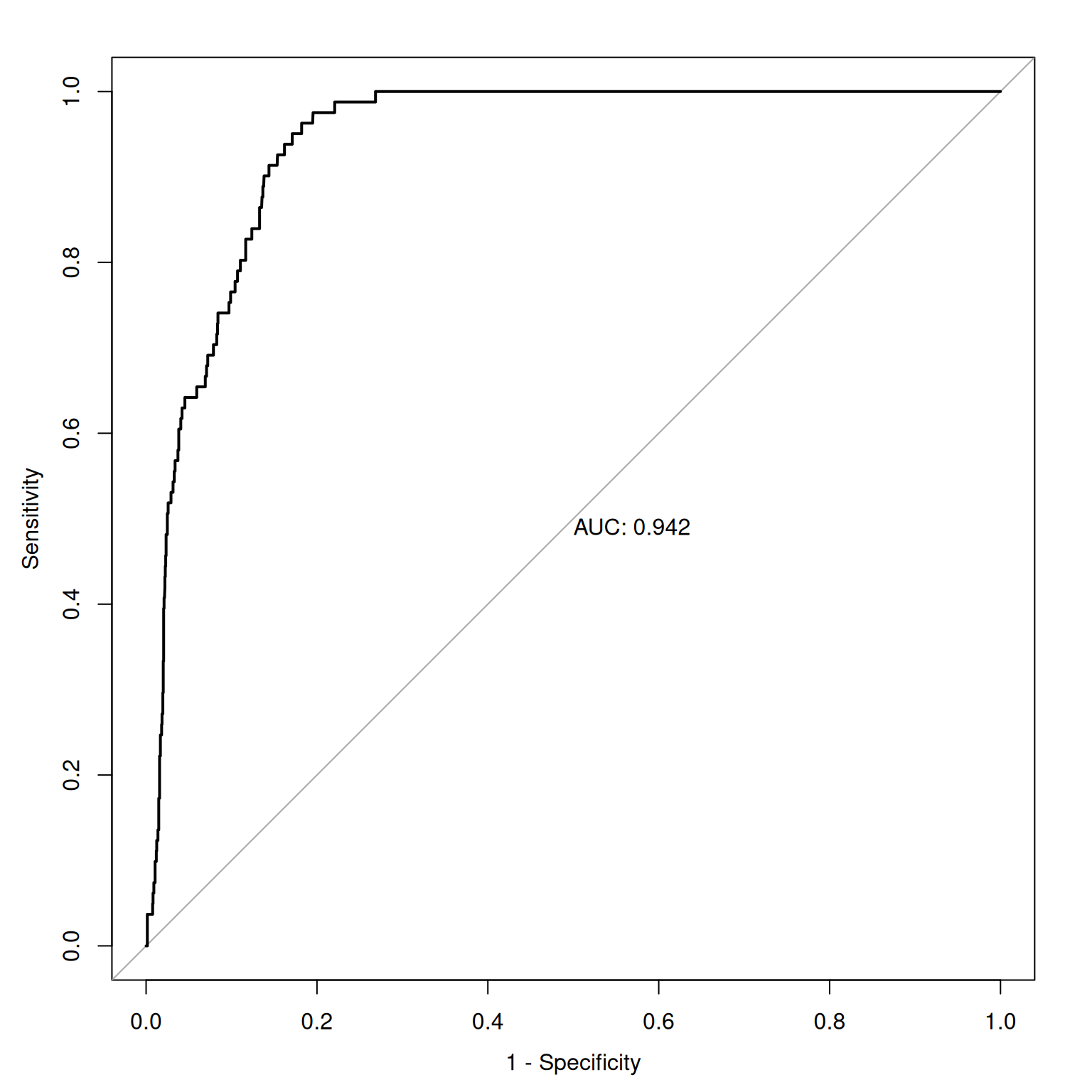
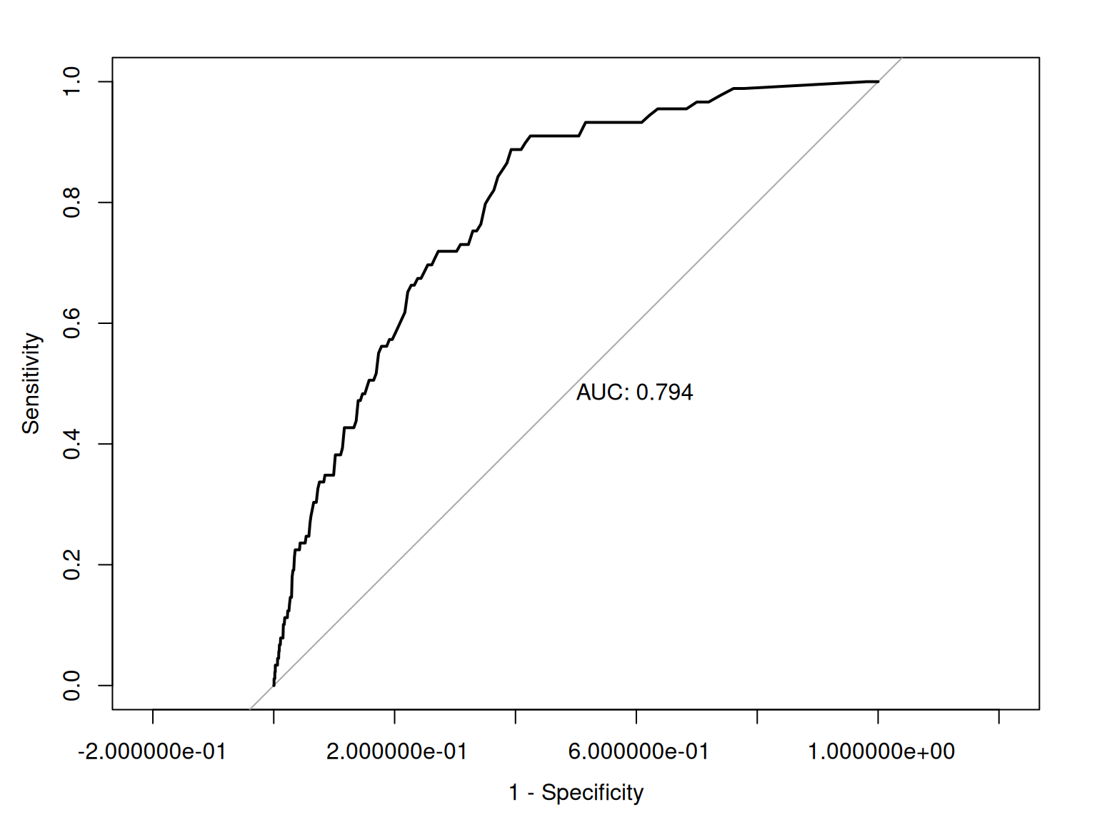
Figure 17.11 depicts an empirical ROC plot where lines are drawn to connect the hit and false alarm rates, in predicting Running Backs and Wide Receivers who score 300 or more fantasy points.
Code
Figure 17.12 depicts an ROC curve where a smoothed and fitted curve is drawn to connect the hit and false alarm rates, in predicting Running Backs and Wide Receivers who score 300 or more fantasy points.
Code
17.6.9.1.1 Area Under the ROC Curve
ROC methods can be used to compare and compute the discriminative power of measurement devices free from the influence of selection ratios, base rates, and costs and benefits. An ROC analysis yields a quantitative index of how well an index predicts a signal of interest or can discriminate between different signals. ROC analysis can help tell us how often our assessment would be correct. If we randomly pick two observations, and we were right once and wrong once, we were 50% accurate. But this would be a useless measure because it reflects chance responding.
The geometrical area under the ROC curve reflects the discriminative accuracy of the measure. The index is called the area under the curve (AUC) of an ROC curve. AUC quantifies the discriminative power of an assessment. AUC is the probability that a randomly selected target and a randomly selected non-target is ranked correctly by the assessment method. AUC values range from 0.0 to 1.0, where chance accuracy is 0.5 as indicated by diagonal line in the ROC curve. That is, a measure can be useful to the extent that its ROC curve is above the diagonal line (i.e., its discriminative accuracy is above chance).
AUC is a threshold-independent accuracy index that applies across all possible cutoff values.
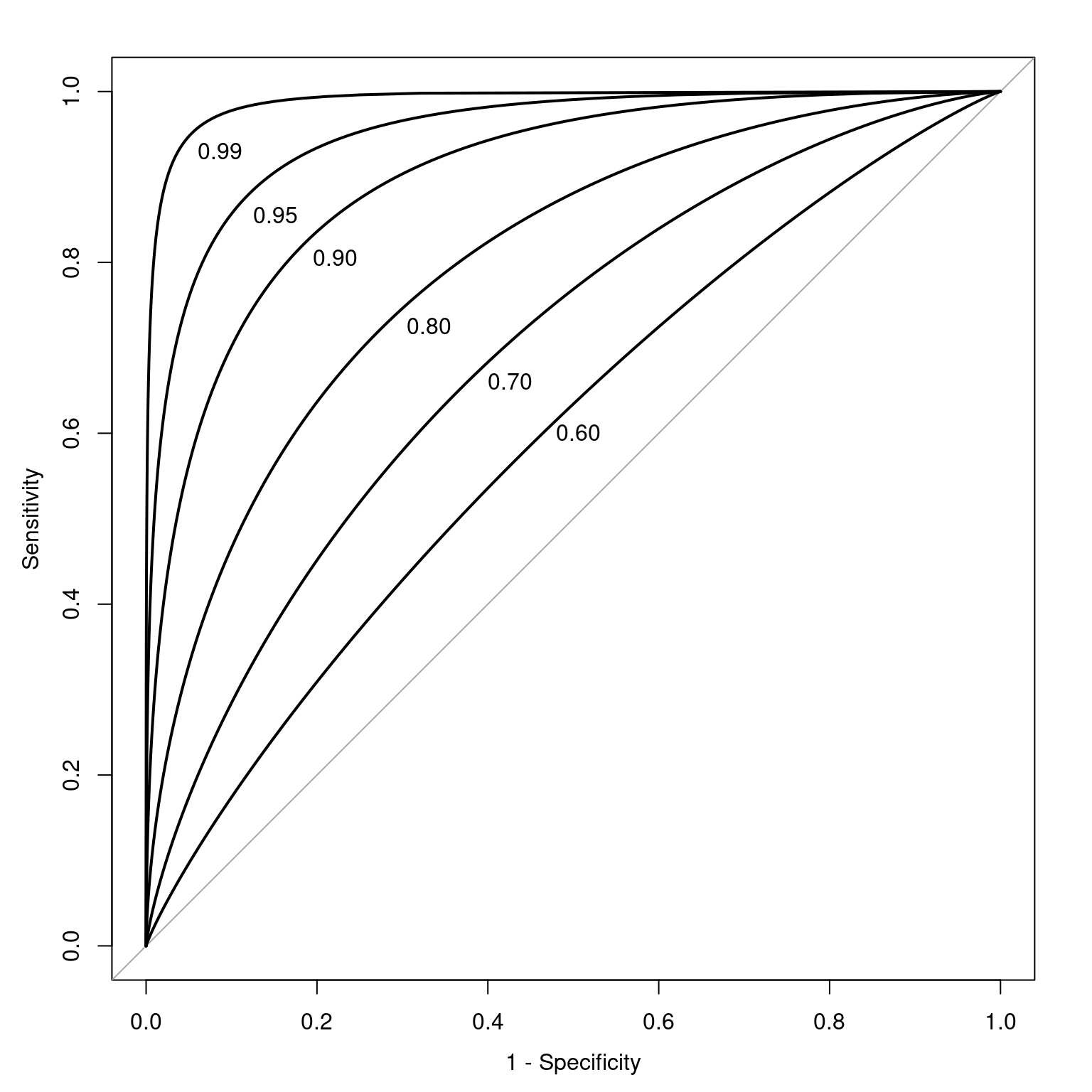
Figure 17.13 depicts ROC curves with a range of AUC values.
Code
set.seed(52242)

auc60 <- petersenlab::simulateAUC(.60, 50000)
auc70 <- petersenlab::simulateAUC(.70, 50000)
auc80 <- petersenlab::simulateAUC(.80, 50000)
auc90 <- petersenlab::simulateAUC(.90, 50000)
auc95 <- petersenlab::simulateAUC(.95, 50000)
auc99 <- petersenlab::simulateAUC(.99, 50000)

plot(
  pROC::roc(
    y ~ x,
    auc60,
    smooth = TRUE),
  legacy.axes = TRUE,
  print.auc = TRUE,
  print.auc.x = .52,
  print.auc.y = .61,
  print.auc.pattern = "%.2f")

plot(
  pROC::roc(
    y ~ x,
    auc70,
    smooth = TRUE),
  legacy.axes = TRUE,
  print.auc = TRUE,
  print.auc.x = .6,
  print.auc.y = .67,
  print.auc.pattern = "%.2f",
  add = TRUE)

plot(
  pROC::roc(
    y ~ x,
    auc80,
    smooth = TRUE),
  legacy.axes = TRUE,
  print.auc = TRUE,
  print.auc.x = .695,
  print.auc.y = .735,
  print.auc.pattern = "%.2f",
  add = TRUE)

plot(
  pROC::roc(
    y ~ x,
    auc90,
    smooth = TRUE),
  legacy.axes = TRUE,
  print.auc = TRUE,
  print.auc.x = .805,
  print.auc.y = .815,
  print.auc.pattern = "%.2f",
  add = TRUE)

plot(
  pROC::roc(
    y ~ x,
    auc95,
    smooth = TRUE),
  legacy.axes = TRUE,
  print.auc = TRUE,
  print.auc.x = .875,
  print.auc.y = .865,
  print.auc.pattern = "%.2f",
  add = TRUE)

plot(
  pROC::roc(
    y ~ x,
    auc99,
    smooth = TRUE),
  legacy.axes = TRUE,
  print.auc = TRUE,
  print.auc.x = .94,
  print.auc.y = .94,
  print.auc.pattern = "%.2f",
add = TRUE)As an example, given an AUC of .75, this says that the overall score of an individual who has the characteristic in question will be higher 75% of the time than the overall score of an individual who does not have the characteristic. In lay terms, AUC provides the probability that we will classify correctly based on our instrument if we were to randomly pick one good and one bad outcome. AUC is a stronger index of accuracy than percent accuracy, because you can have high percent accuracy just by going with the base rate. AUC tells us how much better than chance a measure is at discriminating outcomes. AUC is useful as a measure of general discriminative accuracy, and it tells us how accurate a measure is at all possible cutoffs. Knowing the accuracy of a measure at all possible cutoffs can be helpful for selecting the optimal cutoff, given the goals of the assessment. In reality, however, we may not be interested in all cutoffs because not all errors are equal in their costs.
If we lower the base rate, we would need a larger sample to get enough people to classify into each group. SDT/ROC methods are traditionally about dichotomous decisions (yes/no), not graded judgments. SDT/ROC methods can get messy with ordinal data that are more graded because you would have an AUC curve for each ordinal grouping.
17.6.10 Accuracy Indices
There are various accuracy indices we can use to evaluate the accuracy of predictions for categorical outcome variables. We have already described several accuracy indices, including percent accuracy, sensitivity, specificity, positive predictive value, negative predictive value, and area under the ROC curve. We describe these and other indices in greater detail below.
The petersenlab package (Petersen, 2025a) contains the petersenlab::accuracyAtCutoff() function that computes many accuracy indices for the prediction of categorical outcome variables. In the example below, we compute the accuracy of predictions for which Running Backs or Wide Receivers will score 300 or more fantasy points, using a cutoff for projected fantasy points of 300.
Code
The petersenlab package (Petersen, 2025a) contains the petersenlab::accuracyAtEachCutoff() function that computes many accuracy indices for the prediction of categorical outcome variables at each possible cutoff. In the example below, we compute the accuracy of predictions for which Running Backs or Wide Receivers will score 300 or more fantasy points, at each possible cutoff for projected fantasy points.
Code
There are also test calculators available online:
- http://araw.mede.uic.edu/cgi-bin/testcalc.pl [Schwartz (2006); archived at https://perma.cc/X8TF-7YBX]
- https://dlrs.shinyapps.io/shinyDLRs (Goodman et al., 2022)
17.6.10.1 Confusion Matrix aka 2x2 Accuracy Table aka Cross-Tabulation aka Contingency Table
A confusion matrix (aka 2x2 accuracy table, cross-tabulation table, or contigency table) is a matrix for categorical data that presents the predicted outcome on one dimension and the actual outcome (truth) on the other dimension. If the predictions and outcomes are dichotomous, the confusion matrix is a 2x2 matrix with two rows and two columns that represent four possible predicted-actual combinations (decision outcomes). In such a case, the confusion matrix provides a tabular count of each type of accurate cases (true positives and true negatives) versus the number of each type of error (false positives and false negatives), as shown in Figure 17.2. An example of a confusion matrix is in Figure 17.3.
Here is our 2x2 confusion matrix, predicting which Running Backs or Wide Receivers will score 300 or more fantasy points.
Code
projectionsWithActuals_seasonal_subset <- projectionsWithActuals_seasonal %>%
  filter(position_group %in% c("RB","WR")) %>%
  filter(season == 2024)

projectionsWithActuals_seasonal_subset$prediction <- ifelse(projectionsWithActuals_seasonal_subset$raw_points >= 300, 1, 0)
projectionsWithActuals_seasonal_subset$truth <- ifelse(projectionsWithActuals_seasonal_subset$fantasyPoints >= 300, 1, 0)

projectionsWithActuals_seasonal_subset$predictionFactor <- factor(
  projectionsWithActuals_seasonal_subset$prediction,
  levels = c(1,0),
  labels = c("Prediction: Will Score 300+ Points", "Prediction: Will Not Score 300+ Points"))

projectionsWithActuals_seasonal_subset$truthFactor <- factor(
  projectionsWithActuals_seasonal_subset$truth,
  levels = c(1,0),
  labels = c("Truth: Scored 300+ Points", "Truth: Did Not Score 300+ Points")
)

table(projectionsWithActuals_seasonal_subset$predictionFactor)
    Prediction: Will Score 300+ Points Prediction: Will Not Score 300+ Points
                                    57                                   2131
       Truth: Scored 300+ Points Truth: Did Not Score 300+ Points
                              81                             2156
17.6.10.1.1 Number
Code
                                         Truth: Scored 300+ Points
  Prediction: Will Score 300+ Points                            20
  Prediction: Will Not Score 300+ Points                        61

                                         Truth: Did Not Score 300+ Points
  Prediction: Will Score 300+ Points                                   37
  Prediction: Will Not Score 300+ Points                             2070
17.6.10.1.2 Number With Margins Added
Code
                                         Truth: Scored 300+ Points
  Prediction: Will Score 300+ Points                            20
  Prediction: Will Not Score 300+ Points                        61
  Sum                                                           81

                                         Truth: Did Not Score 300+ Points  Sum
  Prediction: Will Score 300+ Points                                   37   57
  Prediction: Will Not Score 300+ Points                             2070 2131
  Sum                                                                2107 2188
17.6.10.1.3 Proportions
Code
                                         Truth: Scored 300+ Points
  Prediction: Will Score 300+ Points                   0.009140768
  Prediction: Will Not Score 300+ Points               0.027879342

                                         Truth: Did Not Score 300+ Points
  Prediction: Will Score 300+ Points                          0.016910420
  Prediction: Will Not Score 300+ Points                      0.946069470
17.6.10.1.4 Proportions With Margins Added
Code
                                         Truth: Scored 300+ Points
  Prediction: Will Score 300+ Points                   0.009140768
  Prediction: Will Not Score 300+ Points               0.027879342
  Sum                                                  0.037020110

                                         Truth: Did Not Score 300+ Points
  Prediction: Will Score 300+ Points                          0.016910420
  Prediction: Will Not Score 300+ Points                      0.946069470
  Sum                                                         0.962979890

                                                 Sum
  Prediction: Will Score 300+ Points     0.026051188
  Prediction: Will Not Score 300+ Points 0.973948812
  Sum                                    1.000000000
17.6.10.2 True Positives (TP)
True positives (TPs) are instances in which a positive classification (e.g., stating that a disease is present for a person) is correct—that is, the test says that a classification is present, and the classification is present. True positives are also called valid positives (VPs) or hits. Higher values reflect greater accuracy. The formula for true positives is in Equation 17.4:
\[ \begin{aligned} \text{TP} &= \text{BR} \times \text{SR} \times N \end{aligned} \tag{17.4}\]
17.6.10.3 True Negatives (TN)
True negatives (TNs) are instances in which a negative classification (e.g., stating that a disease is absent for a person) is correct—that is, the test says that a classification is not present, and the classification is actually not present. True negatives are also called valid negatives (VNs) or correct rejections. Higher values reflect greater accuracy. The formula for true negatives is in Equation 17.5:
\[ \begin{aligned} \text{TN} &= (1 - \text{BR}) \times (1 - \text{SR}) \times N \end{aligned} \tag{17.5}\]
17.6.10.4 False Positives (FP)
False positives (FPs) are instances in which a positive classification (e.g., stating that a disease is present for a person) is incorrect—that is, the test says that a classification is present, and the classification is not present. False positives are also called false alarms (FAs). Lower values reflect greater accuracy. The formula for false positives is in Equation Equation 17.6:
\[ \begin{aligned} \text{FP} &= (1 - \text{BR}) \times \text{SR} \times N \end{aligned} \tag{17.6}\]
17.6.10.5 False Negatives (FN)
False negatives (FNs) are instances in which a negative classification (e.g., stating that a disease is absent for a person) is incorrect—that is, the test says that a classification is not present, and the classification is present. False negatives are also called misses. Lower values reflect greater accuracy. The formula for false negatives is in Equation 17.7:
\[ \begin{aligned} \text{FN} &= \text{BR} \times (1 - \text{SR}) \times N \end{aligned} \tag{17.7}\]
17.6.10.6 Selection Ratio (SR)
The selection ratio (SR) is the marginal probability of selection, independent of other things: \(P(R_i)\). It is not an index of accuracy, per se. In medicine, the selection ratio is the proportion of people who test positive for the disease. In fantasy football, the selection ratio is the proportion of players who you predict will show a given outcome. For example, if you are trying to predict the players who will score a touchdown in a game, the selection ratio is the proportion of players who you predict will score a touchdown. The formula for calculating the selection ratio is in Equation 17.8.
\[ \begin{aligned} \text{SR} &= P(R_i) \\ &= \frac{\text{TP} + \text{FP}}{N} \end{aligned} \tag{17.8}\]
17.6.10.7 Base Rate (BR)
The base rate (BR) of a classification is its marginal probability, independent of other things: \(P(C_i)\). It is not an index of accuracy, per se. In medicine, the base rate of a disease is its prevalence in the population, as in Equation 17.9. Without additional information, the base rate is used as the initial pretest probability. In fantasy football, the base rate is the proportion of players who actually show the particular outcome. For example, if you are trying to predict the players who will score a touchdown in a game, the base rate is the proportion of players who actually score a touchdown in the game. The formula for calculating the selection ratio is in Equation 17.9.
\[ \begin{aligned} \text{BR} &= P(C_i) \\ &= \frac{\text{TP} + \text{FN}}{N} \end{aligned} \tag{17.9}\]
17.6.10.8 Pretest Odds
The pretest odds of a classification can be estimated using the pretest probability (i.e., base rate). To convert a probability to odds, divide the probability by one minus that probability, as in Equation 17.10.
\[ \begin{aligned} \text{pretest odds} &= \frac{\text{pretest probability}}{1 - \text{pretest probability}} \\ \end{aligned} \tag{17.10}\]
17.6.10.9 Percent Accuracy
Percent Accuracy is also called overall accuracy. Higher values reflect greater accuracy. The formula for percent accuracy is in Equation 17.11. Percent accuracy has several problems. First, it treats all errors (FP and FN) as equally important. However, in practice, it is rarely the case that false positives and false negatives are equally important. Second, percent accuracy can be misleading because it is highly influenced by base rates. You can have a high percent accuracy by predicting from the base rate and saying that no one has the characteristic (if the base rate is low) or that everyone has the characteristic (if the base rate is high). Thus, it is also important to consider other aspects of accuracy.
\[ \text{Percent Accuracy} = 100\% \times \frac{\text{TP} + \text{TN}}{N} \tag{17.11}\]
17.6.10.10 Percent Accuracy by Chance
The formula for calculating percent accuracy by chance is in Equation 17.12.
\[ \begin{aligned} \text{Percent Accuracy by Chance} &= 100\% \times [P(\text{TP}) + P(\text{TN})] \\ &= 100\% \times \{(\text{BR} \times {\text{SR}}) + [(1 - \text{BR}) \times (1 - \text{SR})]\} \end{aligned} \tag{17.12}\]
17.6.10.11 Percent Accuracy Predicting from the Base Rate
Predicting from the base rate is going with the most likely outcome in every prediction. If the base rate is less than .50, it would involve predicting that the condition is absent for every case. If the base rate is .50 or above, it would involve predicting that the condition is present for every case. Predicting from the base rate is a special case of percent accuracy by chance when the selection ratio is set to either one (if the base rate \(\geq\) .5) or zero (if the base rate < .5).
17.6.10.12 Relative Improvement Over Chance (RIOC)
Relative improvement over chance (RIOC) is a prediction’s improvement over chance as a proportion of the maximum possible improvement over chance, as described by Farrington & Loeber (1989). Higher values reflect greater accuracy. The formula for calculating RIOC is in Equation 17.13.
\[ \begin{aligned} \text{relative improvement over chance (RIOC)} &= \frac{\text{total correct} - \text{chance correct}}{\text{maximum correct} - \text{chance correct}} \\ \end{aligned} \tag{17.13}\]
17.6.10.13 Relative Improvement Over Predicting from the Base Rate
Relative improvement over predicting from the base rate is a prediction’s improvement over predicting from the base rate as a proportion of the maximum possible improvement over predicting from the base rate. Higher values reflect greater accuracy. The formula for calculating relative improvement over predicting from the base rate is in Equation 17.14.
\[ \scriptsize \begin{aligned} \text{relative improvement over predicting from base rate} &= \frac{\text{total correct} - \text{correct by predicting from base rate}}{\text{maximum correct} - \text{correct by predicting from base rate}} \\ \end{aligned} \tag{17.14}\]
17.6.10.14 Sensitivity (SN)
Sensitivity (SN) is also called true positive rate (TPR), hit rate (HR), or recall. Sensitivity is the conditional probability of a positive test given that the person has the condition: \(P(R|C)\). Higher values reflect greater accuracy. The formula for calculating sensitivity is in Equation 17.15. As described in Section 17.6.7.1, as the cutoff increases (becomes more conservative), sensitivity decreases. As the cutoff decreases, sensitivity increases.
\[ \begin{aligned} \text{sensitivity (SN)} &= P(R|C) \\ &= \frac{\text{TP}}{\text{TP} + \text{FN}} = \frac{\text{TP}}{N \times \text{BR}} = 1 - \text{FNR} \end{aligned} \tag{17.15}\]
17.6.10.15 Specificity (SP)
Specificity (SP) is also called true negative rate (TNR) or selectivity. Specificity is the conditional probability of a negative test given that the person does not have the condition: \(P(\text{not } R|\text{not } C)\). Higher values reflect greater accuracy. The formula for calculating specificity is in Equation 17.16. As described in Section 17.6.7.1, as the cutoff increases (becomes more conservative), specificity increases. As the cutoff decreases, specificity decreases.
\[ \begin{aligned} \text{specificity (SP)} &= P(\text{not } R|\text{not } C) \\ &= \frac{\text{TN}}{\text{TN} + \text{FP}} = \frac{\text{TN}}{N (1 - \text{BR})} = 1 - \text{FPR} \end{aligned} \tag{17.16}\]
17.6.10.16 False Negative Rate (FNR)
The false negative rate (FNR) is also called the miss rate. The false negative rate is the conditional probability of a negative test given that the person has the condition: \(P(\text{not } R|C)\). Lower values reflect greater accuracy. The formula for calculating false negative rate is in Equation 17.17.
\[ \begin{aligned} \text{false negative rate (FNR)} &= P(\text{not } R|C) \\ &= \frac{\text{FN}}{\text{FN} + \text{TP}} = \frac{\text{FN}}{N \times \text{BR}} = 1 - \text{TPR} \end{aligned} \tag{17.17}\]
17.6.10.17 False Positive Rate (FPR)
The false positive rate (FPR) is also called the false alarm rate (FAR) or fall-out. The false positive rate is the conditional probability of a positive test given that the person does not have the condition: \(P(R|\text{not } C)\). Lower values reflect greater accuracy. The formula for calculating false positive rate is in Equation 17.18:
\[ \begin{aligned} \text{false positive rate (FPR)} &= P(R|\text{not } C) \\ &= \frac{\text{FP}}{\text{FP} + \text{TN}} = \frac{\text{FP}}{N (1 - \text{BR})} = 1 - \text{TNR} \end{aligned} \tag{17.18}\]
17.6.10.18 Positive Predictive Value (PPV)
The positive predictive value (PPV) is also called the positive predictive power (PPP) or precision. Many people confuse sensitivity (\(P(R|C)\)) with its inverse conditional probability, PPV (\(P(C|R)\)). PPV is the conditional probability of having the condition given a positive test: \(P(C|R)\). Higher values reflect greater accuracy. The formula for calculating positive predictive value is in Equation 17.19.
PPV can be low even when sensitivity is high because it depends not only on sensitivity, but also on specificity and the base rate. Because PPV depends on the base rate, PPV is not an intrinsic property of a measure. The same measure will have a different PPV in different contexts with different base rates (Treat & Viken, 2023). As described in Section 17.6.7.1, as the base rate increases, PPV increases. As the base rate decreases, PPV decreases. PPV also differs as a function of the cutoff. As described in Section 17.6.7.1, as the cutoff increases (becomes more conservative), PPV increases. As the cutoff decreases (becomes more liberal), PPV decreases.
\[ \small \begin{aligned} \text{positive predictive value (PPV)} &= P(C|R) \\ &= \frac{\text{TP}}{\text{TP} + \text{FP}} = \frac{\text{TP}}{N \times \text{SR}}\\ &= \frac{\text{sensitivity} \times {\text{BR}}}{\text{sensitivity} \times {\text{BR}} + [(1 - \text{specificity}) \times (1 - \text{BR})]} \end{aligned} \tag{17.19}\]
17.6.10.19 Negative Predictive Value (NPV)
The negative predictive value (NPV) is also called the negative predictive power (NPP). Many people confuse specificity (\(P(\text{not } R|\text{not } C)\)) with its inverse conditional probability, NPV (\(P(\text{not } C| \text{not } R)\)). NPV is the conditional probability of not having the condition given a negative test: \(P(\text{not } C| \text{not } R)\). Higher values reflect greater accuracy. The formula for calculating negative predictive value is in Equation 17.20.
NPV can be low even when specificity is high because it depends not only on specificity, but also on sensitivity and the base rate. Because NPV depends on the base rate, NPV is not an intrinsic property of a measure. The same measure will have a different NPV in different contexts with different base rates (Treat & Viken, 2023). As described in Section 17.6.7.1, as the base rate increases, NPV decreases. As the base rate decreases, NPV increases. NPV also differs as a function of the cutoff. As described in Section 17.6.7.1, as the cutoff increases (becomes more conservative), NPV decreases. As the cutoff decreases (becomes more liberal), NPV decreases.
\[ \small \begin{aligned} \text{negative predictive value (NPV)} &= P(\text{not } C|\text{not } R) \\ &= \frac{\text{TN}}{\text{TN} + \text{FN}} = \frac{\text{TN}}{N(\text{1 - SR})}\\ &= \frac{\text{specificity} \times (1-{\text{BR}})}{\text{specificity} \times (1-{\text{BR}}) + [(1 - \text{sensitivity}) \times \text{BR})]} \end{aligned} \tag{17.20}\]
17.6.10.20 False Discovery Rate (FDR)
Many people confuse the false positive rate (\(P(R|\text{not } C)\)) with its inverse conditional probability, the false discovery rate (\(P(\text{not } C| R)\)). The false discovery rate (FDR) is the conditional probability of not having the condition given a positive test: \(P(\text{not } C| R)\). Lower values reflect greater accuracy. The formula for calculating false discovery rate is in Equation 17.21.
\[ \begin{aligned} \text{false discovery rate (FDR)} &= P(\text{not } C|R) \\ &= \frac{\text{FP}}{\text{FP} + \text{TP}} = 1 - \text{PPV} \end{aligned} \tag{17.21}\]
17.6.10.21 False Omission Rate (FOR)
Many people confuse the false negative rate (\(P(\text{not } R|C)\)) with its inverse conditional probability, the false omission rate (\(P(C|\text{not } R)\)). The false omission rate (FOR) is the conditional probability of having the condition given a negative test: \(P(C|\text{not } R)\). Lower values reflect greater accuracy. The formula for calculating false omission rate is in Section 17.6.10.21.
\[ \begin{aligned} \text{false omission rate (FOR)} &= P(C|\text{not } R) \\ &= \frac{\text{FN}}{\text{FN} + \text{TN}} = 1 - \text{NPV} \end{aligned} \tag{17.22}\]
17.6.10.22 Youden’s J Statistic
Youden’s J statistic is also called Youden’s Index or informedness. Youden’s J statistic is the sum of sensitivity and specificity (and subtracting one). Higher values reflect greater accuracy. The formula for calculating Youden’s J statistic is in Equation 17.23.
\[ \begin{aligned} \text{Youden's J statistic} &= \text{sensitivity} + \text{specificity} - 1 \end{aligned} \tag{17.23}\]
17.6.10.23 Balanced Accuracy
Balanced accuracy is the average of sensitivity and specificity. Higher values reflect greater accuracy. The formula for calculating balanced accuracy is in Equation 17.24.
\[ \begin{aligned} \text{balanced accuracy} &= \frac{\text{sensitivity} + \text{specificity}}{2} \end{aligned} \tag{17.24}\]
17.6.10.24 F-Score
The F-score combines precision (positive predictive value) and recall (sensitivity), where \(\beta\) indicates how many times more important sensitivity is than the positive predictive value. If sensitivity and the positive predictive value are equally important, \(\beta = 1\), and the F-score is called the \(F_1\) score. Higher values reflect greater accuracy. The formula for calculating the F-score is in Equation 17.25.
\[ \begin{aligned} F_\beta &= (1 + \beta^2) \cdot \frac{\text{positive predictive value} \cdot \text{sensitivity}}{(\beta^2 \cdot \text{positive predictive value}) + \text{sensitivity}} \\ &= \frac{(1 + \beta^2) \cdot \text{TP}}{(1 + \beta^2) \cdot \text{TP} + \beta^2 \cdot \text{FN} + \text{FP}} \end{aligned} \tag{17.25}\]
The formula for calculating the \(F_1\) score is in Equation 17.26.
\[ \begin{aligned} F_1 &= \frac{2 \cdot \text{positive predictive value} \cdot \text{sensitivity}}{(\text{positive predictive value}) + \text{sensitivity}} \\ &= \frac{2 \cdot \text{TP}}{2 \cdot \text{TP} + \text{FN} + \text{FP}} \end{aligned} \tag{17.26}\]
17.6.10.25 Matthews Correlation Coefficient (MCC)
The Matthews correlation coefficient (MCC) is also called the phi coefficient. It is a correlation coefficient between predicted and observed values from a binary classification. Higher values reflect greater accuracy. The formula for calculating the MCC is in Equation 17.27.
\[ \begin{aligned} \text{MCC} &= \frac{\text{TP} \times \text{TN} - \text{FP} \times \text{FN}}{\sqrt{(\text{TP} + \text{FP})(\text{TP} + \text{FN})(\text{TN} + \text{FP})(\text{TN} + \text{FN})}} \end{aligned} \tag{17.27}\]
17.6.10.26 Diagnostic Odds Ratio
The diagnostic odds ratio is the odds of a positive test among people with the condition relative to the odds of a positive test among people without the condition. Higher values reflect greater accuracy. The formula for calculating the diagnostic odds ratio is in Equation 17.28. If the predictor is bad, the diagnostic odds ratio could be less than one, and values can go up from there. If the diagnostic odds ratio is greater than 2, we take the odds ratio seriously because we are twice as likely to predict accurately than inaccurately. However, the diagnostic odds ratio ignores/hides base rates. When interpreting the diagnostic odds ratio, it is important to keep in mind the practical significance, because otherwise it is not very meaningful. Consider a risk factor that has a diagnostic odds ratio of 3 for tuberculosis, i.e., it puts you at 3 times as likely to develop tuberculosis. The prevalence of tuberculosis is relatively low. Assuming the prevalence of tuberculosis is less than 1/10th of 1%, your risk of developing tuberculosis is still very low even if the risk factor (with a diagnostic odds ratio of 3) is present.
\[ \begin{aligned} \text{diagnostic odds ratio} &= \frac{\text{TP} \times \text{TN}}{\text{FP} \times \text{FN}} \\ &= \frac{\text{sensitivity} \times \text{specificity}}{(1 - \text{sensitivity}) \times (1 - \text{specificity})} \\ &= \frac{\text{PPV} \times \text{NPV}}{(1 - \text{PPV}) \times (1 - \text{NPV})} \\ &= \frac{\text{LR+}}{\text{LR}-} \end{aligned} \tag{17.28}\]
17.6.10.27 Diagnostic Likelihood Ratio
The diagnostic likelihood ratio is described in Section 16.8.2.1. There are two types of diagnostic likelihood ratios: the positive likelihood ratio and the negative likelihood ratio.
17.6.10.27.1 Positive Likelihood Ratio (LR+)
The positive likelihood ratio (LR+) is described in Section 16.8.2.1.1. The formula for calculating the positive likelihood ratio is in Equation 16.22.
17.6.10.27.2 Negative Likelihood Ratio (LR−)
The negative likelihood ratio (LR−) is described in Section 16.8.2.1.2. The formula for calculating the negative likelihood ratio is in Equation 16.22.
17.6.10.28 Posttest Odds
As presented in Equation 16.21, the posttest (or posterior) odds are equal to the pretest odds multiplied by the likelihood ratio. The posttest odds and posttest probability can be useful to calculate when the pretest probability is different from the pretest probability (or prevalence) of the classification. For instance, you might use a different pretest probability if a test result is already known and you want to know the updated posttest probability after conducting a second test. The formula for calculating posttest odds is in Equation 17.29.
\[ \begin{aligned} \text{posttest odds} &= \text{pretest odds} \times \text{likelihood ratio} \\ \end{aligned} \tag{17.29}\]
For calculating the posttest odds of a true positive compared to a false positive, we use the positive likelihood ratio below. We would use the negative likelihood ratio if we wanted to calculate the posttest odds of a false negative compared to a true negative.
17.6.10.29 Posttest Probability
The posttest probability is the probability of having the characteristic given a test result. When the base rate is used as the pretest probability, the posttest probability given a positive test is equal to positive predictive value. To convert odds to a probability, divide the odds by one plus the odds, as is in Equation 17.30.
\[ \begin{aligned} \text{posttest probability} &= \frac{\text{posttest odds}}{1 + \text{posttest odds}} \end{aligned} \tag{17.30}\]
17.6.10.30 Mean Difference Between Predicted and Observed Values
The mean difference between predicted values versus observed values at a given cutoff is an index of miscalibration of predictions at that cutoff. It is called “calibration-in-the-small” (as opposed to calibration-in-the-large, which spans all cutoffs). Values closer to zero reflect greater accuracy. Values above zero indicate that the predicted values are, on average, greater than the observed values. Values below zero indicate that the observed values are, on average, greater than the predicted values.
17.6.11 Optimal Cutoff
The petersenlab package (Petersen, 2025a) contains the petersenlab::optimalCutoff() function that identifies the cutoff that optimizes each of various accuracy estimates.
  percentAccuracyCutoff percentAccuracyOptimal
1              370.1761               96.29799
2              408.2511               96.29799
  percentAccuracyByChanceCutoff percentAccuracyByChanceOptimal
1                      408.2511                       96.29799
  RIOCCutoff RIOCOptimal
1       0.30           1
2       0.40           1
3       1.06           1
4       1.20           1
5       1.40           1
6       1.50           1
  relativeImprovementOverPredictingFromBaseRateCutoff
1                                            370.1761
2                                            408.2511
  relativeImprovementOverPredictingFromBaseRateOptimal
1                                                    0
2                                                    0
  PPVCutoff PPVOptimal
1  370.1761        0.5
  NPVCutoff NPVOptimal
1      0.30          1
2      0.40          1
3      1.06          1
4      1.20          1
5      1.40          1
6      1.50          1
  youdenJCutoff youdenJOptimal
1           213      0.7821371
  balancedAccuracyCutoff balancedAccuracyOptimal
1                    213               0.8910686
  f1ScoreCutoff f1ScoreOptimal
1         279.6      0.4745763
  mccCutoff mccOptimal
1     262.8  0.4550649
  diagnosticOddsRatioCutoff diagnosticOddsRatioOptimal
1                       199                   284.8485
  positiveLikelihoodRatioCutoff positiveLikelihoodRatioOptimal
1                      370.1761                       26.01235
  negativeLikelihoodRatioCutoff negativeLikelihoodRatioOptimal
1                          0.30                              0
2                          0.40                              0
3                          1.06                              0
4                          1.20                              0
5                          1.40                              0
6                          1.50                              0
  dPrimeSDTCutoff dPrimeSDTOptimal
1             199         3.020862
  betaSDTCutoff betaSDTOptimal
1          0.30              0
2          0.40              0
3          1.06              0
4          1.20              0
5          1.40              0
6          1.50              0
  cSDTCutoff cSDTOptimal
1   226.3314 0.003426349
  aSDTCutoff aSDTOptimal
1        209   0.9405055
  bSDTCutoff  bSDTOptimal
1        0.3 0.0009483167
  differenceBetweenPredictedAndObservedCutoff
1                                        0.20
2                                        0.30
3                                        0.40
4                                        1.06
5                                        1.20
6                                        1.40
  differenceBetweenPredictedAndObservedOptimal
1                                     10.83108
2                                     10.83108
3                                     10.83108
4                                     10.83108
5                                     10.83108
6                                     10.83108
  informationGainCutoff informationGainOptimal
1                   213             0.07596567
17.7 Threshold-Independent Accuracy Indices
This section describes threshold-independent indexes of accuracy. That is, each index of accuracy described in this section provides a single numerical index of accuracy that aggregates the accuracy across all possible cutoffs. The petersenlab package (Petersen, 2025a) contains the petersenlab::accuracyOverall() function that computes many threshold-independent accuracy indices.
17.7.1 General Prediction Accuracy
There are many metrics of general prediction accuracy. When thinking about which metric(s) may be best for a given problem, it is important to consider the purpose of the assessment. The estimates of general prediction accuracy are separated below into scale-dependent and scale-independent accuracy estimates.
17.7.1.1 Scale-Dependent Accuracy Estimates
The estimates of prediction accuracy described in this section are scale-dependent. These accuracy estimates depend on the unit of measurement and therefore cannot be compared across measures with different scales or across data sets.
17.7.1.1.1 Mean Error (ME)
Here, “error” (\(e\)) is the difference between the predicted and observed value for a given individual (\(i\)). Mean error (ME; also known as bias) is the mean difference between the predicted and observed values across individuals (\(i\)), that is, the mean of the errors across individuals (\(e_i\)). Values closer to zero reflect greater accuracy. If mean error is above zero, it indicates that predicted values are, on average, greater than observed values (i.e., overestimating errors). If mean error is below zero, it indicates that predicted values are, on average, less than observed values (i.e., underestimating errors). If both over-estimating and under-estimating errors are present, however, they can cancel each other out. As a result, even with a mean error of zero, there can still be considerable error present. Thus, although mean error can be helpful for examining whether predictions systematically under- or over-estimate the actual scores, other forms of accuracy are necessary to examine the extent of error. The formula for mean error is in Equation 17.31:
\[ \begin{aligned} \text{mean error} &= \frac{\sum\limits_{i = 1}^n(\text{predicted}_i - \text{observed}_i)}{n} \\ &= \text{mean}(e_i) \end{aligned} \tag{17.31}\]
17.7.1.1.2 Mean Absolute Error (MAE)
Mean absolute error (MAE) is the mean of the absolute value of differences between the predicted and observed values across individuals. That is, MAE is the mean of the absolute value of errors (i.e., the mean distance between predicted and observed values). Smaller MAE values (closer to zero) reflect greater accuracy. MAE is preferred over root mean squared error (RMSE) when you want to give equal weight to all errors and when the outliers have considerable impact. The formula for MAE is in Equation 17.32:
\[ \begin{aligned} \text{mean absolute error (MAE)} &= \frac{\sum\limits_{i = 1}^n|\text{predicted}_i - \text{observed}_i|}{n} \\ &= \text{mean}(|e_i|) \end{aligned} \tag{17.32}\]
17.7.1.1.3 Median Absolute Error (MdAE)
Median absolute error (MdAE) is the median of the absolute value of differences between the predicted and observed values across individuals. That is, MdAE is the median of the absolute value of errors (i.e., the median distance between predicted and observed values). Smaller MdAE values (closer to zero) reflect greater accuracy. MdAE indicates the accuracy of the “typical” prediction (i.e., the prediction that is at the 50th percentile in terms of accuracy). The formula for MdAE is in Equation 17.33:
\[ \begin{aligned} \text{median absolute error (MdAE)} &= \frac{\text{median}(|\text{predicted}_i - \text{observed}_i|)}{n} \\ &= \text{median}(|e_i|) \end{aligned} \tag{17.33}\]
17.7.1.1.4 Mean Squared Error (MSE)
Mean squared error (MSE) is the mean of the square of the differences between the predicted and observed values across individuals, that is, the mean of the squared value of errors. Smaller MSE values (closer to zero) reflect greater accuracy. MSE penalizes larger errors more heavily than smaller errors (unlike MAE). However, MSE is sensitive to outliers and can be impacted if the errors are skewed. The formula for MSE is in Equation 17.34:
\[ \begin{aligned} \text{mean squared error (MSE)} &= \frac{\sum\limits_{i = 1}^n(\text{predicted}_i - \text{observed}_i)^2}{n} \\ &= \text{mean}(e_i^2) \end{aligned} \tag{17.34}\]
17.7.1.1.5 Root Mean Squared Error (RMSE)
Root mean squared error (RMSE) is the square root of the mean of the square of the differences between the predicted and observed values across individuals, that is, the root mean squared value of errors. Smaller RMSE values (closer to zero) reflect greater accuracy. RMSE penalizes larger errors more heavily than smaller errors (unlike MAE). However, RMSE is sensitive to outliers and can be impacted if the errors are skewed. The formula for RMSE is in Equation 17.35:
\[ \begin{aligned} \text{root mean squared error (RMSE)} &= \sqrt{\frac{\sum\limits_{i = 1}^n(\text{predicted}_i - \text{observed}_i)^2}{n}} \\ &= \sqrt{\text{mean}(e_i^2)} \end{aligned} \tag{17.35}\]
17.7.1.2 Scale-Independent Accuracy Estimates
The estimates of prediction accuracy described in this section are intended to be scale-independent (unit-free) so the accuracy estimates can be compared across measures with different scales or across data sets (Hyndman & Athanasopoulos, 2021).
17.7.1.2.1 Mean Percentage Error (MPE)
Mean percentage error (MPE) values closer to zero reflect greater accuracy. The formula for percentage error is in Equation 17.36:
\[ \begin{aligned} \text{percentage error }(p_i) = \frac{100\% \times (\text{observed}_i - \text{predicted}_i)}{\text{observed}_i} \end{aligned} \tag{17.36}\]
We then take the mean of the percentage errors to get MPE. The formula for MPE is in Equation 17.37:
\[ \begin{aligned} \text{mean percentage error (MPE)} &= \frac{100\%}{n} \sum\limits_{i = 1}^n \frac{\text{observed}_i - \text{predicted}_i}{\text{observed}_i} \\ &= \text{mean(percentage error)} \\ &= \text{mean}(p_i) \end{aligned} \tag{17.37}\]
Note: MPE is undefined when one or more of the observed values equals zero, due to division by zero. The petersenlab::accuracyOverall() function of the petersenlab package (Petersen, 2025a) provides the option in the function to drop undefined values so you can still generate an estimate of accuracy despite undefined values.
17.7.1.2.2 Mean Absolute Percentage Error (MAPE)
Smaller mean absolute percentage error (MAPE) values (closer to zero) reflect greater accuracy. The formula for MAPE is in Equation 17.38. MAPE is asymmetric because it overweights underestimates and underweights overestimates. MAPE can be preferable to symmetric mean absolute percentage error (sMAPE) if there are no observed values of zero and if you want to emphasize the importance of underestimates (relative to overestimates).
\[ \begin{aligned} \text{mean absolute percentage error (MAPE)} &= \frac{100\%}{n} \sum\limits_{i = 1}^n \Bigg|\frac{\text{observed}_i - \text{predicted}_i}{\text{observed}_i}\Bigg| \\ &= \text{mean(|percentage error|)} \\ &= \text{mean}(|p_i|) \end{aligned} \tag{17.38}\]
Note: MAPE is undefined when one or more of the observed values equals zero, due to division by zero. The petersenlab::accuracyOverall() function of the petersenlab package (Petersen, 2025a) provides the option in the function to drop undefined values so you can still generate an estimate of accuracy despite undefined values.
17.7.1.2.3 Symmetric Mean Absolute Percentage Error (sMAPE)
Unlike MAPE, symmetric mean absolute percentage error (sMAPE) is symmetric because it equally weights underestimates and overestimates. Smaller sMAPE values (closer to zero) reflect greater accuracy. The formula for sMAPE is in Equation 17.39:
\[ \small \begin{aligned} \text{symmetric mean absolute percentage error (sMAPE)} = \frac{100\%}{n} \sum\limits_{i = 1}^n \frac{|\text{predicted}_i - \text{observed}_i|}{|\text{predicted}_i| + |\text{observed}_i|} \end{aligned} \tag{17.39}\]
Note: sMAPE is undefined when one or more of the individuals has a prediction–observed combination such that the sum of the absolute value of the predicted value and the absolute value of the observed value equals zero (\(|\text{predicted}_i| + |\text{observed}_i|\)), due to division by zero. The petersenlab::accuracyOverall() function of the petersenlab package (Petersen, 2025a) provides the option in the function to drop undefined values so you can still generate an estimate of accuracy despite undefined values.
17.7.1.2.4 Mean Absolute Scaled Error (MASE)
Mean absolute scaled error (MASE) is described by (Hyndman & Athanasopoulos, 2021). Values closer to zero reflect greater accuracy.
The adapted formula for MASE with non-time series data is described by Hyndman (2014) at the following link: https://stats.stackexchange.com/a/108963/20338 (archived at https://perma.cc/G469-8NAJ). Scaled errors are calculated using Equation 17.40:
\[ \begin{aligned} \text{scaled error}(q_i) &= \frac{\text{observed}_i - \text{predicted}_i}{\text{scaling factor}} \\ &= \frac{\text{observed}_i - \text{predicted}_i}{\frac{1}{n} \sum\limits_{i = 1}^n |\text{observed}_i - \overline{\text{observed}}|} \end{aligned} \tag{17.40}\]
Then, we calculate the mean of the absolute value of the scaled errors to get MASE, as in Equation 17.41:
\[ \begin{aligned} \text{mean absolute scaled error (MASE)} &= \frac{1}{n} \sum\limits_{i = 1}^n |q_i| \\ &= \text{mean(|scaled error|)} \\ &= \text{mean}(|q_i|) \end{aligned} \tag{17.41}\]
Note: MASE is undefined when the scaling factor is zero, due to division by zero. With non-time series data, the scaling factor is the average of the absolute value of individuals’ observed scores minus the average observed score (\(\frac{1}{n} \sum\limits_{i = 1}^n |\text{observed}_i - \overline{\text{observed}}|\)).
17.7.1.2.5 Root Mean Squared Log Error (RMSLE)
The squared log of the accuracy ratio is described by Tofallis (2015). The accuracy ratio is in Equation 17.42:
\[ \begin{aligned} \text{accuracy ratio} &= \frac{\text{predicted}_i}{\text{observed}_i} \end{aligned} \tag{17.42}\]
However, the accuracy ratio is undefined with observed or predicted values of zero, so it is common to modify it by adding 1 to the predictor and denominator, as in Equation 17.43:
\[ \begin{aligned} \text{accuracy ratio} &= \frac{\text{predicted}_i + 1}{\text{observed}_i + 1} \end{aligned} \tag{17.43}\]
Squaring the log values keeps the values positive, such that smaller values (values closer to zero) reflect greater accuracy. Then we take the mean of the squared log values, which keeps the values positive, and calculate the square root of the mean squared log values to put them back on the (pre-squared) log metric. This is known as the root mean squared log error (RMSLE). Division inside the log is equal to subtraction outside the log. So, the formula can be reformulated with the subtraction of two logs, as in Equation 17.44:
\[ \scriptsize \begin{aligned} \text{root mean squared log error (RMSLE)} &= \sqrt{\sum\limits_{i = 1}^n log\bigg(\frac{\text{predicted}_i + 1}{\text{observed}_i + 1}\bigg)^2} \\ &= \sqrt{\text{mean}\Bigg[log\bigg(\frac{\text{predicted}_i + 1}{\text{observed}_i + 1}\bigg)^2\Bigg]} \\ &= \sqrt{\text{mean}\big[log(\text{accuracy ratio})^2\big]} = \sqrt{\text{mean}\Big\{\big[log(\text{predicted}_i + 1) - log(\text{actual}_i + 1)\big]^2\Big\}} \end{aligned} \tag{17.44}\]
RMSLE can be preferable when the scores have a wide range of values and are skewed. RMSLE can help to reduce the impact of outliers. RMSLE gives more weight to smaller errors in the prediction of small observed values, while also penalizing larger errors in the prediction of larger observed values. It overweights underestimates and underweights overestimates.
There are other variations of prediction accuracy metrics that use the log of the accuracy ratio. One variation makes it similar to median symmetric percentage error (Morley et al., 2018).
Note: Root mean squared log error is undefined when one or more predicted values or actual values equals −1. When predicted or actual values are -1, this leads to \(log(0)\), which is undefined. The petersenlab::accuracyOverall() function of the petersenlab package (Petersen, 2025a) provides the option in the function to drop undefined values so you can still generate an estimate of accuracy despite undefined values.
17.7.1.2.6 Coefficient of Determination (\(R^2\))
The coefficient of determination (\(R^2\)) is described in Section 11.6.1. The coefficient of determination reflects the proportion of variance in the outcome (dependent) variable that is explained by the model predictions: \(R^2 = \frac{\text{variance explained in }Y}{\text{total variance in }Y}\). Larger values indicate greater accuracy.
\(R^2\) is commonly estimated in multiple regression, in which multiple predictors are allowed to predict one outcome.
An issue with \(R^2\) is that it can be artificially inflated by adding more predictors to the model, even if those predictors do not improve the model fit. \(R^2\) never decreases when adding predictors to a model, even if the predictors do not provide any predictive power. Thus, to account for the number of predictors in the model, we can use adjusted \(R^2\).
17.7.1.2.6.1 Adjusted \(R^2\) (\(R^2_{adj}\))
Adjusted \(R^2\) (\(R^2_{adj}\)) is described in Section 11.6.2. Adjusted \(R^2\) is similar to the coefficient of determination, but it accounts for the number of predictors included in the regression model to penalize overfitting. Specifically, adjusted \(R^2\) penalizes the number of predictors in the model. Adjusted \(R^2\) reflects the proportion of variance in the outcome (dependent) variable that is explained by the model predictions over and above what would be expected to be accounted for by chance, given the number of predictors in the model. Thus, adjusted \(R^2\) will increase only if the new predictor improves the model (i.e., explains additional variance in the outcome variable) more than would be expected by chance. Larger values indicate greater accuracy. The formula for adjusted \(R^2\) is in Equation 11.8.
17.7.1.2.6.2 Predictive \(R^2\) (\(R^2_{\text{pred}}\))
Predictive \(R^2\) (\(R^2_{\text{pred}}\)) is described by Hopper (2014) and Tüzen (2025): https://tomhopper.me/2014/05/16/can-we-do-better-than-r-squared/ (archived at https://perma.cc/BK8J-HFUK) and https://mfatihtuzen.netlify.app/posts/2025-04-30_rsquared/ (archived at https://perma.cc/EPP8-VG23). Predictive \(R^2\) penalizes overfitting, unlike traditional \(R^2\). Larger values indicate greater accuracy. The formula for predictive \(R^2\) is in in Equation 17.45:
\[ \begin{aligned} R^2_{\text{pred}} &= 1 - \frac{\text{PRESS}}{\text{SS}_\text{total}} \end{aligned} \tag{17.45}\]
where PRESS is the predictive residual sum of squares, and \(\text{SS}_\text{total}\) is the total sum of squares.
It is preferable to examine predictive \(R^2\) using new data that the model was not trained on—i.e., cross-validation, either in an independent sample (i.e., external cross-validation) or in a hold-out sample (i.e., internal cross-validation on test data).
For example, here is an example of estimating predictive \(R^2\) using 10-fold cross-validation using the tidymodels ecosystem of packages (Kuhn & Wickham, 2020, 2025).
Code
# Set seed for reproducibility
set.seed(52242)

# Set up Cross-Validation
folds_kFold <- rsample::group_vfold_cv(
  projectionsWithActuals_seasonal,
  group = player_id, # ensures all rows for a player are in the training set or all in the validation set for each fold
  v = 10) # 10-fold cross-validation

folds <- folds_kFold

# Define Recipe (Formula)
rec <- recipes::recipe(
  fantasyPoints ~ raw_points, # use all predictors
  data = projectionsWithActuals_seasonal)

# Define Model
lm_spec <- parsnip::linear_reg() %>%
  parsnip::set_engine("lm") %>%
  parsnip::set_mode("regression")

# Workflow
lm_wf <- workflows::workflow() %>%
  workflows::add_recipe(rec) %>%
  workflows::add_model(lm_spec)

# Fit Model with Cross-Validation
cv_results <- tune::fit_resamples(
  lm_wf,
  resamples = folds,
  metrics = yardstick::metric_set(rmse, mae, rsq),
  control = tune::control_resamples(save_pred = TRUE)
)

# View Cross-Validation metrics
tune::collect_metrics(cv_results)
Code
Here is an example of estimating predictive \(R^2\) with a training and hold-out (testing) data set:
Code
# Set seed for reproducibility
set.seed(52242)

# Create 75/25 split
split <- rsample::group_initial_split(
  projectionsWithActuals_seasonal,
  group = player_id,
  prop = 0.75)

# Fit model on training, evaluate on testing
last_fit_results <- tune::last_fit(
  lm_wf,
  split = split,
  metrics = yardstick::metric_set(rmse, mae, rsq)
)

# View predictive R-squared and other metrics
tune::collect_metrics(last_fit_results)
Or, alternatively:
Code
# Set seed for reproducibility
set.seed(52242)

# Create 75/25 split
split <- rsample::group_initial_split(
  projectionsWithActuals_seasonal,
  group = player_id,
  prop = 0.75)

training <- rsample::training(split)
testing  <- rsample::testing(split)

# Fit model on training set
training_model <- parsnip::fit(
  lm_wf,
  data = training)

# Predict on test set
predictions <- predict(
  training_model,
  new_data = testing) %>%
  bind_cols(testing)

# Predictive R-squared
yardstick::rsq(
  predictions,
  truth = fantasyPoints,
  estimate = .pred)
17.7.2 Discrimination
When dealing with a categorical outcome, discrimination is the ability to separate events from non-events. When dealing with a continuous outcome, discrimination is the strength of the association between the predictor and the outcome. Threshold-dependent aspects of discrimination at a particular cutoff (e.g., sensitivity, specificity) are described in Section 17.6.
17.7.2.1 Area under the ROC curve (AUC)
The area under the ROC curve (AUC) is a general index of discrimination accuracy for a categorical outcome. It is also called the concordance (\(c\)) statistic. Larger values reflect greater discrimination accuracy. AUC was estimated using the pROC package (Robin et al., 2011, 2023).
17.7.2.2 Effect Size (\(\beta\)) of Regression
The effect size of a predictor, i.e., the standardized regression coefficient is called a beta (\(\beta\)) coefficient, is a general index of discrimination accuracy for a continuous outcome. Larger values reflect greater accuracy. We can obtain standardized regression coefficients by standardizing the predictors and outcome using the base::scale() function in R.
17.7.3 Calibration
When dealing with a categorical outcome, calibration is the degree to which a probabilistic estimate of an event reflects the true underlying probability of the event. When dealing with a continuous outcome, calibration is the degree to which the predicted values are close in value to the outcome values. The importance of examining calibration (in addition to discrimination) is described by Lindhiem et al. (2020). Calibration can be examined in several ways, including Spiegelhalter’s \(z\) (see Section 17.7.3.2), and the mean difference between predicted and observed values at different binned thresholds as depicted graphically with a calibration plot (see Figure 17.15).
17.7.3.1 Calibration Plot
Calibration plots can be helpful for identifying miscalibration. A calibration plot depicts the predicted probability of an event on the x-axis, and the actual (observed) probability of the event on the y-axis. The predictions are binned into a certain number of groups (commonly 10). The diagonal line reflects predictions that are perfectly calibrated. To the extent that predictions deviate from the diagonal line, the predictions are miscalibrated.
Well-calibrated predictions are depicted in Figure 17.14:
Code
# Specify data
examplePredictionsWellCalibrated <- seq(from = 0, to = 1, by = .1)
exampleOutcomesWellCalibrated <- seq(from = 0, to = 1, by = .1)

# Plot
plot(
  examplePredictionsWellCalibrated,
  exampleOutcomesWellCalibrated,
  xlim = c(0,1),
  ylim = c(0,1),
  xlab = "Predicted Probability",
  ylab = "Observed Proportion",
  bty = "l",
  type = "n")

lines(
  c(0,1),
  c(0,1),
  lwd = 2,
  col = "#377eb8")

points(
  examplePredictionsWellCalibrated,
  exampleOutcomesWellCalibrated,
  cex = 1.5,
  col = "#e41a1c",
  lwd = 2,
type = "p")The various types of general miscalibration are depicted in Figure 17.15:
Code
# Specify data
examplePredictions <- seq(from = 0, to = 1, by = .1)
exampleOutcomes <- c(0, .15, .3, .4, .45, .5, .55, .6, .7, .85, 1)

overPrediction <- c(0, .02, .05, .1, .15, .2, .3, .4, .5, .7, 1)
underPrediction <- c(0, .3, .5, .6, .7, .8, .85, .9, .95, .98, 1)
overExtremity <- c(0, .3, .38, .42, .47, .5, .53, .58, .62, .7, 1)
underExtremity <- c(0, .05, .08, .11, .2, .5, .8, .89, .92, .95, 1)

# Plot
par(
  mfrow = c(2,2),
  mar = c(5,4,1,1) + 0.1) #margins: bottom, left, top, right

plot(
  examplePredictions,
  overExtremity,
  xlim = c(0,1),
  ylim = c(0,1),
  main = "Overextremity",
  xlab = "Predicted Probability",
  ylab = "Observed Proportion",
  bty = "l",
  cex = 1.5,
  col = "#e41a1c",
  type = "o")

lines(
  c(0,1),
  c(0,1),
  lwd = 2,
  col = "#377eb8")

plot(
  examplePredictions,
  underExtremity,
  xlim = c(0,1),
  ylim = c(0,1),
  main = "Underextremity",
  xlab = "Predicted Probability",
  ylab = "Observed Proportion",
  bty = "l",
  cex = 1.5,
  col = "#e41a1c",
  type = "o")

lines(
  c(0,1),
  c(0,1),
  lwd = 2,
  col = "#377eb8")

plot(
  examplePredictions,
  overPrediction,
  xlim = c(0,1),
  ylim = c(0,1),
  main = "Overprediction",
  xlab = "Predicted Probability",
  ylab = "Observed Proportion",
  bty = "l",
  cex = 1.5,
  col = "#e41a1c",
  type = "o")

lines(
  c(0,1),
  c(0,1),
  lwd = 2,
  col = "#377eb8")

plot(
  examplePredictions,
  underPrediction,
  xlim = c(0,1),
  ylim = c(0,1),
  main = "Underprediction",
  xlab = "Predicted Probability",
  ylab = "Observed Proportion",
  bty = "l",
  cex = 1.5,
  col = "#e41a1c",
  type = "o")

lines(
  c(0,1),
  c(0,1),
  lwd = 2,
col = "#377eb8")However, predictions could also be miscalibrated in more specific ways. For instance, predictions could be well-calibrated at all predicted probabilities except for a given predicted probability (e.g., 20%). Or, the predictions could be miscalibrated but not systematically over- or underpredicted. Thus, it is important to evaluate a calibration plot to evaluate the extent to which the predictions are miscalibrated and the pattern of that miscalibration.
17.7.3.2 Spiegelhalter’s z
Spiegelhalter’s z was calculated using the rms package (Harrell, Jr., 2025). Smaller z values (and larger associated p-values) reflect greater calibration accuracy. A statistically significant Spiegelhalter’s z (p < .05) indicates a significant degree of miscalibration.
17.7.3.3 Calibration for Predicting a Continuous Outcome
When predicting a continuous outcome, calibration of the predicted values in relation to the outcome values can be examined in multiple ways including:
- in a calibration plot, the extent to which the intercept is near zero and the slope is near one
- in a calibration plot, the extent to which the 95% confidence interval of the observed value, across all values of the predicted values, includes the diagonal reference line with an intercept of zero and a slope of one
- mean error
- mean absolute error
- mean squared error
- root mean squared error
With a plot of the predictions on the x-axis, and the outcomes on the y-axis (i.e., a calibration plot), calibration can be examined graphically as the extent to which the best-fit regression line has an intercept (alpha) close to zero and a slope (beta) close to one (Stevens & Poppe, 2020; Steyerberg & Vergouwe, 2014). The intercept is also called “calibration-in-the-large”, whereas “calibration-in-the-small” refers to the extent to which the predicted values match the observed values at a specific predicted value (e.g., when the weather forecaster says that there is a 10% chance of rain, does it actually rain 10% of the time?). For predictions to be well calibrated, the intercept should be close to zero and the slope should be close to one. If the slope is close to one but the intercept is not close to zero (or the intercept is close to zero but the slope is not close to one), the predictions would not be considered well calibrated. The 95% confidence interval of the observed value, across all values of the predicted values, should include the diagonal reference line whose intercept is zero and whose slope is one. Gold-standard recommendations include examining the predicted values in relation to the observed values using locally estimated scatterplot smoothing (LOESS) (Austin & Steyerberg, 2014), such as in Figure 17.17. We can examine whether the LOESS-based 95% confidence interval of the observed value at every level of the predicted values includes the diagonal reference line (i.e., the actual observed value).
17.8 Integrating the Accuracy Indices
After computing the accuracy indices of discrimination and (2) calibration, it is then the task to integrate the indices to determine (a) which are the most accurate predictions for the given goals, and (b) whether additional improvements and refinements to the predictions need to be made. Each of the accuracy indices is computed differently and thus reward (and penalize) predictive (in)accuracy differently. Sometimes, the the accuracy indices will paint a consistent picture regarding which predictions are the most accurate. Other times, the accuracy indices may disagree about which predictions are most accurate.
In fantasy football, when evaluating the accuracy of seasonal projections, we care most about accurately distinguishing between higher levels of points (e.g., 200 vs 150) as opposed to lower levels of points (e.g., 0 vs 10). Thus, it can be helpful to punish larger errors more heavily than smaller errors, as RMSE (unlike MAE).
Thus, we would emphasize the following metrics:
If you focus on only one accuracy index, MAE or RMSE would be a good choice. However, I would also examine a calibration plot to evaluate whether predictions are poorly calibrated at higher levels of points. I would also examine ME—not to compare the accuracy of various predictions per se—but to determine whether predictions are systematically under- or overestimating actual points. If so, predictions may be able to be refined by adding or subtracting a constant to the predictions (or to a subset of the predictions); however, this could worsen other accuracy indices, so it is important to conduct an iterative process of modifying then evaluating, then further modifying and evaluating, etc. It may also be valuable to evaluate the accuracy of various subsets of the predictions. For instance, you might examine the predictive accuracy of players whose projected points are greater than 100, to evaluate the accuracy of predictions specifically to distinguish between players at higher levels of points, which is one of the key goals when selecting which players to draft.
If we are making predictions about a categorical variable, we would emphasize the following metrics:
-
discrimination:
- area under the receiver operating characteristic curve (AUC)
- and, secondarily—depending on the particulary cutoff and the relative costs of false positives versus false negatives:
- calibration:
17.9 Theory Versus Empiricism
One question that inevitably arises when making predictions is the extent to which one should leverage theory versus empiricism. Theory involves conceptual claims of understanding how the causal system works (i.e., what influences what). For example, use of theory in prediction might involve specification of the causal system that influences player performance, measurement of those factors, and the integration of that information to make a prediction. Empiricism involves “letting the data speak for themselves” and is an atheoretical approach. For example, empiricism might involve examining how thousands of variables are associated with the criterion of interest (e.g., fantasy points) and developing the best-fitting model based on those thousands of predictor variables.
Although the atheoretical approach can perform reasonably well, it can be improved by making better use of theory. An empirical result (e.g., a correlation) might not necessarily have a lot of meaning associated with it. As the maxim goes, correlation does not imply causation. Moreover, empiricism can lead to overfitting. So, empiricism is often not enough.
As Silver (2012) notes, “The numbers have no way of speaking for themselves. We speak for them. We imbue them with meaning.” (p. 9). If we understand the variables in the system and how they influence each other, we can predict things more accurately than predicting for the sake of predicting. For instance, we have made great strides in the last decades when it comes to more accurate weather forecasts [Rosalsky (2023); archived at https://perma.cc/PF8P-BT3D], including extreme weather events like hurricanes. These great strides have more to do with a better causal understanding of the weather system and the ability to conduct simulations of the atmosphere than merely because of big data (Silver, 2012). By contrast, other events are still incredibly difficult to predict, including earthquakes, in large part because we do not have a strong understanding of the system (and because we do not have ways of precisely measuring those causes because they occur at a depth below which we are realistically able to drill) (Silver, 2012).
At the same time, in the social and behavioral sciences, our theories of the causal processes that influence outcomes are not yet very strong. Indeed, I have misgivings calling them theories because they do not meet the traditional scientific standard for a theory. A scientific theory is an explanation of the natural world that is testable and falsifiable, and that has withstood rigorous scientific testing and scrutiny. In psychology (and other areas of social and behavioral sciences), our “theories” are more like conceptual frameworks. And these conceptual frameworks are often vague, do not make specific predictions of effects and noneffects, and do not hold up consistently when rigorously tested. As described by Meehl (1978):
I consider it unnecessary to persuade you that most so-called “theories” in the soft areas of psychology (clinical, counseling, social, personality, community, and school psychology) are scientifically unimpressive and technologically worthless … Perhaps the easiest way to convince yourself is by scanning the literature of soft psychology over the last 30 years and noticing what happens to theories. Most of them suffer the fate that General MacArthur ascribed to old generals—They never die, they just slowly fade away. In the developed sciences, theories tend either to become widely accepted and built into the larger edifice of well-tested human knowledge or else they suffer destruction in the face of recalcitrant facts and are abandoned, perhaps regretfully as a “nice try.” But in fields like personology and social psychology, this seems not to happen. There is a period of enthusiasm about a new theory, a period of attempted application to several fact domains, a period of disillusionment as the negative data come in, a growing bafflement about inconsistent and unreplicable empirical results, multiple resort to ad hoc excuses, and then finally people just sort of lose interest in the thing and pursue other endeavors.
— Meehl (1978, pp. 806–807)
Even if we had strong theoretical understanding of the causal system that influences behavior, we would likely still have difficulty making accurate predictions because the field has largely relied on relatively crude instruments. According to one philosophical perspective known as LaPlace’s demon, if we were able to know the exact conditions of everything in the universe, we would be able to know how the conditions would be in the future. This is an example of scientific determinism, where if you know the initial conditions, you also know the future. Other perspectives, such as quantum mechanics and chaos theory, would say that, even if we knew the initial conditions with 100% certainty, there would still be uncertainty in our understanding of the future. But assume, for a moment, that LaPlace’s demon is true. A challenge in the social and behavioral sciences is that we have a relatively poor understanding of the initial conditions of the universe. Thus, our predictions would necessarily be probabilistic, similar to weather forecasts. Despite having a strong understanding of how weather systems behave, we have imperfect understanding of the initial conditions (e.g., the position and movement of all molecules) (Silver, 2012).
Theories tend to make grand conceptual claims that one observed variable influences another observed variable through a complex chain of intervening processes that are unobservable. Empiricism provides rich lower-level information, but lacks the broader picture. So, it seems, that we need both theory and empiricism. Theory and empiricism can—and should—inform each other.
17.10 Test Bias
Test bias refers to systematic error (in measurement, prediction, etc.) as a function of group membership that leads the same score to have different meaning for different groups. For instance, if the Wonderlic Contemporary Cognitive Ability Test is a strong predictor of performance for Quarterbacks but not for Running Backs, the test is biased. Test bias, including how to identify and address it, is described in Petersen (2025b).
17.11 Example of Predicting a Categorical outcome
Let’s consider an example of predicting a categorical outcome. For this example, let’s predict whether or not a Running Back rushes for 200 yards in a game. To predict that, we will use the number of rushing yards the player had in the previous game.
Code
Here are our accuracy indices at a cutoff of 100. That is, we predict that each player who rushed more than 100 yards in a given game will rush for 200 yards in their next game.
Code
Now, let’s lower the cutoff to 50 and see how that impacts our predictive accuracy.
Code
Now, let’s raise the cutoff to 150 and see how that impacts our predictive accuracy.
Code
We can also examine the accuracy at each possible cutoff.
Code
We can also create a receiver operating characteristic (ROC) curve, as in Figure 17.16.
Here is the area under the ROC curve (AUC):
We can identify the cutoff that optimizes each of various accuracy estimates.
Code
[[1]]
  percentAccuracyCutoff percentAccuracyOptimal
1                296.01               99.73312

[[2]]
  percentAccuracyByChanceCutoff percentAccuracyByChanceOptimal
1                        296.01                       99.73312

[[3]]
   RIOCCutoff RIOCOptimal
1         -12           1
2         -11           1
3         -10           1
4          -9           1
5          -8           1
6          -7           1
7          -6           1
8          -5           1
9          -4           1
10         -3           1
11         -2           1
12         -1           1
13          0           1

[[4]]
  relativeImprovementOverPredictingFromBaseRateCutoff
1                                              296.01
  relativeImprovementOverPredictingFromBaseRateOptimal
1                                                    0

[[5]]
  PPVCutoff PPVOptimal
1       228       0.05

[[6]]
   NPVCutoff NPVOptimal
1        -12          1
2        -11          1
3        -10          1
4         -9          1
5         -8          1
6         -7          1
7         -6          1
8         -5          1
9         -4          1
10        -3          1
11        -2          1
12        -1          1
13         0          1

[[7]]
  youdenJCutoff youdenJOptimal
1            32      0.4894665

[[8]]
  balancedAccuracyCutoff balancedAccuracyOptimal
1                     32               0.7447332

[[9]]
  f1ScoreCutoff f1ScoreOptimal
1           195        0.03125

[[10]]
  mccCutoff mccOptimal
1       124 0.05190072

[[11]]
  diagnosticOddsRatioCutoff diagnosticOddsRatioOptimal
1                         2                   28.97222

[[12]]
  positiveLikelihoodRatioCutoff positiveLikelihoodRatioOptimal
1                           228                       19.66853

[[13]]
   negativeLikelihoodRatioCutoff negativeLikelihoodRatioOptimal
1                            -12                              0
2                            -11                              0
3                            -10                              0
4                             -9                              0
5                             -8                              0
6                             -7                              0
7                             -6                              0
8                             -5                              0
9                             -4                              0
10                            -3                              0
11                            -2                              0
12                            -1                              0
13                             0                              0

[[14]]
  dPrimeSDTCutoff dPrimeSDTOptimal
1               2         1.588774

[[15]]
   betaSDTCutoff betaSDTOptimal
1            -12              0
2            -11              0
3            -10              0
4             -9              0
5             -8              0
6             -7              0
7             -6              0
8             -5              0
9             -4              0
10            -3              0
11            -2              0
12            -1              0
13             0              0
14           229              0
15           231              0
16           233              0
17           234              0
18           235              0
19           236              0
20           238              0
21           244              0
22           251              0
23           253              0
24           255              0
25           266              0
26           278              0
27           286              0
28           295              0
29           296              0

[[16]]
  cSDTCutoff    cSDTOptimal
1         47 -0.00001398119

[[17]]
  aSDTCutoff aSDTOptimal
1         29   0.8351623

[[18]]
  bSDTCutoff  bSDTOptimal
1        -12 0.0000569314

[[19]]
  differenceBetweenPredictedAndObservedCutoff
1                                           0
  differenceBetweenPredictedAndObservedOptimal
1                                            1

[[20]]
  informationGainCutoff informationGainOptimal
1                    29            0.002043668
17.12 Accuracy of Fantasy Projections
Below are estimates of projection accuracy and calibration plots for seasonal and weekly projections. FantasyFootballAnalytics.net also provides tools to evaluate the accuracy of historical projections (Fantasy Football Analytics, 2025): https://fantasyfootballanalytics.net/ffanalytics-web-app-accuracy-tab. For instance, the web application allows evaluating the accuracy of historical projections: https://apps.fantasyfootballanalytics.net.
17.12.1 Seasonal Projections
17.12.1.1 Overall
Here are the seasonal accuracy indexes for all players (across all positions):
Code
In the data object, each projection source has a row for each player and season. Thus, the \(R^2\) may be higher for this aggregated object than it is for many of the individual sources. To calculate the accuracy by source, we could use the following code:
Code
accuracy_by_source <- projectionsWithActuals_seasonal %>%
  filter(!is.na(data_src)) %>%
  filter(data_src != "FantasyPros") %>% # remove crowd-averaged source; we compare to crowd average later
  group_by(data_src) %>%
  summarise(
    accuracy = list(
      accuracyOverall(
        predicted = raw_points,
        actual = fantasyPoints,
        dropUndefined = TRUE
      )
    ),
    .groups = "drop"
  )

accuracy_by_source[[1]]
ME MAE MdAE MSE RMSE MPE MAPE sMAPE MASE
1 20.31003 50.45542 38.4 4555.725 67.49611 -102.03 245.0961 29.88548 0.6753044
RMSLE rsquared rsquaredAsPredictor rsquaredAdjAsPredictor
1 0.9880797 0.4720627 0.5687007 0.5681442
rsquaredPredictiveAsPredictor
1 0.5659186
[[2]]
ME MAE MdAE MSE RMSE MPE MAPE sMAPE
1 10.28556 49.01057 37.8 4158.653 64.48762 -94.09012 178.0539 26.49431
MASE RMSLE rsquared rsquaredAsPredictor rsquaredAdjAsPredictor
1 0.6849554 0.8704348 0.4866143 0.5458582 0.5452591
rsquaredPredictiveAsPredictor
1 0.5428459
[[3]]
ME MAE MdAE MSE RMSE MPE MAPE sMAPE MASE
1 10.18827 36.39235 25.5 2610.592 51.09395 -92.69415 190.5163 23.3332 0.6464522
RMSLE rsquared rsquaredAsPredictor rsquaredAdjAsPredictor
1 0.7977753 0.5511699 0.5890661 0.5887653
rsquaredPredictiveAsPredictor
1 0.5870532
[[4]]
ME MAE MdAE MSE RMSE MPE MAPE sMAPE
1 8.168723 46.57635 33.43733 4260.297 65.27095 -49.95727 125.9258 39.382
MASE RMSLE rsquared rsquaredAsPredictor rsquaredAdjAsPredictor
1 0.6518682 1.406565 0.4698305 0.5779641 0.5770623
rsquaredPredictiveAsPredictor
1 0.5732087
[[5]]
ME MAE MdAE MSE RMSE MPE MAPE sMAPE
1 8.380046 30.79561 19.525 2073.147 45.53183 -131.9743 223.9603 31.12057
MASE RMSLE rsquared rsquaredAsPredictor rsquaredAdjAsPredictor
1 0.6367373 1.020549 0.5522092 0.6300414 0.6298862
rsquaredPredictiveAsPredictor
1 0.6287386
[[6]]
ME MAE MdAE MSE RMSE MPE MAPE sMAPE
1 12.40688 49.20438 38.63677 4095.131 63.99321 -164.6811 192.3582 26.06048
MASE RMSLE rsquared rsquaredAsPredictor rsquaredAdjAsPredictor
1 0.6797643 0.8505108 0.5016773 0.5424604 0.5418412
rsquaredPredictiveAsPredictor
1 0.5394228
[[7]]
ME MAE MdAE MSE RMSE MPE MAPE sMAPE
1 25.03418 49.35248 40.915 4013.115 63.34915 -140.8549 167.6951 32.0584
MASE RMSLE rsquared rsquaredAsPredictor rsquaredAdjAsPredictor
1 0.8370334 0.9958654 0.3569112 0.5349655 0.5342856
rsquaredPredictiveAsPredictor
1 0.5309907
[[8]]
ME MAE MdAE MSE RMSE MPE MAPE sMAPE
1 30.36809 57.27076 43.85 5694.854 75.46426 -183.662 292.2651 29.69148
MASE RMSLE rsquared rsquaredAsPredictor rsquaredAdjAsPredictor
1 0.7707951 0.9879993 0.3336794 0.5303143 0.5296838
rsquaredPredictiveAsPredictor
1 0.5273195
[[9]]
ME MAE MdAE MSE RMSE MPE MAPE sMAPE
1 36.54989 61.77155 51.3125 6103.482 78.12478 -111.3231 122.9652 24.05556
MASE RMSLE rsquared rsquaredAsPredictor rsquaredAdjAsPredictor
1 0.8304163 0.7841397 0.2725095 0.4623457 0.4613312
rsquaredPredictiveAsPredictor
1 0.4576935The intercept and slope of the best-fit line can be estimated using regression, as in below:
Call:
lm(formula = fantasyPoints ~ raw_points, data = projectionsWithActuals_seasonal)

Residuals:
     Min       1Q   Median       3Q      Max
-259.619  -29.045   -5.387   25.111  234.560

Coefficients:
             Estimate Std. Error t value            Pr(>|t|)
(Intercept) 11.034728   0.911020   12.11 <0.0000000000000002 ***
raw_points   0.771326   0.006475  119.12 <0.0000000000000002 ***
---
Signif. codes:  0 '***' 0.001 '**' 0.01 '*' 0.05 '.' 0.1 ' ' 1

Residual standard error: 54.43 on 9524 degrees of freedom
  (32031 observations deleted due to missingness)
Multiple R-squared:  0.5984,    Adjusted R-squared:  0.5984
F-statistic: 1.419e+04 on 1 and 9524 DF,  p-value: < 0.00000000000000022
A calibration plot of the seasonal projections for all players (across all positions) is in Figure 17.17. The best-fit LOESS line is the yellow line. The intercept from the best-fit line is positive; the slope is less than one. The predicted values are less than the observed values at lower levels of projected points, whereas the predicted values are higher than the observed values at higher levels of projected points, consistent with the overextremity form of miscalibration. The confidence interval of the observed value (i.e., the purple band) is the interval within which we have 95% confidence that the true observed value would lie for a given predicted value, based on the model. The 95% prediction interval of the observed value (i.e., the dashed red lines) is the interval within which we would expect that 95% of future observations would lie for a given predicted value. We calculate the 95% prediction interval based on a LOESS model, which allows nonlinear associations, using the msir::loess.sd() function of the msir package (Scrucca, 2011, 2020). The black diagonal line indicates the reference line with an intercept of zero and a slope of one. The predictions would be significantly miscalibrated at a given level of the predicted values if the 95% confidence interval of the observed value does not include the reference line at that level of the predicted value. In this case, based on the intercept and slope of the calibration plot in Figure 17.17, the 95% confidence interval of the observed value does not include the reference line (i.e., the actual observed value) at lower or upper levels of the predicted values, so the predictions are miscalibrated at lower and upper levels of the predicted values.
Code
#95 prediction interval based on LOESS model
calibrationLoessModel <- msir::loess.sd(
  x = projectionsWithActuals_seasonal$raw_points,
  y = projectionsWithActuals_seasonal$fantasyPoints,
  nsigma = qnorm(.975),
  na.action = "na.exclude")

calibrationLoessPredictionInterval <- data.frame(
  x = calibrationLoessModel$x,
  y = calibrationLoessModel$y,
  lower = calibrationLoessModel$lower,
  upper = calibrationLoessModel$upper)

plotRangeMin <- min(calibrationLoessModel$lower, na.rm = TRUE)

plotRangeMax <- max(calibrationLoessModel$upper, na.rm = TRUE)

ggplot2::ggplot(
  data = projectionsWithActuals_seasonal,
  aes(
    x = raw_points,
    y = fantasyPoints)) +
  coord_cartesian(
    xlim = c(0, plotRangeMax),
    ylim = c(plotRangeMin, plotRangeMax),
    expand = FALSE) +
  scale_x_continuous(breaks = seq(0, plotRangeMax, by = 100)) +
  scale_y_continuous(breaks = seq(0, plotRangeMax, by = 100)) +
  geom_line(
    data = calibrationLoessPredictionInterval,
    aes(
      x = x,
      y = lower),
    color = "red",
    linetype = "dashed") + #Lower estimate of 95% prediction interval of linear model
  geom_line(
    data = calibrationLoessPredictionInterval,
    aes(
      x = x,
      y = upper),
    color = "red",
    linetype = "dashed") + #Upper estimate of 95% prediction interval of linear model
  geom_smooth(
    method = "loess",
    color = viridisLite::viridis(3)[3],
    fill = viridisLite::viridis(3)[1],
    alpha = 0.7) + #95% confidence interval of LOESS model
  geom_abline(
    slope = 1,
    intercept = 0) +
  labs(
    x = "Projected Fantasy Points",
    y = "Actual Fantasy Points",
    title = "Calibration Plot for Seasonal Projections"
  ) +
  theme_classic() +
theme(axis.title.y = element_text(angle = 0, vjust = 0.5)) # horizontal y-axis titleHere are the seasonal accuracy indexes for players across all positions, but only among those who had high projected or actual points (i.e., players who had more than 100 projected or actual points; the players that are most important to differentiate between):
Code
petersenlab::accuracyOverall(
  predicted = projectionsWithActuals_seasonal$raw_points[which(projectionsWithActuals_seasonal$player_id_season %in% playersWithHighProjectedOrActualPoints)],
  actual = projectionsWithActuals_seasonal$fantasyPoints[which(projectionsWithActuals_seasonal$player_id_season %in% playersWithHighProjectedOrActualPoints)],
  dropUndefined = TRUE
)
Here are the seasonal accuracy indexes for crowd-averaged projections of all players (across all positions):
Code
Here are the seasonal accuracy indexes for crowd-averaged projections of players across all positions, but only among those who had high projected or actual points (i.e., players who had more than 100 projected or actual points; the players that are most important to differentiate between):
Code
petersenlab::accuracyOverall(
  predicted = crowdAveragedProjectionsWithActuals_seasonal$points[which(crowdAveragedProjectionsWithActuals_seasonal$player_id_season %in% playersWithHighProjectedOrActualPoints)],
  actual = crowdAveragedProjectionsWithActuals_seasonal$fantasyPoints[which(crowdAveragedProjectionsWithActuals_seasonal$player_id_season %in% playersWithHighProjectedOrActualPoints)],
  dropUndefined = TRUE
)
17.12.1.2 Quarterbacks
Here are the seasonal accuracy indexes for all Quarterbacks:
Code
A calibration plot of the seasonal projections for Quarterbacks is in Figure 17.18.
Code
#95 prediction interval based on LOESS model
calibrationLoessModel <- msir::loess.sd(
  x = projectionsWithActuals_seasonal_qb$raw_points,
  y = projectionsWithActuals_seasonal_qb$fantasyPoints,
  nsigma = qnorm(.975),
  na.action = "na.exclude")

calibrationLoessPredictionInterval <- data.frame(
  x = calibrationLoessModel$x,
  y = calibrationLoessModel$y,
  lower = calibrationLoessModel$lower,
  upper = calibrationLoessModel$upper)

plotRangeMin <- min(calibrationLoessModel$lower, na.rm = TRUE)

plotRangeMax <- max(calibrationLoessModel$upper, na.rm = TRUE)

ggplot2::ggplot(
  data = projectionsWithActuals_seasonal_qb,
  aes(
    x = raw_points,
    y = fantasyPoints)) +
  coord_cartesian(
    xlim = c(0, plotRangeMax),
    ylim = c(plotRangeMin, plotRangeMax),
    expand = FALSE) +
  scale_x_continuous(breaks = seq(0, plotRangeMax, by = 100)) +
  scale_y_continuous(breaks = seq(0, plotRangeMax, by = 100)) +
  geom_line(
    data = calibrationLoessPredictionInterval,
    aes(
      x = x,
      y = lower),
    color = "red",
    linetype = "dashed") + #Lower estimate of 95% prediction interval of linear model
  geom_line(
    data = calibrationLoessPredictionInterval,
    aes(
      x = x,
      y = upper),
    color = "red",
    linetype = "dashed") + #Upper estimate of 95% prediction interval of linear model
  geom_smooth(
    method = "loess",
    color = viridisLite::viridis(3)[3],
    fill = viridisLite::viridis(3)[1],
    alpha = 0.7) + #95% confidence interval of LOESS model
  geom_abline(
    slope = 1,
    intercept = 0) +
  labs(
    x = "Projected Fantasy Points",
    y = "Actual Fantasy Points",
    title = "Calibration Plot for Seasonal Projections of Quarterbacks"
  ) +
  theme_classic() +
theme(axis.title.y = element_text(angle = 0, vjust = 0.5)) # horizontal y-axis titleHere are the seasonal accuracy indexes for only those Quarterbacks who had high projected or actual points (i.e., players who had more than 100 projected or actual points; the players that are most important to differentiate between):
Code
petersenlab::accuracyOverall(
  predicted = projectionsWithActuals_seasonal_qb$raw_points[which(projectionsWithActuals_seasonal$player_id_season %in% playersWithHighProjectedOrActualPoints)],
  actual = projectionsWithActuals_seasonal_qb$fantasyPoints[which(projectionsWithActuals_seasonal$player_id_season %in% playersWithHighProjectedOrActualPoints)],
  dropUndefined = TRUE
)
Here are the seasonal accuracy indexes for crowd-averaged projections for Quarterbacks:
Code
Here are the seasonal accuracy indexes for crowd-averaged projections of Quarterbacks, but only among those who had high projected or actual points (i.e., players who had more than 100 projected or actual points; the players that are most important to differentiate between):
Code
petersenlab::accuracyOverall(
  predicted = crowdAveragedProjectionsWithActuals_seasonal_qb$points[which(crowdAveragedProjectionsWithActuals_seasonal_qb$player_id_season %in% playersWithHighProjectedOrActualPoints)],
  actual = crowdAveragedProjectionsWithActuals_seasonal_qb$fantasyPoints[which(crowdAveragedProjectionsWithActuals_seasonal_qb$player_id_season %in% playersWithHighProjectedOrActualPoints)],
  dropUndefined = TRUE
)
17.12.1.3 Running Backs
Here are the seasonal accuracy indexes for all Running Backs:
Code
A calibration plot of the seasonal projections for Running Backs is in Figure 17.19.
Code
#95 prediction interval based on LOESS model
calibrationLoessModel <- msir::loess.sd(
  x = projectionsWithActuals_seasonal_rb$raw_points,
  y = projectionsWithActuals_seasonal_rb$fantasyPoints,
  nsigma = qnorm(.975),
  na.action = "na.exclude")

calibrationLoessPredictionInterval <- data.frame(
  x = calibrationLoessModel$x,
  y = calibrationLoessModel$y,
  lower = calibrationLoessModel$lower,
  upper = calibrationLoessModel$upper)

plotRangeMin <- min(calibrationLoessModel$lower, na.rm = TRUE)

plotRangeMax <- max(calibrationLoessModel$upper, na.rm = TRUE)

ggplot2::ggplot(
  data = projectionsWithActuals_seasonal_rb,
  aes(
    x = raw_points,
    y = fantasyPoints)) +
  coord_cartesian(
    xlim = c(0, plotRangeMax),
    ylim = c(plotRangeMin, plotRangeMax),
    expand = FALSE) +
  scale_x_continuous(breaks = seq(0, plotRangeMax, by = 100)) +
  scale_y_continuous(breaks = seq(0, plotRangeMax, by = 100)) +
  geom_line(
    data = calibrationLoessPredictionInterval,
    aes(
      x = x,
      y = lower),
    color = "red",
    linetype = "dashed") + #Lower estimate of 95% prediction interval of linear model
  geom_line(
    data = calibrationLoessPredictionInterval,
    aes(
      x = x,
      y = upper),
    color = "red",
    linetype = "dashed") + #Upper estimate of 95% prediction interval of linear model
  geom_smooth(
    method = "loess",
    color = viridisLite::viridis(3)[3],
    fill = viridisLite::viridis(3)[1],
    alpha = 0.7) + #95% confidence interval of LOESS model
  geom_abline(
    slope = 1,
    intercept = 0) +
  labs(
    x = "Projected Fantasy Points",
    y = "Actual Fantasy Points",
    title = "Calibration Plot for Seasonal Projections of Running Backs"
  ) +
  theme_classic() +
theme(axis.title.y = element_text(angle = 0, vjust = 0.5)) # horizontal y-axis titleHere are the seasonal accuracy indexes for only those Running Backs who had high projected or actual points (i.e., players who had more than 100 projected or actual points; the players that are most important to differentiate between):
Code
petersenlab::accuracyOverall(
  predicted = projectionsWithActuals_seasonal_rb$raw_points[which(projectionsWithActuals_seasonal$player_id_season %in% playersWithHighProjectedOrActualPoints)],
  actual = projectionsWithActuals_seasonal_rb$fantasyPoints[which(projectionsWithActuals_seasonal$player_id_season %in% playersWithHighProjectedOrActualPoints)],
  dropUndefined = TRUE
)
Here are the seasonal accuracy indexes for crowd-averaged projections for Running Backs:
Code
Here are the seasonal accuracy indexes for crowd-averaged projections of Running Backs, but only among those who had high projected or actual points (i.e., players who had more than 100 projected or actual points; the players that are most important to differentiate between):
Code
petersenlab::accuracyOverall(
  predicted = crowdAveragedProjectionsWithActuals_seasonal_rb$points[which(crowdAveragedProjectionsWithActuals_seasonal_rb$player_id_season %in% playersWithHighProjectedOrActualPoints)],
  actual = crowdAveragedProjectionsWithActuals_seasonal_rb$fantasyPoints[which(crowdAveragedProjectionsWithActuals_seasonal_rb$player_id_season %in% playersWithHighProjectedOrActualPoints)],
  dropUndefined = TRUE
)
17.12.1.4 Wide Receivers
Here are the seasonal accuracy indexes for all Wide Receivers:
Code
A calibration plot of the seasonal projections for Wide Receivers is in Figure 17.20.
Code
#95 prediction interval based on LOESS model
calibrationLoessModel <- msir::loess.sd(
  x = projectionsWithActuals_seasonal_wr$raw_points,
  y = projectionsWithActuals_seasonal_wr$fantasyPoints,
  nsigma = qnorm(.975),
  na.action = "na.exclude")

calibrationLoessPredictionInterval <- data.frame(
  x = calibrationLoessModel$x,
  y = calibrationLoessModel$y,
  lower = calibrationLoessModel$lower,
  upper = calibrationLoessModel$upper)

plotRangeMin <- min(calibrationLoessModel$lower, na.rm = TRUE)

plotRangeMax <- max(calibrationLoessModel$upper, na.rm = TRUE)

ggplot2::ggplot(
  data = projectionsWithActuals_seasonal_wr,
  aes(
    x = raw_points,
    y = fantasyPoints)) +
  coord_cartesian(
    xlim = c(0, plotRangeMax),
    ylim = c(plotRangeMin, plotRangeMax),
    expand = FALSE) +
  scale_x_continuous(breaks = seq(0, plotRangeMax, by = 100)) +
  scale_y_continuous(breaks = seq(0, plotRangeMax, by = 100)) +
  geom_line(
    data = calibrationLoessPredictionInterval,
    aes(
      x = x,
      y = lower),
    color = "red",
    linetype = "dashed") + #Lower estimate of 95% prediction interval of linear model
  geom_line(
    data = calibrationLoessPredictionInterval,
    aes(
      x = x,
      y = upper),
    color = "red",
    linetype = "dashed") + #Upper estimate of 95% prediction interval of linear model
  geom_smooth(
    method = "loess",
    color = viridisLite::viridis(3)[3],
    fill = viridisLite::viridis(3)[1],
    alpha = 0.7) + #95% confidence interval of LOESS model
  geom_abline(
    slope = 1,
    intercept = 0) +
  labs(
    x = "Projected Fantasy Points",
    y = "Actual Fantasy Points",
    title = "Calibration Plot for Seasonal Projections of Wide Receivers"
  ) +
  theme_classic() +
theme(axis.title.y = element_text(angle = 0, vjust = 0.5)) # horizontal y-axis titleHere are the seasonal accuracy indexes for only those Wide Receivers who had high projected or actual points (i.e., players who had more than 100 projected or actual points; the players that are most important to differentiate between):
Code
petersenlab::accuracyOverall(
  predicted = projectionsWithActuals_seasonal_wr$raw_points[which(projectionsWithActuals_seasonal$player_id_season %in% playersWithHighProjectedOrActualPoints)],
  actual = projectionsWithActuals_seasonal_wr$fantasyPoints[which(projectionsWithActuals_seasonal$player_id_season %in% playersWithHighProjectedOrActualPoints)],
  dropUndefined = TRUE
)
Here are the seasonal accuracy indexes for crowd-averaged projections for Wide Receivers:
Code
Here are the seasonal accuracy indexes for crowd-averaged projections of Wide Receivers, but only among those who had high projected or actual points (i.e., players who had more than 100 projected or actual points; the players that are most important to differentiate between):
Code
petersenlab::accuracyOverall(
  predicted = crowdAveragedProjectionsWithActuals_seasonal_wr$points[which(crowdAveragedProjectionsWithActuals_seasonal_wr$player_id_season %in% playersWithHighProjectedOrActualPoints)],
  actual = crowdAveragedProjectionsWithActuals_seasonal_wr$fantasyPoints[which(crowdAveragedProjectionsWithActuals_seasonal_wr$player_id_season %in% playersWithHighProjectedOrActualPoints)],
  dropUndefined = TRUE
)
17.12.1.5 Tight Ends
Here are the seasonal accuracy indexes for all Tight Ends:
Code
A calibration plot of the seasonal projections for Tight Ends is in Figure 17.21.
Code
#95 prediction interval based on LOESS model
calibrationLoessModel <- msir::loess.sd(
  x = projectionsWithActuals_seasonal_te$raw_points,
  y = projectionsWithActuals_seasonal_te$fantasyPoints,
  nsigma = qnorm(.975),
  na.action = "na.exclude")

calibrationLoessPredictionInterval <- data.frame(
  x = calibrationLoessModel$x,
  y = calibrationLoessModel$y,
  lower = calibrationLoessModel$lower,
  upper = calibrationLoessModel$upper)

plotRangeMin <- min(calibrationLoessModel$lower, na.rm = TRUE)

plotRangeMax <- max(calibrationLoessModel$upper, na.rm = TRUE)

ggplot2::ggplot(
  data = projectionsWithActuals_seasonal_te,
  aes(
    x = raw_points,
    y = fantasyPoints)) +
  coord_cartesian(
    xlim = c(0, plotRangeMax),
    ylim = c(plotRangeMin, plotRangeMax),
    expand = FALSE) +
  scale_x_continuous(breaks = seq(0, plotRangeMax, by = 50)) +
  scale_y_continuous(breaks = seq(0, plotRangeMax, by = 50)) +
  geom_line(
    data = calibrationLoessPredictionInterval,
    aes(
      x = x,
      y = lower),
    color = "red",
    linetype = "dashed") + #Lower estimate of 95% prediction interval of linear model
  geom_line(
    data = calibrationLoessPredictionInterval,
    aes(
      x = x,
      y = upper),
    color = "red",
    linetype = "dashed") + #Upper estimate of 95% prediction interval of linear model
  geom_smooth(
    method = "loess",
    color = viridisLite::viridis(3)[3],
    fill = viridisLite::viridis(3)[1],
    alpha = 0.7) + #95% confidence interval of LOESS model
  geom_abline(
    slope = 1,
    intercept = 0) +
  labs(
    x = "Projected Fantasy Points",
    y = "Actual Fantasy Points",
    title = "Calibration Plot for Seasonal Projections of Tight Ends"
  ) +
  theme_classic() +
theme(axis.title.y = element_text(angle = 0, vjust = 0.5)) # horizontal y-axis titleHere are the seasonal accuracy indexes for only those Tight Ends who had high projected or actual points (i.e., players who had more than 100 projected or actual points; the players that are most important to differentiate between):
Code
petersenlab::accuracyOverall(
  predicted = projectionsWithActuals_seasonal_te$raw_points[which(projectionsWithActuals_seasonal$player_id_season %in% playersWithHighProjectedOrActualPoints)],
  actual = projectionsWithActuals_seasonal_te$fantasyPoints[which(projectionsWithActuals_seasonal$player_id_season %in% playersWithHighProjectedOrActualPoints)],
  dropUndefined = TRUE
)
Here are the seasonal accuracy indexes for crowd-averaged projections for Tight Ends:
Code
Here are the seasonal accuracy indexes for crowd-averaged projections of Tight Ends, but only among those who had high projected or actual points (i.e., players who had more than 100 projected or actual points; the players that are most important to differentiate between):
Code
petersenlab::accuracyOverall(
  predicted = crowdAveragedProjectionsWithActuals_seasonal_te$points[which(crowdAveragedProjectionsWithActuals_seasonal_te$player_id_season %in% playersWithHighProjectedOrActualPoints)],
  actual = crowdAveragedProjectionsWithActuals_seasonal_te$fantasyPoints[which(crowdAveragedProjectionsWithActuals_seasonal_te$player_id_season %in% playersWithHighProjectedOrActualPoints)],
  dropUndefined = TRUE
)
17.12.1.6 Kickers
Here are the seasonal accuracy indexes for all Kickers:
Code
A calibration plot of the seasonal projections for Kickers is in Figure 17.22.
Code
#95 prediction interval based on LOESS model
calibrationLoessModel <- msir::loess.sd(
  x = projectionsWithActuals_seasonal_k$raw_points,
  y = projectionsWithActuals_seasonal_k$fantasyPoints,
  nsigma = qnorm(.975),
  na.action = "na.exclude")

calibrationLoessPredictionInterval <- data.frame(
  x = calibrationLoessModel$x,
  y = calibrationLoessModel$y,
  lower = calibrationLoessModel$lower,
  upper = calibrationLoessModel$upper)

plotRangeMin <- min(calibrationLoessModel$lower, na.rm = TRUE)

plotRangeMax <- max(calibrationLoessModel$upper, na.rm = TRUE)

ggplot2::ggplot(
  data = projectionsWithActuals_seasonal_k,
  aes(
    x = raw_points,
    y = fantasyPoints)) +
  coord_cartesian(
    xlim = c(0, plotRangeMax),
    ylim = c(plotRangeMin, plotRangeMax),
    expand = FALSE) +
  scale_x_continuous(breaks = seq(0, plotRangeMax, by = 50)) +
  scale_y_continuous(breaks = seq(0, plotRangeMax, by = 50)) +
  geom_line(
    data = calibrationLoessPredictionInterval,
    aes(
      x = x,
      y = lower),
    color = "red",
    linetype = "dashed") + #Lower estimate of 95% prediction interval of linear model
  geom_line(
    data = calibrationLoessPredictionInterval,
    aes(
      x = x,
      y = upper),
    color = "red",
    linetype = "dashed") + #Upper estimate of 95% prediction interval of linear model
  geom_smooth(
    method = "loess",
    color = viridisLite::viridis(3)[3],
    fill = viridisLite::viridis(3)[1],
    alpha = 0.7) + #95% confidence interval of LOESS model
  geom_abline(
    slope = 1,
    intercept = 0) +
  labs(
    x = "Projected Fantasy Points",
    y = "Actual Fantasy Points",
    title = "Calibration Plot for Seasonal Projections of Kickers"
  ) +
  theme_classic() +
theme(axis.title.y = element_text(angle = 0, vjust = 0.5)) # horizontal y-axis titleHere are the seasonal accuracy indexes for only those Kickers who had high projected or actual points (i.e., players who had more than 100 projected or actual points; the players that are most important to differentiate between):
Code
petersenlab::accuracyOverall(
  predicted = projectionsWithActuals_seasonal_k$raw_points[which(projectionsWithActuals_seasonal$player_id_season %in% playersWithHighProjectedOrActualPoints)],
  actual = projectionsWithActuals_seasonal_k$fantasyPoints[which(projectionsWithActuals_seasonal$player_id_season %in% playersWithHighProjectedOrActualPoints)],
  dropUndefined = TRUE
)
Here are the seasonal accuracy indexes for crowd-averaged projections for Kickers:
Code
Here are the seasonal accuracy indexes for crowd-averaged projections of Kickers, but only among those who had high projected or actual points (i.e., players who had more than 100 projected or actual points; the players that are most important to differentiate between):
Code
petersenlab::accuracyOverall(
  predicted = crowdAveragedProjectionsWithActuals_seasonal_k$points[which(crowdAveragedProjectionsWithActuals_seasonal_k$player_id_season %in% playersWithHighProjectedOrActualPoints)],
  actual = crowdAveragedProjectionsWithActuals_seasonal_k$fantasyPoints[which(crowdAveragedProjectionsWithActuals_seasonal_k$player_id_season %in% playersWithHighProjectedOrActualPoints)],
  dropUndefined = TRUE
)
17.12.1.7 Defensive Linemen
Here are the seasonal accuracy indexes for all Defensive Linemen:
Code
A calibration plot of the seasonal projections for Defensive Linemen is in Figure 17.23.
Code
#95 prediction interval based on LOESS model
calibrationLoessModel <- msir::loess.sd(
  x = projectionsWithActuals_seasonal_dl$raw_points,
  y = projectionsWithActuals_seasonal_dl$fantasyPoints,
  nsigma = qnorm(.975),
  na.action = "na.exclude")

calibrationLoessPredictionInterval <- data.frame(
  x = calibrationLoessModel$x,
  y = calibrationLoessModel$y,
  lower = calibrationLoessModel$lower,
  upper = calibrationLoessModel$upper)

plotRangeMin <- min(calibrationLoessModel$lower, na.rm = TRUE)

plotRangeMax <- max(calibrationLoessModel$upper, na.rm = TRUE)

ggplot2::ggplot(
  data = projectionsWithActuals_seasonal_dl,
  aes(
    x = raw_points,
    y = fantasyPoints)) +
  coord_cartesian(
    xlim = c(0, plotRangeMax),
    ylim = c(plotRangeMin, plotRangeMax),
    expand = FALSE) +
  scale_x_continuous(breaks = seq(0, plotRangeMax, by = 20)) +
  scale_y_continuous(breaks = seq(0, plotRangeMax, by = 20)) +
  geom_line(
    data = calibrationLoessPredictionInterval,
    aes(
      x = x,
      y = lower),
    color = "red",
    linetype = "dashed") + #Lower estimate of 95% prediction interval of linear model
  geom_line(
    data = calibrationLoessPredictionInterval,
    aes(
      x = x,
      y = upper),
    color = "red",
    linetype = "dashed") + #Upper estimate of 95% prediction interval of linear model
  geom_smooth(
    method = "loess",
    color = viridisLite::viridis(3)[3],
    fill = viridisLite::viridis(3)[1],
    alpha = 0.7) + #95% confidence interval of LOESS model
  geom_abline(
    slope = 1,
    intercept = 0) +
  labs(
    x = "Projected Fantasy Points",
    y = "Actual Fantasy Points",
    title = "Calibration Plot for Seasonal Projections of Defensive Linemen"
  ) +
  theme_classic() +
theme(axis.title.y = element_text(angle = 0, vjust = 0.5)) # horizontal y-axis titleHere are the seasonal accuracy indexes for only those Defensive Linemen who had high projected or actual points (i.e., players who had more than 100 projected or actual points; the players that are most important to differentiate between):
Code
petersenlab::accuracyOverall(
  predicted = projectionsWithActuals_seasonal_dl$raw_points[which(projectionsWithActuals_seasonal$player_id_season %in% playersWithHighProjectedOrActualPoints)],
  actual = projectionsWithActuals_seasonal_dl$fantasyPoints[which(projectionsWithActuals_seasonal$player_id_season %in% playersWithHighProjectedOrActualPoints)],
  dropUndefined = TRUE
)
Here are the seasonal accuracy indexes for crowd-averaged projections for Defensive Linemen:
Code
Here are the seasonal accuracy indexes for crowd-averaged projections of Defensive Linemen, but only among those who had high projected or actual points (i.e., players who had more than 100 projected or actual points; the players that are most important to differentiate between):
Code
petersenlab::accuracyOverall(
  predicted = crowdAveragedProjectionsWithActuals_seasonal_dl$points[which(crowdAveragedProjectionsWithActuals_seasonal_dl$player_id_season %in% playersWithHighProjectedOrActualPoints)],
  actual = crowdAveragedProjectionsWithActuals_seasonal_dl$fantasyPoints[which(crowdAveragedProjectionsWithActuals_seasonal_dl$player_id_season %in% playersWithHighProjectedOrActualPoints)],
  dropUndefined = TRUE
)
17.12.1.8 Linebackers
Here are the seasonal accuracy indexes for all Linebackers:
Code
A calibration plot of the seasonal projections for Linebackers is in Figure 17.24.
Code
#95 prediction interval based on LOESS model
calibrationLoessModel <- msir::loess.sd(
  x = projectionsWithActuals_seasonal_lb$raw_points,
  y = projectionsWithActuals_seasonal_lb$fantasyPoints,
  nsigma = qnorm(.975),
  na.action = "na.exclude")

calibrationLoessPredictionInterval <- data.frame(
  x = calibrationLoessModel$x,
  y = calibrationLoessModel$y,
  lower = calibrationLoessModel$lower,
  upper = calibrationLoessModel$upper)

plotRangeMin <- min(calibrationLoessModel$lower, na.rm = TRUE)

plotRangeMax <- max(calibrationLoessModel$upper, na.rm = TRUE)

ggplot2::ggplot(
  data = projectionsWithActuals_seasonal_lb,
  aes(
    x = raw_points,
    y = fantasyPoints)) +
  coord_cartesian(
    xlim = c(0, plotRangeMax),
    ylim = c(plotRangeMin, plotRangeMax),
    expand = FALSE) +
  scale_x_continuous(breaks = seq(0, plotRangeMax, by = 20)) +
  scale_y_continuous(breaks = seq(0, plotRangeMax, by = 20)) +
  geom_line(
    data = calibrationLoessPredictionInterval,
    aes(
      x = x,
      y = lower),
    color = "red",
    linetype = "dashed") + #Lower estimate of 95% prediction interval of linear model
  geom_line(
    data = calibrationLoessPredictionInterval,
    aes(
      x = x,
      y = upper),
    color = "red",
    linetype = "dashed") + #Upper estimate of 95% prediction interval of linear model
  geom_smooth(
    method = "loess",
    color = viridisLite::viridis(3)[3],
    fill = viridisLite::viridis(3)[1],
    alpha = 0.7) + #95% confidence interval of LOESS model
  geom_abline(
    slope = 1,
    intercept = 0) +
  labs(
    x = "Projected Fantasy Points",
    y = "Actual Fantasy Points",
    title = "Calibration Plot for Seasonal Projections of Linebackers"
  ) +
  theme_classic() +
theme(axis.title.y = element_text(angle = 0, vjust = 0.5)) # horizontal y-axis titleHere are the seasonal accuracy indexes for only those Linebackers who had high projected or actual points (i.e., players who had more than 100 projected or actual points; the players that are most important to differentiate between):
Code
petersenlab::accuracyOverall(
  predicted = projectionsWithActuals_seasonal_lb$raw_points[which(projectionsWithActuals_seasonal$player_id_season %in% playersWithHighProjectedOrActualPoints)],
  actual = projectionsWithActuals_seasonal_lb$fantasyPoints[which(projectionsWithActuals_seasonal$player_id_season %in% playersWithHighProjectedOrActualPoints)],
  dropUndefined = TRUE
)
Here are the seasonal accuracy indexes for crowd-averaged projections for Linebackers:
Code
Here are the seasonal accuracy indexes for crowd-averaged projections of Linebackers, but only among those who had high projected or actual points (i.e., players who had more than 100 projected or actual points; the players that are most important to differentiate between):
Code
petersenlab::accuracyOverall(
  predicted = crowdAveragedProjectionsWithActuals_seasonal_lb$points[which(crowdAveragedProjectionsWithActuals_seasonal_lb$player_id_season %in% playersWithHighProjectedOrActualPoints)],
  actual = crowdAveragedProjectionsWithActuals_seasonal_lb$fantasyPoints[which(crowdAveragedProjectionsWithActuals_seasonal_lb$player_id_season %in% playersWithHighProjectedOrActualPoints)],
  dropUndefined = TRUE
)
17.12.1.9 Defensive Backs
Here are the seasonal accuracy indexes for all Defensive Backs:
Code
A calibration plot of the seasonal projections for Defensive backs is in Figure 17.25.
Code
#95 prediction interval based on LOESS model
calibrationLoessModel <- msir::loess.sd(
  x = projectionsWithActuals_seasonal_db$raw_points,
  y = projectionsWithActuals_seasonal_db$fantasyPoints,
  nsigma = qnorm(.975),
  na.action = "na.exclude")

calibrationLoessPredictionInterval <- data.frame(
  x = calibrationLoessModel$x,
  y = calibrationLoessModel$y,
  lower = calibrationLoessModel$lower,
  upper = calibrationLoessModel$upper)

plotRangeMin <- min(calibrationLoessModel$lower, na.rm = TRUE)

plotRangeMax <- max(calibrationLoessModel$upper, na.rm = TRUE)

ggplot2::ggplot(
  data = projectionsWithActuals_seasonal_db,
  aes(
    x = raw_points,
    y = fantasyPoints)) +
  coord_cartesian(
    xlim = c(0, plotRangeMax),
    ylim = c(plotRangeMin, plotRangeMax),
    expand = FALSE) +
  scale_x_continuous(breaks = seq(0, plotRangeMax, by = 20)) +
  scale_y_continuous(breaks = seq(0, plotRangeMax, by = 20)) +
  geom_line(
    data = calibrationLoessPredictionInterval,
    aes(
      x = x,
      y = lower),
    color = "red",
    linetype = "dashed") + #Lower estimate of 95% prediction interval of linear model
  geom_line(
    data = calibrationLoessPredictionInterval,
    aes(
      x = x,
      y = upper),
    color = "red",
    linetype = "dashed") + #Upper estimate of 95% prediction interval of linear model
  geom_smooth(
    method = "loess",
    color = viridisLite::viridis(3)[3],
    fill = viridisLite::viridis(3)[1],
    alpha = 0.7) + #95% confidence interval of LOESS model
  geom_abline(
    slope = 1,
    intercept = 0) +
  labs(
    x = "Projected Fantasy Points",
    y = "Actual Fantasy Points",
    title = "Calibration Plot for Seasonal Projections of Defensive Backs"
  ) +
  theme_classic() +
theme(axis.title.y = element_text(angle = 0, vjust = 0.5)) # horizontal y-axis titleHere are the seasonal accuracy indexes for only those Defensive Backs who had high projected or actual points (i.e., players who had more than 100 projected or actual points; the players that are most important to differentiate between):
Code
petersenlab::accuracyOverall(
  predicted = projectionsWithActuals_seasonal_db$raw_points[which(projectionsWithActuals_seasonal$player_id_season %in% playersWithHighProjectedOrActualPoints)],
  actual = projectionsWithActuals_seasonal_db$fantasyPoints[which(projectionsWithActuals_seasonal$player_id_season %in% playersWithHighProjectedOrActualPoints)],
  dropUndefined = TRUE
)
Here are the seasonal accuracy indexes for crowd-averaged projections for Defensive Backs:
Code
Here are the seasonal accuracy indexes for crowd-averaged projections of Defensive Backs, but only among those who had high projected or actual points (i.e., players who had more than 100 projected or actual points; the players that are most important to differentiate between):
Code
petersenlab::accuracyOverall(
  predicted = crowdAveragedProjectionsWithActuals_seasonal_db$points[which(crowdAveragedProjectionsWithActuals_seasonal_db$player_id_season %in% playersWithHighProjectedOrActualPoints)],
  actual = crowdAveragedProjectionsWithActuals_seasonal_db$fantasyPoints[which(crowdAveragedProjectionsWithActuals_seasonal_db$player_id_season %in% playersWithHighProjectedOrActualPoints)],
  dropUndefined = TRUE
)
17.12.2 Weekly Projections
17.12.2.1 Overall
Here are the weekly accuracy indexes for all players (across all positions):
Code
A calibration plot of the weekly projections for all players (across all positions) is in Figure 17.26.
Code
#95 prediction interval based on LOESS model
calibrationLoessModel <- msir::loess.sd(
  x = projectionsWithActuals_weekly$raw_points,
  y = projectionsWithActuals_weekly$fantasyPoints,
  nsigma = qnorm(.975),
  na.action = "na.exclude")

calibrationLoessPredictionInterval <- data.frame(
  x = calibrationLoessModel$x,
  y = calibrationLoessModel$y,
  lower = calibrationLoessModel$lower,
  upper = calibrationLoessModel$upper)

plotRangeMin <- min(calibrationLoessModel$lower, na.rm = TRUE)

plotRangeMax <- max(calibrationLoessModel$upper, na.rm = TRUE)

ggplot2::ggplot(
  data = projectionsWithActuals_weekly,
  aes(
    x = raw_points,
    y = fantasyPoints)) +
  coord_cartesian(
    xlim = c(0, plotRangeMax),
    ylim = c(plotRangeMin, plotRangeMax),
    expand = FALSE) +
  scale_x_continuous(breaks = seq(0, plotRangeMax, by = 5)) +
  scale_y_continuous(breaks = seq(0, plotRangeMax, by = 5)) +
  geom_line(
    data = calibrationLoessPredictionInterval,
    aes(
      x = x,
      y = lower),
    color = "red",
    linetype = "dashed") + #Lower estimate of 95% prediction interval of linear model
  geom_line(
    data = calibrationLoessPredictionInterval,
    aes(
      x = x,
      y = upper),
    color = "red",
    linetype = "dashed") + #Upper estimate of 95% prediction interval of linear model
  geom_smooth(
    method = "gam",
    color = viridisLite::viridis(3)[3],
    fill = viridisLite::viridis(3)[1],
    alpha = 0.7) + #95% confidence interval of GAM model
  geom_abline(
    slope = 1,
    intercept = 0) +
  labs(
    x = "Projected Fantasy Points",
    y = "Actual Fantasy Points",
    title = "Calibration Plot for Weekly Projections"
  ) +
  theme_classic() +
theme(axis.title.y = element_text(angle = 0, vjust = 0.5)) # horizontal y-axis titleHere are the weekly accuracy indexes for players across all positions, but only among those who had high projected or actual points (i.e., players who had more than 6 projected or actual points; the players that are most important to differentiate between):
Code
petersenlab::accuracyOverall(
  predicted = projectionsWithActuals_weekly$raw_points[which(projectionsWithActuals_weekly$player_id_season_week %in% playersWithHighProjectedOrActualPoints_weekly)],
  actual = projectionsWithActuals_weekly$fantasyPoints[which(projectionsWithActuals_weekly$player_id_season_week %in% playersWithHighProjectedOrActualPoints_weekly)],
  dropUndefined = TRUE
)
Here are the weekly accuracy indexes for crowd-averaged projections of all players (across all positions):
Code
Here are the weekly accuracy indexes for crowd-averaged projections of players across all positions, but only among those who had high projected or actual points (i.e., players who had more than 6 projected or actual points; the players that are most important to differentiate between):
Code
petersenlab::accuracyOverall(
  predicted = crowdAveragedProjectionsWithActuals_weekly$points[which(crowdAveragedProjectionsWithActuals_weekly$player_id_season_week %in% playersWithHighProjectedOrActualPoints_weekly)],
  actual = crowdAveragedProjectionsWithActuals_weekly$fantasyPoints[which(crowdAveragedProjectionsWithActuals_weekly$player_id_season_week %in% playersWithHighProjectedOrActualPoints_weekly)],
  dropUndefined = TRUE
)
17.12.2.2 Quarterbacks
Here are the weekly accuracy indexes for all Quarterbacks:
Code
A calibration plot of the weekly projections for Quarterbacks is in Figure 17.27.
Code
#95 prediction interval based on LOESS model
calibrationLoessModel <- msir::loess.sd(
  x = projectionsWithActuals_weekly_qb$raw_points,
  y = projectionsWithActuals_weekly_qb$fantasyPoints,
  nsigma = qnorm(.975),
  na.action = "na.exclude")

calibrationLoessPredictionInterval <- data.frame(
  x = calibrationLoessModel$x,
  y = calibrationLoessModel$y,
  lower = calibrationLoessModel$lower,
  upper = calibrationLoessModel$upper)

plotRangeMin <- min(calibrationLoessModel$lower, na.rm = TRUE)

plotRangeMax <- max(calibrationLoessModel$upper, na.rm = TRUE)

ggplot2::ggplot(
  data = projectionsWithActuals_weekly_qb,
  aes(
    x = raw_points,
    y = fantasyPoints)) +
  coord_cartesian(
    xlim = c(0, plotRangeMax),
    ylim = c(plotRangeMin, plotRangeMax),
    expand = FALSE) +
  scale_x_continuous(breaks = seq(0, plotRangeMax, by = 5)) +
  scale_y_continuous(breaks = seq(0, plotRangeMax, by = 5)) +
  geom_line(
    data = calibrationLoessPredictionInterval,
    aes(
      x = x,
      y = lower),
    color = "red",
    linetype = "dashed") + #Lower estimate of 95% prediction interval of linear model
  geom_line(
    data = calibrationLoessPredictionInterval,
    aes(
      x = x,
      y = upper),
    color = "red",
    linetype = "dashed") + #Upper estimate of 95% prediction interval of linear model
  geom_smooth(
    method = "gam",
    color = viridisLite::viridis(3)[3],
    fill = viridisLite::viridis(3)[1],
    alpha = 0.7) + #95% confidence interval of GAM model
  geom_abline(
    slope = 1,
    intercept = 0) +
  labs(
    x = "Projected Fantasy Points",
    y = "Actual Fantasy Points",
    title = "Calibration Plot for Weekly Projections of Quarterbacks"
  ) +
  theme_classic() +
theme(axis.title.y = element_text(angle = 0, vjust = 0.5)) # horizontal y-axis titleHere are the weekly accuracy indexes for only those Quarterbacks who had high projected or actual points (i.e., players who had more than 6 projected or actual points; the players that are most important to differentiate between):
Code
petersenlab::accuracyOverall(
  predicted = projectionsWithActuals_weekly_qb$raw_points[which(projectionsWithActuals_weekly$player_id_season_week %in% playersWithHighProjectedOrActualPoints_weekly)],
  actual = projectionsWithActuals_weekly_qb$fantasyPoints[which(projectionsWithActuals_weekly$player_id_season_week %in% playersWithHighProjectedOrActualPoints_weekly)],
  dropUndefined = TRUE
)
Here are the weekly accuracy indexes for crowd-averaged projections of Quarterbacks:
Code
Here are the weekly accuracy indexes for crowd-averaged projections of Quarterbacks, but only among those who had high projected or actual points (i.e., players who had more than 6 projected or actual points; the players that are most important to differentiate between):
Code
petersenlab::accuracyOverall(
  predicted = crowdAveragedProjectionsWithActuals_weekly_qb$points[which(crowdAveragedProjectionsWithActuals_weekly_qb$player_id_season_week %in% playersWithHighProjectedOrActualPoints_weekly)],
  actual = crowdAveragedProjectionsWithActuals_weekly_qb$fantasyPoints[which(crowdAveragedProjectionsWithActuals_weekly_qb$player_id_season_week %in% playersWithHighProjectedOrActualPoints_weekly)],
  dropUndefined = TRUE
)
17.12.2.3 Running Backs
Here are the weekly accuracy indexes for all Running Backs:
Code
A calibration plot of the weekly projections for Running Backs is in Figure 17.28.
Code
#95 prediction interval based on LOESS model
calibrationLoessModel <- msir::loess.sd(
  x = projectionsWithActuals_weekly_rb$raw_points,
  y = projectionsWithActuals_weekly_rb$fantasyPoints,
  nsigma = qnorm(.975),
  na.action = "na.exclude")

calibrationLoessPredictionInterval <- data.frame(
  x = calibrationLoessModel$x,
  y = calibrationLoessModel$y,
  lower = calibrationLoessModel$lower,
  upper = calibrationLoessModel$upper)

plotRangeMin <- min(calibrationLoessModel$lower, na.rm = TRUE)

plotRangeMax <- max(calibrationLoessModel$upper, na.rm = TRUE)

ggplot2::ggplot(
  data = projectionsWithActuals_weekly_rb,
  aes(
    x = raw_points,
    y = fantasyPoints)) +
  coord_cartesian(
    xlim = c(0, plotRangeMax),
    ylim = c(plotRangeMin, plotRangeMax),
    expand = FALSE) +
  scale_x_continuous(breaks = seq(0, plotRangeMax, by = 5)) +
  scale_y_continuous(breaks = seq(0, plotRangeMax, by = 5)) +
  geom_line(
    data = calibrationLoessPredictionInterval,
    aes(
      x = x,
      y = lower),
    color = "red",
    linetype = "dashed") + #Lower estimate of 95% prediction interval of linear model
  geom_line(
    data = calibrationLoessPredictionInterval,
    aes(
      x = x,
      y = upper),
    color = "red",
    linetype = "dashed") + #Upper estimate of 95% prediction interval of linear model
  geom_smooth(
    method = "gam",
    color = viridisLite::viridis(3)[3],
    fill = viridisLite::viridis(3)[1],
    alpha = 0.7) + #95% confidence interval of GAM model
  geom_abline(
    slope = 1,
    intercept = 0) +
  labs(
    x = "Projected Fantasy Points",
    y = "Actual Fantasy Points",
    title = "Calibration Plot for Weekly Projections of Running Backs"
  ) +
  theme_classic() +
theme(axis.title.y = element_text(angle = 0, vjust = 0.5)) # horizontal y-axis titleHere are the weekly accuracy indexes for only those Running Backs who had high projected or actual points (i.e., players who had more than 6 projected or actual points; the players that are most important to differentiate between):
Code
petersenlab::accuracyOverall(
  predicted = projectionsWithActuals_weekly_rb$raw_points[which(projectionsWithActuals_weekly$player_id_season_week %in% playersWithHighProjectedOrActualPoints_weekly)],
  actual = projectionsWithActuals_weekly_rb$fantasyPoints[which(projectionsWithActuals_weekly$player_id_season_week %in% playersWithHighProjectedOrActualPoints_weekly)],
  dropUndefined = TRUE
)
Here are the weekly accuracy indexes for crowd-averaged projections of Running Backs:
Code
Here are the weekly accuracy indexes for crowd-averaged projections of Running Backs, but only among those who had high projected or actual points (i.e., players who had more than 6 projected or actual points; the players that are most important to differentiate between):
Code
petersenlab::accuracyOverall(
  predicted = crowdAveragedProjectionsWithActuals_weekly_rb$points[which(crowdAveragedProjectionsWithActuals_weekly_rb$player_id_season_week %in% playersWithHighProjectedOrActualPoints_weekly)],
  actual = crowdAveragedProjectionsWithActuals_weekly_rb$fantasyPoints[which(crowdAveragedProjectionsWithActuals_weekly_rb$player_id_season_week %in% playersWithHighProjectedOrActualPoints_weekly)],
  dropUndefined = TRUE
)
17.12.2.4 Wide Receivers
Here are the weekly accuracy indexes for all Wide Receivers:
Code
A calibration plot of the weekly projections for Wide Receivers is in Figure 17.29.
Code
#95 prediction interval based on LOESS model
calibrationLoessModel <- msir::loess.sd(
  x = projectionsWithActuals_weekly_wr$raw_points,
  y = projectionsWithActuals_weekly_wr$fantasyPoints,
  nsigma = qnorm(.975),
  na.action = "na.exclude")

calibrationLoessPredictionInterval <- data.frame(
  x = calibrationLoessModel$x,
  y = calibrationLoessModel$y,
  lower = calibrationLoessModel$lower,
  upper = calibrationLoessModel$upper)

plotRangeMin <- min(calibrationLoessModel$lower, na.rm = TRUE)

plotRangeMax <- max(calibrationLoessModel$upper, na.rm = TRUE)

ggplot2::ggplot(
  data = projectionsWithActuals_weekly_wr,
  aes(
    x = raw_points,
    y = fantasyPoints)) +
  coord_cartesian(
    xlim = c(0, plotRangeMax),
    ylim = c(plotRangeMin, plotRangeMax),
    expand = FALSE) +
  scale_x_continuous(breaks = seq(0, plotRangeMax, by = 5)) +
  scale_y_continuous(breaks = seq(0, plotRangeMax, by = 5)) +
  geom_line(
    data = calibrationLoessPredictionInterval,
    aes(
      x = x,
      y = lower),
    color = "red",
    linetype = "dashed") + #Lower estimate of 95% prediction interval of linear model
  geom_line(
    data = calibrationLoessPredictionInterval,
    aes(
      x = x,
      y = upper),
    color = "red",
    linetype = "dashed") + #Upper estimate of 95% prediction interval of linear model
  geom_smooth(
    method = "gam",
    color = viridisLite::viridis(3)[3],
    fill = viridisLite::viridis(3)[1],
    alpha = 0.7) + #95% confidence interval of GAM model
  geom_abline(
    slope = 1,
    intercept = 0) +
  labs(
    x = "Projected Fantasy Points",
    y = "Actual Fantasy Points",
    title = "Calibration Plot for Weekly Projections of Wide Receivers"
  ) +
  theme_classic() +
theme(axis.title.y = element_text(angle = 0, vjust = 0.5)) # horizontal y-axis titleHere are the weekly accuracy indexes for only those Wide Receivers who had high projected or actual points (i.e., players who had more than 6 projected or actual points; the players that are most important to differentiate between):
Code
petersenlab::accuracyOverall(
  predicted = projectionsWithActuals_weekly_wr$raw_points[which(projectionsWithActuals_weekly$player_id_season_week %in% playersWithHighProjectedOrActualPoints_weekly)],
  actual = projectionsWithActuals_weekly_wr$fantasyPoints[which(projectionsWithActuals_weekly$player_id_season_week %in% playersWithHighProjectedOrActualPoints_weekly)],
  dropUndefined = TRUE
)
Here are the weekly accuracy indexes for crowd-averaged projections of Wide Receivers:
Code
Here are the weekly accuracy indexes for crowd-averaged projections of Wide Receivers, but only among those who had high projected or actual points (i.e., players who had more than 6 projected or actual points; the players that are most important to differentiate between):
Code
petersenlab::accuracyOverall(
  predicted = crowdAveragedProjectionsWithActuals_weekly_wr$points[which(crowdAveragedProjectionsWithActuals_weekly_wr$player_id_season_week %in% playersWithHighProjectedOrActualPoints_weekly)],
  actual = crowdAveragedProjectionsWithActuals_weekly_wr$fantasyPoints[which(crowdAveragedProjectionsWithActuals_weekly_wr$player_id_season_week %in% playersWithHighProjectedOrActualPoints_weekly)],
  dropUndefined = TRUE
)
17.12.2.5 Tight Ends
Here are the weekly accuracy indexes for all Tight Ends:
Code
A calibration plot of the weekly projections for Tight Ends is in Figure 17.30.
Code
#95 prediction interval based on LOESS model
calibrationLoessModel <- msir::loess.sd(
  x = projectionsWithActuals_weekly_te$raw_points,
  y = projectionsWithActuals_weekly_te$fantasyPoints,
  nsigma = qnorm(.975),
  na.action = "na.exclude")

calibrationLoessPredictionInterval <- data.frame(
  x = calibrationLoessModel$x,
  y = calibrationLoessModel$y,
  lower = calibrationLoessModel$lower,
  upper = calibrationLoessModel$upper)

plotRangeMin <- min(calibrationLoessModel$lower, na.rm = TRUE)

plotRangeMax <- max(calibrationLoessModel$upper, na.rm = TRUE)

ggplot2::ggplot(
  data = projectionsWithActuals_weekly_te,
  aes(
    x = raw_points,
    y = fantasyPoints)) +
  coord_cartesian(
    xlim = c(0, plotRangeMax),
    ylim = c(plotRangeMin, plotRangeMax),
    expand = FALSE) +
  scale_x_continuous(breaks = seq(0, plotRangeMax, by = 5)) +
  scale_y_continuous(breaks = seq(0, plotRangeMax, by = 5)) +
  geom_line(
    data = calibrationLoessPredictionInterval,
    aes(
      x = x,
      y = lower),
    color = "red",
    linetype = "dashed") + #Lower estimate of 95% prediction interval of linear model
  geom_line(
    data = calibrationLoessPredictionInterval,
    aes(
      x = x,
      y = upper),
    color = "red",
    linetype = "dashed") + #Upper estimate of 95% prediction interval of linear model
  geom_smooth(
    method = "gam",
    color = viridisLite::viridis(3)[3],
    fill = viridisLite::viridis(3)[1],
    alpha = 0.7) + #95% confidence interval of GAM model
  geom_abline(
    slope = 1,
    intercept = 0) +
  labs(
    x = "Projected Fantasy Points",
    y = "Actual Fantasy Points",
    title = "Calibration Plot for Weekly Projections of Tight Ends"
  ) +
  theme_classic() +
theme(axis.title.y = element_text(angle = 0, vjust = 0.5)) # horizontal y-axis titleHere are the weekly accuracy indexes for only those Tight Ends who had high projected or actual points (i.e., players who had more than 6 projected or actual points; the players that are most important to differentiate between):
Code
petersenlab::accuracyOverall(
  predicted = projectionsWithActuals_weekly_te$raw_points[which(projectionsWithActuals_weekly$player_id_season_week %in% playersWithHighProjectedOrActualPoints_weekly)],
  actual = projectionsWithActuals_weekly_te$fantasyPoints[which(projectionsWithActuals_weekly$player_id_season_week %in% playersWithHighProjectedOrActualPoints_weekly)],
  dropUndefined = TRUE
)
Here are the weekly accuracy indexes for crowd-averaged projections of Tight Ends:
Code
Here are the weekly accuracy indexes for crowd-averaged projections of Tight Ends, but only among those who had high projected or actual points (i.e., players who had more than 6 projected or actual points; the players that are most important to differentiate between):
Code
petersenlab::accuracyOverall(
  predicted = crowdAveragedProjectionsWithActuals_weekly_te$points[which(crowdAveragedProjectionsWithActuals_weekly_te$player_id_season_week %in% playersWithHighProjectedOrActualPoints_weekly)],
  actual = crowdAveragedProjectionsWithActuals_weekly_te$fantasyPoints[which(crowdAveragedProjectionsWithActuals_weekly_te$player_id_season_week %in% playersWithHighProjectedOrActualPoints_weekly)],
  dropUndefined = TRUE
)
17.12.2.6 Kickers
Here are the weekly accuracy indexes for all Kickers:
Code
A calibration plot of the weekly projections for Kickers is in Figure 17.31.
Code
#95 prediction interval based on LOESS model
calibrationLoessModel <- msir::loess.sd(
  x = projectionsWithActuals_weekly_k$raw_points,
  y = projectionsWithActuals_weekly_k$fantasyPoints,
  nsigma = qnorm(.975),
  na.action = "na.exclude")

calibrationLoessPredictionInterval <- data.frame(
  x = calibrationLoessModel$x,
  y = calibrationLoessModel$y,
  lower = calibrationLoessModel$lower,
  upper = calibrationLoessModel$upper)

plotRangeMin <- min(calibrationLoessModel$lower, na.rm = TRUE)

plotRangeMax <- max(calibrationLoessModel$upper, na.rm = TRUE)

ggplot2::ggplot(
  data = projectionsWithActuals_weekly_k,
  aes(
    x = raw_points,
    y = fantasyPoints)) +
  coord_cartesian(
    xlim = c(0, plotRangeMax),
    ylim = c(plotRangeMin, plotRangeMax),
    expand = FALSE) +
  scale_x_continuous(breaks = seq(0, plotRangeMax, by = 5)) +
  scale_y_continuous(breaks = seq(0, plotRangeMax, by = 5)) +
  geom_line(
    data = calibrationLoessPredictionInterval,
    aes(
      x = x,
      y = lower),
    color = "red",
    linetype = "dashed") + #Lower estimate of 95% prediction interval of linear model
  geom_line(
    data = calibrationLoessPredictionInterval,
    aes(
      x = x,
      y = upper),
    color = "red",
    linetype = "dashed") + #Upper estimate of 95% prediction interval of linear model
  geom_smooth(
    method = "gam",
    color = viridisLite::viridis(3)[3],
    fill = viridisLite::viridis(3)[1],
    alpha = 0.7) + #95% confidence interval of GAM model
  geom_abline(
    slope = 1,
    intercept = 0) +
  labs(
    x = "Projected Fantasy Points",
    y = "Actual Fantasy Points",
    title = "Calibration Plot for Weekly Projections of Kickers"
  ) +
  theme_classic() +
theme(axis.title.y = element_text(angle = 0, vjust = 0.5)) # horizontal y-axis titleHere are the weekly accuracy indexes for only those Kickers who had high projected or actual points (i.e., players who had more than 6 projected or actual points; the players that are most important to differentiate between):
Code
petersenlab::accuracyOverall(
  predicted = projectionsWithActuals_weekly_k$raw_points[which(projectionsWithActuals_weekly$player_id_season_week %in% playersWithHighProjectedOrActualPoints_weekly)],
  actual = projectionsWithActuals_weekly_k$fantasyPoints[which(projectionsWithActuals_weekly$player_id_season_week %in% playersWithHighProjectedOrActualPoints_weekly)],
  dropUndefined = TRUE
)
Here are the weekly accuracy indexes for crowd-averaged projections of Kickers:
Code
Here are the weekly accuracy indexes for crowd-averaged projections of Kickers, but only among those who had high projected or actual points (i.e., players who had more than 6 projected or actual points; the players that are most important to differentiate between):
Code
petersenlab::accuracyOverall(
  predicted = crowdAveragedProjectionsWithActuals_weekly_k$points[which(crowdAveragedProjectionsWithActuals_weekly_k$player_id_season_week %in% playersWithHighProjectedOrActualPoints_weekly)],
  actual = crowdAveragedProjectionsWithActuals_weekly_k$fantasyPoints[which(crowdAveragedProjectionsWithActuals_weekly_k$player_id_season_week %in% playersWithHighProjectedOrActualPoints_weekly)],
  dropUndefined = TRUE
)
17.12.2.7 Defensive Linemen
Here are the weekly accuracy indexes for all Defensive Linemen:
Code
A calibration plot of the weekly projections for Defensive Linemen is in Figure 17.32.
Code
#95 prediction interval based on LOESS model
calibrationLoessModel <- msir::loess.sd(
  x = projectionsWithActuals_weekly_dl$raw_points,
  y = projectionsWithActuals_weekly_dl$fantasyPoints,
  nsigma = qnorm(.975),
  na.action = "na.exclude")

calibrationLoessPredictionInterval <- data.frame(
  x = calibrationLoessModel$x,
  y = calibrationLoessModel$y,
  lower = calibrationLoessModel$lower,
  upper = calibrationLoessModel$upper)

plotRangeMin <- min(calibrationLoessModel$lower, na.rm = TRUE)

plotRangeMax <- max(calibrationLoessModel$upper, na.rm = TRUE)

ggplot2::ggplot(
  data = projectionsWithActuals_weekly_dl,
  aes(
    x = raw_points,
    y = fantasyPoints)) +
  coord_cartesian(
    xlim = c(0, plotRangeMax),
    ylim = c(plotRangeMin, plotRangeMax),
    expand = FALSE) +
  scale_x_continuous(breaks = seq(0, plotRangeMax, by = 5)) +
  scale_y_continuous(breaks = seq(0, plotRangeMax, by = 5)) +
  geom_line(
    data = calibrationLoessPredictionInterval,
    aes(
      x = x,
      y = lower),
    color = "red",
    linetype = "dashed") + #Lower estimate of 95% prediction interval of linear model
  geom_line(
    data = calibrationLoessPredictionInterval,
    aes(
      x = x,
      y = upper),
    color = "red",
    linetype = "dashed") + #Upper estimate of 95% prediction interval of linear model
  geom_smooth(
    method = "gam",
    color = viridisLite::viridis(3)[3],
    fill = viridisLite::viridis(3)[1],
    alpha = 0.7) + #95% confidence interval of GAM model
  geom_abline(
    slope = 1,
    intercept = 0) +
  labs(
    x = "Projected Fantasy Points",
    y = "Actual Fantasy Points",
    title = "Calibration Plot for Weekly Projections of Defensive Linemen"
  ) +
  theme_classic() +
theme(axis.title.y = element_text(angle = 0, vjust = 0.5)) # horizontal y-axis titleHere are the weekly accuracy indexes for only those Defensive Linemen who had high projected or actual points (i.e., players who had more than 6 projected or actual points; the players that are most important to differentiate between):
Code
petersenlab::accuracyOverall(
  predicted = projectionsWithActuals_weekly_dl$raw_points[which(projectionsWithActuals_weekly$player_id_season_week %in% playersWithHighProjectedOrActualPoints_weekly)],
  actual = projectionsWithActuals_weekly_dl$fantasyPoints[which(projectionsWithActuals_weekly$player_id_season_week %in% playersWithHighProjectedOrActualPoints_weekly)],
  dropUndefined = TRUE
)
Here are the weekly accuracy indexes for crowd-averaged projections of Defensive Linemen:
Code
Here are the weekly accuracy indexes for crowd-averaged projections of Defensive Linemen, but only among those who had high projected or actual points (i.e., players who had more than 6 projected or actual points; the players that are most important to differentiate between):
Code
petersenlab::accuracyOverall(
  predicted = crowdAveragedProjectionsWithActuals_weekly_dl$points[which(crowdAveragedProjectionsWithActuals_weekly_dl$player_id_season_week %in% playersWithHighProjectedOrActualPoints_weekly)],
  actual = crowdAveragedProjectionsWithActuals_weekly_dl$fantasyPoints[which(crowdAveragedProjectionsWithActuals_weekly_dl$player_id_season_week %in% playersWithHighProjectedOrActualPoints_weekly)],
  dropUndefined = TRUE
)
17.12.2.8 Linebackers
Here are the weekly accuracy indexes for all Linebackers:
Code
A calibration plot of the weekly projections for Linebackers is in Figure 17.33.
Code
#95 prediction interval based on LOESS model
calibrationLoessModel <- msir::loess.sd(
  x = projectionsWithActuals_weekly_lb$raw_points,
  y = projectionsWithActuals_weekly_lb$fantasyPoints,
  nsigma = qnorm(.975),
  na.action = "na.exclude")

calibrationLoessPredictionInterval <- data.frame(
  x = calibrationLoessModel$x,
  y = calibrationLoessModel$y,
  lower = calibrationLoessModel$lower,
  upper = calibrationLoessModel$upper)

plotRangeMin <- min(calibrationLoessModel$lower, na.rm = TRUE)

plotRangeMax <- max(calibrationLoessModel$upper, na.rm = TRUE)

ggplot2::ggplot(
  data = projectionsWithActuals_weekly_lb,
  aes(
    x = raw_points,
    y = fantasyPoints)) +
  coord_cartesian(
    xlim = c(0, plotRangeMax),
    ylim = c(plotRangeMin, plotRangeMax),
    expand = FALSE) +
  scale_x_continuous(breaks = seq(0, plotRangeMax, by = 5)) +
  scale_y_continuous(breaks = seq(0, plotRangeMax, by = 5)) +
  geom_line(
    data = calibrationLoessPredictionInterval,
    aes(
      x = x,
      y = lower),
    color = "red",
    linetype = "dashed") + #Lower estimate of 95% prediction interval of linear model
  geom_line(
    data = calibrationLoessPredictionInterval,
    aes(
      x = x,
      y = upper),
    color = "red",
    linetype = "dashed") + #Upper estimate of 95% prediction interval of linear model
  geom_smooth(
    method = "gam",
    color = viridisLite::viridis(3)[3],
    fill = viridisLite::viridis(3)[1],
    alpha = 0.7) + #95% confidence interval of GAM model
  geom_abline(
    slope = 1,
    intercept = 0) +
  labs(
    x = "Projected Fantasy Points",
    y = "Actual Fantasy Points",
    title = "Calibration Plot for Weekly Projections of Linebackers"
  ) +
  theme_classic() +
theme(axis.title.y = element_text(angle = 0, vjust = 0.5)) # horizontal y-axis titleHere are the weekly accuracy indexes for only those Linebackers who had high projected or actual points (i.e., players who had more than 6 projected or actual points; the players that are most important to differentiate between):
Code
petersenlab::accuracyOverall(
  predicted = projectionsWithActuals_weekly_lb$raw_points[which(projectionsWithActuals_weekly$player_id_season_week %in% playersWithHighProjectedOrActualPoints_weekly)],
  actual = projectionsWithActuals_weekly_lb$fantasyPoints[which(projectionsWithActuals_weekly$player_id_season_week %in% playersWithHighProjectedOrActualPoints_weekly)],
  dropUndefined = TRUE
)
Here are the weekly accuracy indexes for crowd-averaged projections of Linebackers:
Code
Here are the weekly accuracy indexes for crowd-averaged projections of Linebackers, but only among those who had high projected or actual points (i.e., players who had more than 6 projected or actual points; the players that are most important to differentiate between):
Code
petersenlab::accuracyOverall(
  predicted = crowdAveragedProjectionsWithActuals_weekly_lb$points[which(crowdAveragedProjectionsWithActuals_weekly_lb$player_id_season_week %in% playersWithHighProjectedOrActualPoints_weekly)],
  actual = crowdAveragedProjectionsWithActuals_weekly_lb$fantasyPoints[which(crowdAveragedProjectionsWithActuals_weekly_lb$player_id_season_week %in% playersWithHighProjectedOrActualPoints_weekly)],
  dropUndefined = TRUE
)
17.12.2.9 Defensive Backs
Here are the weekly accuracy indexes for all Defensive Backs:
Code
A calibration plot of the weekly projections for Linebackers is in Figure 17.34.
Code
#95 prediction interval based on LOESS model
calibrationLoessModel <- msir::loess.sd(
  x = projectionsWithActuals_weekly_db$raw_points,
  y = projectionsWithActuals_weekly_db$fantasyPoints,
  nsigma = qnorm(.975),
  na.action = "na.exclude")

calibrationLoessPredictionInterval <- data.frame(
  x = calibrationLoessModel$x,
  y = calibrationLoessModel$y,
  lower = calibrationLoessModel$lower,
  upper = calibrationLoessModel$upper)

plotRangeMin <- min(calibrationLoessModel$lower, na.rm = TRUE)

plotRangeMax <- max(calibrationLoessModel$upper, na.rm = TRUE)

ggplot2::ggplot(
  data = projectionsWithActuals_weekly_db,
  aes(
    x = raw_points,
    y = fantasyPoints)) +
  coord_cartesian(
    xlim = c(0, plotRangeMax),
    ylim = c(plotRangeMin, plotRangeMax),
    expand = FALSE) +
  scale_x_continuous(breaks = seq(0, plotRangeMax, by = 5)) +
  scale_y_continuous(breaks = seq(0, plotRangeMax, by = 5)) +
  geom_line(
    data = calibrationLoessPredictionInterval,
    aes(
      x = x,
      y = lower),
    color = "red",
    linetype = "dashed") + #Lower estimate of 95% prediction interval of linear model
  geom_line(
    data = calibrationLoessPredictionInterval,
    aes(
      x = x,
      y = upper),
    color = "red",
    linetype = "dashed") + #Upper estimate of 95% prediction interval of linear model
  geom_smooth(
    method = "gam",
    color = viridisLite::viridis(3)[3],
    fill = viridisLite::viridis(3)[1],
    alpha = 0.7) + #95% confidence interval of GAM model
  geom_abline(
    slope = 1,
    intercept = 0) +
  labs(
    x = "Projected Fantasy Points",
    y = "Actual Fantasy Points",
    title = "Calibration Plot for Weekly Projections of Defensive Backs"
  ) +
  theme_classic() +
theme(axis.title.y = element_text(angle = 0, vjust = 0.5)) # horizontal y-axis titleHere are the weekly accuracy indexes for only those Defensive Backs who had high projected or actual points (i.e., players who had more than 6 projected or actual points; the players that are most important to differentiate between):
Code
petersenlab::accuracyOverall(
  predicted = projectionsWithActuals_weekly_db$raw_points[which(projectionsWithActuals_weekly$player_id_season_week %in% playersWithHighProjectedOrActualPoints_weekly)],
  actual = projectionsWithActuals_weekly_db$fantasyPoints[which(projectionsWithActuals_weekly$player_id_season_week %in% playersWithHighProjectedOrActualPoints_weekly)],
  dropUndefined = TRUE
)
Here are the weekly accuracy indexes for crowd-averaged projections of Defensive Backs:
Code
Here are the weekly accuracy indexes for crowd-averaged projections of Defensive Backs, but only among those who had high projected or actual points (i.e., players who had more than 6 projected or actual points; the players that are most important to differentiate between):
Code
petersenlab::accuracyOverall(
  predicted = crowdAveragedProjectionsWithActuals_weekly_db$points[which(crowdAveragedProjectionsWithActuals_weekly_db$player_id_season_week %in% playersWithHighProjectedOrActualPoints_weekly)],
  actual = crowdAveragedProjectionsWithActuals_weekly_db$fantasyPoints[which(crowdAveragedProjectionsWithActuals_weekly_db$player_id_season_week %in% playersWithHighProjectedOrActualPoints_weekly)],
  dropUndefined = TRUE
)
17.12.3 Summarizing the Accuracy By Position
We summarize the accuracy of seasonal projections by position in Tables 17.1 and 17.2.
| Position | \(R^2\) | Mean Error | Mean Absolute Error |
|---|---|---|---|
| All Positions | 0.52 | 14.41 | 43.07 |
| Quarterbacks | 0.53 | 10.16 | 61.15 |
| Running Backs | 0.53 | 7.13 | 50.36 |
| Wide Receivers | 0.37 | 21.35 | 51.21 |
| Tight Ends | 0.51 | 5.93 | 35.63 |
| Kickers | -1.80 | 36.81 | 41.43 |
| Defensive Linemen | 0.11 | 2.67 | 14.84 |
| Linebackers | -0.29 | 14.82 | 29.38 |
| Defensive Backs | -0.60 | 19.92 | 29.53 |
| Position | \(R^2\) | Mean Error | Mean Absolute Error |
|---|---|---|---|
| All Positions | 0.30 | 21.65 | 57.07 |
| Quarterbacks | 0.58 | 6.77 | 58.66 |
| Running Backs | 0.62 | 6.19 | 46.28 |
| Wide Receivers | 0.43 | 21.00 | 54.54 |
| Tight Ends | 0.60 | 4.41 | 32.08 |
| Kickers | -0.93 | 33.47 | 37.42 |
| Defensive Linemen | 0.07 | 3.09 | 16.57 |
| Linebackers | -0.04 | 8.54 | 27.05 |
| Defensive Backs | -0.37 | 17.74 | 28.32 |
We summarize the accuracy of crowd-averaged seasonal projections by position in Tables 17.3 and 17.4.
| Position | \(R^2\) | Mean Error | Mean Absolute Error |
|---|---|---|---|
| All Positions | 0.58 | 9.13 | 29.17 |
| Quarterbacks | 0.65 | 3.10 | 49.32 |
| Running Backs | 0.62 | 4.69 | 41.21 |
| Wide Receivers | 0.54 | 13.78 | 40.41 |
| Tight Ends | 0.61 | 3.97 | 28.63 |
| Kickers | -1.53 | 29.77 | 40.96 |
| Defensive Linemen | 0.31 | 1.62 | 13.31 |
| Linebackers | 0.08 | 8.90 | 23.46 |
| Defensive Backs | -0.20 | 14.61 | 26.16 |
| Position | \(R^2\) | Mean Error | Mean Absolute Error |
|---|---|---|---|
| All Positions | 0.34 | 20.71 | 50.96 |
| Quarterbacks | 0.08 | 10.25 | 75.38 |
| Running Backs | 0.41 | 8.56 | 58.68 |
| Wide Receivers | 0.24 | 23.64 | 55.59 |
| Tight Ends | 0.16 | 8.17 | 49.35 |
| Kickers | -1.53 | 36.54 | 39.76 |
| Defensive Linemen | -1.17 | 11.84 | 41.38 |
| Linebackers | -1.20 | 24.47 | 40.82 |
| Defensive Backs | -1.84 | 30.72 | 37.23 |
We summarize the accuracy of weekly projections by position in Tables 17.5 and 17.6.
| Position | \(R^2\) | Mean Error | Mean Absolute Error |
|---|---|---|---|
| All Positions | 0.40 | -0.27 | 4.10 |
| Quarterbacks | 0.21 | -1.19 | 6.08 |
| Running Backs | 0.41 | -0.79 | 4.53 |
| Wide Receivers | 0.31 | -0.43 | 4.72 |
| Tight Ends | 0.25 | -0.85 | 3.82 |
| Kickers | -0.29 | 1.33 | 3.21 |
| Defensive Linemen | 0.00 | 0.18 | 1.75 |
| Linebackers | -0.12 | 1.04 | 2.61 |
| Defensive Backs | -0.13 | 0.87 | 2.49 |
| Position | \(R^2\) | Mean Error | Mean Absolute Error |
|---|---|---|---|
| All Positions | 0.22 | -0.59 | 5.11 |
| Quarterbacks | 0.21 | -1.32 | 6.11 |
| Running Backs | 0.42 | -0.67 | 4.29 |
| Wide Receivers | 0.29 | -0.42 | 4.81 |
| Tight Ends | 0.29 | -0.72 | 3.66 |
| Kickers | -0.27 | 1.24 | 3.18 |
| Defensive Linemen | 0.05 | 0.18 | 1.75 |
| Linebackers | -0.08 | 0.86 | 2.52 |
| Defensive Backs | -0.17 | 1.00 | 2.61 |
We summarize the accuracy of crowd-averaged seasonal projections by position in Tables 17.7 and 17.8.
| Position | \(R^2\) | Mean Error | Mean Absolute Error |
|---|---|---|---|
| All Positions | 0.47 | -0.13 | 3.26 |
| Quarterbacks | 0.33 | -1.36 | 5.72 |
| Running Backs | 0.46 | -0.81 | 4.14 |
| Wide Receivers | 0.38 | -0.48 | 4.26 |
| Tight Ends | 0.31 | -0.86 | 3.42 |
| Kickers | -0.16 | 1.29 | 3.07 |
| Defensive Linemen | 0.06 | 0.07 | 1.64 |
| Linebackers | 0.10 | 0.61 | 2.27 |
| Defensive Backs | 0.00 | 0.66 | 2.27 |
| Position | \(R^2\) | Mean Error | Mean Absolute Error |
|---|---|---|---|
| All Positions | 0.24 | -0.57 | 4.71 |
| Quarterbacks | -0.03 | -1.60 | 6.54 |
| Running Backs | 0.20 | -1.38 | 5.65 |
| Wide Receivers | 0.13 | -0.94 | 5.56 |
| Tight Ends | -0.08 | -1.78 | 5.08 |
| Kickers | -0.16 | 1.29 | 3.07 |
| Defensive Linemen | -1.05 | -2.32 | 4.22 |
| Linebackers | -0.57 | 0.74 | 3.26 |
| Defensive Backs | -0.37 | 0.71 | 2.90 |
In general, projections showed moderate accuracy in predicting players’ fantasy performance. Projections showed moderate accuracy in terms of discrimination, based on \(R^2\). However, projections were not highly accurate. Projections showed some miscalibration with respect to actual fantasy points. In general, projected showed a modest tendency to underpredict performance at lower levels of projected points and a moderate-to-strong tendency overpredict performance at higher levels of projected points, an example of the overextremity form of miscalibration. As a reminder, the overextremity form of miscalibration is an example of the overprecision form of overconfidence. That is, projection sources appear to be overconfident in their projections of player performance.
For seasonal projections, in terms of comparison by position, projections showed greatest discrimination (\(R^2\)) for Quarterbacks, followed by Running Backs/Tight Ends, and Wide Receivers. Predictions for defensive players and kickers showed a negative \(R^2\), indicating that projections would have been more accurate merely by predicting the mean of the actual values for every observation (i.e., predicting from the base rate). In terms of comparison by projection source, crowd-averaged projections showed greater accuracy than individual projection sources (i.e., “experts”) in terms of discrimination (\(R^2\)) and calibration (MAE). This was especially the case when examining individual sources separately (rather than in one combined object).
For weekly projections, in terms of comparison by position, projections showed greatest discrimination (\(R^2\)) for Running Backs, followed by Wide Receivers, Quarterbacks, and Tight Ends. Predictions for defensive players and kickers showed a negative \(R^2\), indicating that projections would have been more accurate merely by predicting the mean of the actual values for every observation (i.e., predicting from the base rate). In terms of comparison by projection source, crowd-averaged projections showed greater accuracy than individual projection sources in terms of discrimination (\(R^2\)) and calibration (MAE).
In summary, we found that, for both seasonal and weekly projections, crowd-averaged projections showed greater accuracy than individual projection sources (i.e., “experts”), consistent with prior findings [Kartes (2024); archived at https://perma.cc/69F7-LLTN; Petersen (2017); archived at https://perma.cc/BG2W-ANUF]. Nevertheless projections—including individual sources and crowd-averaged—were not highly accurate. Projections tended not to explain more than about two-thirds of the variance in players’ performance, and frequently explained well less than half of the variance, particularly when distinguishing between players with high (i.e, more than 100) projected or actual points—who are the players that are the most important to distinguish, because those are the players that you are most likely trying to decide between when drafting. Thus, although projections for offensive positions (besides Kickers) do better than chance, there remains considerable room for improvement in predictive accuracy. The modest accuracy of projections likely reflects that human behavior is multiply determined and hard to predict.
Prediction accuracy tended to be higher for seasonal projections than for weekly projections—likely because of the greater number of “trials” (i.e., plays) in a season compared to a game, so more of the random error averages out. The weaker accuracy weekly projections makes betting on daily fantasy sports a gamble.
The association between projected and actual fantasy points tended to flatten at the higher levels of projected points, for some positions, including Running Backs, Kickers, and defensive players. A consequence of this pattern, from the perspective of draft strategy, is that it would not make sense to draft players projected to score more than the flattening of the projected–actual curve. For instance, drafting a highly routed Wide Receiver may be safer than drafting a highly ranked Running Back, who may be more prone to injury. This finding is consistent with findings from Petersen (2017, archived at https://perma.cc/BG2W-ANUF), who found that projections were more accurate for Quarterbacks and Wide Receivers than for Running Backs; projections were the least accurate for Kickers, Defensive Backs, and Defense/Special Teams. These finding were also extended by Kartes (2025) (archived at https://perma.cc/R3WS-CAKD) whose evaluation of the accuracy of projections by position found that:
- Quarterbacks with preseason ranks of 6–10 showed the greatest systematic underperformance relative to their projections, suggesting that you should either draft an elite Quarterback (ranked 1–5) or wait until later rounds to draft multiple lower-ranked Quarterbacks.
- Elite Running Backs (with preseason ranks of 1–5) showed strong underperformance (relative to projections), suggesting that you should draft Running Backs ranked 6 and below.
- Wide Receivers showed among the more consistent and predictable patterns in projections, suggesting that it may be safer to draft a top Wide Receiver than top-ranked players at other positions.
- Tight Ends showed relative inaccuracy of projections with limited upside concentrated among a few players, which means it is difficult, at the outset, to predict which Tight Ends will excel; based on this, Kartes (2025) suggested avoiding overpaying for mid-tier Tight Ends; to either draft a Tight End early or to wait until later rounds.
This does not mean that you should intentionally draft a 6th ranked Running Back instead of the top-ranked Running Back. Instead, what it may mean is that, instead of drafting the top-ranked Running Back, you may be better off drafting the top-ranked Wide Receiver and to get a value player at Running Back in a subsequent pick.
17.13 Ways to Improve Prediction Accuracy
On the whole, experts’ predictions are inaccurate. Experts’ predictions from many different domains tend to be inaccurate, including political scientists (Tetlock, 2017), physicians (Koehler et al., 2002), clinical psychologists (Oskamp, 1965), stock market traders and corporate financial officers (Skala, 2008), seismologists’ predictions of earthquakes (Hough, 2016), economists’ predictions about the economy (Makridakis et al., 2009), lawyers (Koehler et al., 2002), and business managers (Russo & Schoemaker, 1992). Thus, I would not put much confidence in the predictions by fantasy football pundits. The most common pattern of experts’ predictions is that they show overextremity, that is, their predictions have probability judgments that tend to be too extreme, as described in Section 17.3.2. Overextremity of experts’ predictions reflects the overprecision type of overconfidence bias. The degree of confidence of a person’s predictions is often not a good indicator of the accuracy of their predictions [and confidence and prediction accuracy are sometimes inversely associated; Silver (2012)]. Heuristics such as the anchoring and adjustment heuristic, cognitive biases such as confirmation bias (Hoch, 1985; Koriat et al., 1980), fallacies such as the base rate fallacy (Eddy, 1982; Koehler et al., 2002) could contribute to overconfidence of predictions. Poorly calibrated predictions are especially likely when the base rate is very low (e.g., suicide) or when the base rate is very high (Koehler et al., 2002).
Nevertheless, there are some domains that have shown greater predictive accuracy, from which we may learn what practices may lead to greater accuracy. For instance, experts have shown stronger predictive accuracy in weather forecasting (Murphy & Winkler, 1984), horse race betting (Johnson & Bruce, 2001), and playing the card game of bridge (Keren, 1987), but see Koehler et al. (2002) for exceptions.
Here are some potential ways to improve the accuracy (and honesty) of predictions and judgments:
- Provide appropriate anchoring of your predictions to the base rate of the phenomenon you are predicting. To the extent that the base rate of the event you are predicting is low, more extreme evidence should be necessary to consistently and accurately predict that the event will occur. Applying actuarial formulas and Bayes’ theorem can help you appropriately weigh the base rate and evidence.
- Include multiple predictors, ideally from different measures and measurement methods. Include the predictors with the strongest validity based on theory of the causal process and based on criterion-related validity.
- When possible, aggregate multiple perspectives of predictions, especially predictions made independently (from different people/methods/etc.). The “wisdom of the crowd” is often more accurate than individuals’ predictions, including predictions by so-called “experts” (Silver, 2012).
- Instead of aggregating scores from multiple variables, another option is to “unamalgamate” the predictors, that is, to use each variable as a separate predictor, to maximize predictive power (Trafimow et al., in press).
- A goal of prediction is to capture as much signal as possible and as little noise (error) as possible (Silver, 2012). Parsimony (i.e., not having too many predictors) can help reduce the amount of error variance captured by the prediction model. However, to accurately model complex systems like human behavior, complex models may be necessary. However, strong theory of the causal processes and dynamics may be necessary to develop accurate complex models.
- Although incorporating theory can be helpful, provide more weight to empiricism than to theory, until our theories and measures are stronger. Ideally, we would use theory to design a model that mirrors the causal system, with accurate measures of each process in the system, so we could make accurate predictions. However, as described in Section 17.9, our psychological theories of the causal processes that influence behavior are not yet very strong. Until we have stronger theories that specify the causal process for a given outcome, and until we have accurate measures of those causal processes, actuarial approaches are likely to be most accurate, as discussed in Chapter 15. At the same time, keep in mind that measures involving human behavior, and their resulting data, are often noisy. As a result, theoretically (conceptually) informed empirical approaches may lead to more accuracy than empiricism alone.
- Use an empirically validated and cross-validated statistical algorithm to combine information from the predictors in a formalized way. Give each predictor appropriate weight in the statistical algorithm, according to its strength of association with the outcome. Use measures with strong reliability and validity for assessing these processes to be used in the algorithm. Cross-validation will help reduce the likelihood that your model is fitting to noise and will maximize the likelihood that the model predicts accurately when applied to new data (i.e., the model’s predictions accurately generalize), as described in Section 15.8.
- When presenting your predictions, acknowledge what you do not know.
- Express your predictions in terms of probabilistic estimates and present the uncertainty in your predictions with confidence intervals [even though bolder, more extreme predictions tend to receive stronger television ratings; Silver (2012)].
- Qualify your predictions by identifying and noting counter-examples that would not be well fit by your prediction model, such as extreme cases, edge cases, and “broken leg” (Meehl, 1957) cases.
- Provide clear, consistent, and timely feedback on the outcomes of the predictions to the people making the predictions (Bolger & Önkal-Atay, 2004).
- Be self-critical about your predictions. Update your judgments based on their accuracy, rather than trying to confirm your beliefs (Atanasov et al., 2020).
- In addition to considering the accuracy of the prediction, consider the quality of the prediction process, especially when random chance is involved to a degree, such as in poker and fantasy football (Silver, 2012).
- Work to identify and mitigate potential blindspots; be aware of cognitive biases and fallacies, such as confirmation bias and the base rate fallacy.
- Evaluate for the possibility of test bias. Correct for any test bias.
17.14 Conclusion
When the base rate of a behavior is very low or very high, you can be highly accurate in predicting the behavior by predicting from the base rate. Thus, you cannot judge how accurate your prediction is until you know how accurate your predictions would be by random chance. Moreover, maximizing percent accuracy may not be the ultimate goal because different errors have different costs. Though there are many indices of accuracy, there are two general types of accuracy: discrimination and calibration. Discrimination accuracy is frequently evaluated with the area under the receiver operating characteristic curve, or with sensitivity and specificity, or with standardized regression coefficients or the coefficient of determination. Calibration accuracy is frequently evaluated graphically and with various indices. Sensitivity and specificity depend on the cutoff. It is important to evaluate both discrimination and calibration when evaluating prediction accuracy.
In terms of the accuracy of historical fantasy football projections, projections showed moderate accuracy in terms of discrimination in predicting players’ fantasy performance. However, projections were not highly accurate. Projections showed some miscalibration with respect to actual fantasy points. Projection sources appeared to be overconfident in their projections of player performance. In general, projected showed a modest tendency to underpredict performance at lower levels of projected points and a moderate-to-strong tendency overpredict performance at higher levels of projected points, an example of the overextremity, which is an example of the overprecision form of overconfidence. Crowd-averaged projections tend to be more accurate than individual sources of projections.
17.15 Session Info
R version 4.6.0 (2026-04-24)
Platform: x86_64-pc-linux-gnu
Running under: Ubuntu 24.04.4 LTS

Matrix products: default
BLAS:   /usr/lib/x86_64-linux-gnu/openblas-pthread/libblas.so.3
LAPACK: /usr/lib/x86_64-linux-gnu/openblas-pthread/libopenblasp-r0.3.26.so;  LAPACK version 3.12.0

locale:
 [1] LC_CTYPE=C.UTF-8       LC_NUMERIC=C           LC_TIME=C.UTF-8
 [4] LC_COLLATE=C.UTF-8     LC_MONETARY=C.UTF-8    LC_MESSAGES=C.UTF-8
 [7] LC_PAPER=C.UTF-8       LC_NAME=C              LC_ADDRESS=C
[10] LC_TELEPHONE=C         LC_MEASUREMENT=C.UTF-8 LC_IDENTIFICATION=C

time zone: UTC
tzcode source: system (glibc)

attached base packages:
[1] stats     graphics  grDevices utils     datasets  methods   base

other attached packages:
 [1] lubridate_1.9.5    forcats_1.0.1      stringr_1.6.0      readr_2.2.0
 [5] tibble_3.3.1       tidyverse_2.0.0    yardstick_1.4.0    workflowsets_1.1.1
 [9] workflows_1.3.0    tune_2.1.0         tidyr_1.3.2        tailor_0.1.0
[13] rsample_1.3.2      recipes_1.3.2      purrr_1.2.2        parsnip_1.5.0
[17] modeldata_1.5.1    infer_1.1.0        ggplot2_4.0.3      dplyr_1.2.1
[21] dials_1.4.3        scales_1.4.0       broom_1.0.12       tidymodels_1.5.0
[25] msir_1.4           viridis_0.6.5      viridisLite_0.4.3  magrittr_2.0.5
[29] pROC_1.19.0.1      petersenlab_1.2.3

loaded via a namespace (and not attached):
 [1] RColorBrewer_1.1-3  rstudioapi_0.18.0   jsonlite_2.0.0
 [4] farver_2.1.2        nloptr_2.2.1        rmarkdown_2.31
 [7] vctrs_0.7.3         minqa_1.2.8         base64enc_0.1-6
[10] sparsevctrs_0.3.6   htmltools_0.5.9     Formula_1.2-5
[13] parallelly_1.47.0   htmlwidgets_1.6.4   plyr_1.8.9
[16] lifecycle_1.0.5     pkgconfig_2.0.3     Matrix_1.7-5
[19] R6_2.6.1            fastmap_1.2.0       rbibutils_2.4.1
[22] future_1.70.0       digest_0.6.39       colorspace_2.1-2
[25] furrr_0.4.0         Hmisc_5.2-5         labeling_0.4.3
[28] timechange_0.4.0    mgcv_1.9-4          compiler_4.6.0
[31] withr_3.0.2         htmlTable_2.5.0     S7_0.2.2
[34] backports_1.5.1     DBI_1.3.0           psych_2.6.3
[37] MASS_7.3-65         lava_1.9.0          tools_4.6.0
[40] pbivnorm_0.6.0      foreign_0.8-91      otel_0.2.0
[43] future.apply_1.20.2 nnet_7.3-20         glue_1.8.1
[46] quadprog_1.5-8      nlme_3.1-169        grid_4.6.0
[49] checkmate_2.3.4     cluster_2.1.8.2     reshape2_1.4.5
[52] generics_0.1.4      gtable_0.3.6        tzdb_0.5.0
[55] class_7.3-23        data.table_1.18.2.1 hms_1.1.4
[58] pillar_1.11.1       mitools_2.4         splines_4.6.0
[61] lattice_0.22-9      survival_3.8-6      tidyselect_1.2.1
[64] mix_1.0-13          knitr_1.51          reformulas_0.4.4
[67] gridExtra_2.3       stats4_4.6.0        xfun_0.57
[70] hardhat_1.4.3       timeDate_4052.112   stringi_1.8.7
[73] DiceDesign_1.10     yaml_2.3.12         boot_1.3-32
[76] evaluate_1.0.5      codetools_0.2-20    cli_3.6.6
[79] rpart_4.1.27        xtable_1.8-8        Rdpack_2.6.6
[82] lavaan_0.6-21       mirai_2.6.1         Rcpp_1.1.1-1.1
[85] globals_0.19.1      nanonext_1.8.2      parallel_4.6.0
[88] gower_1.0.2         mclust_6.1.2        lme4_2.0-1
[91] listenv_0.10.1      mvtnorm_1.3-7       ipred_0.9-15
[94] prodlim_2026.03.11 rlang_1.2.0 mnormt_2.1.2 