I want your feedback to make the book better for you and other readers. If you find typos, errors, or places where the text may be improved, please let me know.
The best ways to provide feedback are by GitHub or hypothes.is annotations.
Alternatively, you can leave an annotation using hypothes.is.
To add an annotation, select some text and then click the
symbol on the pop-up menu.
To see the annotations of others, click the
symbol in the upper right-hand corner of the page.
12Mixed Models
This chapter provides an overview of mixed models.
We created the player_stats_weekly.RData and player_stats_seasonal.RData objects in Section 4.4.3.
12.2 Overview of Mixed Models
Mixed models are simply regression models that account for the nested or hierarchical structure of the data. Mixed models can be be used to address the assumption in multiple regression that the residuals are independent (i.e., uncorrelated). When data come from the same group, that can lead to residuals being correlated, so accounting for the grouping-level structure can address the assumption.
The modeling framework goes by many terms, including mixed models, mixed-effects models, multilevel models, hierarchical linear models. They are sometimes called multilevel models and hierarchical linear models, whose name emphasizes the hierarchical structure of the data because the data are nonindependent. When observations (i.e., data points) are collected from multiple lower-level units (e.g., people) in an upper-level unit (e.g., married couple, family, classroom, school, neighborhood, team), the data from the lower-level units are considered “nested” within the upper-level unit. In this context, nested data refers to multiple observations from the same upper-level unit. For instance, longitudinal data are nested within the same participant. Students are nested within classrooms, which are nested within schools. Players are nested within teams.
When data are nested, the data from the lower-level unit are likely to be correlated, to some degree, because they come from the same upper-level unit. For example, multiple players may come from the same team, and the players’ performance on that team is likely interrelated because they share common experiences and influence one another. Thus, data from multiple players on a given team are considered nested within that team. Longitudinal data can also be considered nested data, in which time points are nested within the person (i.e., the same player provides an observation across multiple time points). As we will discuss, it is important to account for levels of nesting when the observations are nonindependent. Mixed models provide a framework for accounting for levels of nesting, in order to account for why data from the same upper-level unit are likely to be intercorrelated.
These models are also sometimes called mixed models or mixed-effects models because the models can include a mix of fixed and random effects. Fixed effects are effects that are constant across individuals (i.e., upper-level units). Random effects are effects that vary across individuals (i.e., upper-level units). For instance, consider a longitudinal study of fantasy performance as a function of age. If we have longitudinal data for multiple players, the time points are nested within players. Examining the association between age as a fixed effect in relation to fantasy performance would examine the association between a player’s age and their fantasy performance while holding the association between age and fantasy performance constant across all players. That is, it would assume that all players show the same trajectory such as increase from ages 20 to 24 and then decrease. Examining the association between age as a random effect in relation to fantasy performance would examine the association between a player’s age and their fantasy performance while allowing the association between age and fantasy performance to vary across players. That is, it would allow the possibility that some players improve with age, whereas other players decline in performance with age.
When including random effects of a variable (e.g., age) in a mixed model, it is also important to include fixed effects of that variable in the model. This is because random effects have a mean of zero. Fixed effects allow the mean to differ from zero. Thus, inclusion of random effects without the corresponding fixed effect can lead to bias in estimation of the association between the predictor variables and the outcome variable.
Mixed modeling is a more flexible modeling framework than analysis of variance (ANOVA). Unlike ANOVA, mixed modeling can accommodate both continuous and categorical predictor variables that vary within units (Brauer & Curtin, 2018). ANOVA, cannot handle continuous predictor variables that vary within units (Brauer & Curtin, 2018). In addition, ANOVA yields biased inferences (i.e., a higher Type I error rate) when the same participants are exposed to multiple items or stimuli (i.e., responses by the same respondent tend to be correlated across items, and responses to the same item tend to be correlated across respondents; Brauer & Curtin, 2018). Additionally, mixed models better handle missing data compared to ANOVA(Brauer & Curtin, 2018).
12.2.1 Ecological Fallacy
As described in Section 14.5.9, the ecological fallacy is the error of drawing inferences about an individual from group-level data. A type of ecological fallacy is Simpson’s paradox.
12.2.2 Simpson’s Paradox
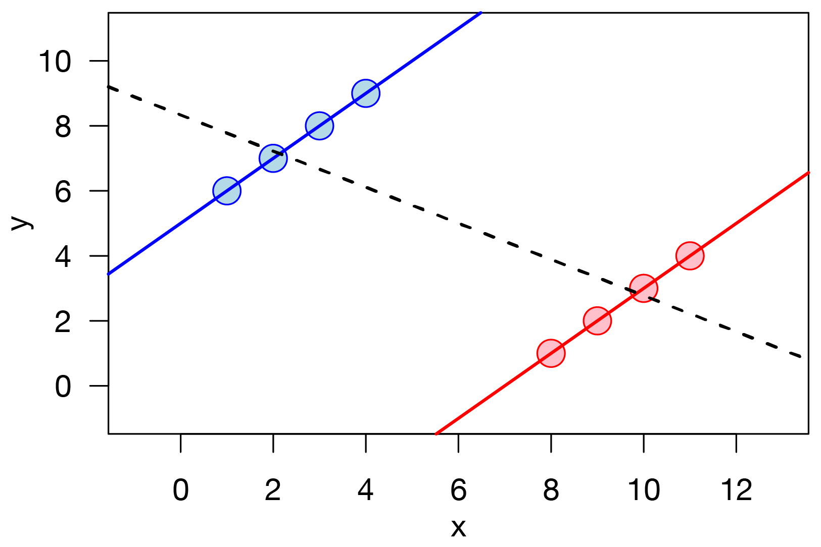
Simpson’s paradox occurs when the association between the predictor variable and outcome variable for the subgroups differ from the association when the subgroups are combined. Examples of Simpson’s paradox are depicted in Figures 13.5 and 12.1. In the example below, there is a positive association between the predictor variable and outcome variable for each group. However, when the groups are combined, there is a negative association between predictor variable and outcome variable. That is, the sign of an association can differ at different levels of analysis (e.g., group level versus person level).
Figure 12.1: An Example of Simpson’s Paradox. In this example, there is a positive association between x and y within each group (i.e., red or blue), but there is a negative association between x and y when the groups are combined. (Figure retrieved from https://en.wikipedia.org/wiki/File:Simpson%27s_paradox_continuous.svg)
Consider that we observe a between-person association between a predictor, for example, how much sports drink a player drinks and their performance, such that players who drink more sports drink before games tend to perform better during games. However, based on this association, if we draw the inference that sports drink consumption leads to better performance, this could be a faulty inference. It is possible that, at the within-person level, there is no association or even a negative association between sports drink consumption and performance. For helping to approximate causality, a much stronger test than relying on the between-person association would be to examine the association within the individual. That is, examining the association within the individual would examine: when a player consumes more sports drink, whether they perform better than when the same player consumes less sports drink. We describe within-person analyses to approximate causal inferences in Section 13.5.2.2.
In short, we often need to account for the groups or “levels” within which people are nested. When multiple observations are nested within the same upper-level unit, they are often correlated. That is, some variance is attributable to the lower-level unit (e.g., the player) and some variance is attributable to the upper-level unit (e.g., the team). It is important to evaluate how much variance is attributable to the upper-level unit. A way of evaluating how much variance is attributable to an upper-level unit is with the intraclass correlation coefficient (ICC). The ICC indicates the proportion of variance that is attributable to an upper-level unit, and it ranges from 0–1. The ICC can also be interpreted to reflect the correlation between scores for those observations that share an upper-level unit (e.g., the correlation of fantasy points across time within players). If substantial variance is attributable to the upper-level unit (i.e., there is a substantial ICC), it is important to account for the nested structure of the data. Mixed models are a useful approach to account for data with a nested structure so you can avoid committing the ecological fallacy.
12.2.3 Data Structure
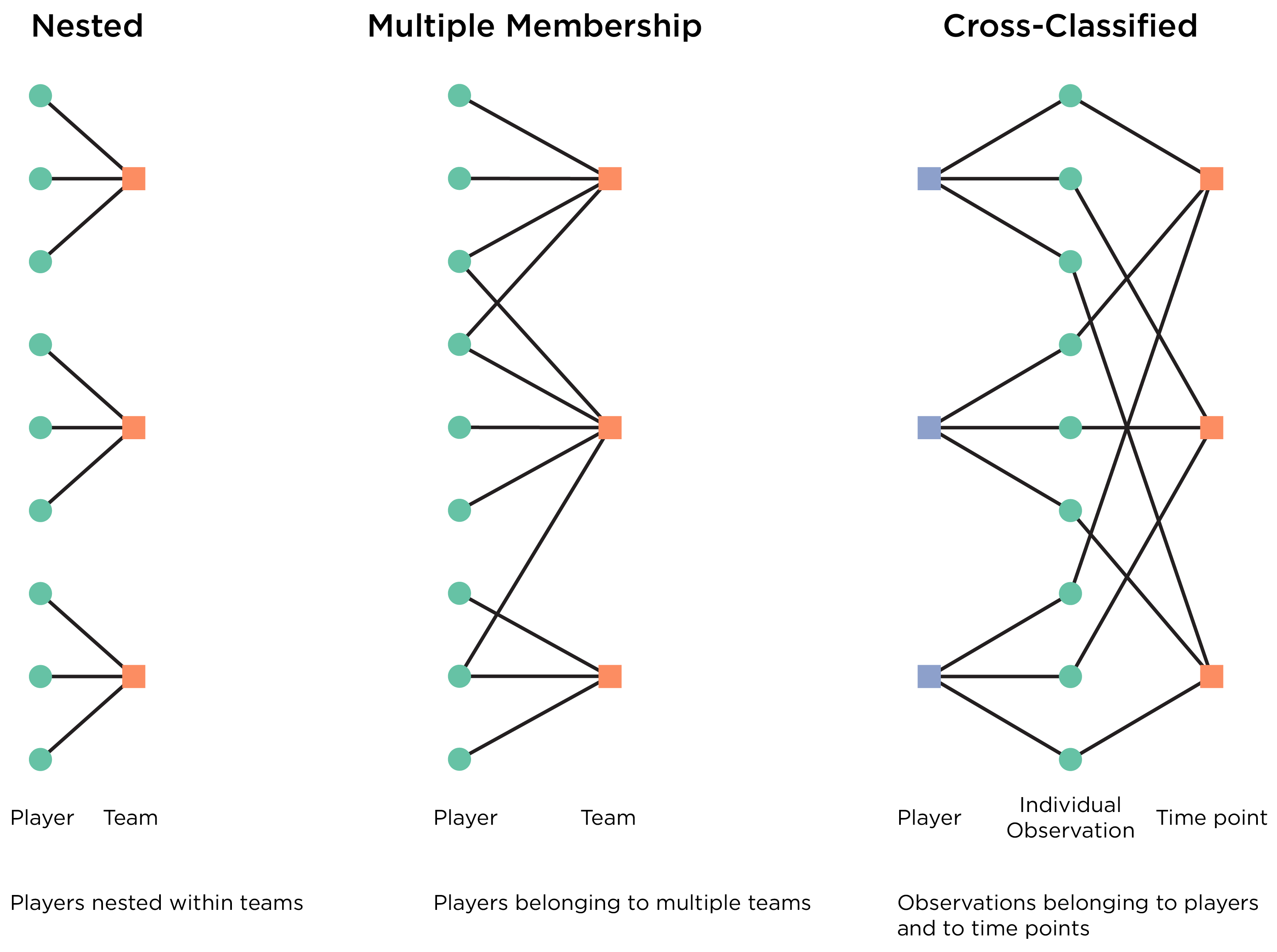
For fitting mixed models, the data should be in long form—each player (or unit of interest) should have multiple rows based on the grouping structure. The cluster variable is the variable or variables that represent the upper-level unit(s), within which the data are nested. When estimating mixed models, it is important to know the grouping structure of the data because the data structure influences the model syntax. Examples of data from nonindependent units include nested data, multiple membership data, and cross-classified data, as depicted in Figure 12.2.
Figure 12.2: Various Data Structures Involving Data from Nonindependent Units, Including Nested data, Multiple Membership Data, and Cross-Classified Data.
One example of nonindependent data is if your data are nested. When data are collected from multiple lower-level units (e.g., people) in an upper-level unit (e.g., married couple, family, classroom, school, neighborhood), and each lower-level unit belongs to one and only one higher-level unit, the data from the lower-level units are considered nested within the upper-level unit. For example, multiple participants in your sample may come from the same classroom. Data from multiple people can be nested within the same family, classroom, school, etc. Longitudinal data can also be considered nested data, in which time points are nested within the participant (i.e., the same participant provides an observation across multiple time points). And if you have multiple informants of a child’s behavior (e.g., parent-, teacher-, friend-, and self-report), the ratings could also be nested within the participant (i.e., there are ratings from multiple informants of the same child).
Another form of nonindependent data is when data involve multiple membership. Data involve multiple membership when the lower-level units belong to more than one upper-level unit. As an example of multiple membership, children may have more than one teacher, and therefore, in a modeling sense, children “belong” to more than one teacher cluster.
Another form of nonindependent data is when data are cross-classified (also called crossed). Data are cross-classified when the lower-level units are classified by two or more upper-level units, but the upper-level units are not hierarchical or nested within one another. For instance, children may be nested within the crossing of schools and neighborhoods. That is, children are nested within schools, and children are also nested within neighborhoods; however, children attending the same school may not necessarily be from the same neighborhood, and children from the same neighborhood may not necessarily attend the same school. The data would still have a two-level hierarchy, but the data would be nested in specific school-neighborhood combinations. That is, children are nested within the cross-classification of schools and neighborhoods. An example of cross-classified data in football is that players are nested within teams and within agents. Agents are not nested within teams, and teams are not nested within agents. That is, teams are nested within the cross-classification of teams and agents.
Applied to longitudinal fantasy football data, most simply, players’ longitudinal performance data would be modeled as nested data with a two-level model: timepoints nested within players, with the player’s ID as the cluster variable. However, you could get more complicated. For instance, you could estimate a three-level model of timepoints nested within players nested within teams. This would help account for players’ productivity benefitting or taking a hit from being on a given team, and it would account for players changing teams. Alternatively, consistent with Usami & Murayama (2018), you could estimate a cross-classified model of players’ individual observations/measurement occasions belonging to two upper-level units: players and time points (e.g., week 1, week 2, 2025 season, etc.). This would help account for systematic effects that are specific to a given timepoint (e.g., week or season).
When trying to determine what predictors to include and how complex of a model to fit, it can be helpful to compare a variety a models to determine how well they fit the data (i.e., how much variance they account for). To compare non-nested models, you can use fit criteria such as Akaike information criterion (AIC), which penalizes model complexity. If two models are nested, you can compare their model fit using a likelihood ratio test. Two models are considered nested if one model includes all of the terms of the original model along with additional terms. The simpler model is considered “nested within” the more complex model. In the likelihood ratio test, a significant difference indicates that the more complex model is significantly better fitting than the simpler model. If the likelihood ratio test is non-significant, it indicates that the more complex model is not significantly better fitting, and thus you should prefer the more parsimonious model.
12.4 Fantasy Points Per Season by Position, Age, and Experience
In this chapter, we use mixed models to demonstrate how to model trajectories (growth curves) of players’ fantasy points as a function of age. When estimating growth curve models, time points are nested within individuals (i.e., players). Mixed models provide a flexible framework for estimating growth curve models because they allow unequal time intervals between measurement occasions, time intervals that differ between individuals, and different numbers of observations for each individual (Brauer & Curtin, 2018).
One of the challenges when modeling players’ fantasy points as a function of age is that fantasy points are a function of both ability and opportunity. With age, the player’s ability and opportunity may both decline, but it is difficult to disentangle the extent to which a player’s decline is related to declines in ability versus opportunity. As players get older, they may be supplanted by younger, more talented players. With age, despite still having latent (unobserved) ability, players will get fewer and, eventually, no opportunity. And we do not know the counterfactual—how many fantasy points they would have scored had they been given the full opportunity each season. Thus, players may go from scoring 100+ points in a season to all of a sudden scoring way fewer points, with little in the way of intermediate steps. Thus, this should inform how you interpret the resulting trajectories. For instance, the steep declines can make it look like the model-implied fantasy points go well below zero at later ages, even though it is obviously not likely for players to obtain such a magnitude of negative fantasy points. The negative model-implied values of fantasy points at later ages are likely an artifact of the decreasing opportunity that players tend to get as they age. The crossover point, where the positive values becomes negative might indicate, for instance, that players at that age tend to have retired and thus have no opportunity. Regardless, the form/shape/steepness of the decline is still potentially meaningful even if the precise negative number at a given age is not.
Create a newdata object for generating the plots of model-implied fantasy points by age and position:
Code
pointsPerSeason_positionAge_newData <-expand.grid(positionFactor =factor(c("FB","QB","RB","TE","WR")), #,"K"age =seq(from =20, to =40, length.out =10000))pointsPerSeason_positionAge_newData$ageCentered20 <- pointsPerSeason_positionAge_newData$age -20pointsPerSeason_positionAge_newData$ageCentered20Quadratic <- pointsPerSeason_positionAge_newData$ageCentered20 ^2pointsPerSeason_positionAge_newData$years_of_experience <-floor(pointsPerSeason_positionAge_newData$age -22) # assuming that most players start at age 22 (i.e., rookie year) and thus have 1 year of experience at age 23pointsPerSeason_positionAge_newData$years_of_experience[which(pointsPerSeason_positionAge_newData$years_of_experience <0)] <-0
Create an object with complete cases for generating the plots of individuals’ model-implied fantasy points by age and position:
12.4.1 Scatterplots of Fantasy Points by Age and Position
Scatterplots are a helpful tool for quickly examining the association between two variables. However, scatterplots—as well as correlation and multiple regression—can hide meaningful associations that differ across units of analysis.
plot_scatterplotFantasyPointsByAgeQB <-ggplot(data = player_stats_seasonal_offense_subset %>%filter(position =="QB") %>%mutate(age =round(age, 2),fantasyPoints =round(fantasyPoints, 2) ),mapping =aes(x = age,y = fantasyPoints,color = player_id)) +geom_point(aes(text = player_display_name, # add player name for mouse over tooltiplabel = season # add season for mouse over tooltip )) +geom_smooth(mapping =aes(x = age,y = fantasyPoints),inherit.aes =FALSE ) +scale_color_viridis(discrete =TRUE) +labs(x ="Player Age (years)",y ="Fantasy Points (Season)",title ="Fantasy Points (Season) by Player Age: Quarterbacks" ) +theme_classic() +theme(legend.position ="none")plotly::ggplotly( plot_scatterplotFantasyPointsByAgeQB,tooltip =c("age","fantasyPoints","text","label"))
Figure 12.3: Scatterplot of Fantasy Points by Age for Quarterbacks.
Based on the scatterplot (and the bivariate association below), Quarterbacks’ fantasy points appear to (slightly) increase with age.
Code
cor.test(formula =~ age + fantasyPoints,data = player_stats_seasonal_offense_subset %>%filter(position =="QB"))
Pearson's product-moment correlation
data: age and fantasyPoints
t = 2.261, df = 2091, p-value = 0.02386
alternative hypothesis: true correlation is not equal to 0
95 percent confidence interval:
0.006553027 0.092036161
sample estimates:
cor
0.04938503
plot_scatterplotFantasyPointsByAgeTE <-ggplot(data = player_stats_seasonal_offense_subset %>%filter(position =="TE") %>%mutate(age =round(age, 2),fantasyPoints =round(fantasyPoints, 2) ),mapping =aes(x = age,y = fantasyPoints,color = player_id)) +geom_point(aes(text = player_display_name, # add player name for mouse over tooltiplabel = season # add season for mouse over tooltip )) +geom_smooth(mapping =aes(x = age,y = fantasyPoints),inherit.aes =FALSE ) +scale_color_viridis(discrete =TRUE) +labs(x ="Player Age (years)",y ="Fantasy Points (Season)",title ="Fantasy Points (Season) by Player Age: Tight Ends" ) +theme_classic() +theme(legend.position ="none")plotly::ggplotly( plot_scatterplotFantasyPointsByAgeTE,tooltip =c("age","fantasyPoints","text","label"))
Figure 12.7: Scatterplot of Fantasy Points by Age for Tight Ends.
Based on the scatterplot (and the bivariate association below), Tight Ends’ fantasy points appear to increase with age.
Code
cor.test(formula =~ age + fantasyPoints,data = player_stats_seasonal_offense_subset %>%filter(position =="TE"))
Pearson's product-moment correlation
data: age and fantasyPoints
t = 5.6517, df = 3139, p-value = 1.731e-08
alternative hypothesis: true correlation is not equal to 0
95 percent confidence interval:
0.06562156 0.13486568
sample estimates:
cor
0.1003652
12.4.2 Plots of Raw Trajectories of Fantasy Points By Age and Player
Scatterplots can be helpful for quickly visualizing the association between two variables. However, as mentioned earlier, scatterplots can hide the association between variables at different units of analysis. For instance, consider that we are trying to predict how a player will perform based on their age. We are interested not only in what the association is between age and fantasy points between players (i.e., a between-person association). We are also interested in what the association is between age and fantasy points within a given player (and within each player; i.e., a within-individual association). Arguably, the within-individual association between age and fantasy points is more relevant to the prediction of performance than the association between age and fantasy points between players. Assuming that the between-player association between age and fantasy points is the same as the within-player association when it is not is an example of the ecological fallacy.
Below, we depict players’ raw trajectories of fantasy points as a function of age. These are known as spaghetti plots. By examining the trajectory for each player, we can get a better understanding of how performance changes (within an individual) as a function of age.
12.4.2.1 Quarterbacks
A plot of Quarterbacks’ raw fantasy points data by age is in Figure 12.8.
Code
plot_rawFantasyPointsByAgeQB <-ggplot(data = player_stats_seasonal_offense_subset %>%filter(position =="QB") %>%mutate(age =round(age, 2),fantasyPoints =round(fantasyPoints, 2) ),mapping =aes(x = age,y = fantasyPoints,color = player_id)) +geom_line(aes(text = player_display_name, # add player name for mouse over tooltiplabel = season # add season for mouse over tooltip )) +scale_color_viridis(discrete =TRUE) +labs(x ="Player Age (years)",y ="Fantasy Points (Season)",title ="Fantasy Points (Season) by Player Age: Quarterbacks" ) +theme_classic() +theme(legend.position ="none")plotly::ggplotly( plot_rawFantasyPointsByAgeQB,tooltip =c("age","fantasyPoints","text","label"))
Figure 12.8: Plot of Raw Trajectories of Fantasy Points by Age for Quarterbacks.
12.4.2.2 Fullbacks
A plot of Fullbacks’ raw fantasy points data by age is in Figure 12.9.
Code
plot_rawFantasyPointsByAgeFB <-ggplot(data = player_stats_seasonal_offense_subset %>%filter(position =="FB") %>%mutate(age =round(age, 2),fantasyPoints =round(fantasyPoints, 2) ),mapping =aes(x = age,y = fantasyPoints,color = player_id)) +geom_line(aes(text = player_display_name, # add player name for mouse over tooltiplabel = season # add season for mouse over tooltip )) +scale_color_viridis(discrete =TRUE) +labs(x ="Player Age (years)",y ="Fantasy Points (Season)",title ="Fantasy Points (Season) by Player Age: Fullbacks" ) +theme_classic() +theme(legend.position ="none")plotly::ggplotly( plot_rawFantasyPointsByAgeFB,tooltip =c("age","fantasyPoints","text","label"))
Figure 12.9: Plot of Raw Trajectories of Fantasy Points by Age for Fullbacks.
12.4.2.3 Running Backs
A plot of Running Backs’ raw fantasy points data by age is in Figure 12.10.
Code
plot_rawFantasyPointsByAgeRB <-ggplot(data = player_stats_seasonal_offense_subset %>%filter(position =="RB") %>%mutate(age =round(age, 2),fantasyPoints =round(fantasyPoints, 2) ),mapping =aes(x = age,y = fantasyPoints,color = player_id)) +geom_line(aes(text = player_display_name, # add player name for mouse over tooltiplabel = season # add season for mouse over tooltip )) +scale_color_viridis(discrete =TRUE) +labs(x ="Player Age (years)",y ="Fantasy Points (Season)",title ="Fantasy Points (Season) by Player Age: Running Backs" ) +theme_classic() +theme(legend.position ="none")plotly::ggplotly( plot_rawFantasyPointsByAgeRB,tooltip =c("age","fantasyPoints","text","label"))
Figure 12.10: Plot of Raw Trajectories of Fantasy Points by Age for Running Backs.
12.4.2.4 Wide Receivers
A plot of Wide Receivers’ raw fantasy points data by age is in Figure 12.11.
Code
plot_rawFantasyPointsByAgeWR <-ggplot(data = player_stats_seasonal_offense_subset %>%filter(position =="WR") %>%mutate(age =round(age, 2),fantasyPoints =round(fantasyPoints, 2) ),mapping =aes(x = age,y = fantasyPoints,color = player_id)) +geom_line(aes(text = player_display_name, # add player name for mouse over tooltiplabel = season # add season for mouse over tooltip )) +scale_color_viridis(discrete =TRUE) +labs(x ="Player Age (years)",y ="Fantasy Points (Season)",title ="Fantasy Points (Season) by Player Age: Wide Receivers" ) +theme_classic() +theme(legend.position ="none")plotly::ggplotly( plot_rawFantasyPointsByAgeWR,tooltip =c("age","fantasyPoints","text","label"))
Figure 12.11: Plot of Raw Trajectories of Fantasy Points by Age for Wide Receivers.
12.4.2.5 Tight Ends
A plot of Tight Ends’ raw fantasy points data by age is in Figure 12.12.
Code
plot_rawFantasyPointsByAgeTE <-ggplot(data = player_stats_seasonal_offense_subset %>%filter(position =="TE") %>%mutate(age =round(age, 2),fantasyPoints =round(fantasyPoints, 2) ),mapping =aes(x = age,y = fantasyPoints,color = player_id)) +geom_line(aes(text = player_display_name, # add player name for mouse over tooltiplabel = season # add season for mouse over tooltip )) +scale_color_viridis(discrete =TRUE) +labs(x ="Player Age (years)",y ="Fantasy Points (Season)",title ="Fantasy Points (Season) by Player Age: Tight Ends" ) +theme_classic() +theme(legend.position ="none")plotly::ggplotly( plot_rawFantasyPointsByAgeTE,tooltip =c("age","fantasyPoints","text","label"))
Figure 12.12: Plot of Raw Trajectories of Fantasy Points by Age for Tight Ends.
12.4.3 Linear Regression Models
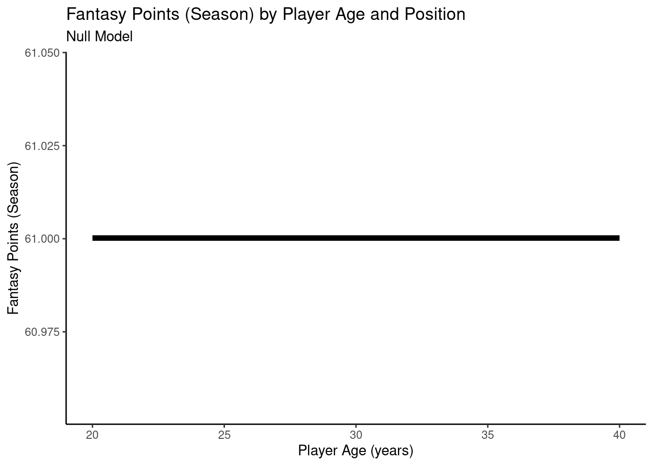
12.4.3.1 Null Model
We can estimate model fit using the MuMIn package (Bartoń, 2024):
By accounting for which player each observation comes from using mixed models, we can examine the association between age and fantasy points in a more meaningful way, without violating the assumption in multiple regression that the observations are independent (i.e., that the residuals are uncorrelated).
The marginal \(R^2\) is the proportion of variance in the outcome variable that is accounted for by the fixed effects in the model, whereas the conditional \(R^2\) is the proportion of variance in the outcome variable that is accounted for by the fixed and random effects in the model.
Figure 12.16: Plot of Model-Implied Trajectories of Fantasy Points by Age in Random Intercepts Mixed Model.
A plot of individuals’ model-implied trajectories of fantasy points by age from the mixed model with random intercepts is in Figure 12.17.
Code
player_stats_seasonal_offense_subsetCC$fantasyPoints_randomIntercepts <-predict(object = pointsPerSeason_randomIntercepts,newdata = player_stats_seasonal_offense_subsetCC)plot_individualFantasyPointsRandomIntercepts <-ggplot(data = player_stats_seasonal_offense_subsetCC %>%mutate(age =round(age, 2),fantasyPoints_randomIntercepts =round(fantasyPoints_randomIntercepts, 2) ),mapping =aes(x = age,y = fantasyPoints_randomIntercepts,group = player_id)) +geom_line(aes(x = age,y = fantasyPoints_randomIntercepts,text = player_display_name, # add player name for mouse over tooltiplabel = season # add season for mouse over tooltip ),linewidth =0.5,color ="black") +geom_line(mapping =aes(x = age,y = fantasyPoints_randomIntercepts ),data = pointsPerSeason_positionAge_newData %>%mutate(age =round(age, 2),fantasyPoints =round(fantasyPoints_randomIntercepts, 2) ),inherit.aes =FALSE,se =TRUE,color ="#3366FF",linewidth =2 ) +labs(x ="Player Age (years)",y ="Fantasy Points (Season)",title ="Fantasy Points (Season) by Player Age and Position: Random Intercepts Model",#color = "Position" ) +theme_classic()plotly::ggplotly( plot_individualFantasyPointsRandomIntercepts,tooltip =c("age","fantasyPoints_randomIntercepts","text","label"))
Figure 12.17: Plot of Individuals’ Implied Trajectories of Fantasy Points by Age, from a Mixed Model with Random Intercepts. Overlaid with the Model-Implied Trajectory.
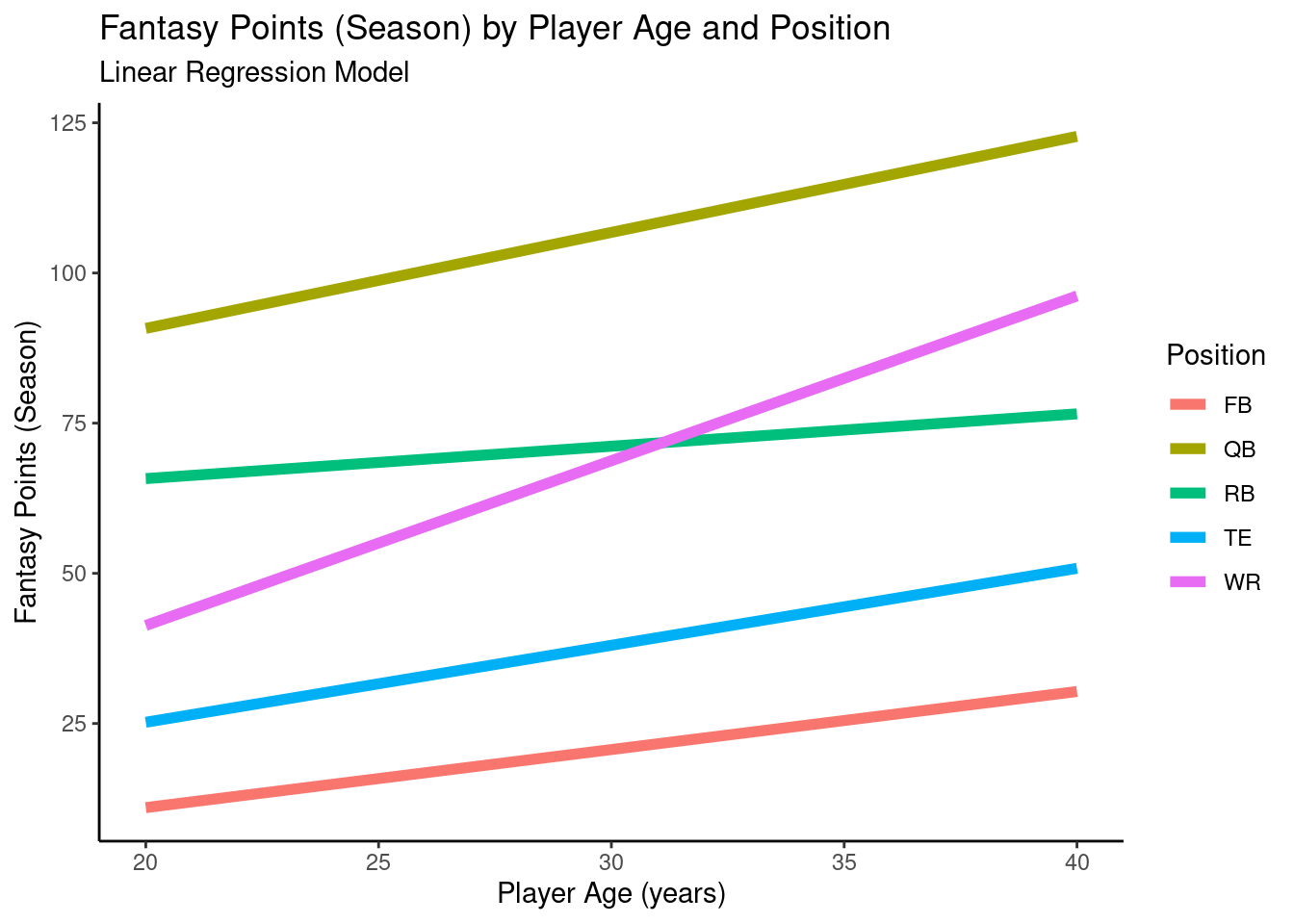
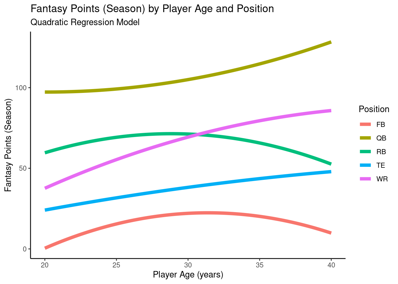
12.4.4.2 Random Intercepts Model with Position as Fixed-Effect Predictor
A plot of the model-implied trajectories of fantasy points by age and position from the mixed model with random intercepts and a fixed effect of position is in Figure 12.18.
Code
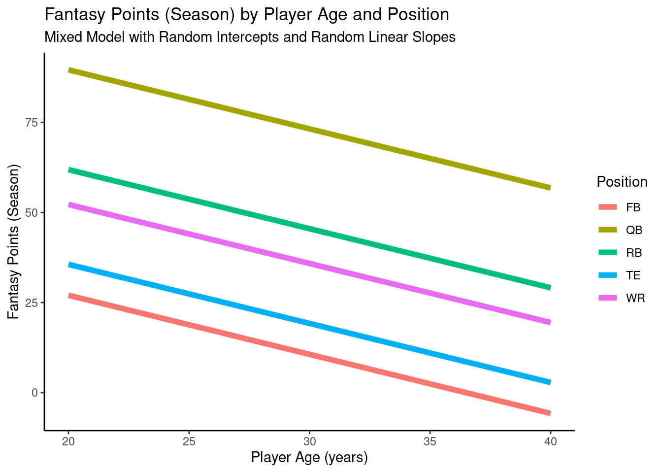
pointsPerSeason_positionAge_newData$fantasyPoints_position <-predict(object = pointsPerSeason_position,newdata = pointsPerSeason_positionAge_newData,re.form =NA)ggplot2::ggplot(data = pointsPerSeason_positionAge_newData,mapping =aes(x = age,y = fantasyPoints_position,color = positionFactor )) +geom_line(linewidth =2) +labs(x ="Player Age (years)",y ="Fantasy Points (Season)",title ="Fantasy Points (Season) by Player Age and Position",subtitle ="Random Intercepts Model With Position as Fixed-Effect Predictor",color ="Position" ) +theme_classic()
Figure 12.18: Plot of Model-Implied Trajectories of Fantasy Points by Age in Random Intercepts Mixed Model With Position as a Fixed-Effect Predictor.
A plot of individuals’ model-implied trajectories of fantasy points by age and position from the mixed model with random intercepts and a fixed effect of position is in Figure 12.19.
Code
player_stats_seasonal_offense_subsetCC$fantasyPoints_position <-predict(object = pointsPerSeason_position,newdata = player_stats_seasonal_offense_subsetCC)plot_individualFantasyPointsPosition <-ggplot(data = player_stats_seasonal_offense_subsetCC %>%mutate(age =round(age, 2),fantasyPoints_position =round(fantasyPoints_position, 2) ),mapping =aes(x = age,y = fantasyPoints_position,color = positionFactor,group = player_id)) +geom_line(aes(x = age,y = fantasyPoints_position,text = player_display_name, # add player name for mouse over tooltiplabel = season # add season for mouse over tooltip ),linewidth =0.5) +geom_line(mapping =aes(x = age,y = fantasyPoints_position,color = positionFactor ),data = pointsPerSeason_positionAge_newData %>%mutate(age =round(age, 2),fantasyPoints_position =round(fantasyPoints_position, 2) ),inherit.aes =FALSE,se =TRUE,linewidth =2 ) +labs(x ="Player Age (years)",y ="Fantasy Points (Season)",title ="Fantasy Points (Season) by Player Age and Position:\nRandom Intercepts Model With Position As Predictor",color ="Position" ) +theme_classic()plotly::ggplotly( plot_individualFantasyPointsPosition,tooltip =c("age","fantasyPoints_position","text","label"))
Figure 12.19: Plot of Individuals’ Implied Trajectories of Fantasy Points by Age, from a Mixed Model With Random Intercepts and a Fixed-Effect of Position. Overlaid with the Model-Implied Trajectory by Position.
12.4.4.3 Identify the Best-Fitting Functional Form of Age
12.4.4.3.1 Linear Models
12.4.4.3.1.1 Random Intercepts, Fixed Linear Slopes
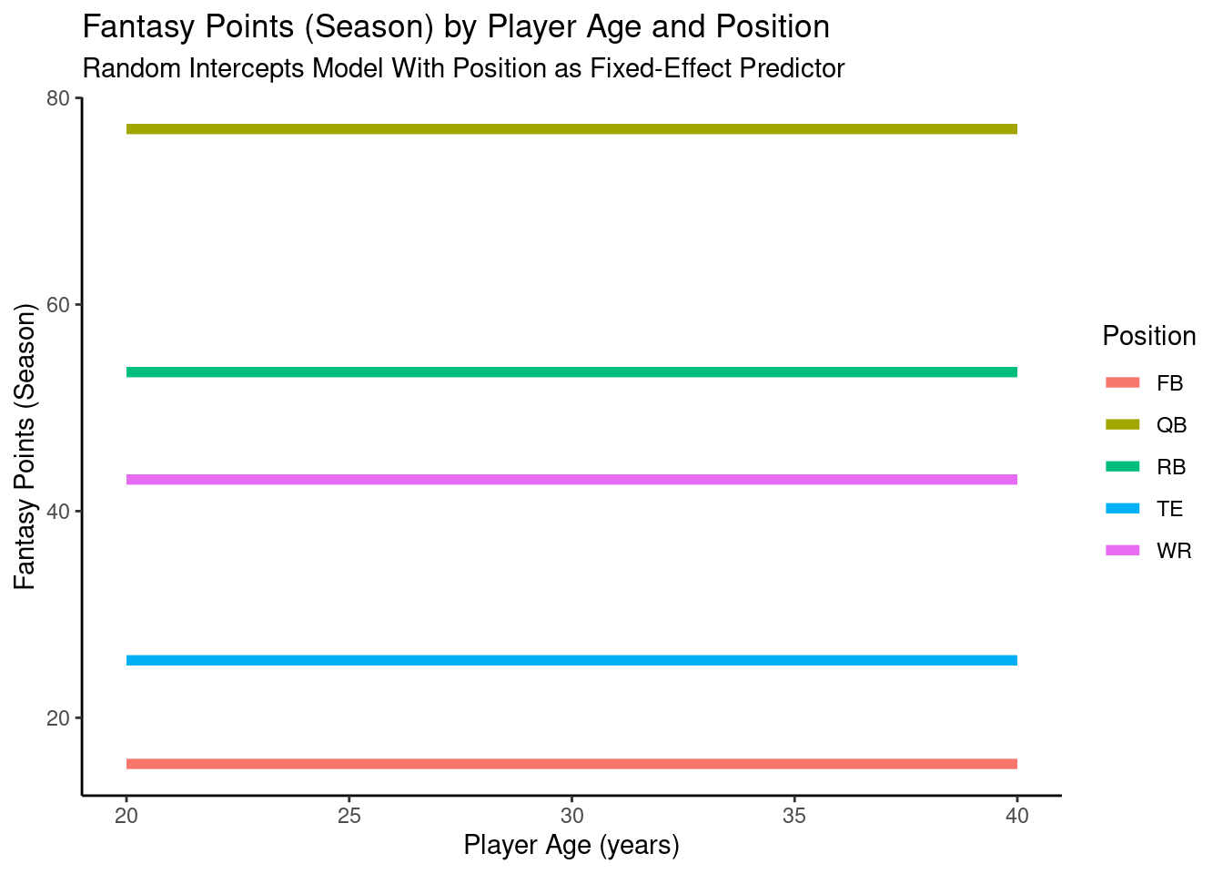
A plot of the model-implied trajectories of fantasy points by age and position from the mixed model with random intercepts and fixed linear slopes is in Figure 12.20.
Code
pointsPerSeason_positionAge_newData$fantasyPoints_fixedLinearSlopes <-predict(object = pointsPerSeason_positionAgeFixedLinearSlopes,newdata = pointsPerSeason_positionAge_newData,re.form =NA)ggplot2::ggplot(data = pointsPerSeason_positionAge_newData,mapping =aes(x = age,y = fantasyPoints_fixedLinearSlopes,color = positionFactor )) +geom_line(linewidth =2) +labs(x ="Player Age (years)",y ="Fantasy Points (Season)",title ="Fantasy Points (Season) by Player Age and Position",subtitle ="Mixed Model with Random Intercepts and Fixed Linear Slopes",color ="Position" ) +theme_classic()
Figure 12.20: Plot of Model-Implied Trajectories of Fantasy Points by Age and Position in Mixed Model With Random Intercepts and Fixed Linear Slopes.
A plot of individuals model-implied trajectories of fantasy points by age and position from the mixed model with random intercepts and fixed linear slopes is in Figure 12.21.
Code
player_stats_seasonal_offense_subsetCC$fantasyPoints_fixedLinearSlopes <-predict(object = pointsPerSeason_positionAgeFixedLinearSlopes,newdata = player_stats_seasonal_offense_subsetCC)plot_individualFantasyPointsFixedLinearSlopes <-ggplot(data = player_stats_seasonal_offense_subsetCC %>%mutate(age =round(age, 2),fantasyPoints_fixedLinearSlopes =round(fantasyPoints_fixedLinearSlopes, 2) ),mapping =aes(x = age,y = fantasyPoints_fixedLinearSlopes,color = positionFactor,group = player_id)) +geom_line(aes(x = age,y = fantasyPoints_fixedLinearSlopes,text = player_display_name, # add player name for mouse over tooltiplabel = season # add season for mouse over tooltip ),linewidth =0.5) +geom_line(mapping =aes(x = age,y = fantasyPoints_fixedLinearSlopes,color = positionFactor ),data = pointsPerSeason_positionAge_newData,inherit.aes =FALSE,se =TRUE,linewidth =2 ) +labs(x ="Player Age (years)",y ="Fantasy Points (Season)",title ="Fantasy Points (Season) by Player Age and Position:\nModel With Random Intercepts and Fixed Slopes",color ="Position" ) +theme_classic()plotly::ggplotly( plot_individualFantasyPointsFixedLinearSlopes,tooltip =c("age","fantasyPoints_fixedLinearSlopes","text","label"))
Figure 12.21: Plot of Individuals’ Implied Trajectories of Fantasy Points by Age and Position, from a Mixed Model With Random Intercepts and Fixed Slopes. Overlaid with the Model-Implied Trajectory by Position.
12.4.4.3.1.2 Random Intercepts, Random Linear Slopes
A plot of the model-implied trajectories of fantasy points by age and position from the mixed model with random intercepts and random linear slopes is in Figure 12.22.
Code
pointsPerSeason_positionAge_newData$fantasyPoints_randomLinearSlopes <-predict(object = pointsPerSeason_positionAgeRandomLinearSlopes,newdata = pointsPerSeason_positionAge_newData,re.form =NA)ggplot2::ggplot(data = pointsPerSeason_positionAge_newData,mapping =aes(x = age,y = fantasyPoints_randomLinearSlopes,color = positionFactor )) +geom_line(linewidth =2) +labs(x ="Player Age (years)",y ="Fantasy Points (Season)",title ="Fantasy Points (Season) by Player Age and Position",subtitle ="Mixed Model with Random Intercepts and Random Linear Slopes",color ="Position" ) +theme_classic()
Figure 12.22: Plot of Model-Implied Trajectories of Fantasy Points by Age and Position in Mixed Model With Random Intercepts and Random Linear Slopes.
A plot of individuals’ model-implied trajectories of fantasy points by age and position from the mixed model with random intercepts and random linear slopes is in Figure 12.22.
Code
player_stats_seasonal_offense_subsetCC$fantasyPoints_randomLinearSlopes <-predict(object = pointsPerSeason_positionAgeRandomLinearSlopes,newdata = player_stats_seasonal_offense_subsetCC)plot_individualFantasyPointsRandomLinearSlopes <-ggplot(data = player_stats_seasonal_offense_subsetCC %>%mutate(age =round(age, 2),fantasyPoints_randomLinearSlopes =round(fantasyPoints_randomLinearSlopes, 2) ),mapping =aes(x = age,y = fantasyPoints_randomLinearSlopes,color = positionFactor,group = player_id)) +geom_line(aes(x = age,y = fantasyPoints_randomLinearSlopes,text = player_display_name, # add player name for mouse over tooltiplabel = season # add season for mouse over tooltip ),linewidth =0.5) +geom_line(mapping =aes(x = age,y = fantasyPoints_randomLinearSlopes,color = positionFactor ),data = pointsPerSeason_positionAge_newData %>%mutate(age =round(age, 2),fantasyPoints_randomLinearSlopes =round(fantasyPoints_randomLinearSlopes, 2) ),inherit.aes =FALSE,se =TRUE,linewidth =2 ) +labs(x ="Player Age (years)",y ="Fantasy Points (Season)",title ="Fantasy Points (Season) by Player Age and Position:\nModel With Random Intercepts and Random Linear Slopes",color ="Position" ) +theme_classic()plotly::ggplotly( plot_individualFantasyPointsRandomLinearSlopes,tooltip =c("age","fantasyPoints_randomLinearSlopes","text","label"))
Figure 12.23: Plot of Individuals’ Implied Trajectories of Fantasy Points by Age and Position, from a Mixed Model With Random Intercepts and Random Linear Slopes. Overlaid with the Model-Implied Trajectory by Position.
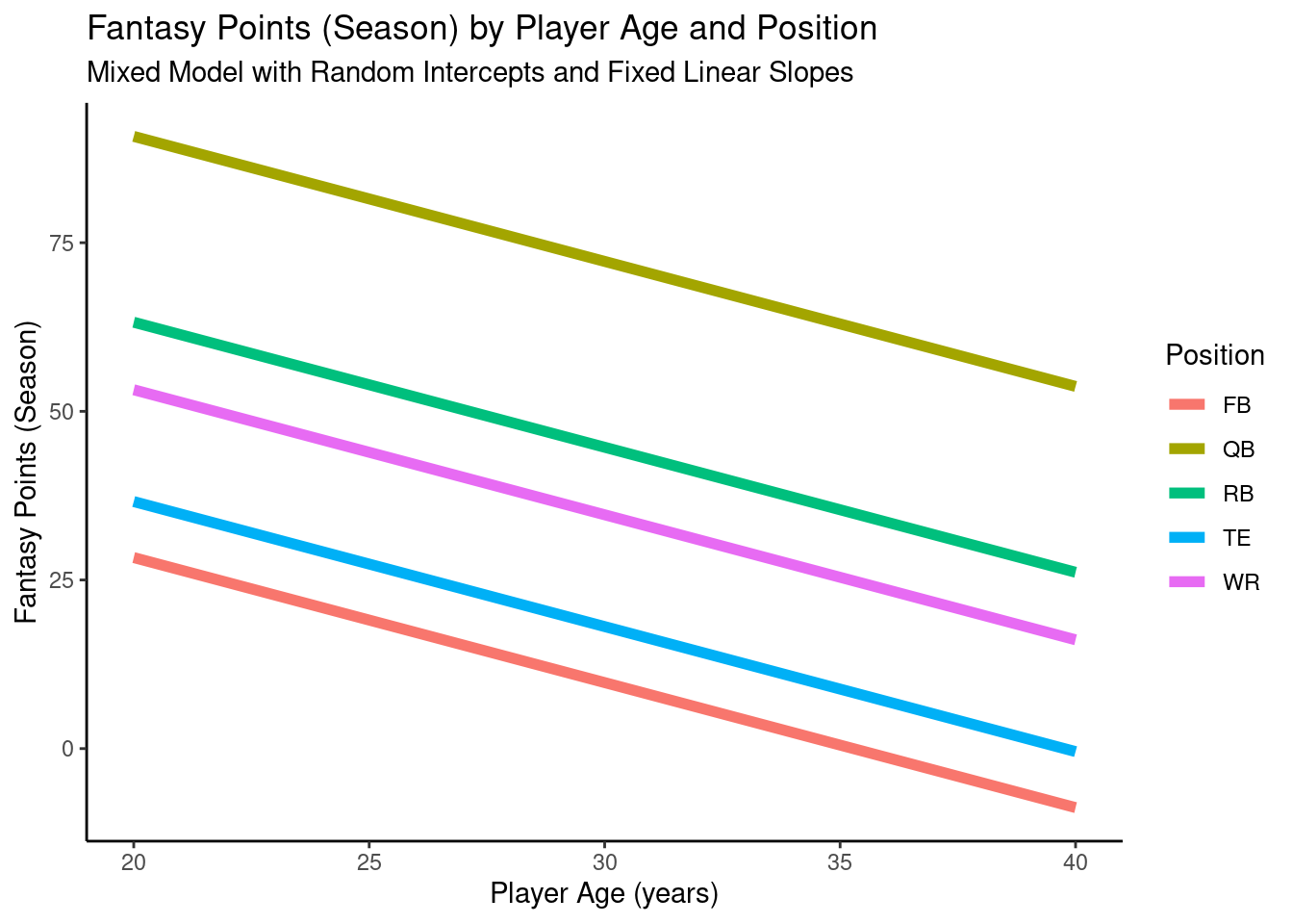
12.4.4.3.2 Quadratic Models
12.4.4.3.2.1 Random Intercepts, Random Linear Slopes, Fixed Quadratic Slopes
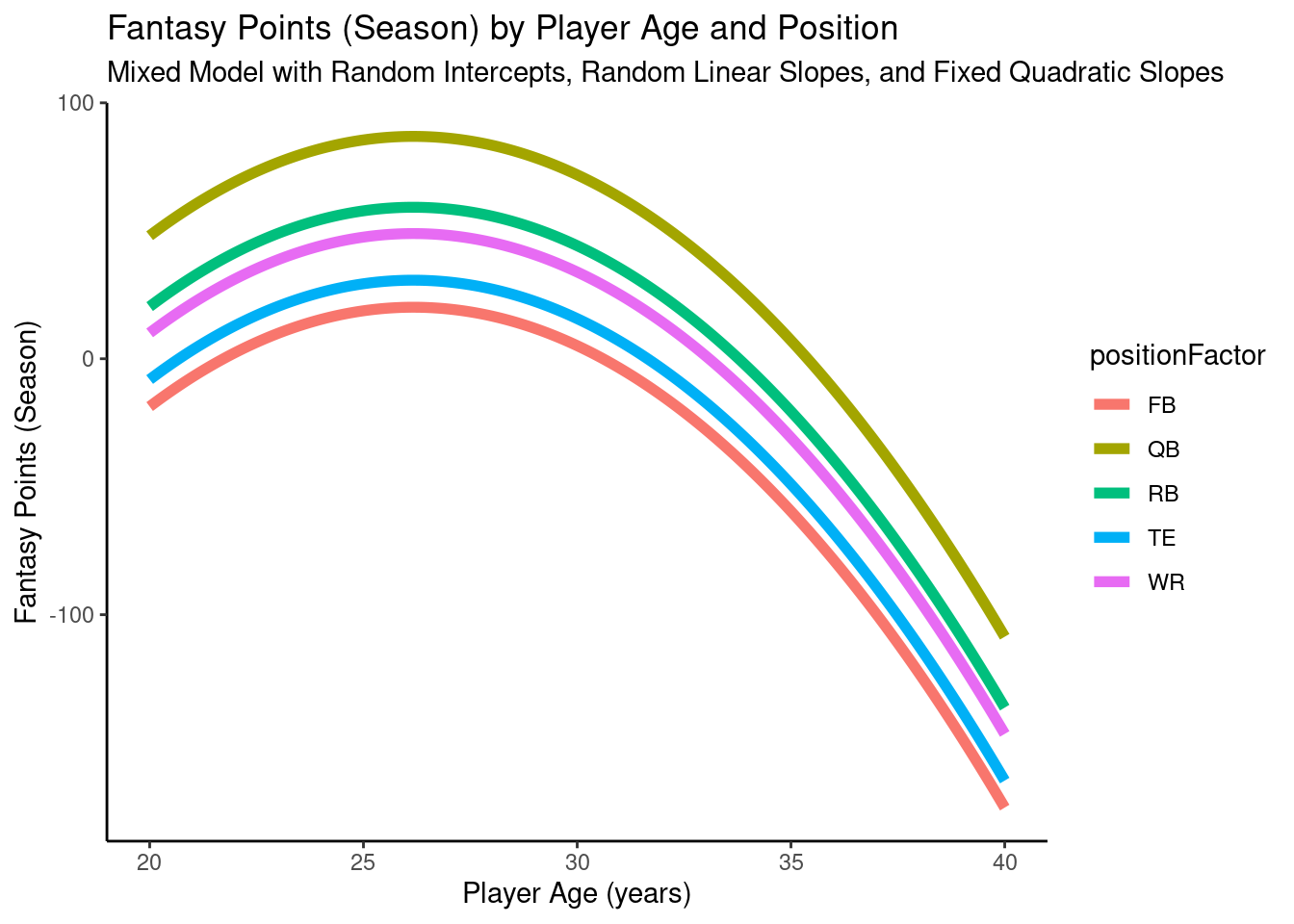
A plot of the model-implied trajectories of fantasy points by age and position from the mixed model with random intercepts, random linear slopes, and fixed quadratic slopes is in Figure 12.24.
Code
pointsPerSeason_positionAge_newData$fantasyPoints_randomLinearFixedQuadraticSlopes <-predict(object = pointsPerSeason_positionAgeRandomLinearFixedQuadraticSlopes,newdata = pointsPerSeason_positionAge_newData,re.form =NA)ggplot2::ggplot(data = pointsPerSeason_positionAge_newData,mapping =aes(x = age,y = fantasyPoints_randomLinearFixedQuadraticSlopes,color = positionFactor )) +geom_line(linewidth =2) +labs(x ="Player Age (years)",y ="Fantasy Points (Season)",title ="Fantasy Points (Season) by Player Age and Position",subtitle ="Mixed Model with Random Intercepts, Random Linear Slopes, and Fixed Quadratic Slopes",color ="Position" ) +theme_classic()
Figure 12.24: Plot of Model-Implied Trajectories of Fantasy Points by Age and Position in Mixed Model With Random Intercepts, Random Linear Slopes, and Fixed Quadratic Slopes.
A plot of individuals’ model-implied trajectories of fantasy points by age and position from the mixed model with random intercepts, random linear slopes, and fixed quadratic slopes is in Figure 12.25.
Code
player_stats_seasonal_offense_subsetCC$fantasyPoints_randomLinearFixedQuadraticSlopes <-predict(object = pointsPerSeason_positionAgeRandomLinearFixedQuadraticSlopes,newdata = player_stats_seasonal_offense_subsetCC)plot_individualFantasyPointsRandomLinearFixedQuadracticSlopes <-ggplot(data = player_stats_seasonal_offense_subsetCC %>%mutate(age =round(age, 2),fantasyPoints_randomLinearFixedQuadraticSlopes =round(fantasyPoints_randomLinearFixedQuadraticSlopes, 2) ),mapping =aes(x = age,y = fantasyPoints_randomLinearFixedQuadraticSlopes,color = positionFactor,group = player_id)) +geom_line(aes(x = age,y = fantasyPoints_randomLinearFixedQuadraticSlopes,text = player_display_name, # add player name for mouse over tooltiplabel = season # add season for mouse over tooltip ),se =FALSE,linewidth =0.5) +geom_line(mapping =aes(x = age,y = fantasyPoints_randomLinearFixedQuadraticSlopes,color = positionFactor ),data = pointsPerSeason_positionAge_newData %>%mutate(age =round(age, 2),fantasyPoints_randomLinearFixedQuadraticSlopes =round(fantasyPoints_randomLinearFixedQuadraticSlopes, 2) ),inherit.aes =FALSE,se =TRUE,linewidth =2 ) +labs(x ="Player Age (years)",y ="Fantasy Points (Season)",title ="Fantasy Points (Season) by Player Age and Position:\nModel With Random Intercepts, Random Linear Slopes, and\nFixed Quadratic Slopes",color ="Position" ) +theme_classic()plotly::ggplotly( plot_individualFantasyPointsRandomLinearFixedQuadracticSlopes,tooltip =c("age","fantasyPoints_randomLinearFixedQuadraticSlopes","text","label"))
Figure 12.25: Plot of Individuals’ Implied Trajectories of Fantasy Points by Age and Position, from a Mixed Model With Random Intercepts, Random Linear Slopes, and Fixed Quadratic Slopes. Overlaid with the Model-Implied Trajectory by Position.
12.4.4.3.2.2 Random Intercepts, Random Linear Slopes, Random Quadratic Slopes
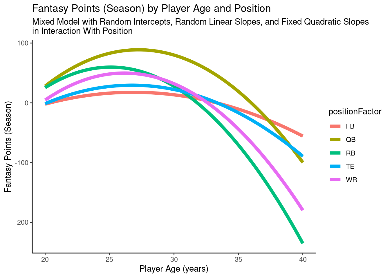
A plot of the model-implied trajectories of fantasy points by age and position from the mixed model with random intercepts, random linear slopes, and fixed quadratic slopes in interaction with position is in Figure 12.26.
Code
pointsPerSeason_positionAge_newData$fantasyPoints_randomLinearFixedQuadraticSlopesInteraction <-predict(object = pointsPerSeason_positionAgeRandomLinearFixedQuadraticSlopesInteraction,newdata = pointsPerSeason_positionAge_newData,re.form =NA)ggplot2::ggplot(data = pointsPerSeason_positionAge_newData,mapping =aes(x = age,y = fantasyPoints_randomLinearFixedQuadraticSlopesInteraction,color = positionFactor )) +geom_line(linewidth =2) +labs(x ="Player Age (years)",y ="Fantasy Points (Season)",title ="Fantasy Points (Season) by Player Age and Position",subtitle ="Mixed Model with Random Intercepts, Random Linear Slopes, and Fixed Quadratic Slopes\nin Interaction With Position",color ="Position" ) +theme_classic()
Figure 12.26: Plot of Model-Implied Trajectories of Fantasy Points by Age and Position in Mixed Model With Random Intercepts, Random Linear Slopes, and Fixed Quadratic Slopes in Interaction With Position.
A plot of individuals’ model-implied trajectories of fantasy points by age and position from the mixed model with random intercepts, random linear slopes, and fixed quadratic slopes in interaction with position is in Figure 12.27.
Code
player_stats_seasonal_offense_subsetCC$fantasyPoints_randomLinearFixedQuadraticSlopesInteraction <-predict(object = pointsPerSeason_positionAgeRandomLinearFixedQuadraticSlopesInteraction,newdata = player_stats_seasonal_offense_subsetCC)plot_individualFantasyPointsRandomLinearFixedQuadraticSlopesInteraction <-ggplot(data = player_stats_seasonal_offense_subsetCC %>%mutate(age =round(age, 2),fantasyPoints_randomLinearFixedQuadraticSlopesInteraction =round(fantasyPoints_randomLinearFixedQuadraticSlopesInteraction, 2) ),mapping =aes(x = age,y = fantasyPoints_randomLinearFixedQuadraticSlopesInteraction,color = positionFactor,group = player_id)) +geom_line(aes(x = age,y = fantasyPoints_randomLinearFixedQuadraticSlopesInteraction,text = player_display_name, # add player name for mouse over tooltiplabel = season # add season for mouse over tooltip ),linewidth =0.5) +geom_line(mapping =aes(x = age,y = fantasyPoints_randomLinearFixedQuadraticSlopesInteraction,color = positionFactor ),data = pointsPerSeason_positionAge_newData %>%mutate(age =round(age, 2),fantasyPoints_randomLinearFixedQuadraticSlopesInteraction =round(fantasyPoints_randomLinearFixedQuadraticSlopesInteraction, 2) ),inherit.aes =FALSE,se =TRUE,linewidth =2 ) +labs(x ="Player Age (years)",y ="Fantasy Points (Season)",title ="Fantasy Points (Season) by Player Age and Position:\nModel With Random Intercepts, Random Linear Slopes, and\nFixed Quadratic Slopes in Interaction With Position",color ="Position" ) +theme_classic()plotly::ggplotly( plot_individualFantasyPointsRandomLinearFixedQuadraticSlopesInteraction,tooltip =c("age","fantasyPoints_randomLinearFixedQuadraticSlopesInteraction","text","label"))
Figure 12.27: Plot of Individuals’ Implied Trajectories of Fantasy Points by Age and Position, from a Mixed Model With Random Intercepts, Random Linear Slopes, and Fixed Quadratic Slopes in Interaction With Position. Overlaid with the Model-Implied Trajectory by Position.
12.4.4.3.2.4 Adding Fixed-Effect Predictor of Experience
After fitting several models, we now must compare their fit to determine which model fits “best” while also considering parsimony. Parsimonious models are more likely to be true and more likely to generalize to other samples, because more complex models are more likely to overfit the data. Thus, more complex models will almost always fit better than simpler models. Thus, we are not just interested in whether a more complex model fits better than the simpler model; we also care about whether the more complex model fits significantly better than the simpler model given its additional complexity. For evaluating and comparing models, we examine the likelihood ratio test, the Akaike Information Criterion (AIC), the corrected AIC (AICc), the Bayesian Information Criterion (BIC), \(R^2\), deviance, and log likelihood.
The BIC penalizes model complexity more than the AIC does. The BIC is preferable when there is a “true” model, and one intends to identify the true model. The AIC is preferable when we are concerned more about predictive accuracy and when overfitting is less of a concern. Because we are more concerned about predictive accuracy and we do not believe one of these models is the “true” model per se of age-related changes in fantasy performance, we will give more weight to AIC than BIC.
Below, we specify various groups of models for the model fit comparisons:
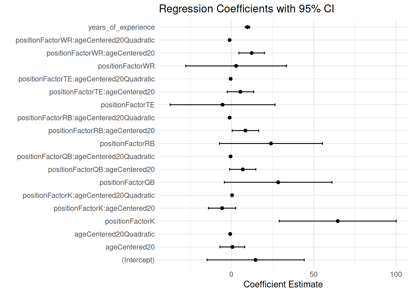
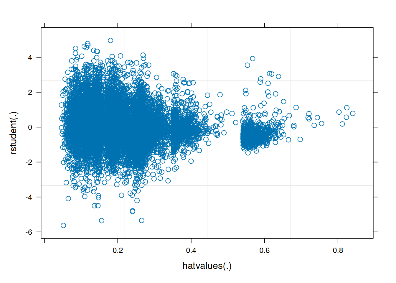
As with multiple regression, multicollinearity is also a potential concern for mixed models. Here are the variance inflation factors (VIFs) from an earlier model (VIF is described in Section 11.11):
Figure 12.28: Regression Coefficients with 95% Confidence Interval from a Mixed Model With Random Intercepts, Random Linear Slopes, and Fixed Quadratic Slopes in Interaction With Position. Overlaid with the Model-Implied Trajectory by Position.
We fit a generalized additive model using the mgcv::bam() function of the mgcv package (Wood, 2017, 2025).
Code
pointsPerSeason_gam <- mgcv::bam( # using bam() instead of gam() for faster estimation due to large size of data fantasyPoints ~ positionFactor +s(ageCentered20, by = positionFactor) + years_of_experience +s(player_idFactor, ageCentered20, bs ="re"),data = player_stats_seasonal_offense_subset,nthreads = num_cores)
#AICcmodavg::bictab(linearMixedModelsVsGAM) # throws error (can't mix bam with lmer)#bbmle::AICctab(linearMixedModelsVsGAM) # different numbers of observationssummary(pointsPerSeason_nullModel)$r.squared
pointsPerSeasonDepth_gam <-bam( # using bam() instead of gam() for faster estimation due to large size of data fantasyPoints ~ positionFactor +s(ageCentered20, by = positionFactor) + years_of_experience +s(player_idFactor, ageCentered20, bs ="re"),data = player_stats_seasonal_offense_subsetDepth,nthreads = num_cores)
Note: the following code that runs the model takes a while. If you just want to save time and load the model object instead of running the model, you can load the model object (which has already been fit) using this code:
Code
load(url("https://osf.io/download/q6rjf/"))
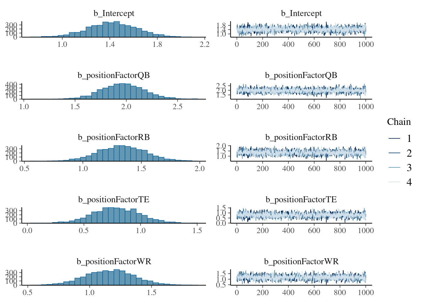
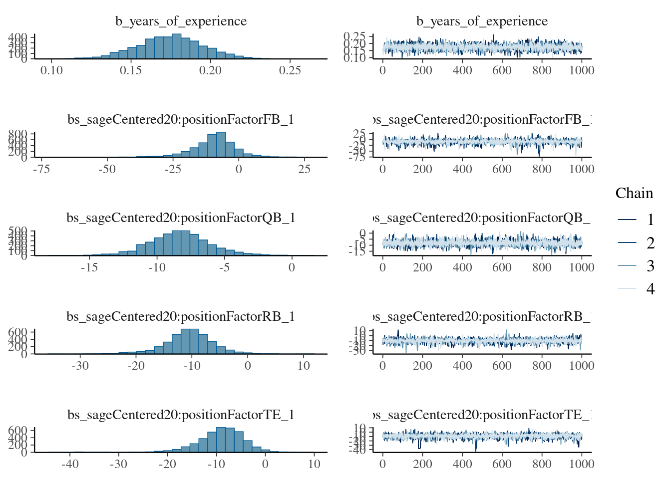
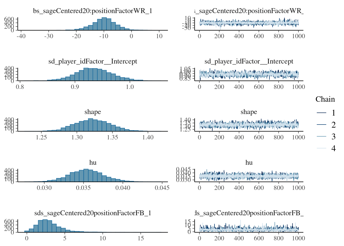
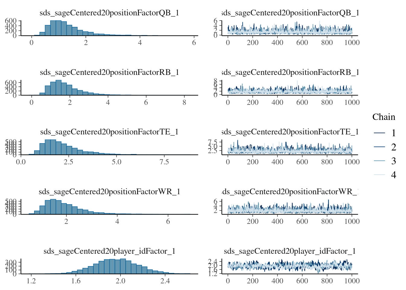
We use the cmdstanr backend (Gabry et al., 2024) and threading using the parellely package (Bengtsson, 2025) for parallel (faster) processing:
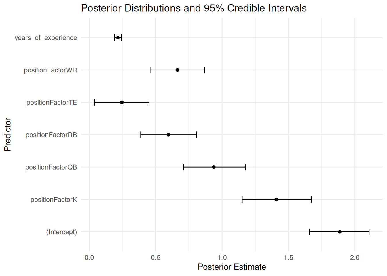
Figure 12.48: Regression Coefficients with 95% Credible Interval from Bayesian Mixed Model.
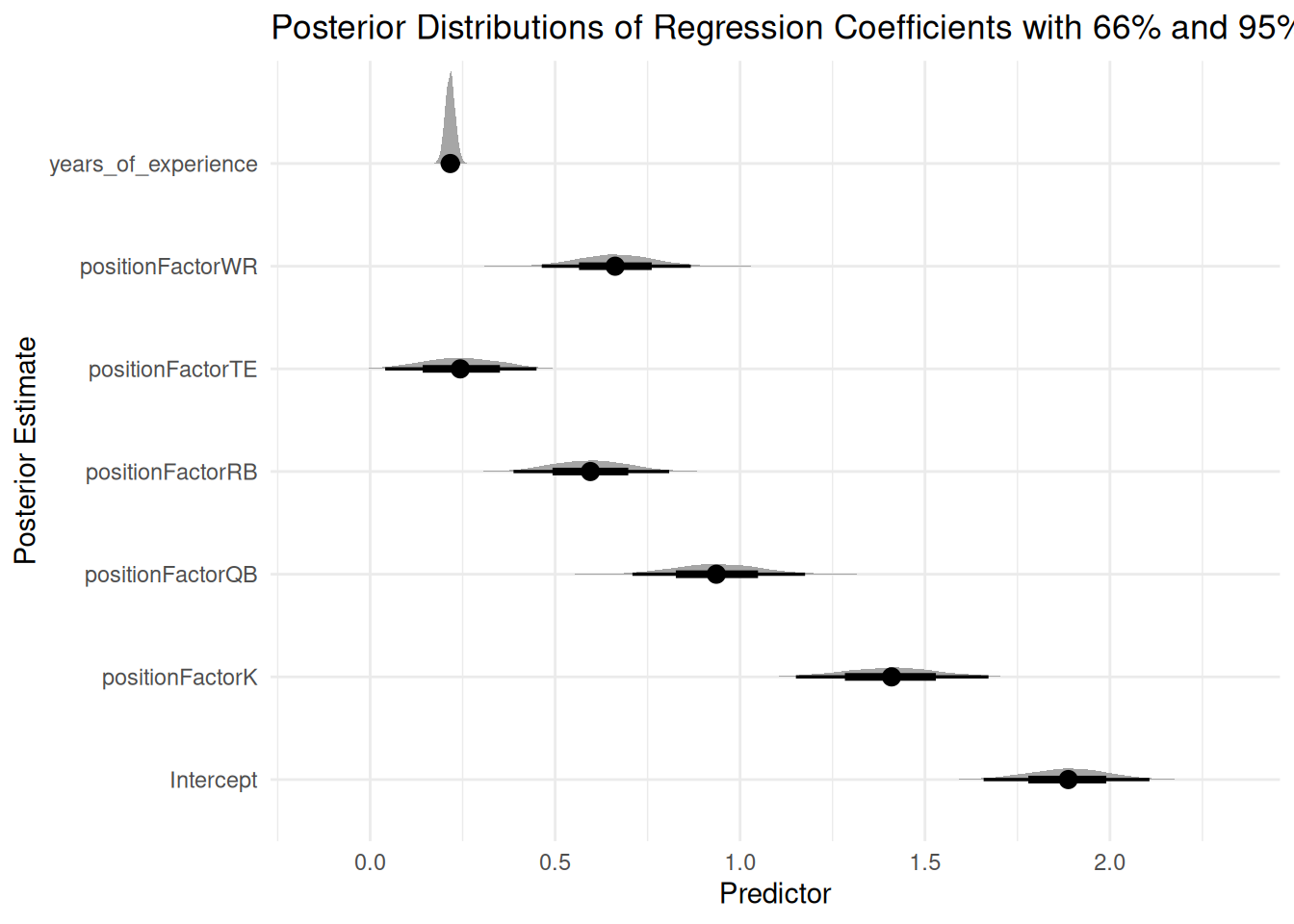
To visualize the distribution of regression coefficients, we can use the tidybayes package (Kay, 2024), as in Figure 12.49.
Code
bayesianMixedModelFit %>% tidybayes::tidy_draws() %>%select(starts_with("b_")) %>%pivot_longer(everything(),names_to ="term",values_to ="estimate") %>%mutate(term =sub("^b_", "", term)) %>%ggplot(aes(x = estimate,y = term)) +stat_halfeye() +# by default, .width shows the 66% (thick line) and 95% (thin line) credible intervalslabs(title ="Posterior Distributions of Regression Coefficients\nwith 66% and 95% Credible Intervals",x ="Predictor",y ="Posterior Estimate") +theme_minimal()
Figure 12.49: Distributions of Regression Coefficients with 66% (Thick Line) and 95% (Thin Line) Credible Intervals from Bayesian Mixed Model.
12.4.6 Plots of Model-Implied Fantasy Points by Position and Age
Code
# From Quadratic Model: All PlayerspointsPerSeason_positionAge_newData$fantasyPoints_quadratic <-predict(object = pointsPerSeason_positionAgeRandomLinearFixedQuadraticSlopesInteractionExperience,newdata = pointsPerSeason_positionAge_newData,re.form =NA)# From Quadratic Model: Players at Top of End-of-Season Depth ChartpointsPerSeason_positionAge_newData$fantasyPoints_depthQuadratic <-predict(object = pointsPerSeason_positionAgeRandomLinearFixedQuadraticSlopesInteractionExperience,newdata = pointsPerSeason_positionAge_newData,re.form =NA)# From GAM Model: All PlayerspointsPerSeason_positionAge_newData$fantasyPoints_gam <-predict(object = pointsPerSeason_gam,newdata = pointsPerSeason_positionAge_newData,newdata.guaranteed =TRUE,exclude ="s(player_idFactor,ageCentered20)")# From GAM Model: Players at Top of End-of-Season Depth ChartpointsPerSeason_positionAge_newData$fantasyPoints_depthGAM <-predict(object = pointsPerSeasonDepth_gam,newdata = pointsPerSeason_positionAge_newData,newdata.guaranteed =TRUE,exclude ="s(player_idFactor,ageCentered20)")
Code
# From Bayesian Model: All Playersmodel_levels <-levels(bayesianMixedModelFit$data$player_idFactor)pointsPerSeason_positionAge_newData$player_idFactor <-factor(rep(model_levels[1], nrow(pointsPerSeason_positionAge_newData)), levels = model_levels)
Plots of model-implied fantasy points by position and age are in Figures 12.50–12.54.
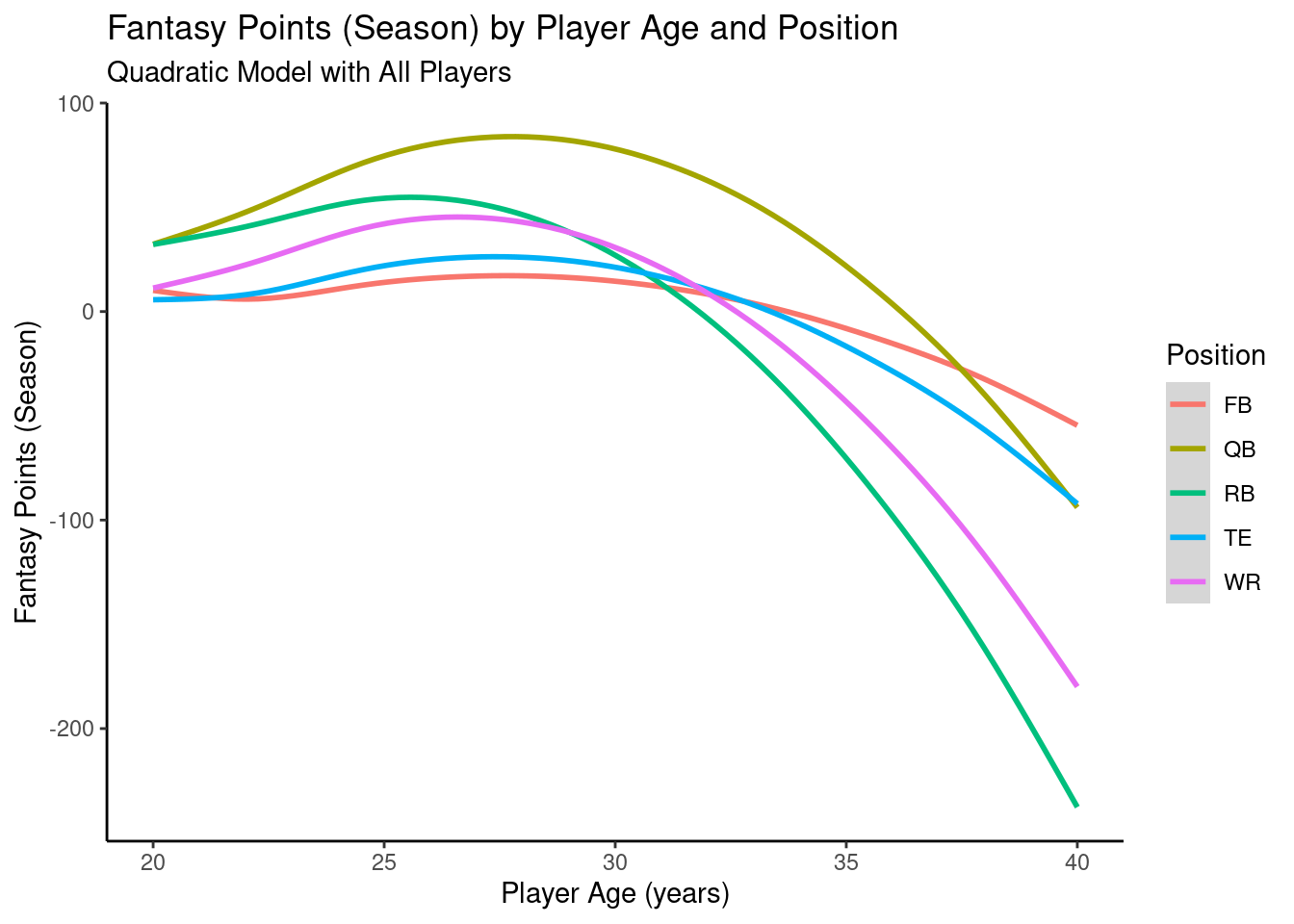
12.4.6.1 Quadratic Model
Code
ggplot2::ggplot(data = pointsPerSeason_positionAge_newData,mapping =aes(x = age,y = fantasyPoints_quadratic,color = positionFactor )) +geom_smooth() +labs(x ="Player Age (years)",y ="Fantasy Points (Season)",title ="Fantasy Points (Season) by Player Age and Position",subtitle ="Quadratic Model with All Players",color ="Position" ) +theme_classic() +guides(color =guide_legend(override.aes =list(fill =NA))) # transparent legend background
Figure 12.50: Plot of Model-Implied Quadratic Trajectories of Fantasy Points by Age.
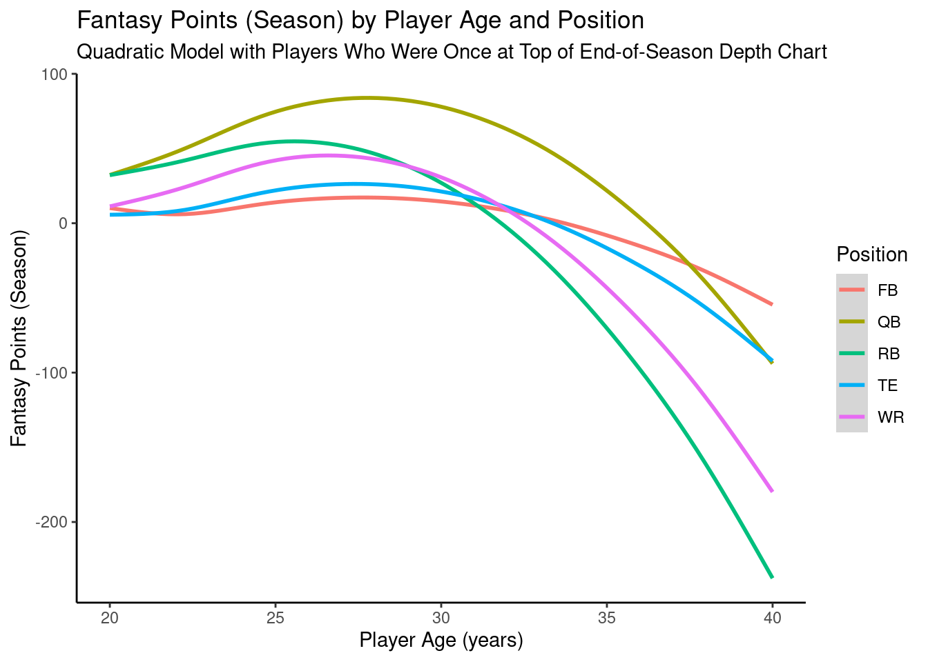
12.4.6.2 Quadratic Model: Top of Depth Chart
Code
ggplot2::ggplot(data = pointsPerSeason_positionAge_newData,mapping =aes(x = age,y = fantasyPoints_depthQuadratic,color = positionFactor )) +geom_smooth() +labs(x ="Player Age (years)",y ="Fantasy Points (Season)",title ="Fantasy Points (Season) by Player Age and Position",subtitle ="Quadratic Model with Players Who Were Once at Top of End-of-Season Depth Chart",color ="Position" ) +theme_classic() +guides(color =guide_legend(override.aes =list(fill =NA))) # transparent legend background
Figure 12.51: Plot of Model-Implied Quadratic Trajectories of Fantasy Points by Age For Players Who Were Once at the Top of the End-of-Season Depth Chart.
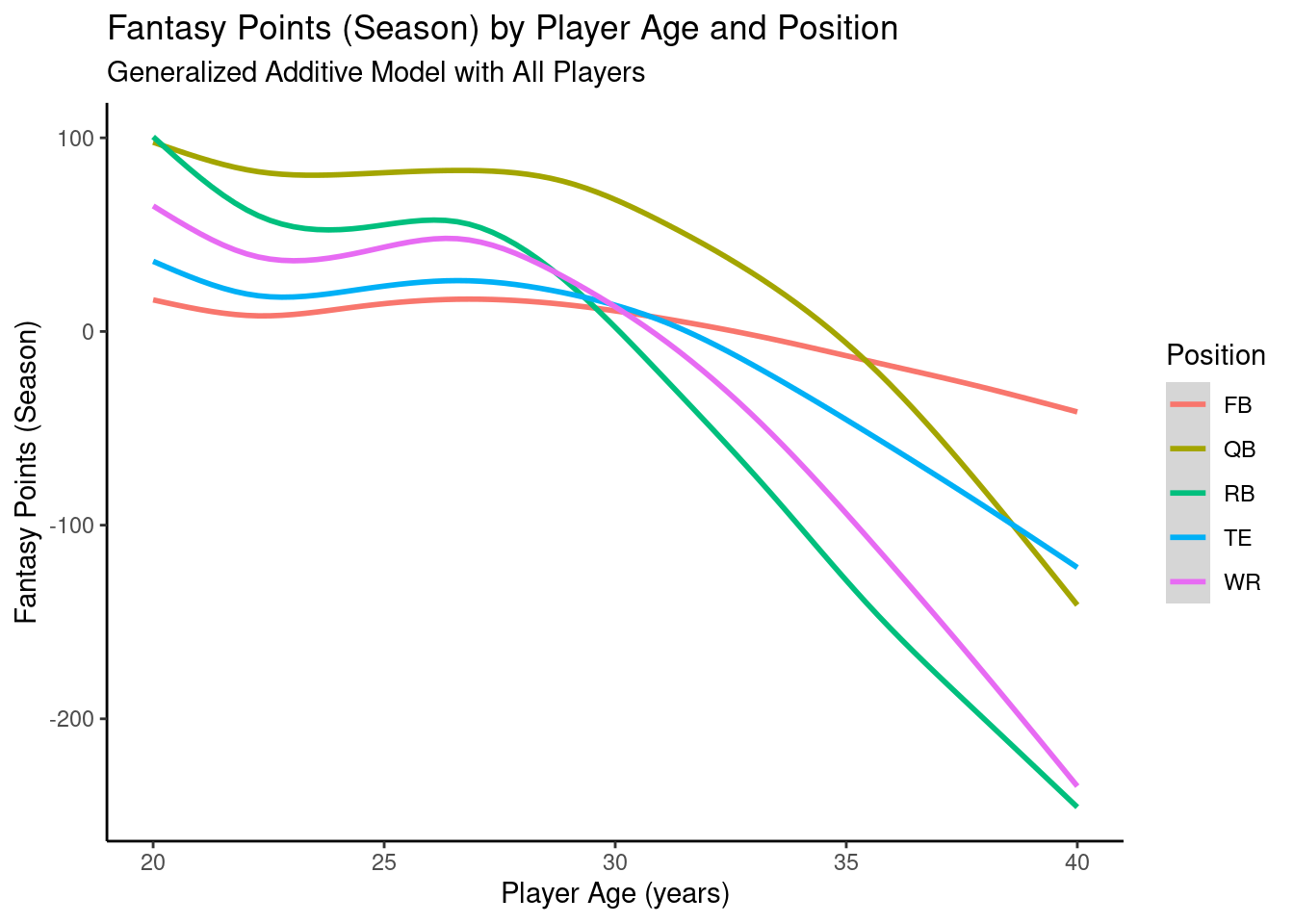
12.4.6.3 Generalized Additive Model
Code
ggplot2::ggplot(data = pointsPerSeason_positionAge_newData,mapping =aes(x = age,y = fantasyPoints_gam,color = positionFactor )) +geom_smooth() +labs(x ="Player Age (years)",y ="Fantasy Points (Season)",title ="Fantasy Points (Season) by Player Age and Position",subtitle ="Generalized Additive Model with All Players",color ="Position" ) +theme_classic() +guides(color =guide_legend(override.aes =list(fill =NA))) # transparent legend background
Figure 12.52: Plot of Implied Trajectories of Fantasy Points by Age from a Generalized Additive Model.
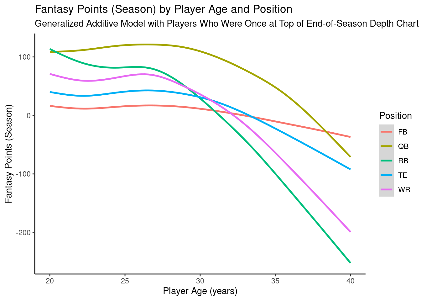
12.4.6.4 Generalized Additive Model: Top of Depth Chart
Code
ggplot2::ggplot(data = pointsPerSeason_positionAge_newData,mapping =aes(x = age,y = fantasyPoints_depthGAM,color = positionFactor )) +geom_smooth() +labs(x ="Player Age (years)",y ="Fantasy Points (Season)",title ="Fantasy Points (Season) by Player Age and Position",subtitle ="Generalized Additive Model with Players Who Were Once at Top of End-of-Season Depth Chart",color ="Position" ) +theme_classic() +guides(color =guide_legend(override.aes =list(fill =NA))) # transparent legend background
Figure 12.53: Plot of Implied Trajectories of Fantasy Points by Age, from a Generalized Additive Model, For Players Who Were Once at the Top of the End-of-Season Depth Chart.
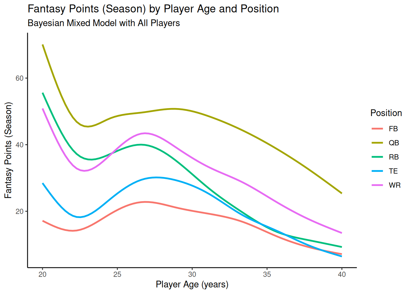
12.4.6.5 Bayesian Mixed Model
Code
ggplot2::ggplot(data = pointsPerSeason_positionAge_newData,mapping =aes(x = age,y = fantasyPoints_bayesian,color = positionFactor )) +geom_smooth() +labs(x ="Player Age (years)",y ="Fantasy Points (Season)",title ="Fantasy Points (Season) by Player Age and Position",subtitle ="Bayesian Mixed Model with All Players",color ="Position" ) +theme_classic() +guides(color =guide_legend(override.aes =list(fill =NA))) # transparent legend background
Figure 12.54: Plot of Implied Trajectories of Fantasy Points by Age from a Bayesian Mixed Model.
12.4.7 Plots of Individuals’ Model-Implied Fantasy Points by Age
We provide plots of individuals’ model-implied fantasy points by age from the Bayesian mixed model in Section 25.5.4.
A plot of Quarterbacks’ model-implied fantasy points by age is in Figure 12.55. The model-implied peak of Quarterbacks’ fantasy points is at age 20. The model-predicted value of zero fantasy points for Quarterbacks is at age 35.
Code
plot_individualFantasyPointsByAgeQB <-ggplot(data = player_stats_seasonal_offense_subsetCC %>%filter(position =="QB"),mapping =aes(x = age,y = fantasyPoints_gam,group = player_id)) +geom_smooth(aes(x = age,y = fantasyPoints_gam,text = player_display_name, # add player name for mouse over tooltiplabel = season # add season for mouse over tooltip ),se =FALSE,linewidth =0.5,color ="black") +geom_smooth(mapping =aes(x = age,y = fantasyPoints_gam ),data = pointsPerSeason_positionAge_newData %>%filter(positionFactor =="QB"),inherit.aes =FALSE,se =TRUE,linewidth =2 ) +geom_point(aes(x = age,y = fantasyPoints_gam,text = player_display_name, # add player name for mouse over tooltiplabel = season # add season for mouse over tooltip ),size =1,color ="transparent"# make points invisible but keep tooltips ) +labs(x ="Player Age (years)",y ="Fantasy Points (Season)",title ="Fantasy Points (Season) by Player Age: Quarterbacks" ) +theme_classic()plotly::ggplotly( plot_individualFantasyPointsByAgeQB,tooltip =c("age","fantasyPoints_gam","text","label"))
Figure 12.55: Plot of Individuals’ Implied Trajectories of Fantasy Points by Age, from a Generalized Additive Model, for Quarterbacks. Overlaid with the Model-Implied Trajectory for Quarterbacks in Blue.
12.4.7.2 Fullbacks
A plot of Fullbacks’ model-implied fantasy points by age is in Figure 12.56. The model-implied peak of Fullbacks’ fantasy points is at age 27. The model-predicted value of zero fantasy points for Fullbacks is at age 34.
Code
plot_individualFantasyPointsByAgeFB <-ggplot(data = player_stats_seasonal_offense_subsetCC %>%filter(position =="FB"),mapping =aes(x = age,y = fantasyPoints_gam,group = player_id)) +geom_smooth(aes(x = age,y = fantasyPoints_gam,text = player_display_name, # add player name for mouse over tooltiplabel = season # add season for mouse over tooltip ),se =FALSE,linewidth =0.5,color ="black") +geom_smooth(mapping =aes(x = age,y = fantasyPoints_gam ),data = pointsPerSeason_positionAge_newData %>%filter(positionFactor =="FB"),inherit.aes =FALSE,se =TRUE,linewidth =2 ) +geom_point(aes(x = age,y = fantasyPoints_gam,text = player_display_name, # add player name for mouse over tooltiplabel = season # add season for mouse over tooltip ),size =1,color ="transparent"# make points invisible but keep tooltips ) +labs(x ="Player Age (years)",y ="Fantasy Points (Season)",title ="Fantasy Points (Season) by Player Age: Fullbacks" ) +theme_classic()plotly::ggplotly( plot_individualFantasyPointsByAgeFB,tooltip =c("age","fantasyPoints_gam","text","label"))
Figure 12.56: Plot of Individuals’ Implied Trajectories of Fantasy Points by Age, from a Generalized Additive Model, for Fullbacks. Overlaid with the Model-Implied Trajectory for Fullbacks in Blue.
12.4.7.3 Running Backs
A plot of Running Backs’ model-implied fantasy points by age is in Figure 12.57. The model-implied peak of Running Backs’ fantasy points is at age 20. The model-predicted value of zero fantasy points for Running Backs is at age 30.
Code
plot_individualFantasyPointsByAgeRB <-ggplot(data = player_stats_seasonal_offense_subsetCC %>%filter(position =="RB"),mapping =aes(x = age,y = fantasyPoints_gam,group = player_id)) +geom_smooth(aes(x = age,y = fantasyPoints_gam,text = player_display_name, # add player name for mouse over tooltiplabel = season # add season for mouse over tooltip ),se =FALSE,linewidth =0.5,color ="black") +geom_smooth(mapping =aes(x = age,y = fantasyPoints_gam ),data = pointsPerSeason_positionAge_newData %>%filter(positionFactor =="RB"),inherit.aes =FALSE,se =TRUE,linewidth =2 ) +geom_point(aes(x = age,y = fantasyPoints_gam,text = player_display_name, # add player name for mouse over tooltiplabel = season # add season for mouse over tooltip ),size =1,color ="transparent"# make points invisible but keep tooltips ) +labs(x ="Player Age (years)",y ="Fantasy Points (Season)",title ="Fantasy Points (Season) by Player Age: Running Backs" ) +theme_classic()plotly::ggplotly( plot_individualFantasyPointsByAgeRB,tooltip =c("age","fantasyPoints_gam","text","label"))
Figure 12.57: Plot of Individuals’ Implied Trajectories of Fantasy Points by Age, from a Generalized Additive Model, for Running Backs. Overlaid with the Model-Implied Trajectory for Running Backs in Blue.
12.4.7.4 Wide Receivers
A plot of Wide Receivers’ model-implied fantasy points by age is in Figure 12.58. The model-implied peaks of Wide Receivers’ fantasy points are at ages 20 and 26. The model-predicted value of zero fantasy points for Wide Receivers is at age 31.
Code
plot_individualFantasyPointsByAgeWR <-ggplot(data = player_stats_seasonal_offense_subsetCC %>%filter(position =="WR"),mapping =aes(x = age,y = fantasyPoints_gam,group = player_id)) +geom_smooth(aes(x = age,y = fantasyPoints_gam,text = player_display_name, # add player name for mouse over tooltiplabel = season # add season for mouse over tooltip ),se =FALSE,linewidth =0.5,color ="black") +geom_smooth(mapping =aes(x = age,y = fantasyPoints_gam ),data = pointsPerSeason_positionAge_newData %>%filter(positionFactor =="WR"),inherit.aes =FALSE,se =TRUE,linewidth =2 ) +geom_point(aes(x = age,y = fantasyPoints_gam,text = player_display_name, # add player name for mouse over tooltiplabel = season # add season for mouse over tooltip ),size =1,color ="transparent"# make points invisible but keep tooltips ) +labs(x ="Player Age (years)",y ="Fantasy Points (Season)",title ="Fantasy Points (Season) by Player Age: Wide Receivers" ) +theme_classic()plotly::ggplotly( plot_individualFantasyPointsByAgeWR,tooltip =c("age","fantasyPoints_gam","text","label"))
Figure 12.58: Plot of Individuals’ Implied Trajectories of Fantasy Points by Age, from a Generalized Additive Model, for Wide Receivers. Overlaid with the Model-Implied Trajectory for Wide Receivers in Blue.
12.4.7.5 Tight Ends
A plot of Tight Ends’ model-implied fantasy points by age is in Figure 12.59. The model-implied peak of Tight Ends’ fantasy points is at age 20. The model-predicted value of zero fantasy points for Tight Ends is at age 32.
Code
plot_individualFantasyPointsByAgeTE <-ggplot(data = player_stats_seasonal_offense_subsetCC %>%filter(position =="TE"),mapping =aes(x = age,y = fantasyPoints_gam,group = player_id)) +geom_smooth(aes(x = age,y = fantasyPoints_gam,text = player_display_name, # add player name for mouse over tooltiplabel = season # add season for mouse over tooltip ),se =FALSE,linewidth =0.5,color ="black") +geom_smooth(mapping =aes(x = age,y = fantasyPoints_gam ),data = pointsPerSeason_positionAge_newData %>%filter(positionFactor =="TE"),inherit.aes =FALSE,se =TRUE,linewidth =2 ) +geom_point(aes(x = age,y = fantasyPoints_gam,text = player_display_name, # add player name for mouse over tooltiplabel = season # add season for mouse over tooltip ),size =1,color ="transparent"# make points invisible but keep tooltips ) +labs(x ="Player Age (years)",y ="Fantasy Points (Season)",title ="Fantasy Points (Season) by Player Age: Tight Ends" ) +theme_classic()plotly::ggplotly( plot_individualFantasyPointsByAgeTE,tooltip =c("age","fantasyPoints_gam","text","label"))
Figure 12.59: Plot of Individuals’ Implied Trajectories of Fantasy Points by Age, from a Generalized Additive Model, for Tight Ends. Overlaid with the Model-Implied Trajectory for Wide Tight Ends in Blue.
12.4.8 Summary of Findings
We applied mixed models with random intercepts and random slopes to allow our model estimates to account for the fact that different players have different starting points (intercepts) and different changes over time (slopes) in fantasy points. A quadratic, inverted-U-shaped form as a function of age fit better than a linear form as a function of age in predicting players’ fantasy points. A generalized additive model that allowed further nonlinearity fit even better than the quadratic model.
Based on the bivariate scatterplots between age and fantasy points, we might conclude that players tend to stay stable or even increase in fantasy points with age. However, this conclusion would be wrong. When we account for the longitudinal data (i.e., multiple observations over time for the same player) using mixed models, we observe that fantasy points tend to decrease with age, with the timing and rate of decline differing for each position. In other words, the association between age and fantasy points differs at the person level versus the group level. This is an example of Simpson’s paradox.
The discrepancy between the positive or null association between age and players’ fantasy points at the group level, and the negative association at the person level may be due, in part, to the selective attrition of players with age. The players who play the longest will tend to be the highest performing players, whereas the poorest performing players will retire or get dropped from the team at younger ages. Thus, the selective attrition of weaker players may make it seem that there is no association between age and performance (or even a positive one!), when in fact, players’ performance tends to decrease with age after age 26 or so (with the timing differing from position to position), until the player eventually retires or is dropped from the team. Selective attrition is common in longitudinal studies (such as this one) and intervention studies. For instance, attrition may be more likely for individuals from lower socioeconomic status backgrounds because they may face more challenges in continuing in longitudinal studies such as fewer financial resources, greater life stressors, etc. In addition, people who experience side effects or lack of improvement may be more likely to drop out of intervention studies. Examining only those who completed treatment (an example of selection bias) would make the intervention look more effective than it actually was because the people who stay in the study are those who experience the greatest improvement. Thus, it is important to use approaches such as mixed models or other approaches that account for the multiple observations from the same person, that use all available information, and that do not exclude people who do not complete all portions of the study.
12.5 Conclusion
Mixed models allow accounting for multiple levels or units of analysis and to include both fixed and random effects. Inclusion of random effects allows the association between the predictor variables (the intercept and age) and the outcome variable (fantasy points) to differ for each individual in the grouping level (in this case, each player). This allows for more accurately predicting phenomena. Based on the bivariate scatterplots between age and fantasy points, we might conclude that players tend to stay stable or even increase in fantasy points with age. However, this conclusion would be wrong. When we account for the longitudinal data using mixed models, we observe that players’ fantasy points tend to decrease with age, with the timing and rate of decline differing for each position. In other words, the association between age and fantasy points differs at the person level versus the group level, which is an example of Simpson’s paradox. In sum, mixed models are valuable for examining associations between variables when there are multiple levels of data (i.e., multiple observations within the same unit, known as clustering or nesting). It is important not to confuse the association at one level (e.g., group level) with the association at another level (e.g., person level), which is an example of the ecological fallacy.
Bates, D., Mächler, M., Bolker, B., & Walker, S. (2015). Fitting linear mixed-effects models using lme4. Journal of Statistical Software, 67(1), 1–48. https://doi.org/10.18637/jss.v067.i01
Ben-Shachar, M. S., Lüdecke, D., & Makowski, D. (2020). effectsize: Estimation of effect size indices and standardized parameters. Journal of Open Source Software, 5(56), 2815. https://doi.org/10.21105/joss.02815
Ben-Shachar, M. S., Makowski, D., Lüdecke, D., Patil, I., Wiernik, B. M., Thériault, R., & Waggoner, P. (2025). effectsize: Indices of effect size. https://doi.org/10.32614/CRAN.package.effectsize
Brauer, M., & Curtin, J. J. (2018). Linear mixed-effects models and the analysis of nonindependent data: A unified framework to analyze categorical and continuous independent variables that vary within-subjects and/or within-items. Psychological Methods, 23(3), 389–411. https://doi.org/10.1037/met0000159
Bürkner, P.-C. (2017). brms: An R package for Bayesian multilevel models using Stan. Journal of Statistical Software, 80(1), 1–28. https://doi.org/10.18637/jss.v080.i01
Bürkner, P.-C. (2018). Advanced Bayesian multilevel modeling with the R package brms. The R Journal, 10(1), 395–411. https://doi.org/10.32614/RJ-2018-017
Corston, R., & Colman, A. M. (2000). A crash course in SPSS for Windows. Wiley-Blackwell.
Delignette-Muller, M. L., & Dutang, C. (2015). fitdistrplus: An R package for fitting distributions. Journal of Statistical Software, 64(4), 1–34. https://doi.org/10.18637/jss.v064.i04
Delignette-Muller, M.-L., Dutang, C., & Siberchicot, A. (2025). fitdistrplus: Help to fit of a parametric distribution to non-censored or censored data. https://doi.org/10.32614/CRAN.package.fitdistrplus
Usami, S., & Murayama, K. (2018). Time-specific errors in growth curve modeling: Type-1 error inflation and a possible solution with mixed-effects models. Multivariate Behavioral Research, 53(6), 876–897. https://doi.org/10.1080/00273171.2018.1504273
Please consider providing feedback about this textbook, so that I can make it as helpful as possible. You can provide feedback at the following link:
https://forms.gle/LsnVKwqmS1VuxWD18
Email Notification
The online version of this book will remain open access. If you want to know when the print version of the book is for sale, enter your email below so I can let you know.
